Extreme relaxation
Client
MAPP
Date
2022
Location
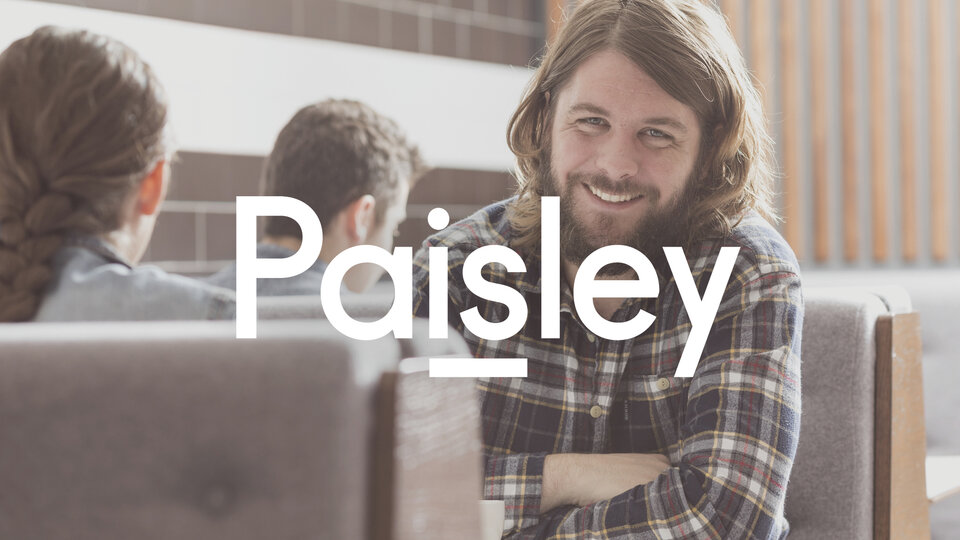
Paisley, UK
Services Provided
Sector
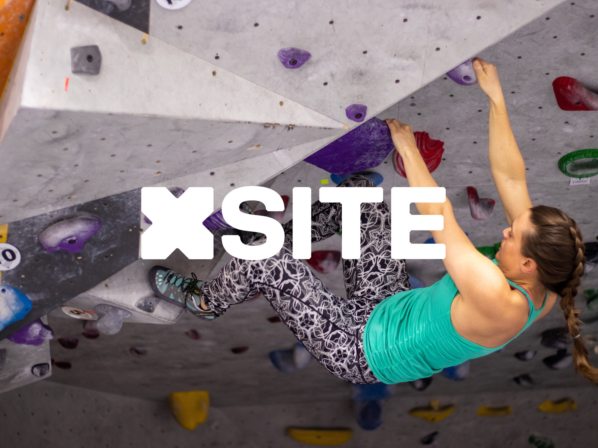
We worked with MAPP property management to reposition and rebrand this unique leisure complex, helping redefine public perception and showcase the diverse offer.
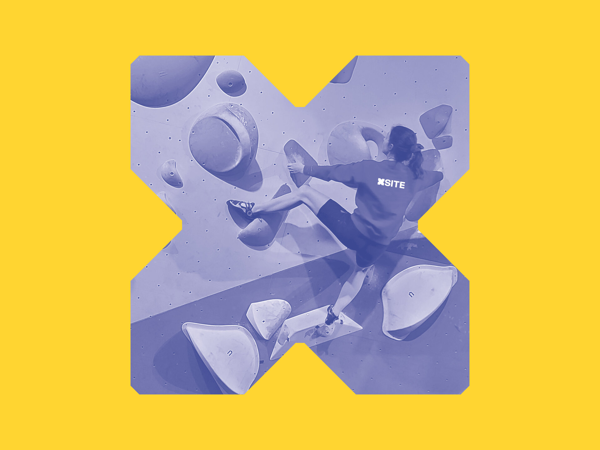
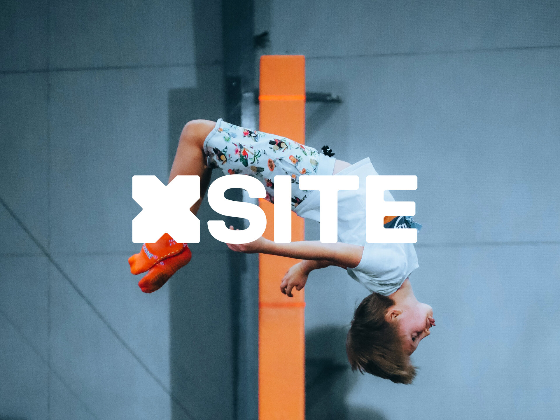
XSite hosts a wide range of adventure based activities, hospitality and a high quality retail experience.
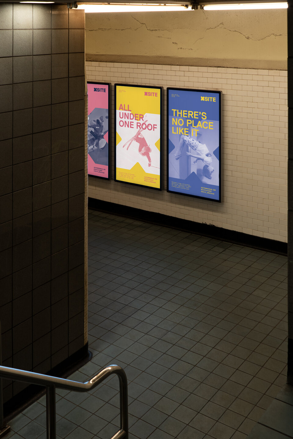
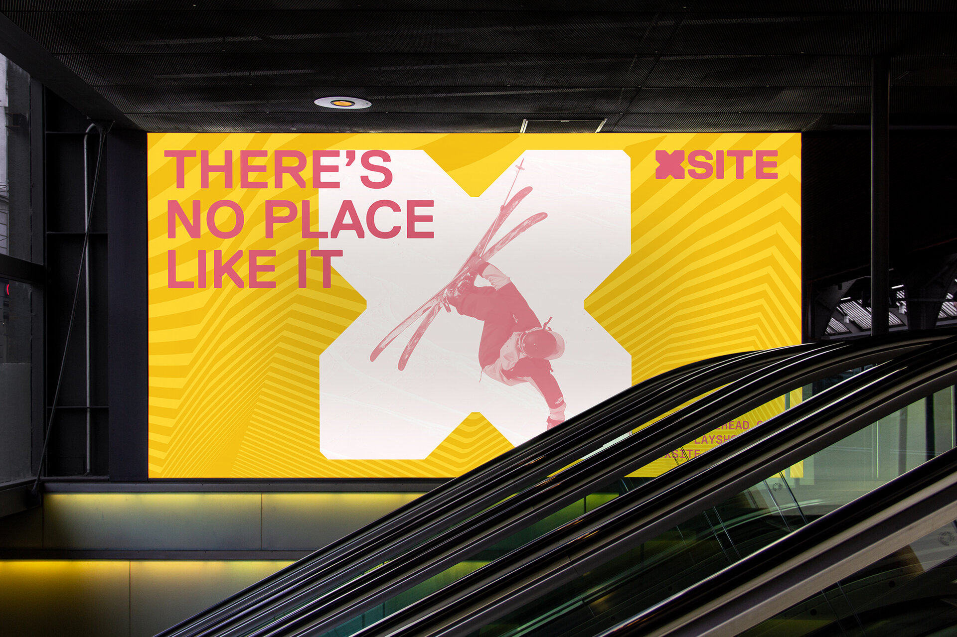
We crafted a new narrative that engages local audiences and those from further afield, helping redefine perceptions and reshape the offer for new customers. A direct approach to the new name makes a playful connection to the activities and experiences on offer in this unique location.
Brand
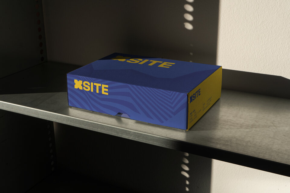
The simple and forthright logotype utilises an oversized X character designed to act as a container or portal device. X marks the spot, a location, a treasure.
Type is formed with chiseled chamfers bringing a contemporary edge and a level of detail that reflects a playful character when used at scale. Geometric graphic patterns are used to reinforce the new brand and introduce a sense of dynamism and movement.