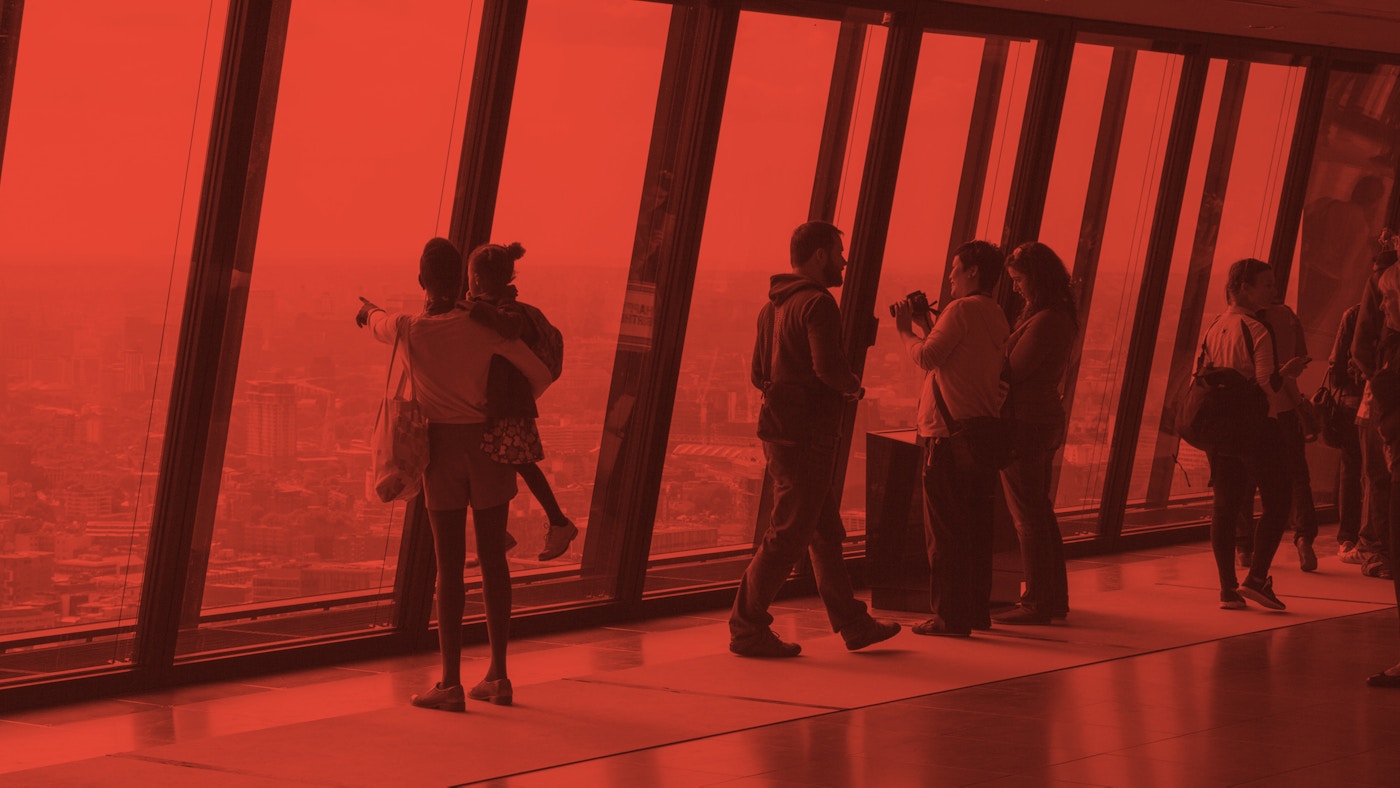
An open view
Open City is a London-based charity that promotes people-centred cities through an extensive range of initiatives and events including Open House London, the world’s largest architectural festival.
Building upon the success of Open House London, we elevated the Open City brand by raising the profile of their multifaceted, year-round educational and professional engagement programme.
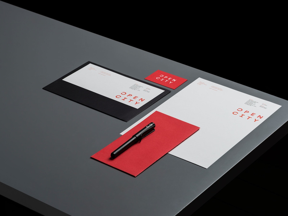
A visual identity system was designed to communicate the breadth of their offer — placing public, professional and educational initiatives on a level footing — the open letters suggest dialogue, equity and a sense of place and community.
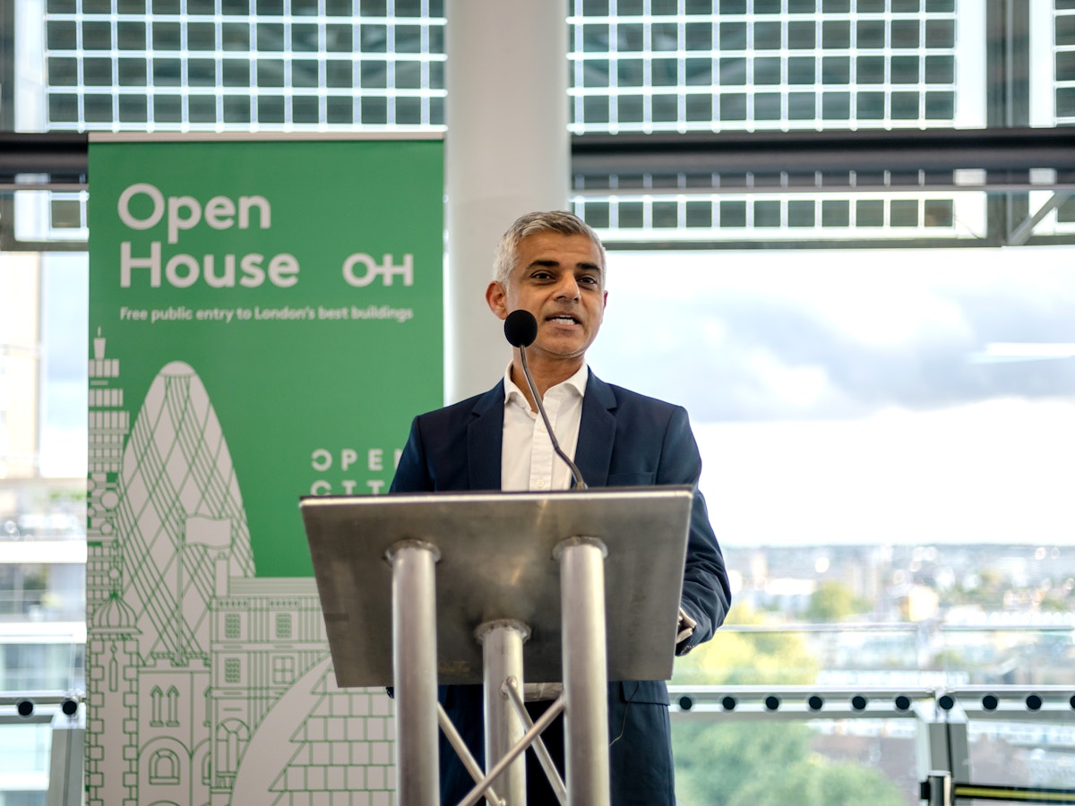
The Open House London brand was refreshed in parallel, building recognition and creating a consistency that captures the synergy between organisation and event, while maintaining these as independent identities.
Striking a balance between the different aspects of their tailored offer, we activated an identity across print and digital applications that inspires an affinity between the built environment and the people who live, learn and work there.
1 of 11
Logotype. Identity.
2 of 11
Digital. Website.
3 of 11
Art Direction.
4 of 11
Digital. Mobile.
5 of 11
Print. Stationery.
6 of 11
Identity guidelines.
7 of 11
Digital. Website.
8 of 11
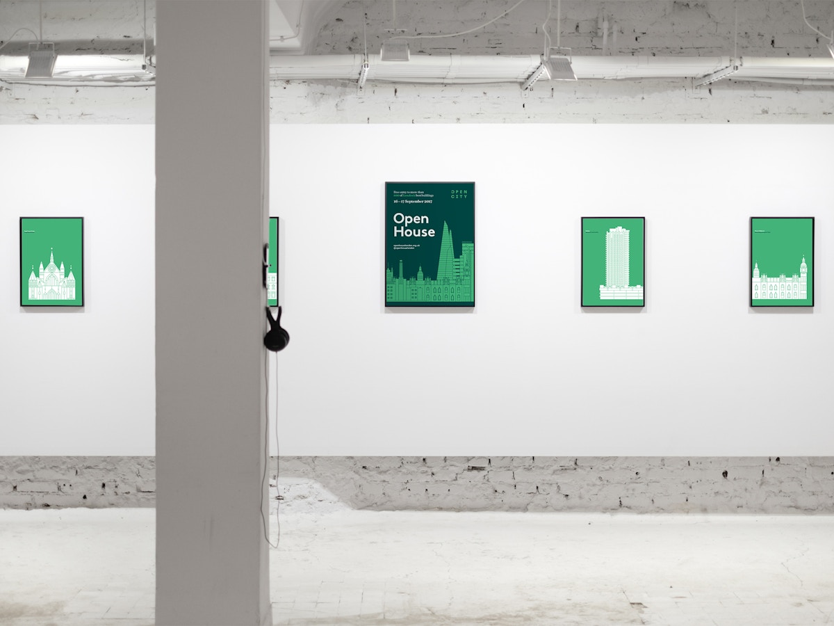
Illustration. Art direction.
9 of 11
Campaign.
10 of 11
Illustration. Art direction.
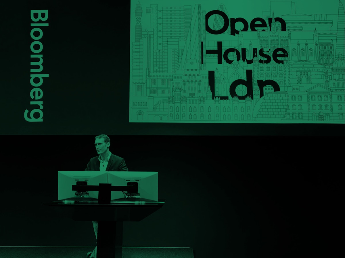
11 of 11
Launch Event.
We had a strong idea of where we wanted to take our brand and its assets and working with Graphical House – with their fresh thinking and elegant ways of doing – gave us a clear direction of travel (and booster rockets)!
Rory Olcayto
Chief Executive
Open City