Brand Architecture
Client
Oberlanders
Date
2024
Location
UK wide
Website
Services Provided
Sector
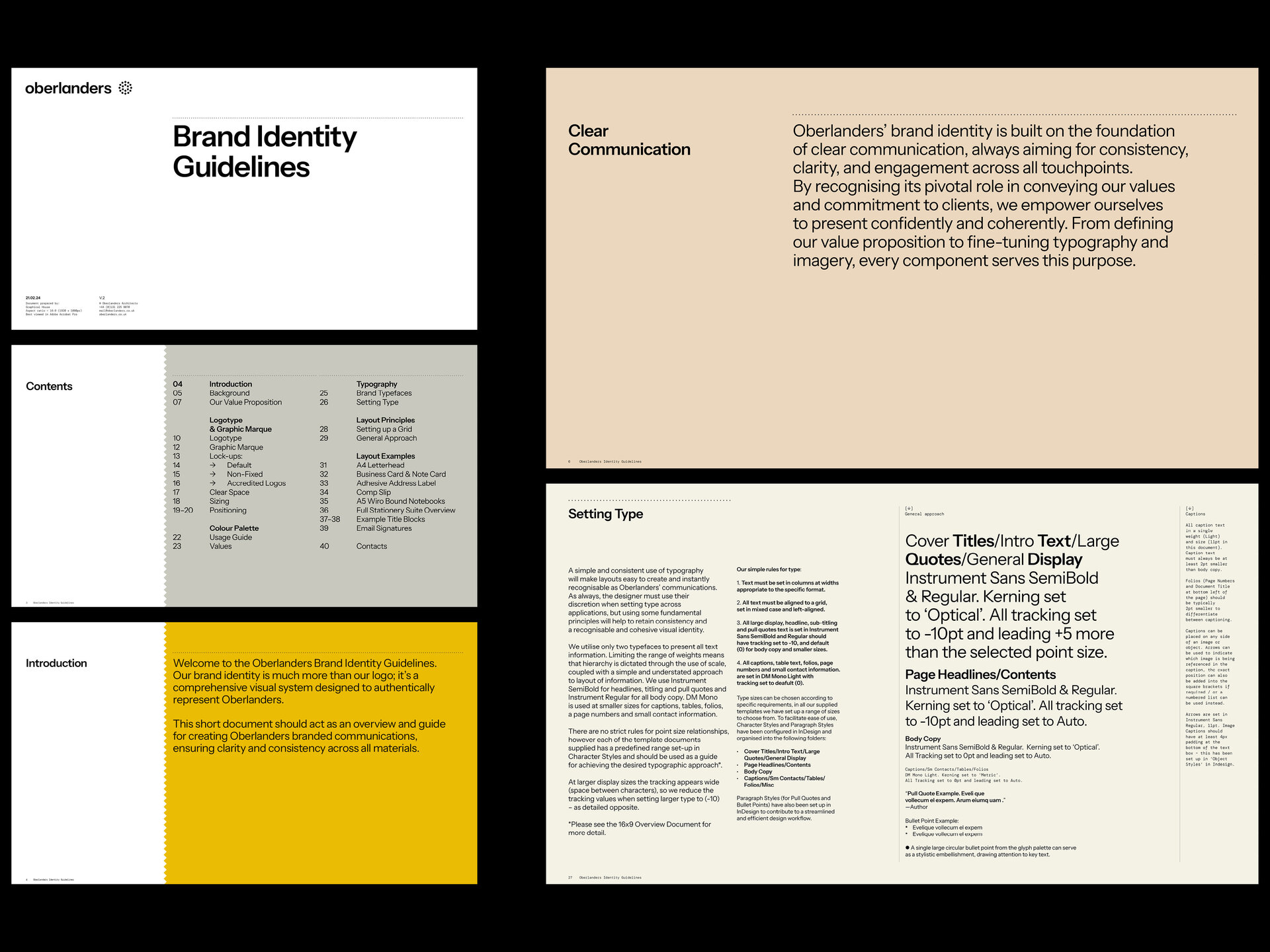
The overhaul of Oberlanders’ brand encompassed the development of a comprehensive visual identity system, centred around a dynamic new website and a suite of adaptable document templates.
Our collaboration also involved strategic work on messaging and ongoing art direction, including photography and filmography. This holistic approach ensured a seamless integration of the brand across various platforms, solidifying Oberlanders’ position as an innovative leader in the architectural landscape.
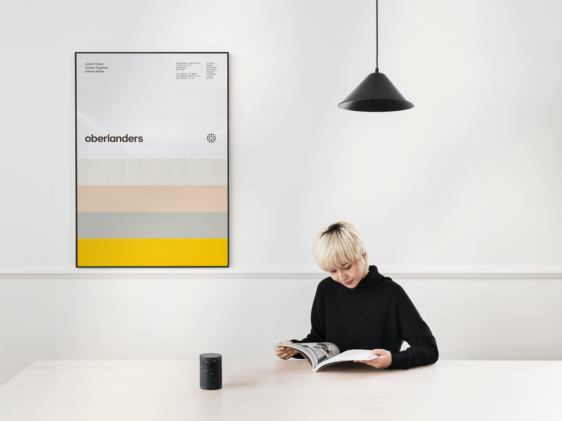
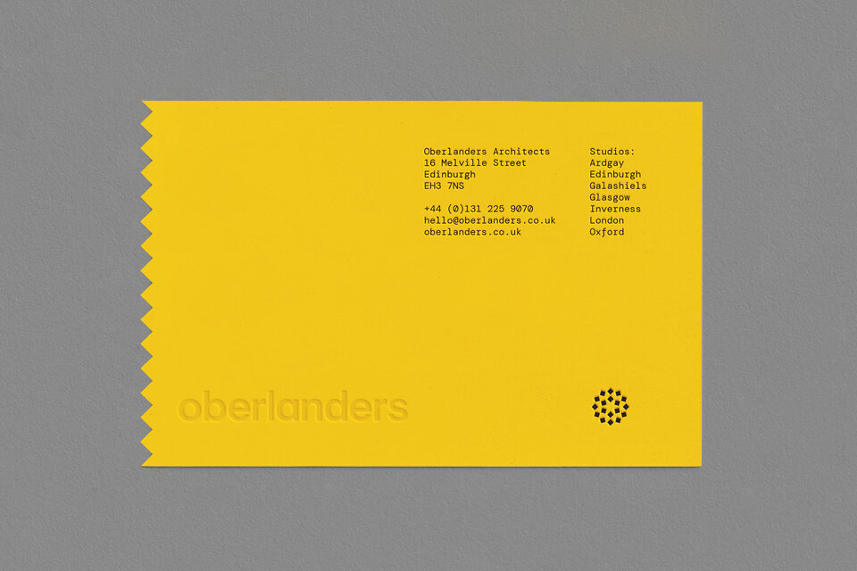
Brand
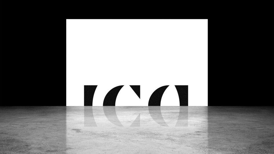
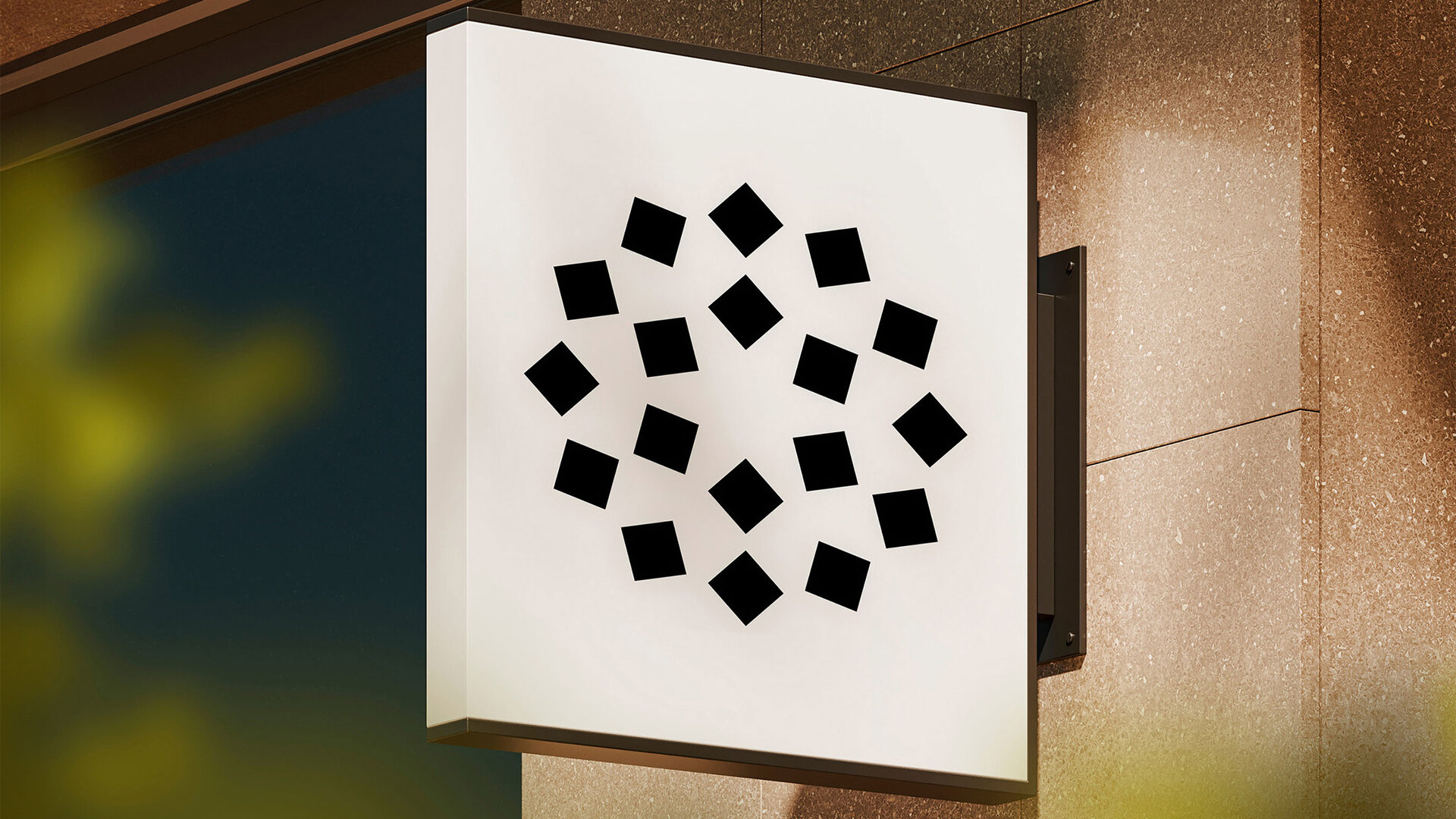
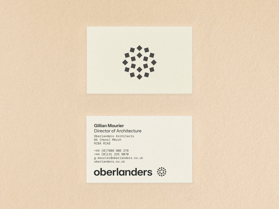
The new Graphic Marque draws inspiration from two distinct sources: the visual language of compass points, paying homage to Oberlanders' studios located across the UK, and the foundational, intricate, and harmonious mathematical patterns found in nature.
The Logotype, all in lowercase, is confident and clear. Set in a timeless, geometric sans serif font, it promotes a commitment to upfront, transparent communication.
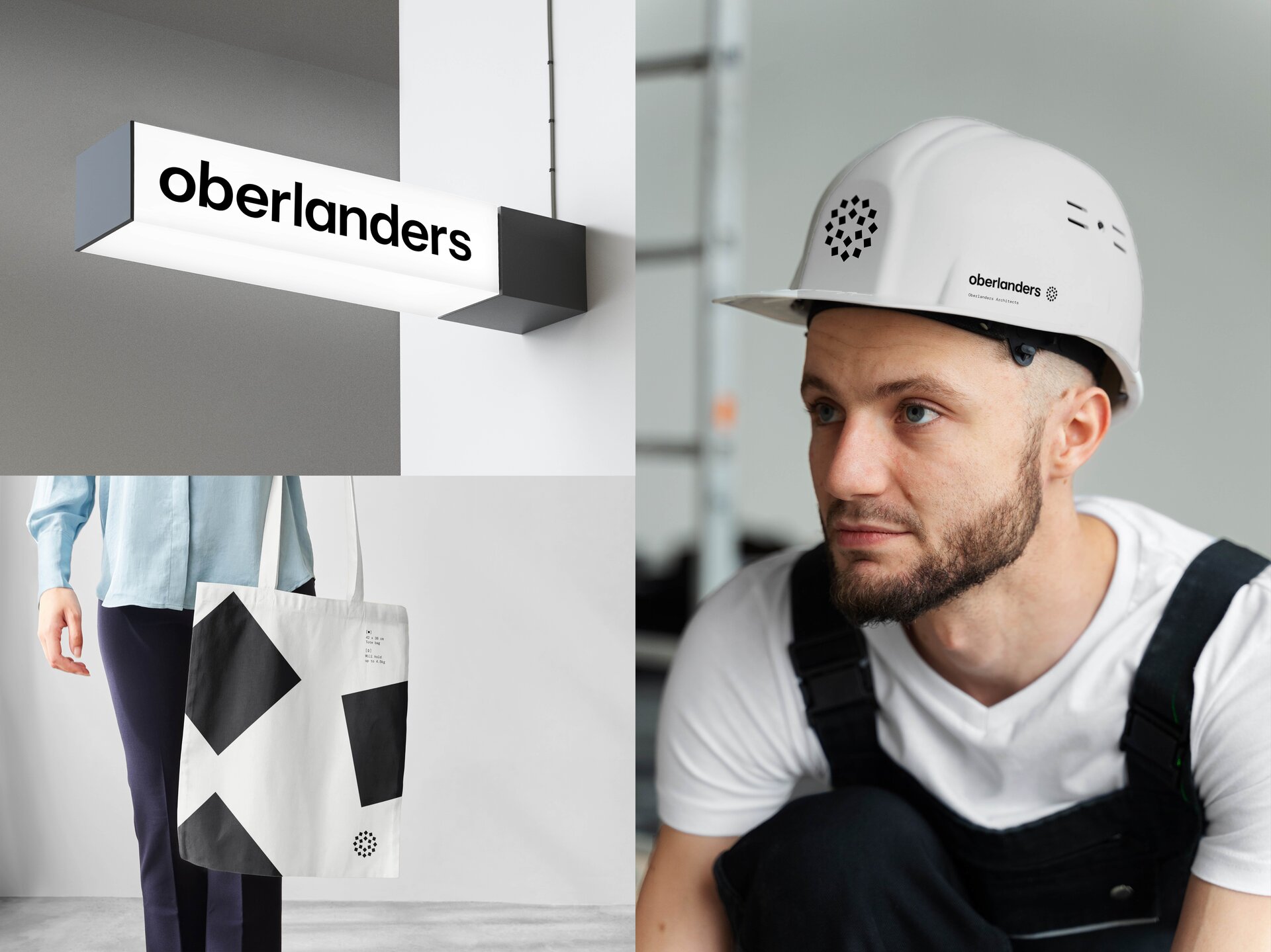
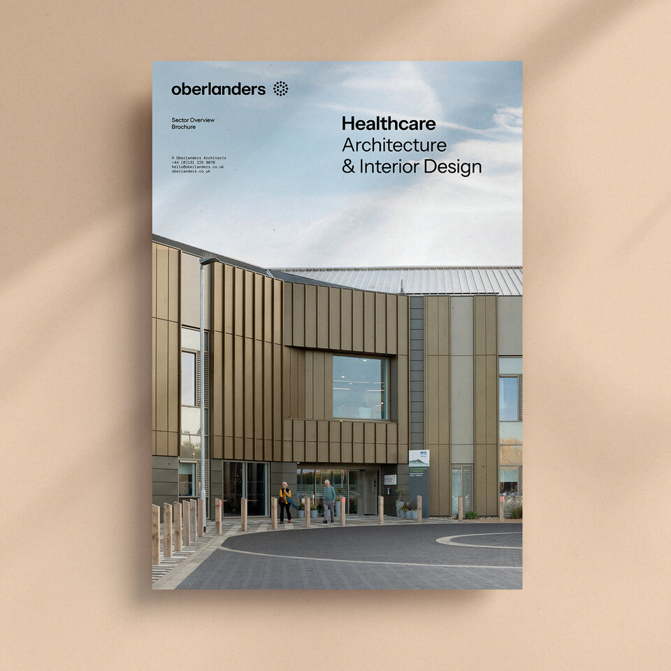
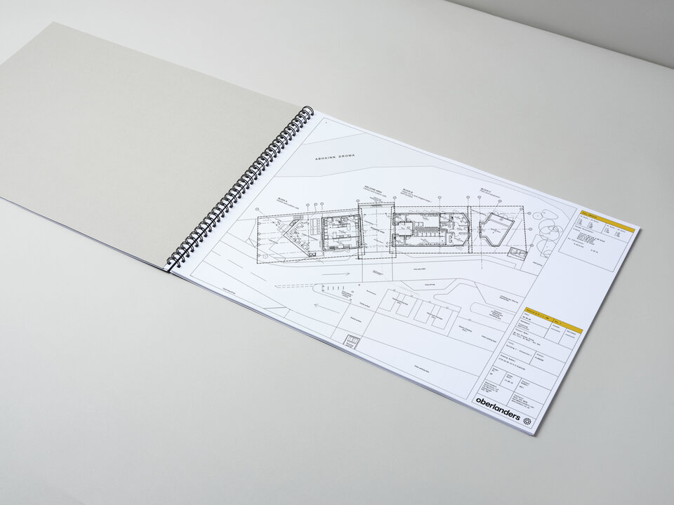
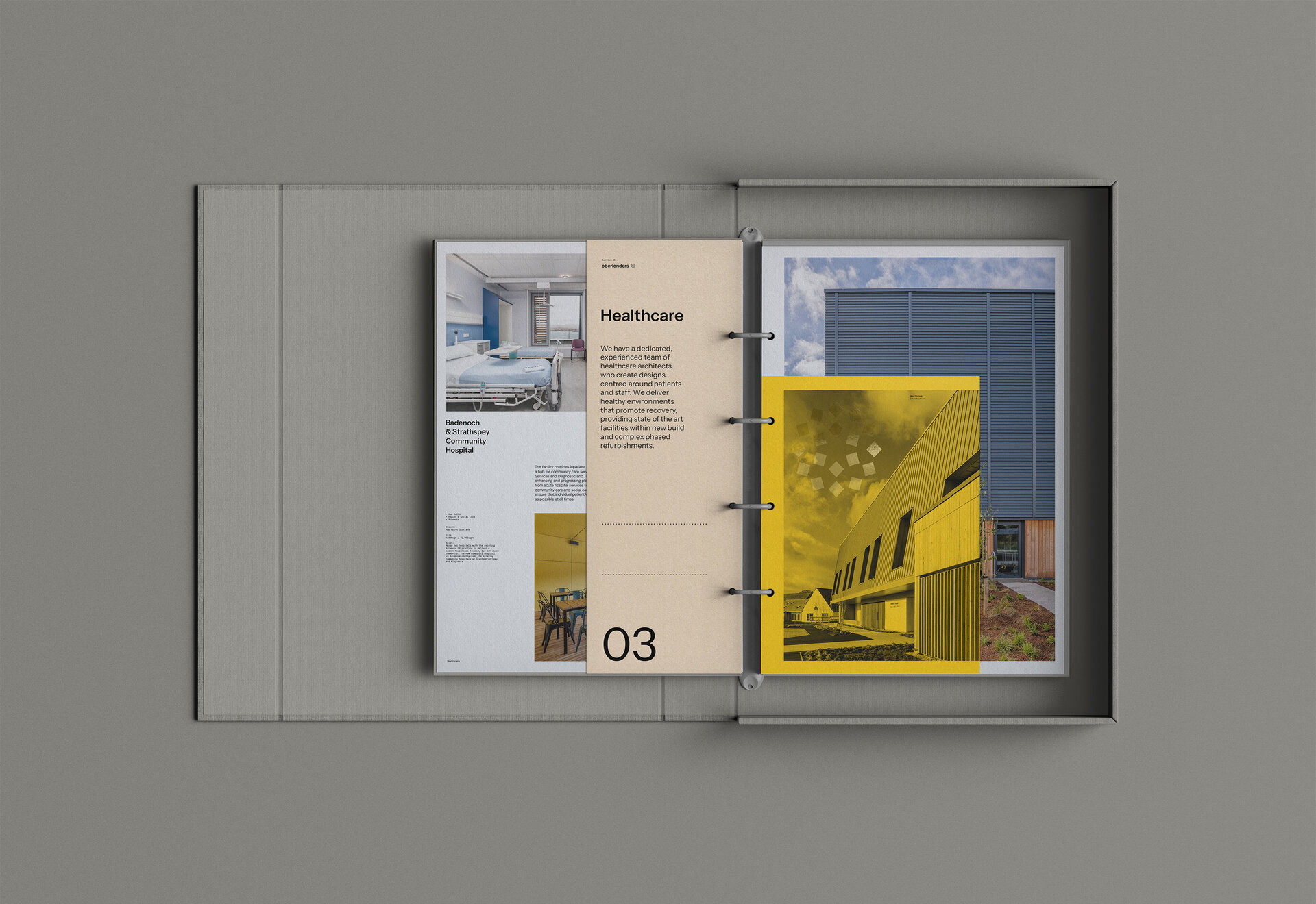
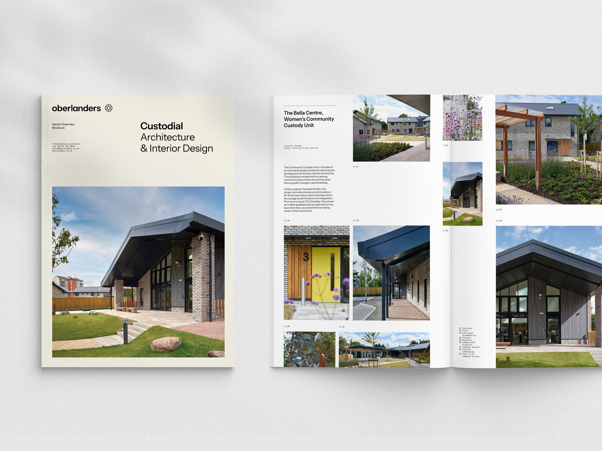
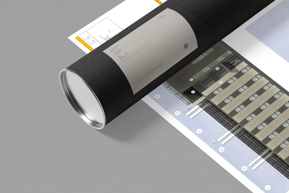
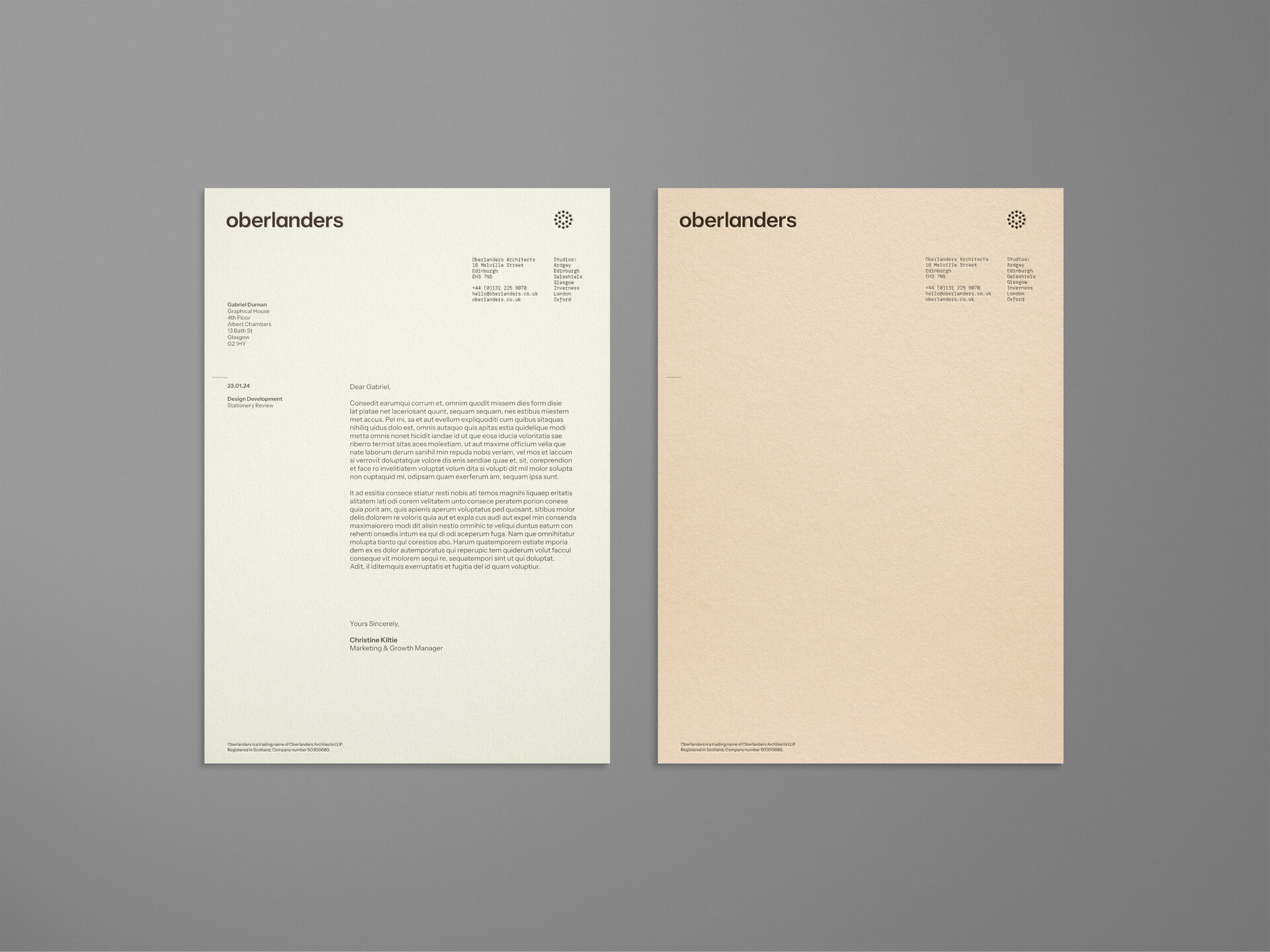
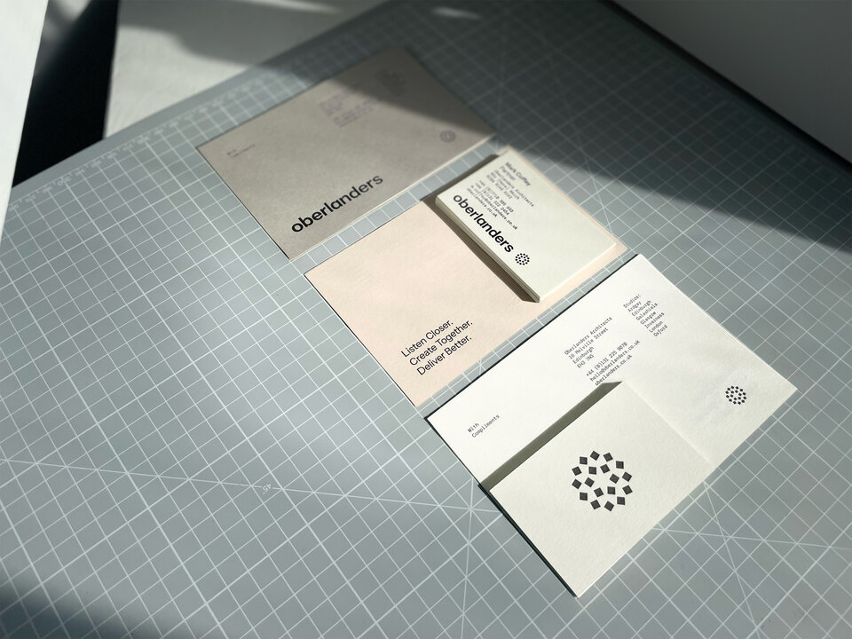
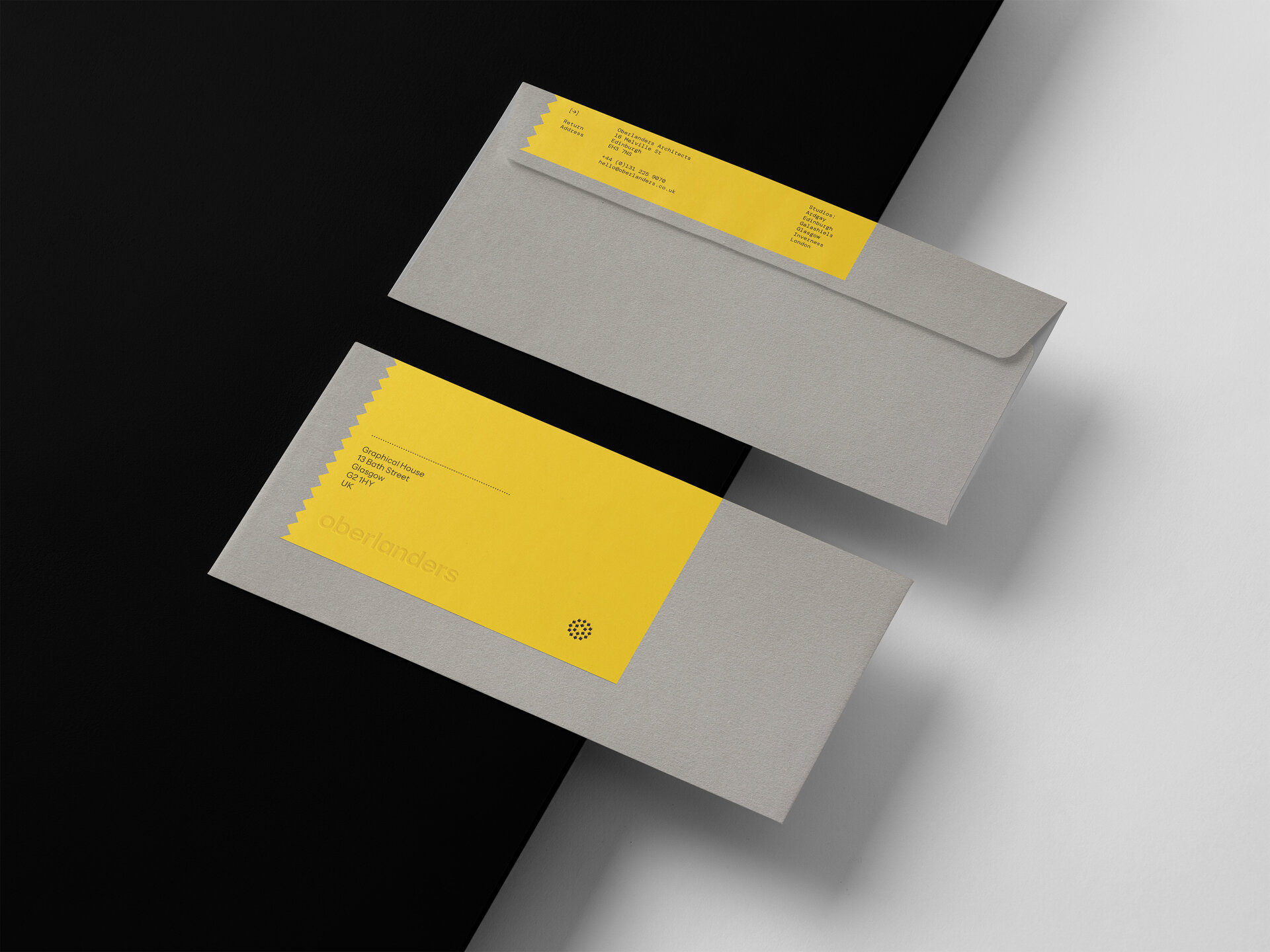
Collateral
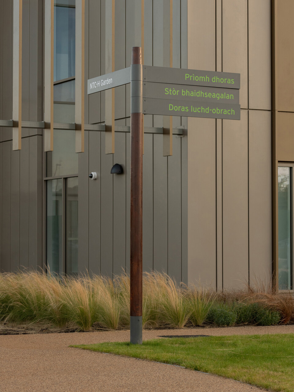
In the world of architecture, physical experiences are key. We reflect this is through a range of collateral where tactile experiences enhance the brand.
Attention to detail is another key message that is expressed through a sense of engineered elegance.
Digital
As the principal touchpoint the website had to reflect all the values of Oberlanders but also function as a clear and easily navigable gateway to everything the organisation has to offer.
The depth of information had to be structured and presented in a digestible way for the user but also it needed to be easily managed and maintained by the firm.
“
The website is an absolute delight and beautifully reflects who we are. That’s an incredible feat and makes me extremely proud and honoured to be a part of it.
Andrew Wilmot
Partner
Content
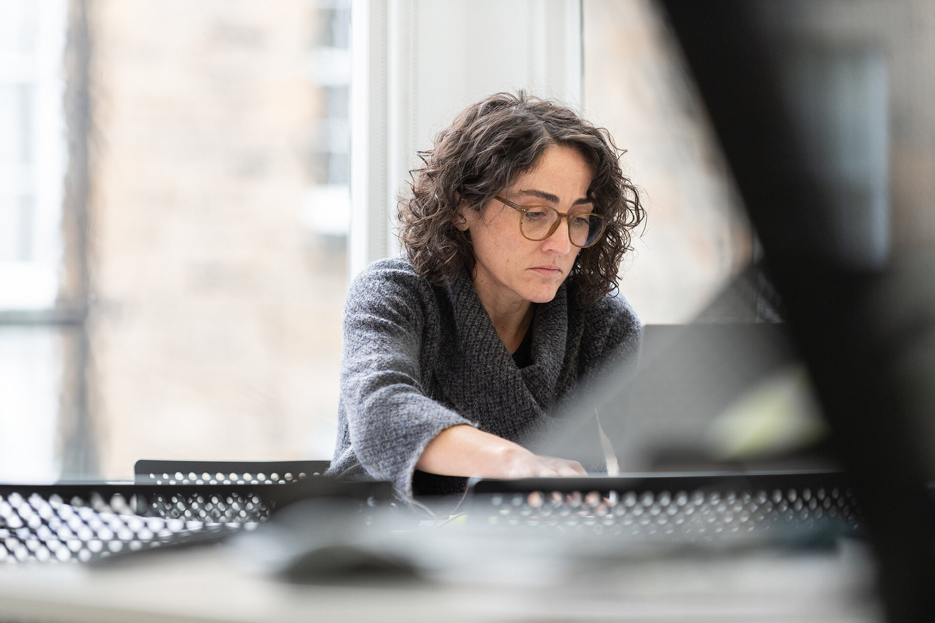
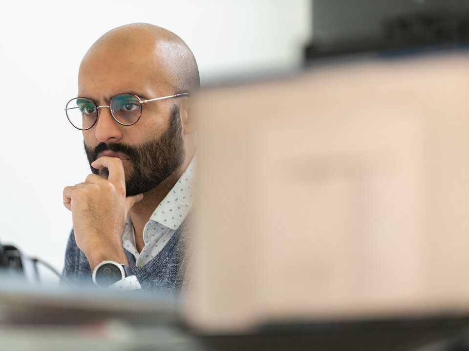
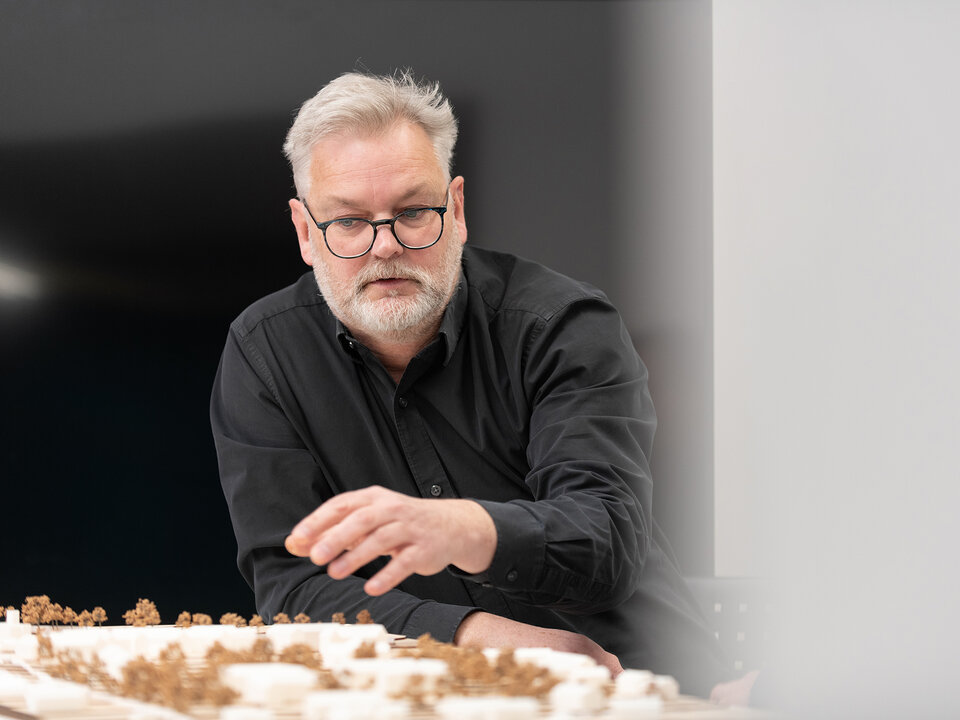
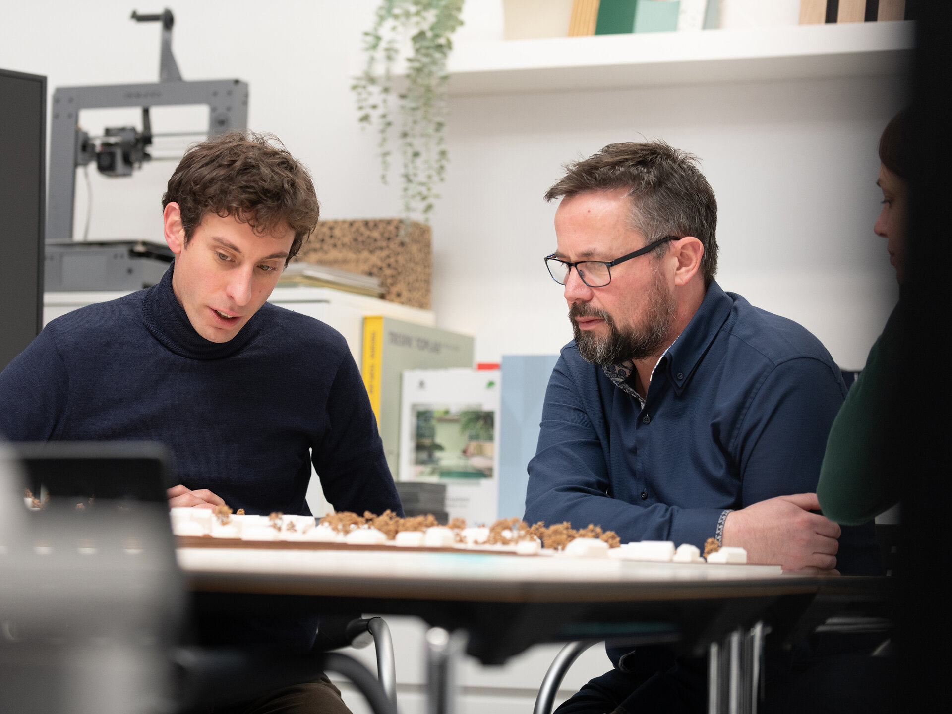
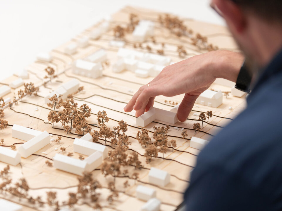
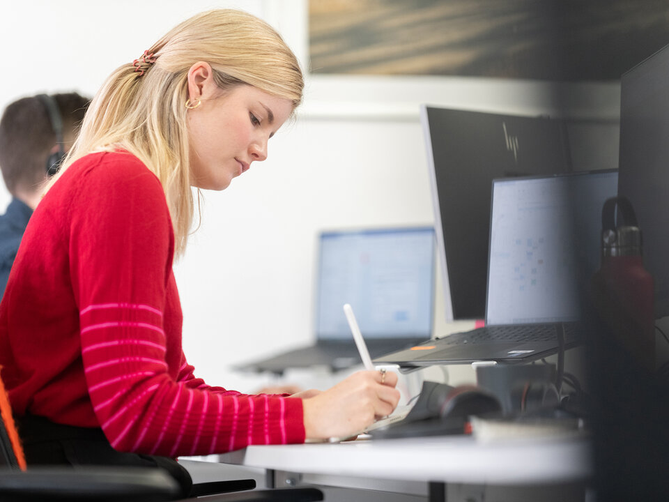
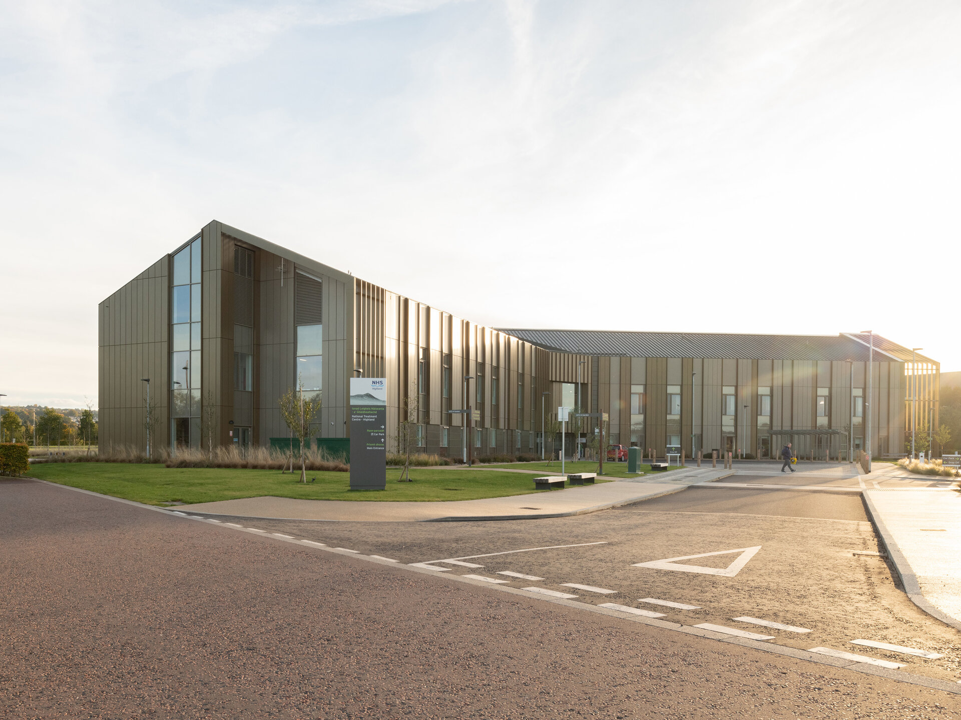
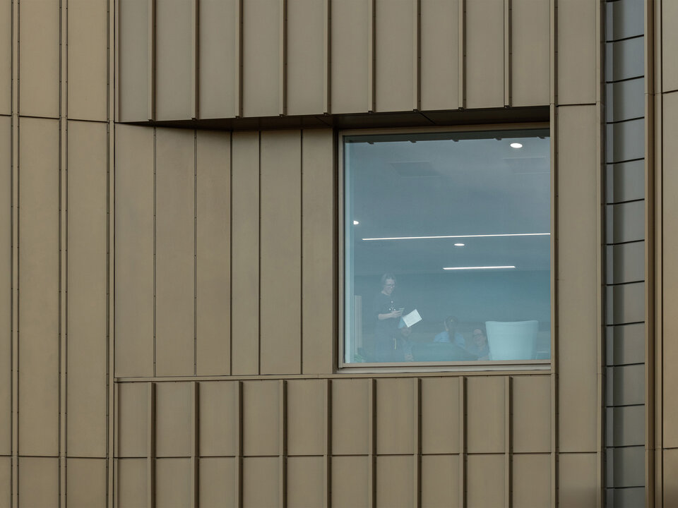
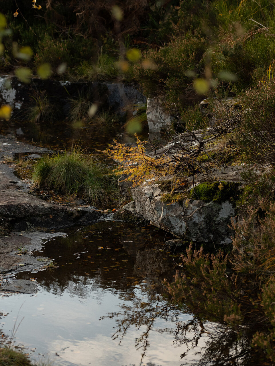
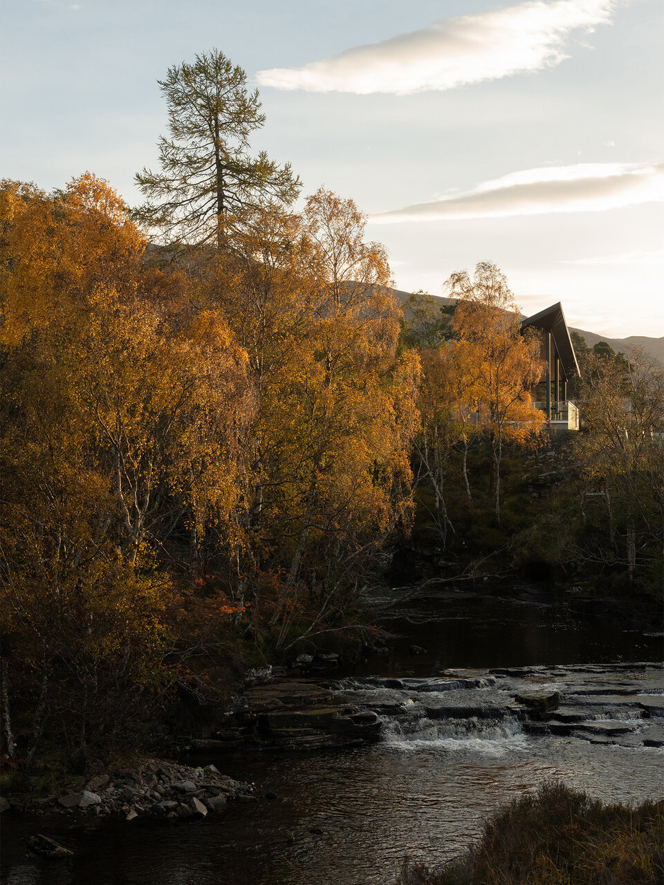
A new library of visual content had to perform two main tasks. First of all, it was important to communicate something of the experience and process of working with Oberlanders, a critical factor to their value proposition.
Secondly, it was important to try to capture the projects from a human perspective. The work of the organisation is extremely end user focused and imagery needed to reflect this.
“
The work which Graphical House have done for us has delivered and more on our expectations. I feel real pride now when sharing our outputs with clients knowing it's truly representative of who we are.
Mark Coffey
Partner