For the change makers
Client
Bywater Properties
Date
2021
Location
Glasgow, UK
Website
Services Provided
Sector
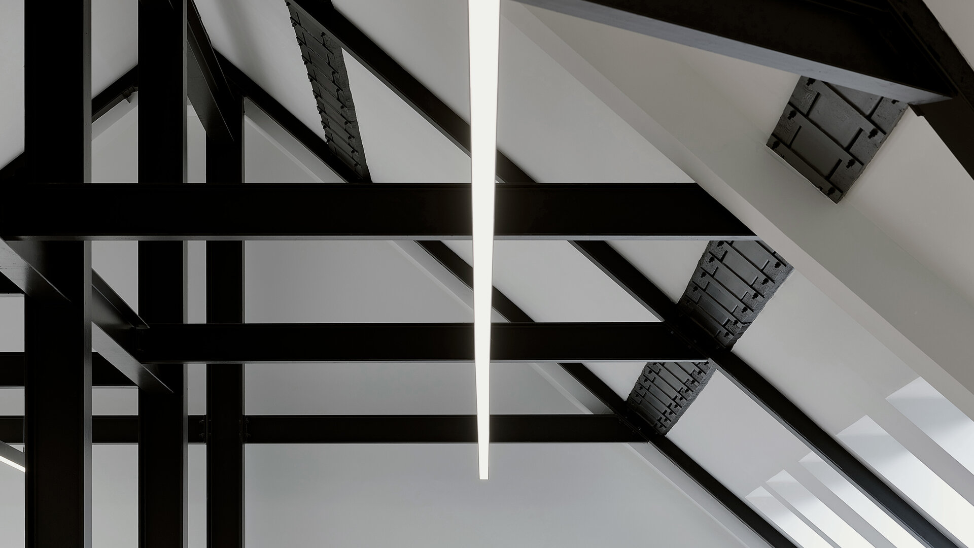
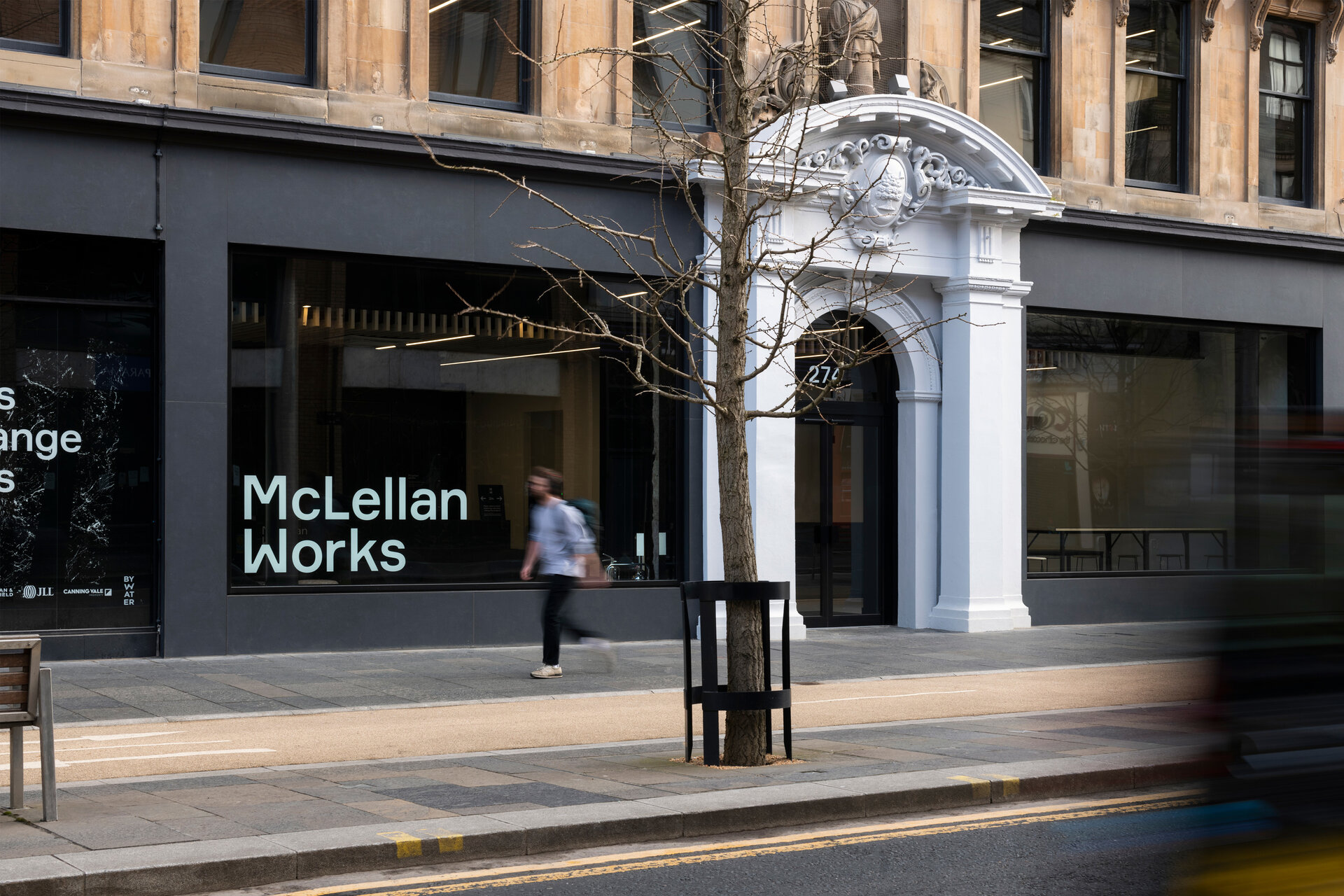
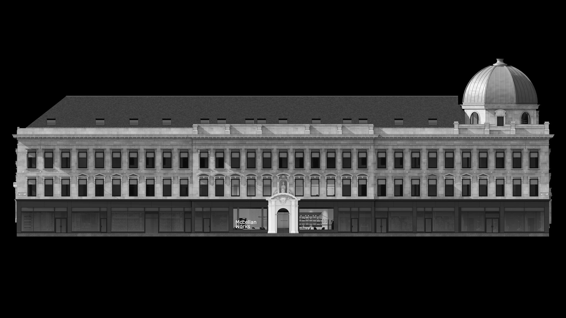
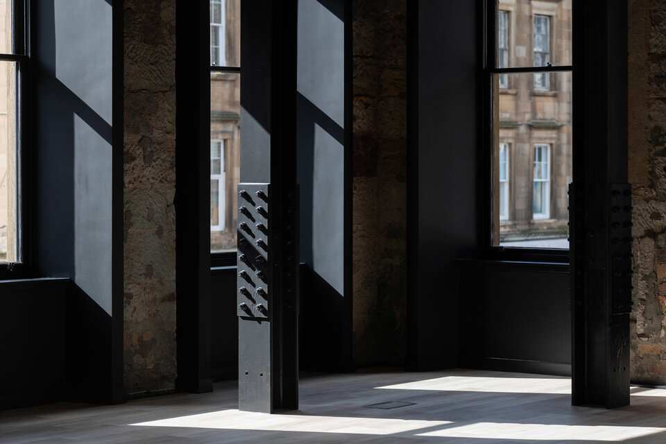
An exemplary new working environment, for a community of like-minded people, McLellan Works offers flexible workspaces for creative SMEs. With a focus on sustainable development, the internal spaces behind the iconic Georgian facade have been redesigned to meet the ever-changing needs of the modern workplace.
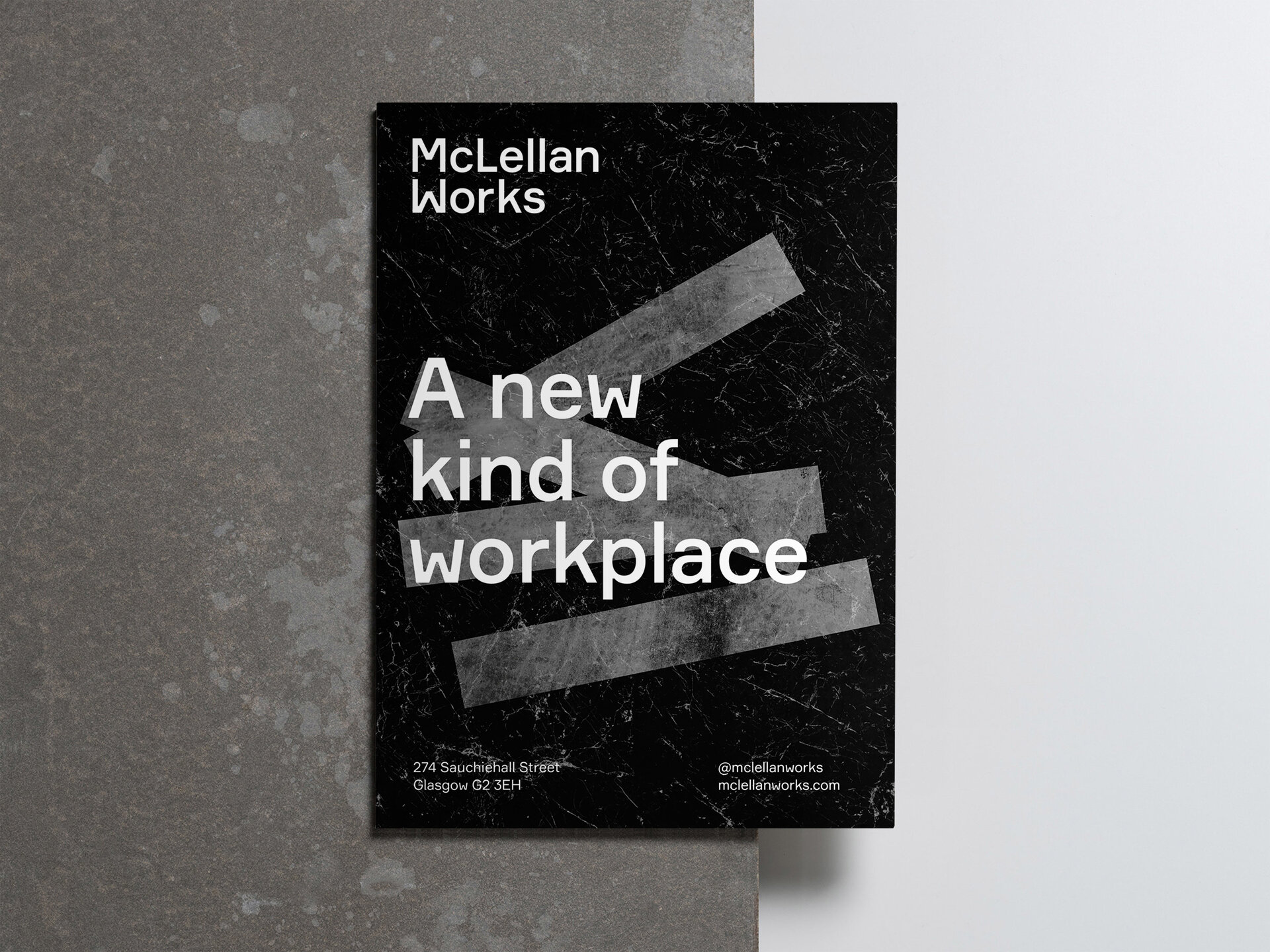
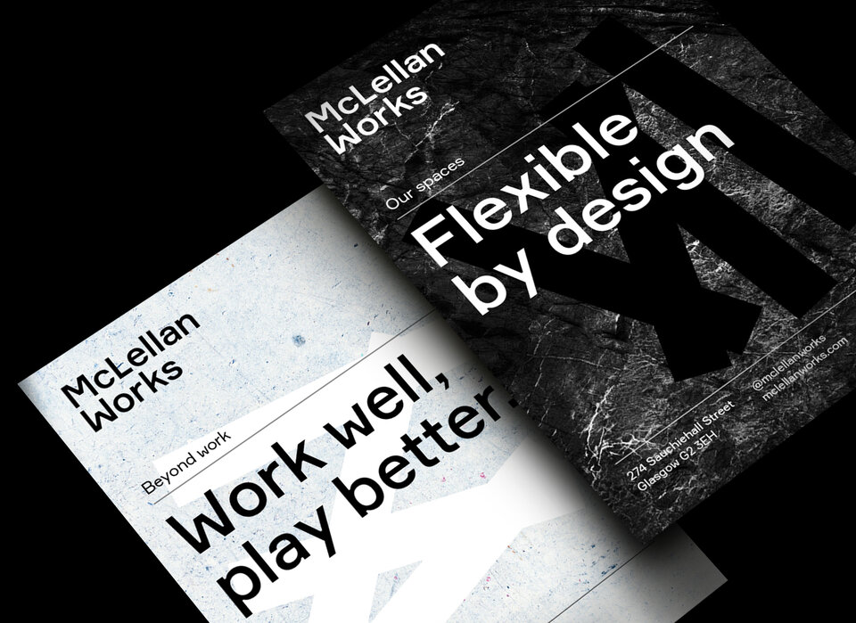
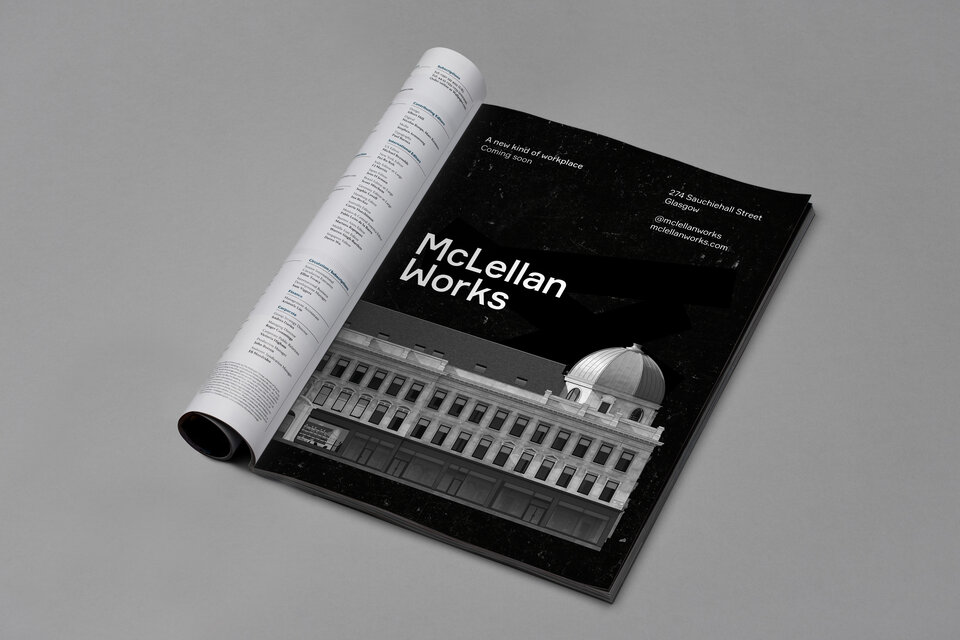
Through a strategic positioning process with our client Bywater and architect Stallan-Brand, a visual identity was created to reflect and build upon the ideas inherent in the architectural scheme. Precise, refined but dynamic, the flexible visual system was developed with a compelling tone of voice to create a suite of targeted marketing materials to promote the transformative redesign.
Brand
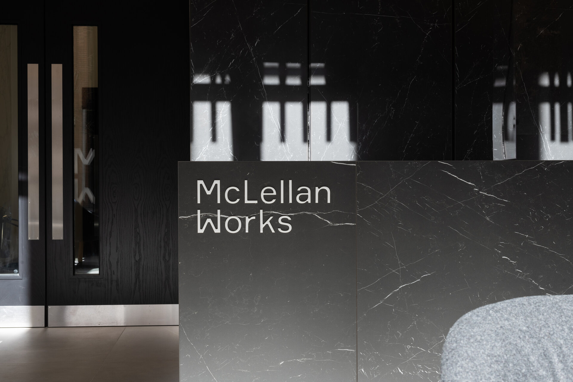
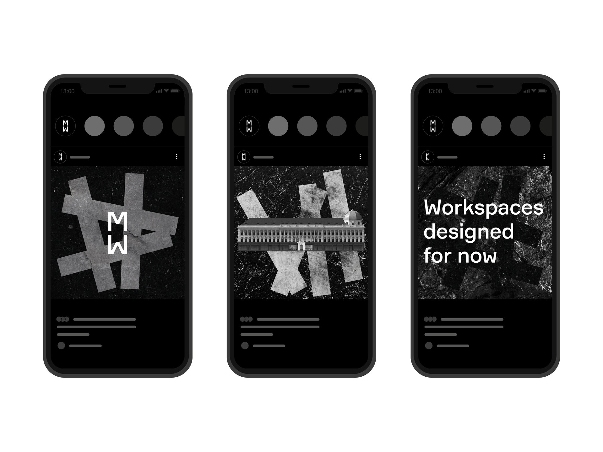
Embracing the relationship between ‘M’ and ‘W’, the logotype reflects themes of repetition and symmetry in the building’s architecture.
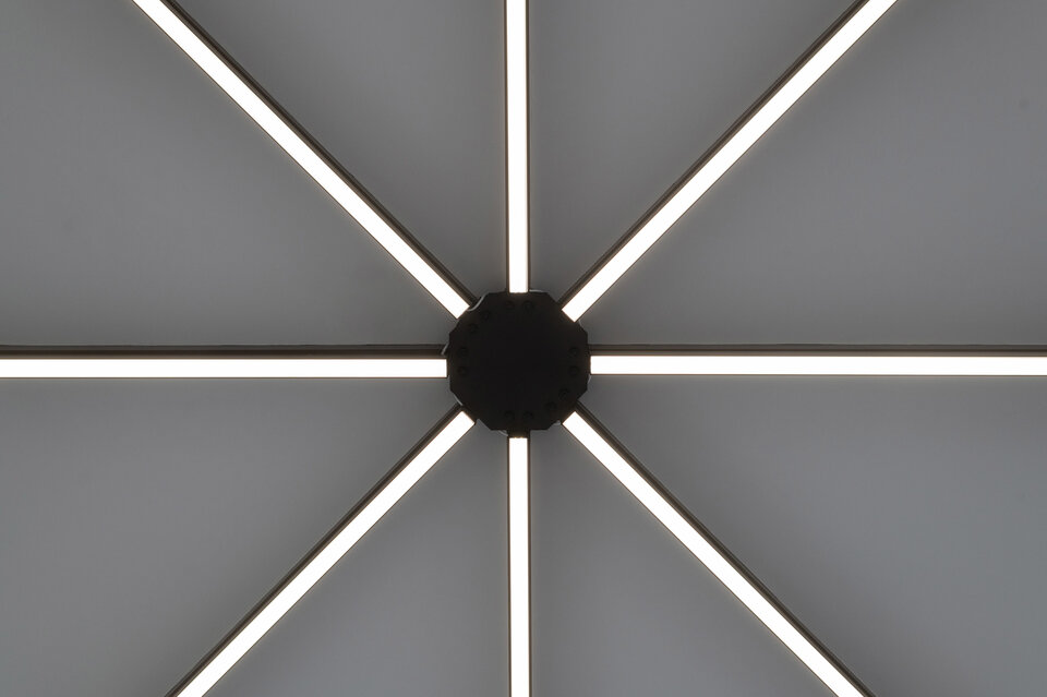
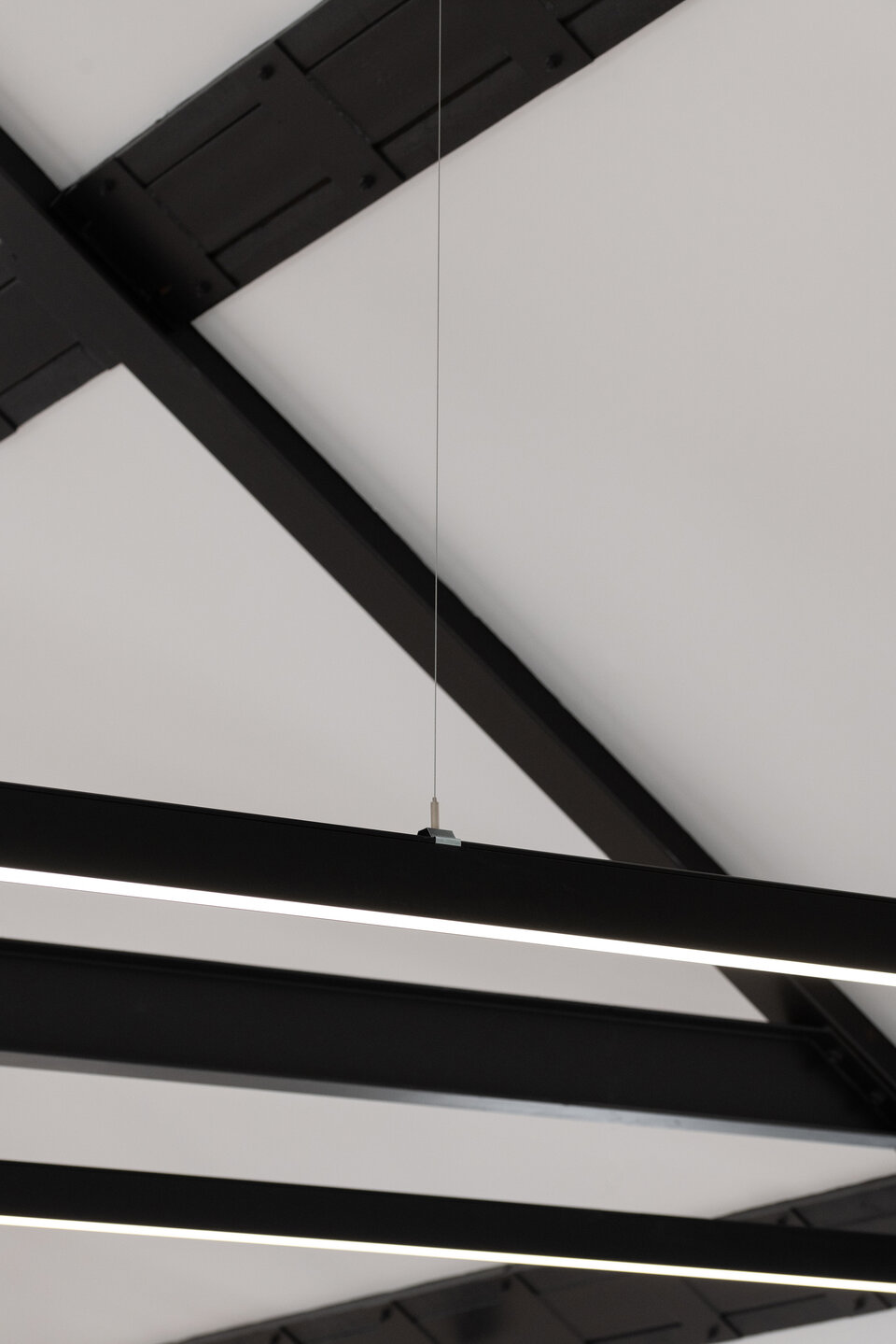
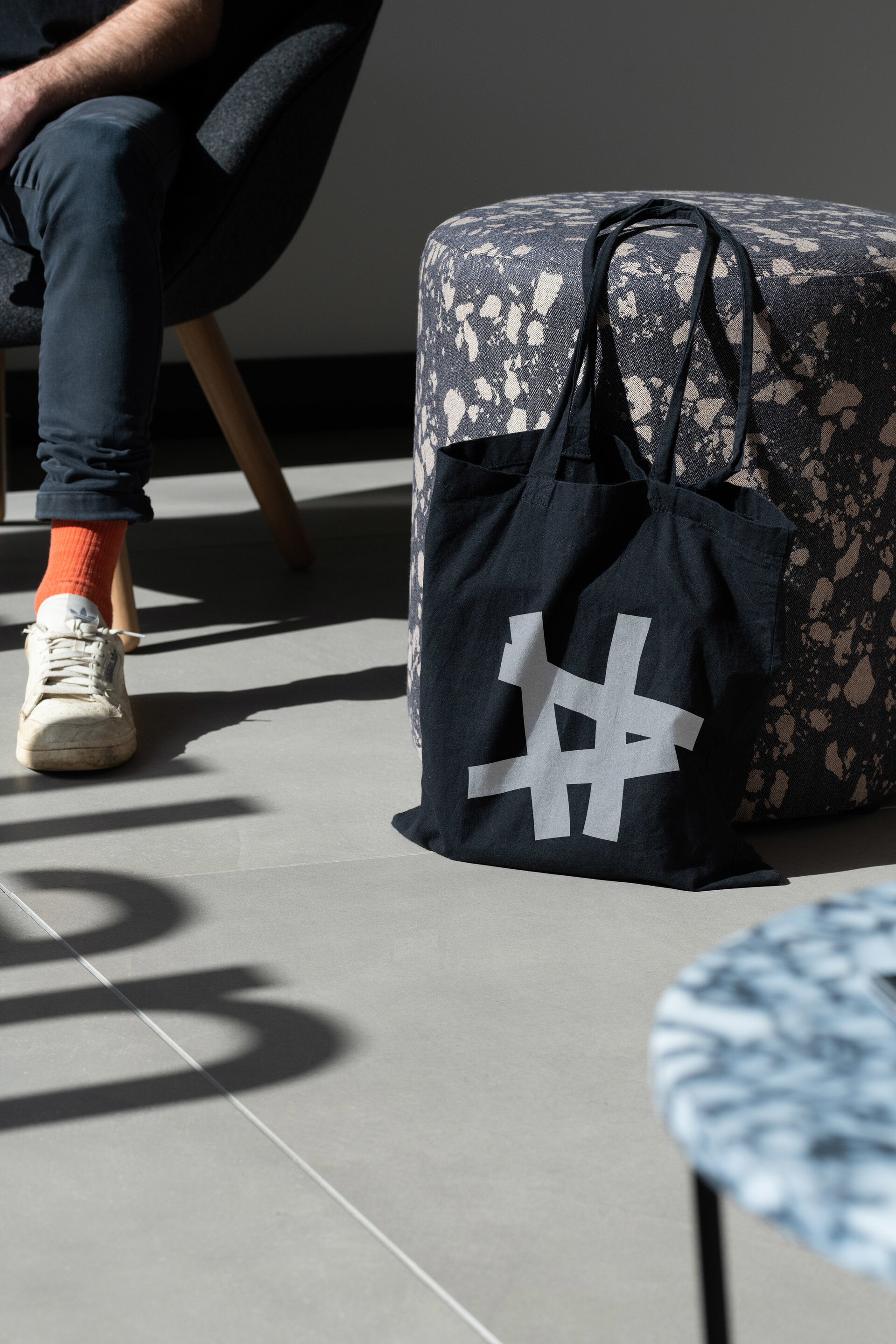
We created a dynamic graphic marque inspired by the building's interior and what goes on inside to bring a sense of energy and creativity to the identity.
Art Direction
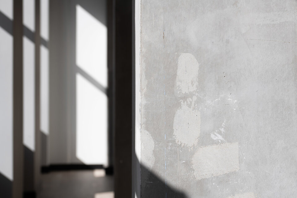
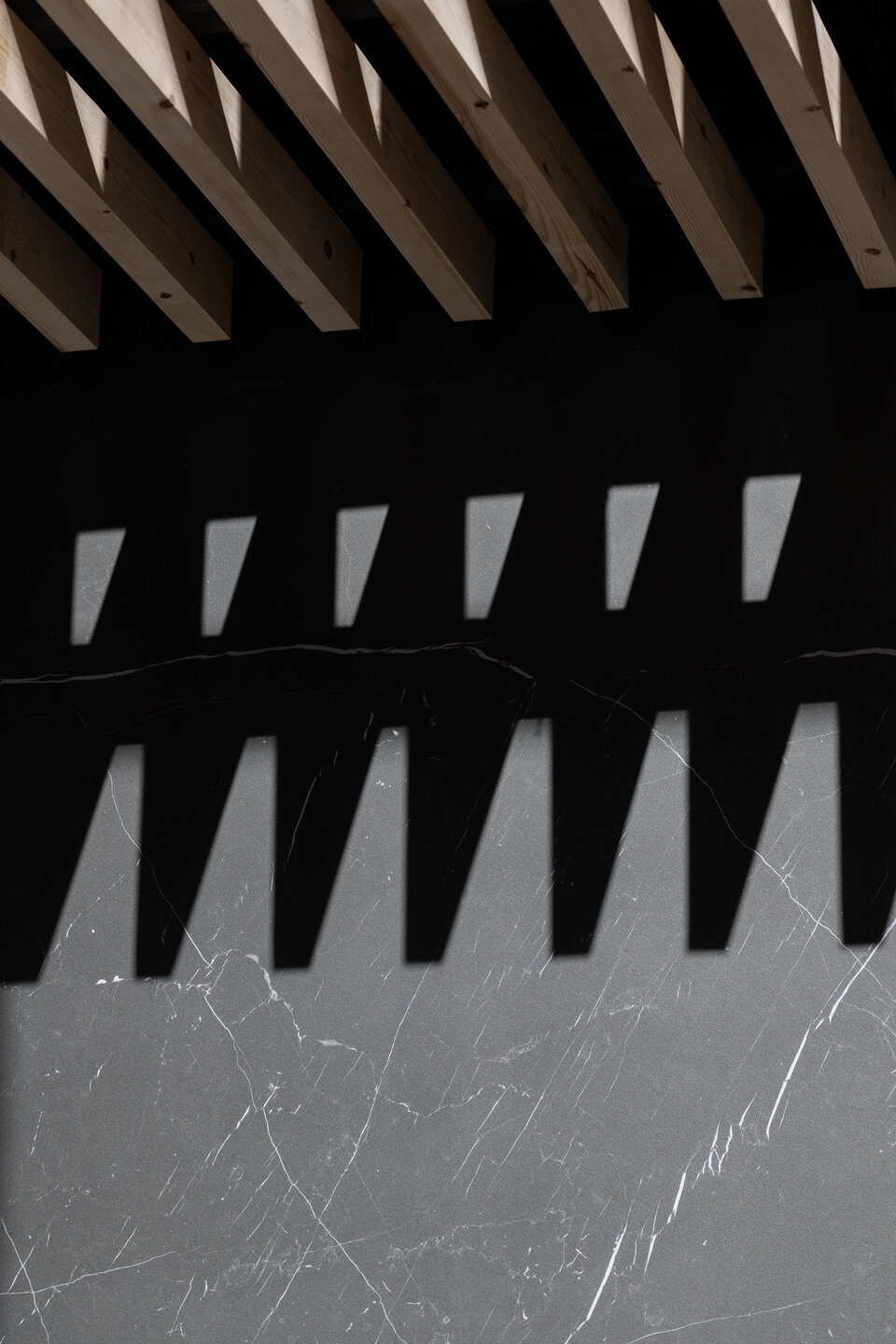
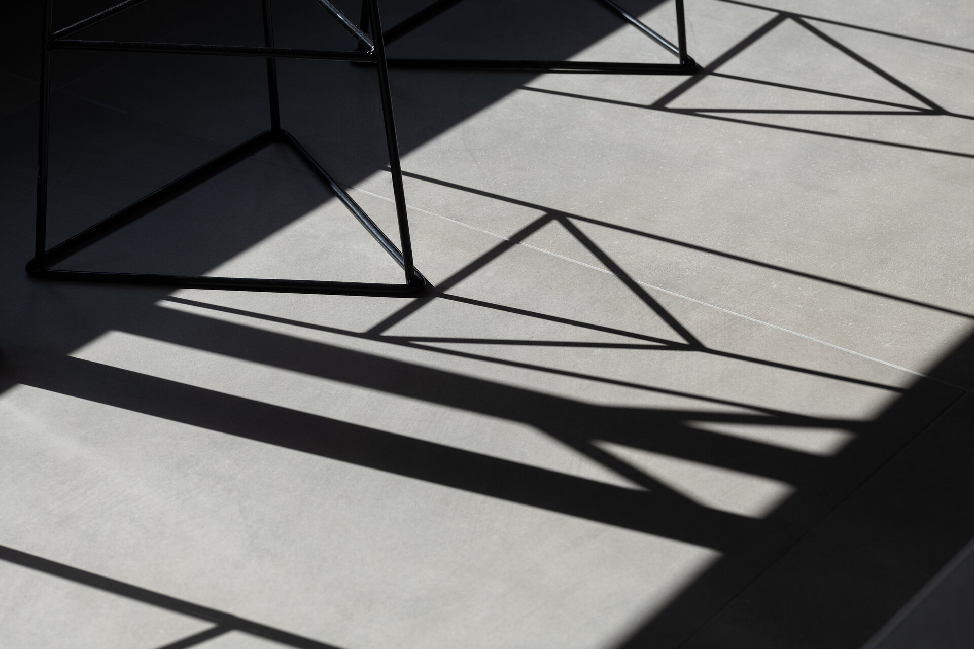
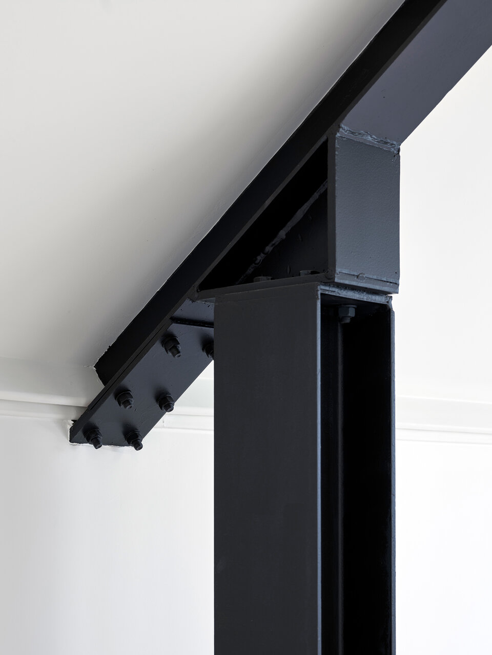
We documented the building's exterior and interior spaces with a set of images that captured the inspiration and essence of the visual identity.
Collateral
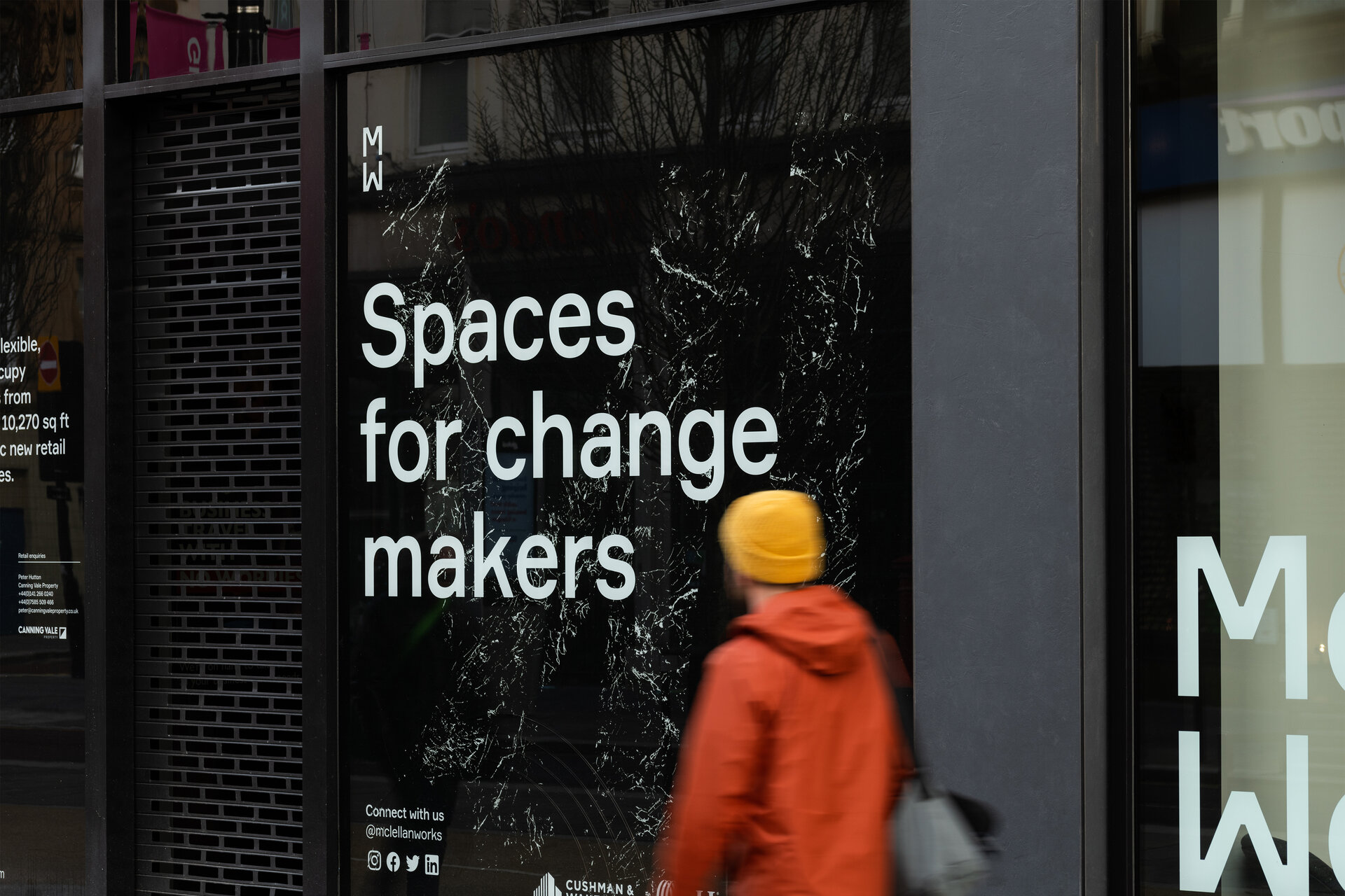
We designed a variety of marketing material for the leasing team to promote the space to prospective tenants as well as the wider community.
Sustainably sourced merchandise was also created to form part of the welcome pack for new tenants.
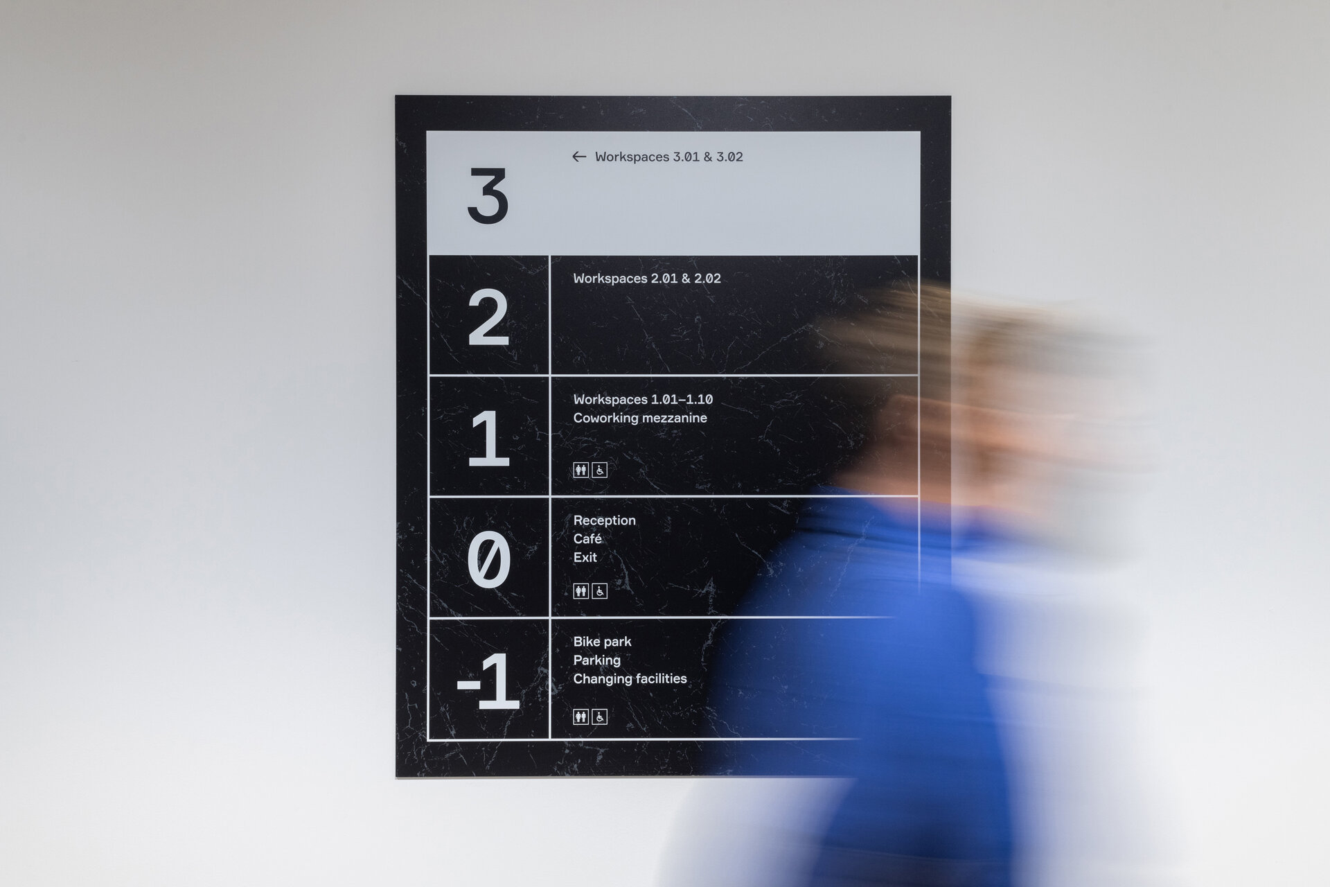
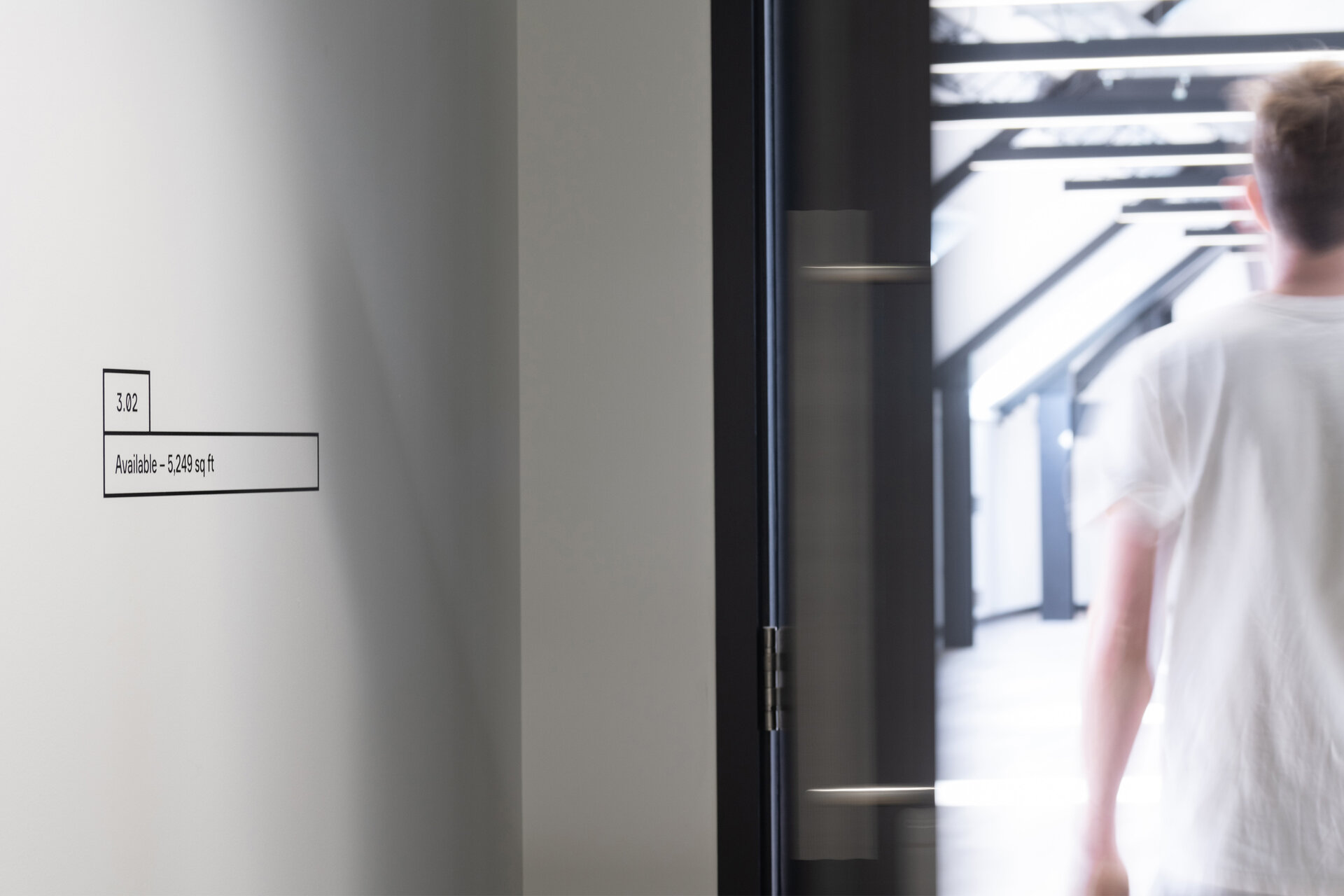
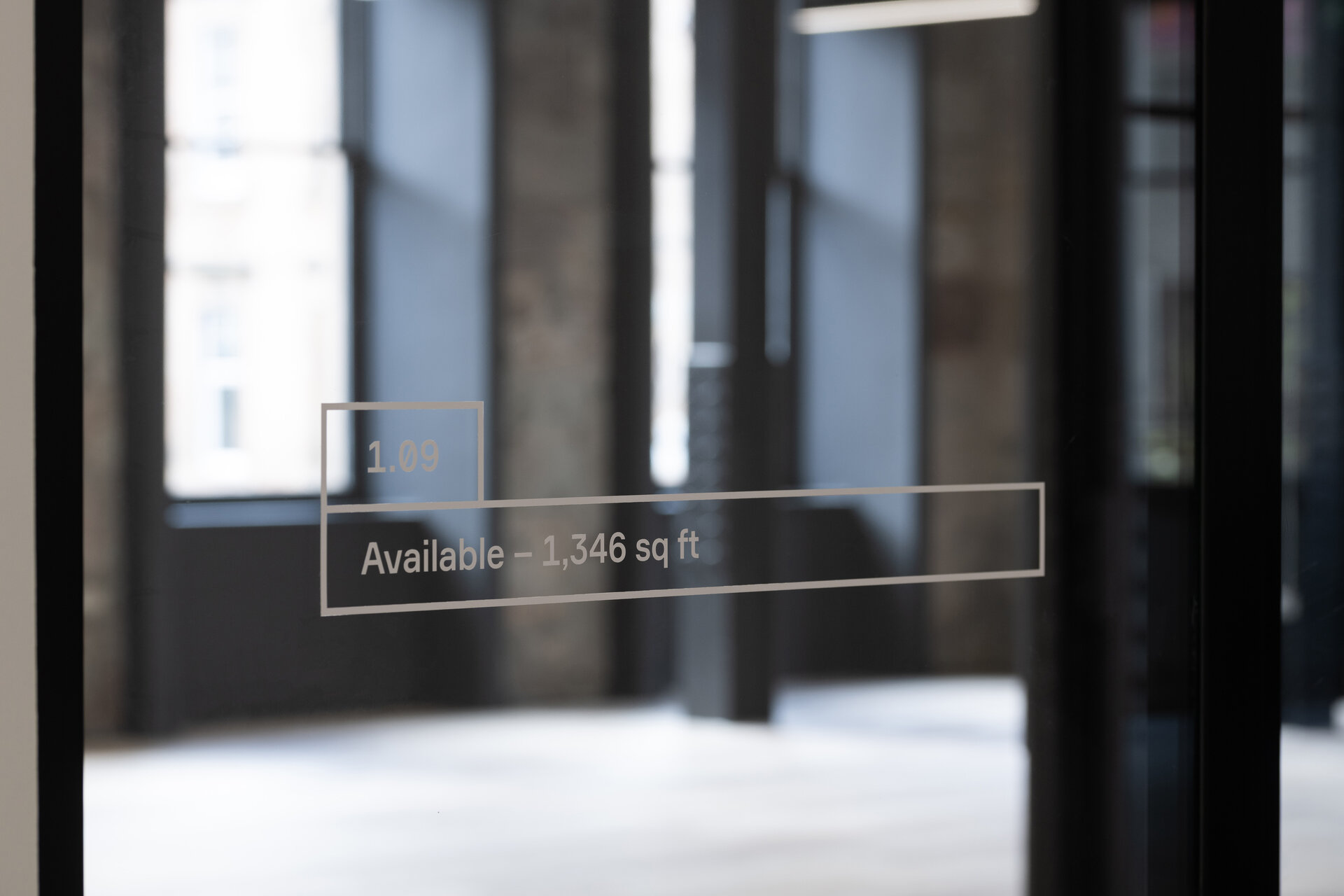
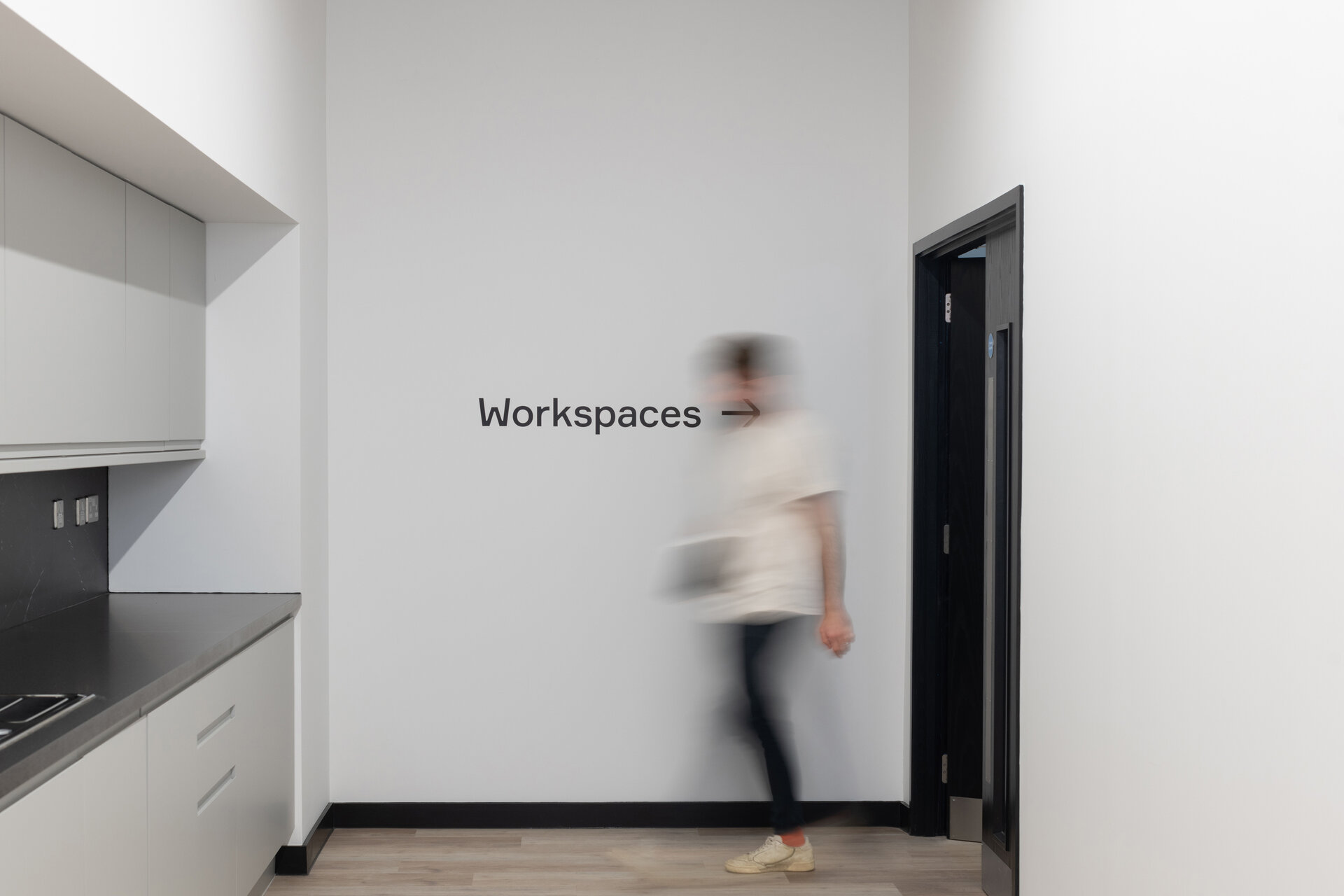
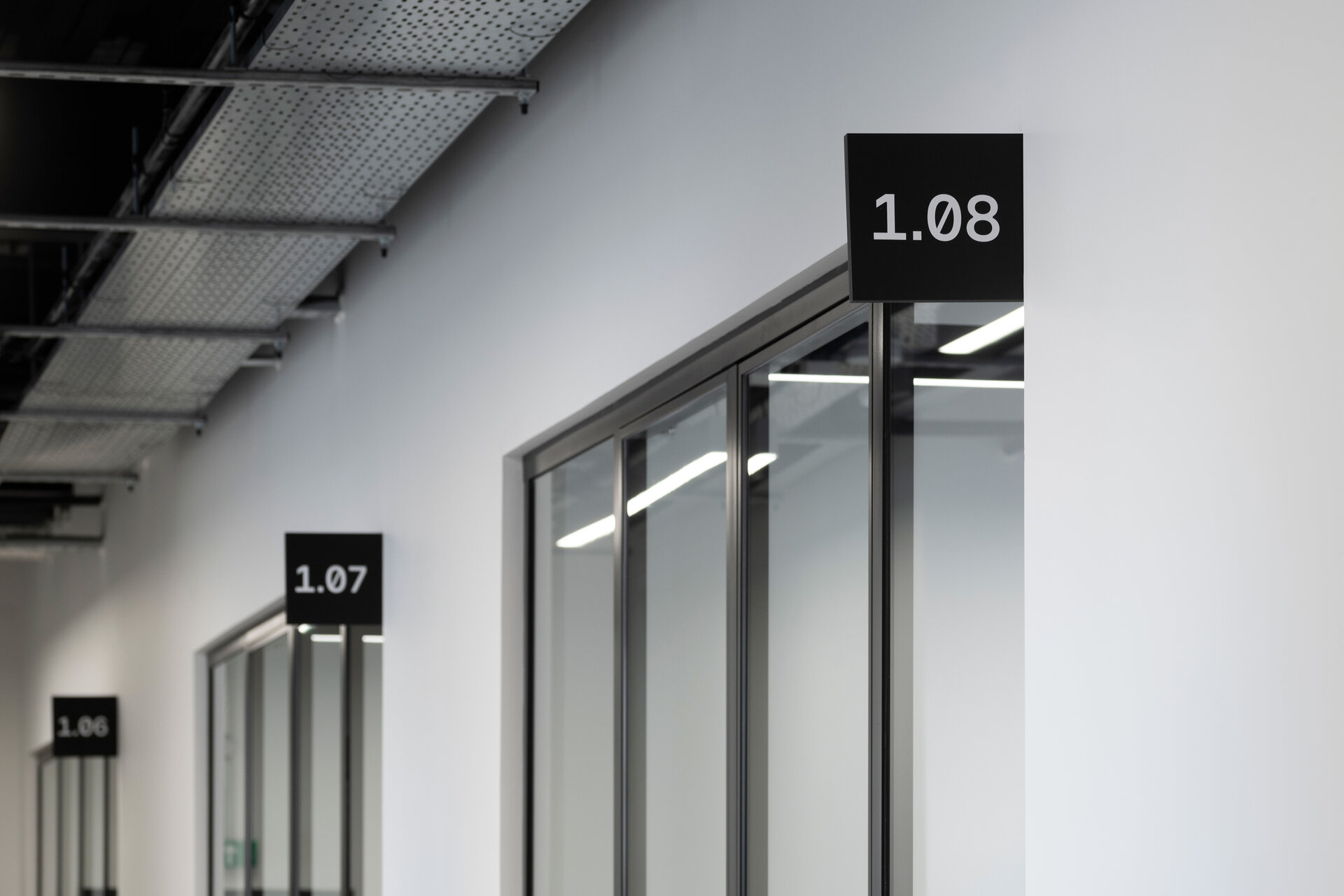
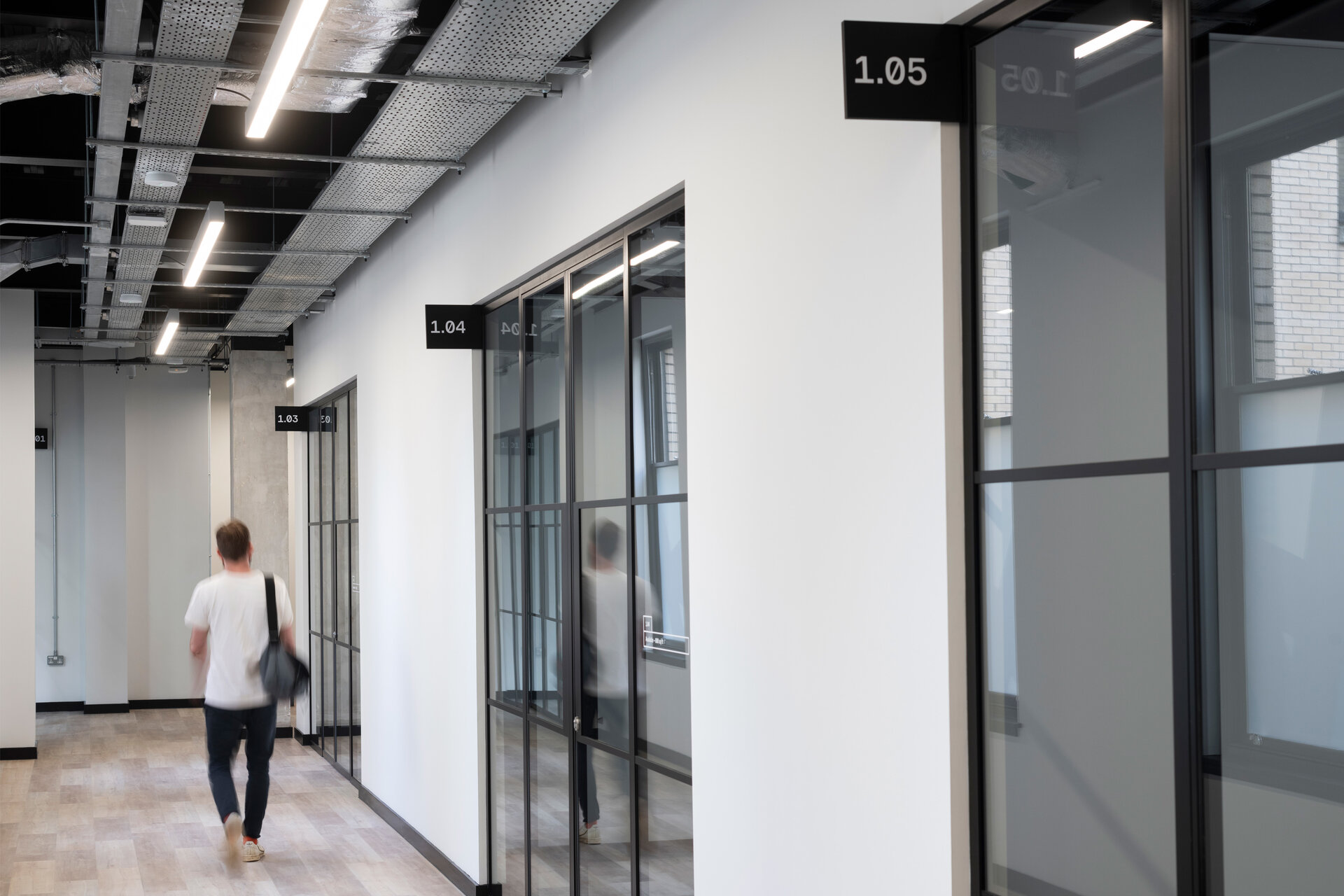
Wayfinding
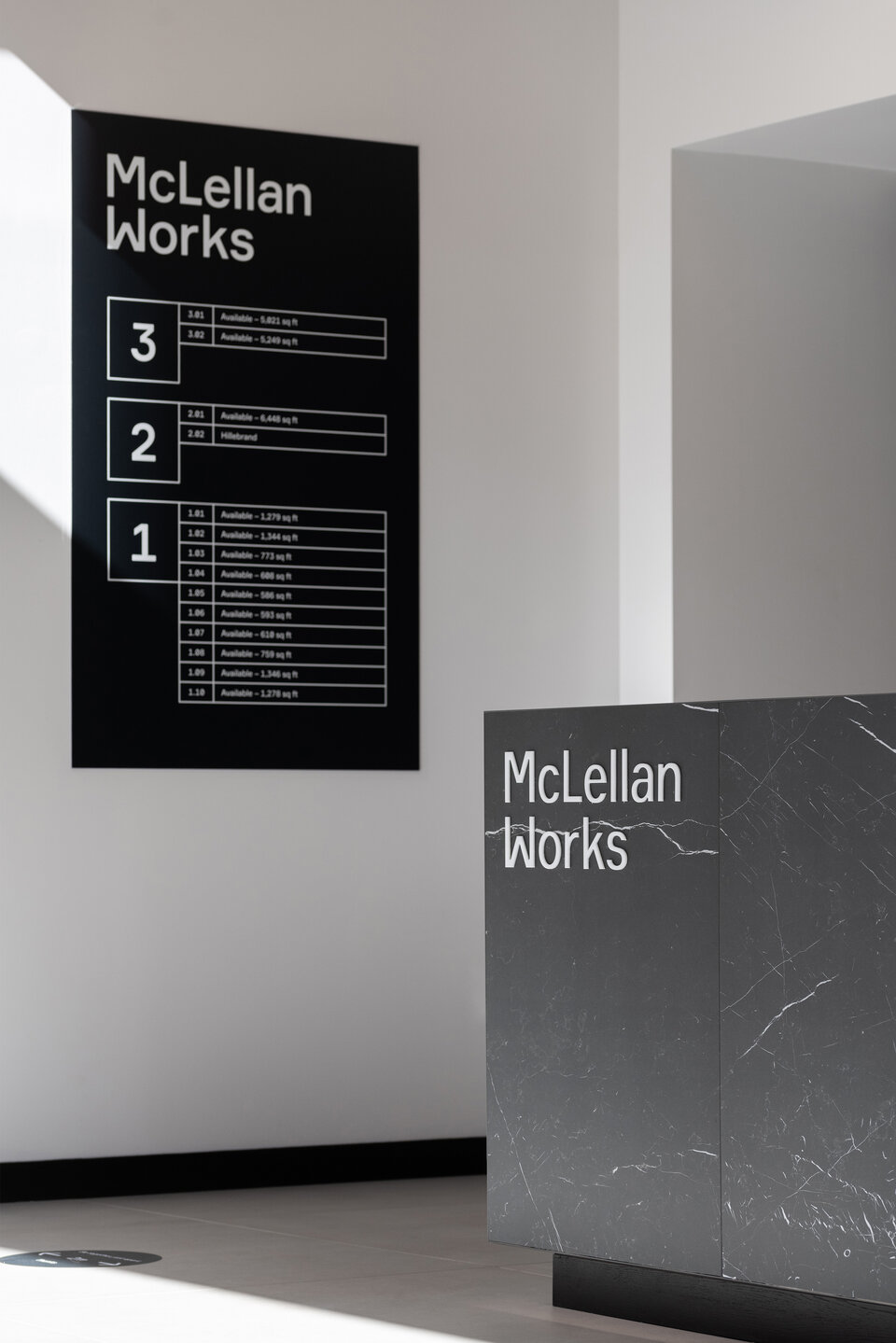
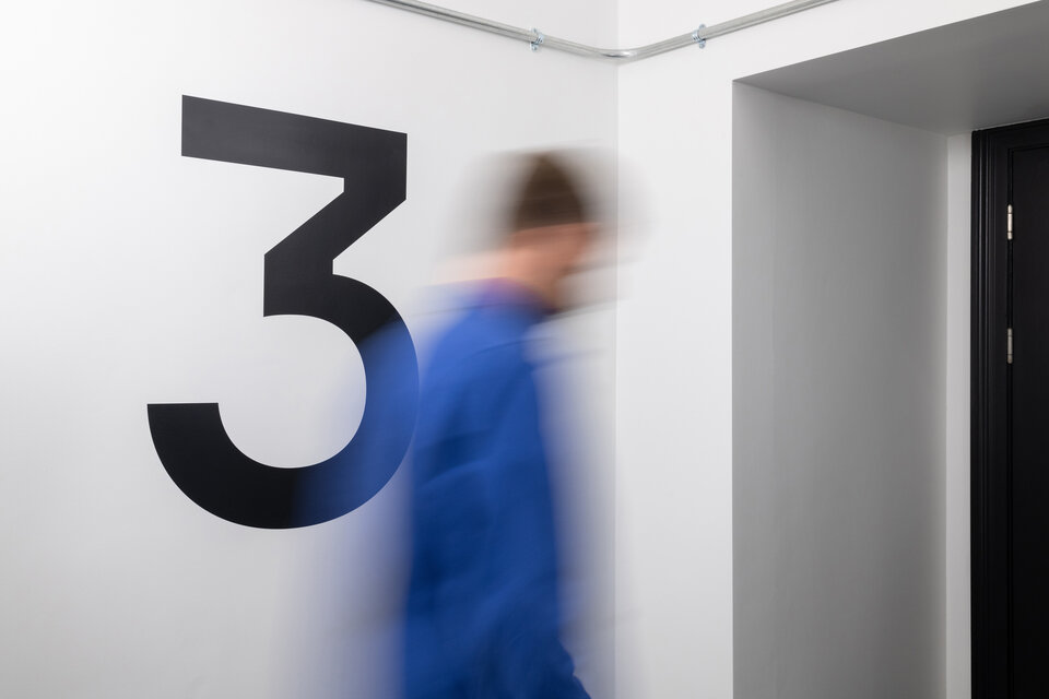
A comprehensive signage and wayfinding system was designed for the building.
This covered everything from directional wayfinding, and individual unit numbering, right through to exterior signage and window vinyls for vacant shop units.
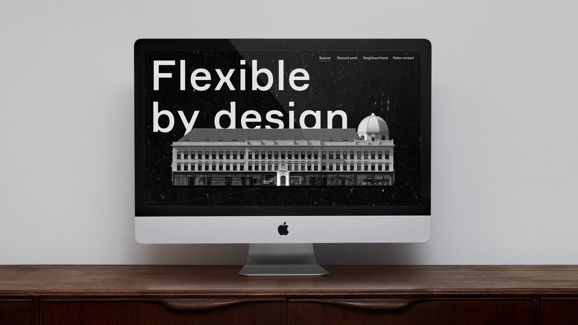
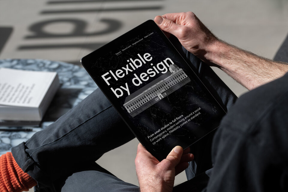
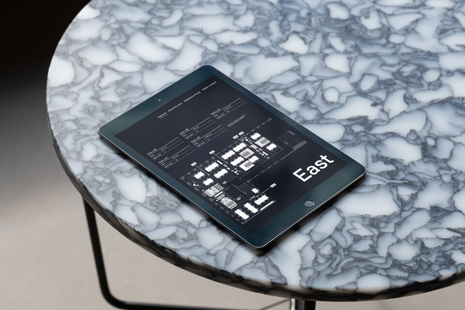
Digital
Initially, a promotional website was created to tell the story of the transformation of the building in a playful and engaging way – using scroll-activated, animated architectural renders.
This was replaced with a fully content managed site designed to showcase the workspaces and gather leasing enquires.
“
We deliberately brought Graphical House on board at an early stage to ensure the visual identity and architectural design developed in parallel and the team quickly understood the spirit of the project. Its coherence across both the building and marketing materials has become a fundamental part of the success of the project.
Theo Michell
Bywater Properties