Discovery story
Client
Shetland Amenity Trust
Date
2016
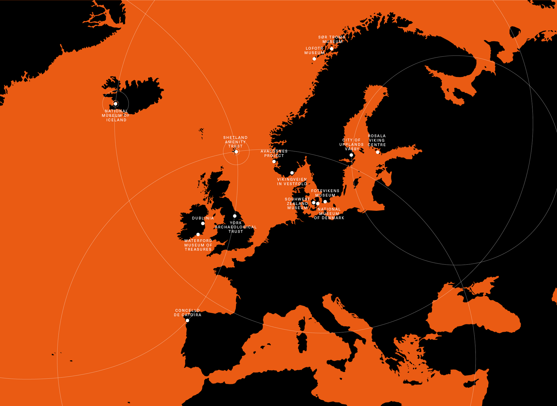
Location
Across Europe
Services Provided
Sector
We were commissioned by the Shetland Amenity Trust to create a new brand and identity system to connect events taking place at Viking locations throughout the Northern Hemisphere.
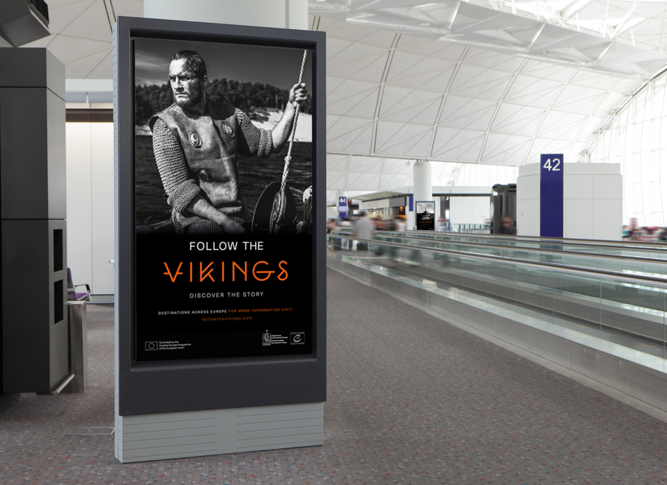
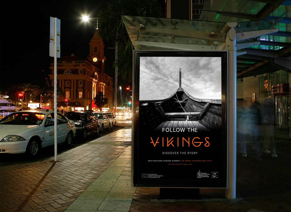
The brand was activated across international locations, enhancing customer experience, challenging misconceptions and highlighting the often-overlooked creative legacy of the Vikings.
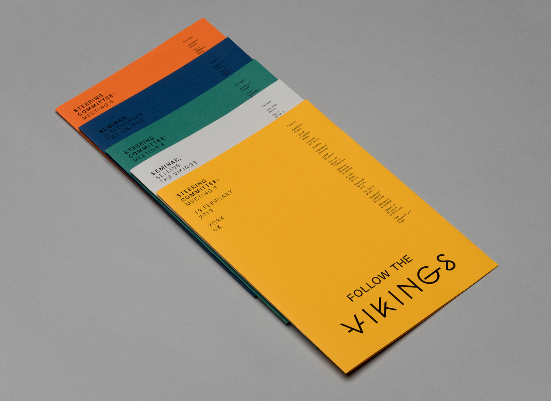
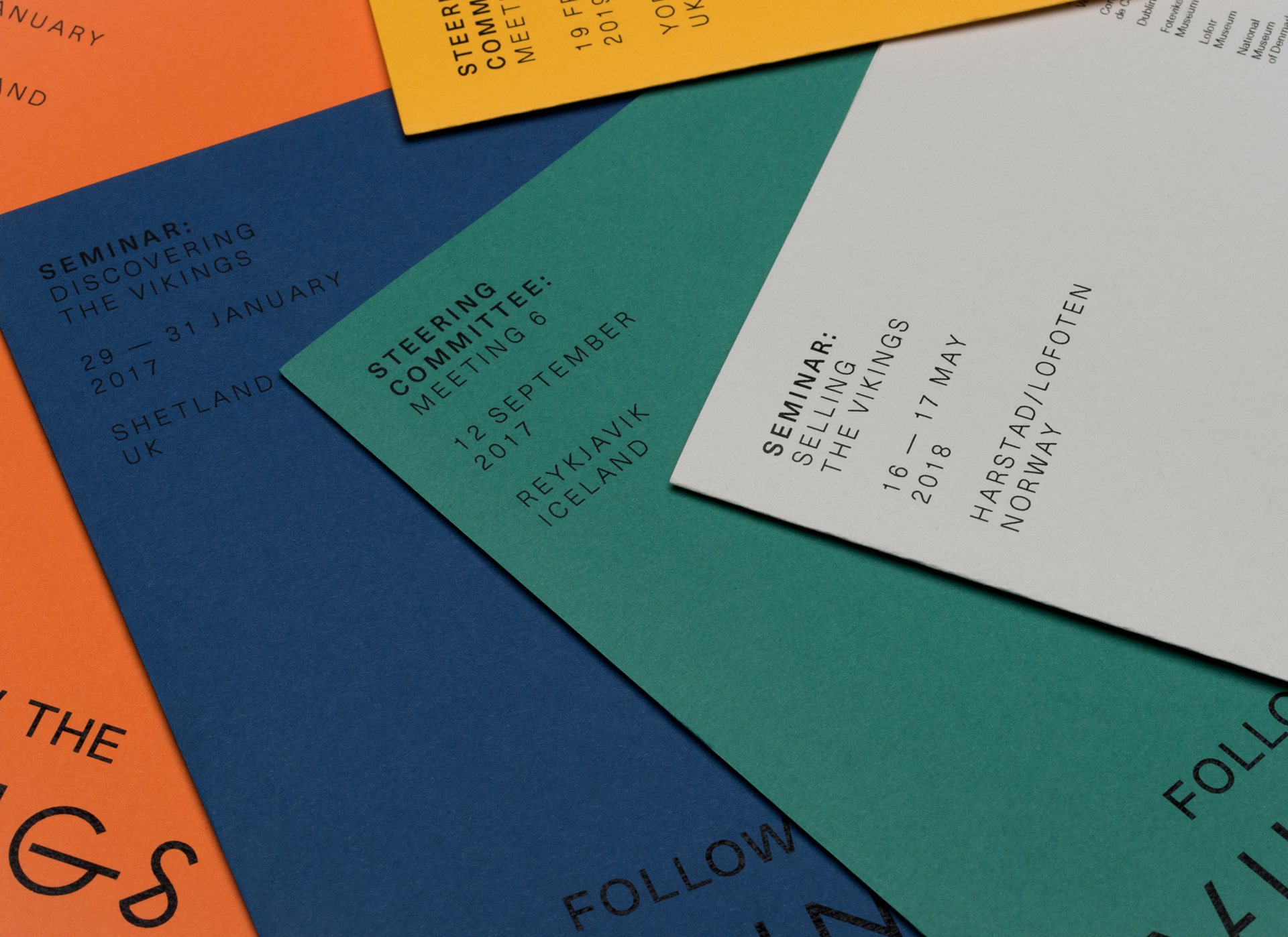
The key was to create a consistent look and feel, and visual tone of voice that could be rolled-out internally by partners across a vast network of organisations.
Identity
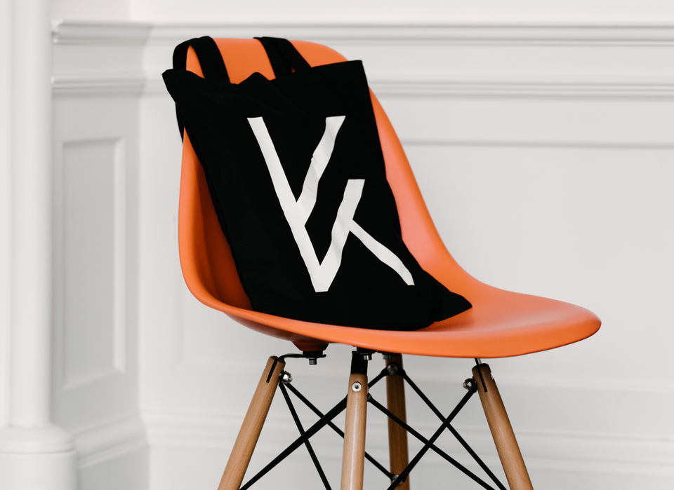
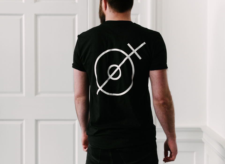
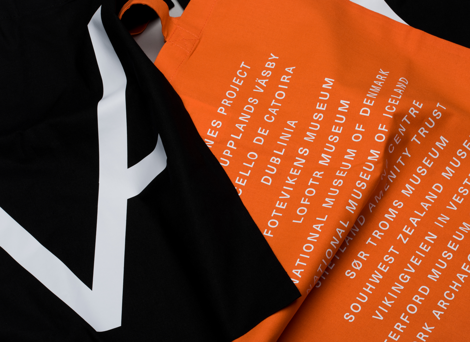
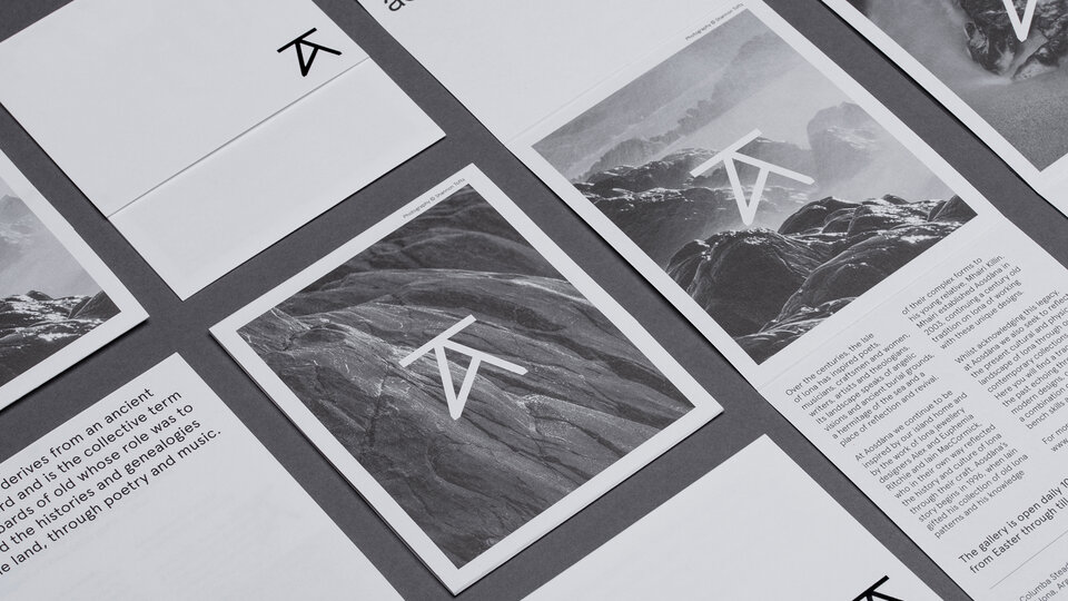
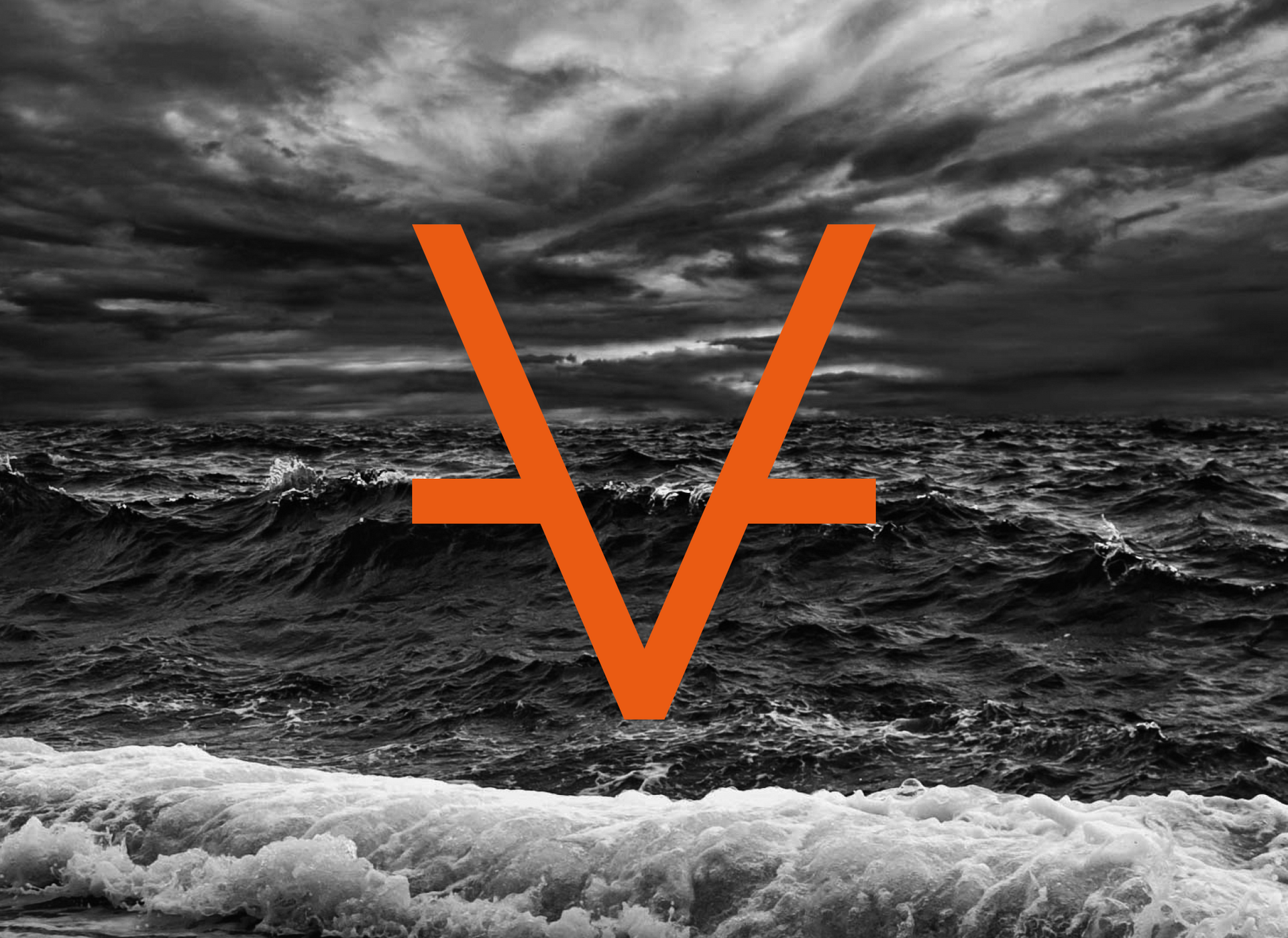
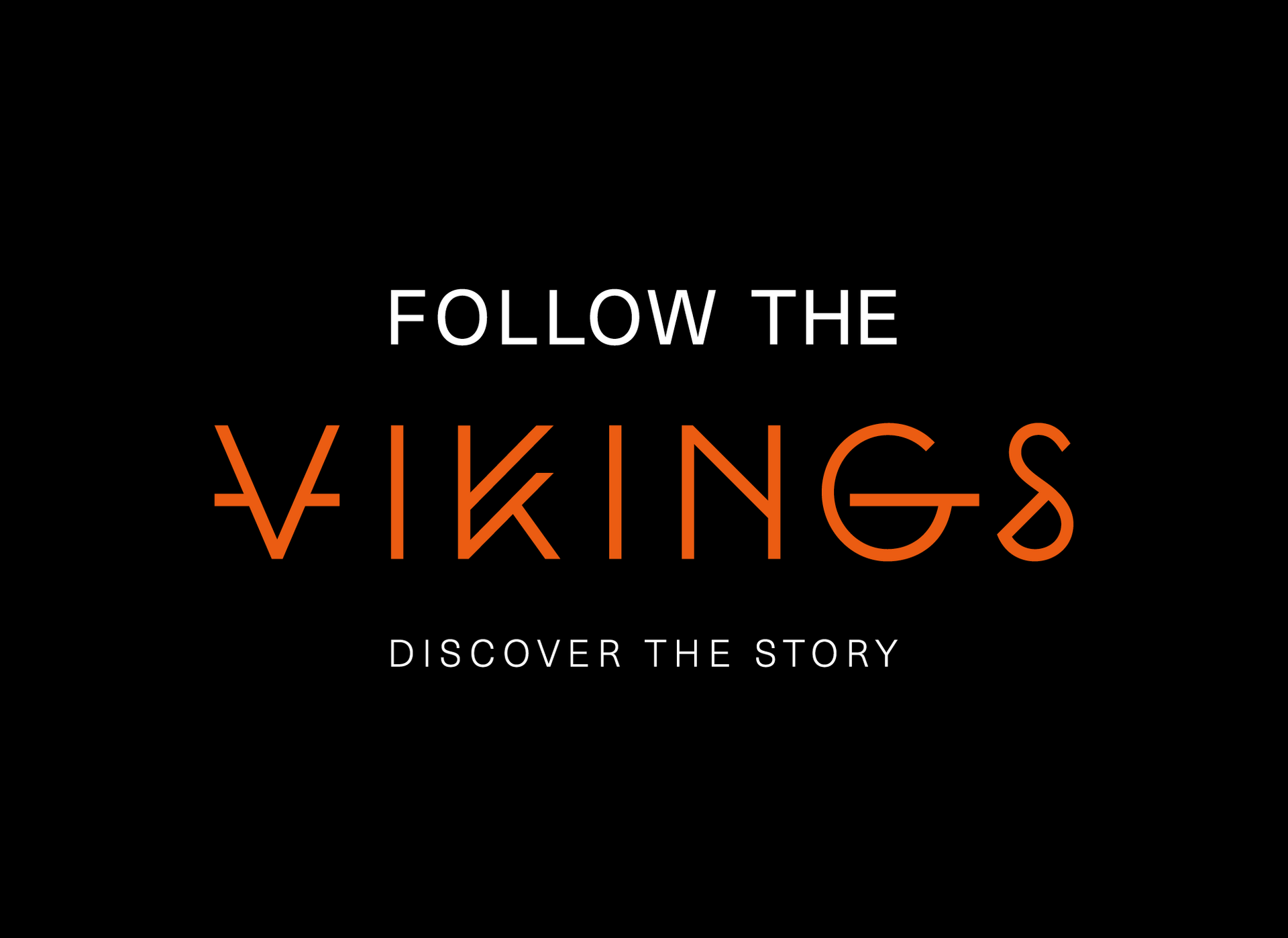
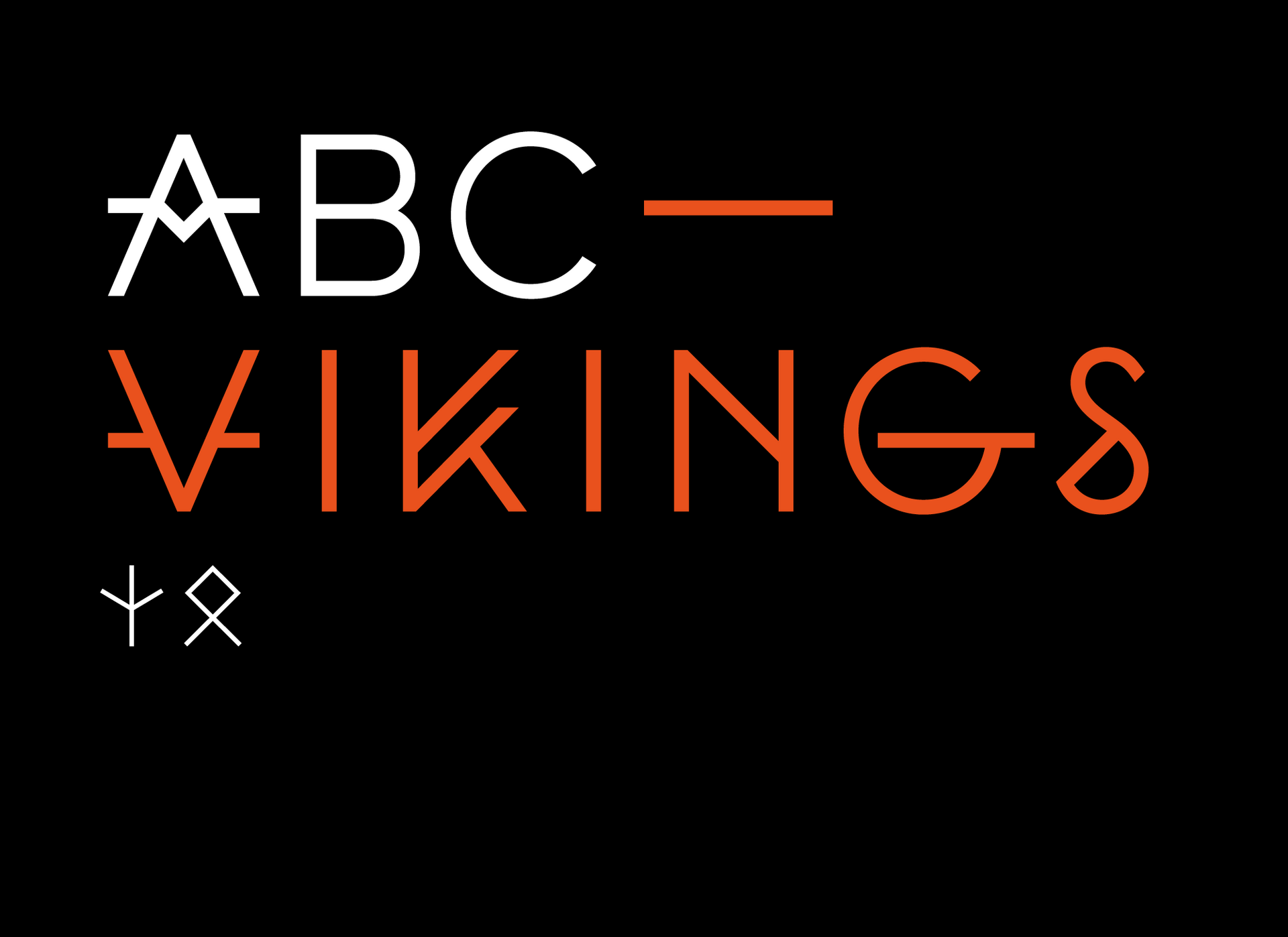
The logotype draws upon runic alphabets, with each letter inspired by an element of Viking culture — the letter ‘V’ evokes the both the splitting of wood and the shape of the Viking longboat.
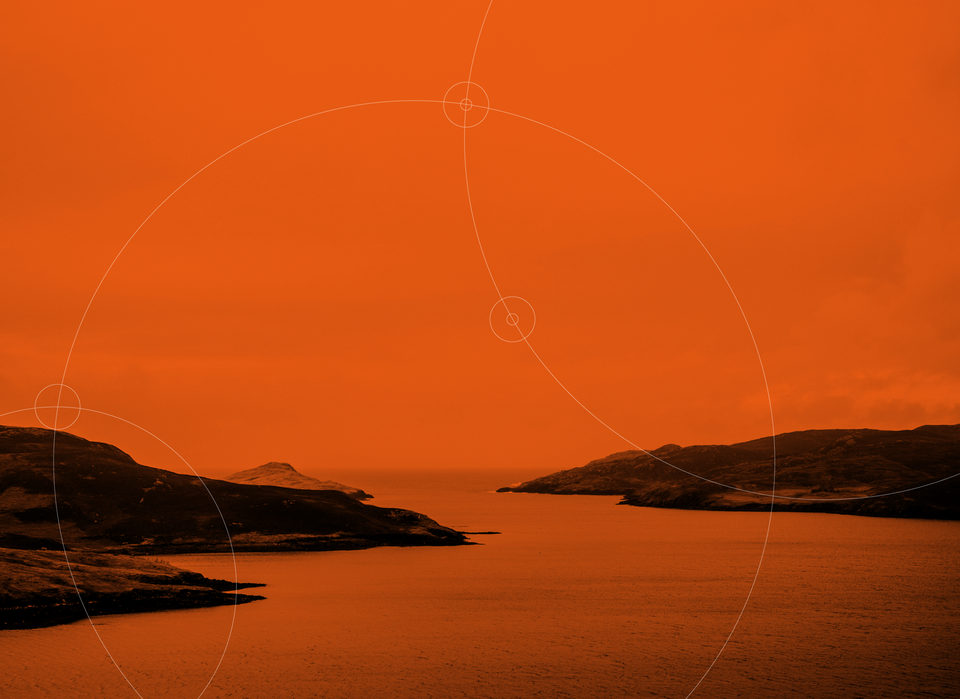
We developed a striking colour palette to evoke the links between Viking culture, festivals and fire.
An extensive set of guidelines were developed to be distributed to a vast network of partner venues and organisations.
Typeface
We commissioned a bespoke display typeface using the runic alphabet as inspiration for the letter-forms. This formed the basis of the brand identity system.
Content
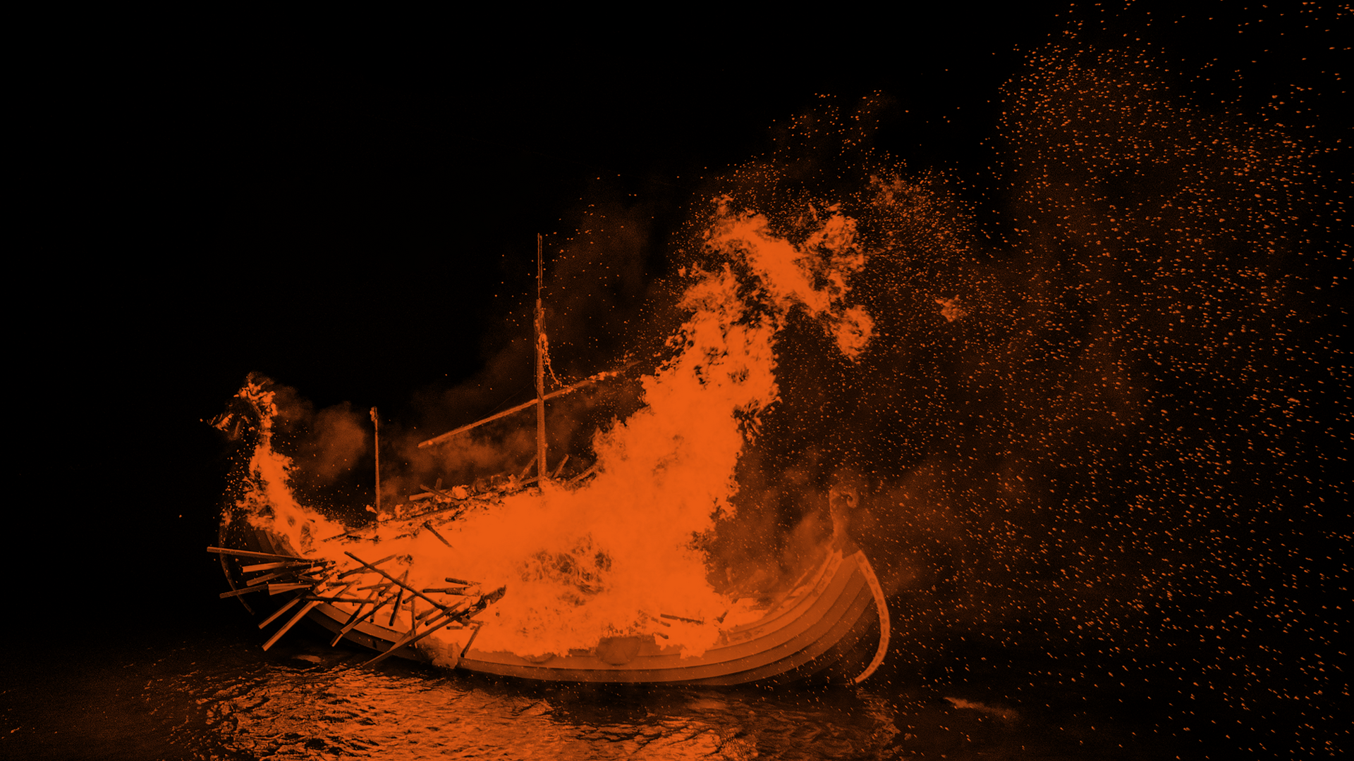
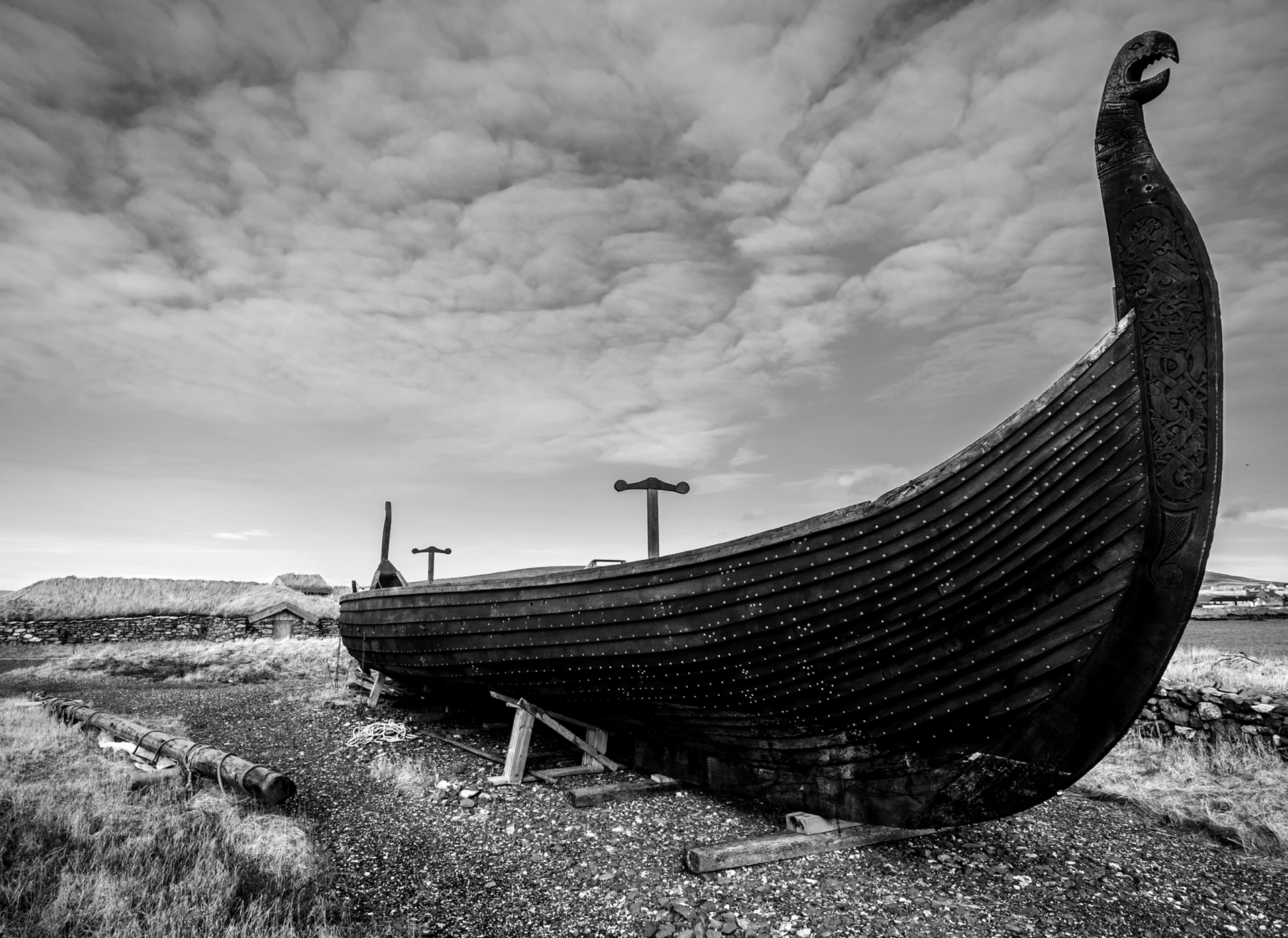
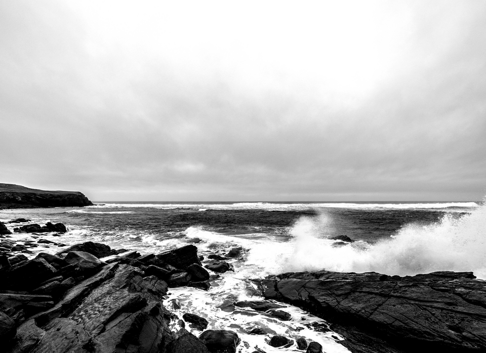
We worked with filmmaker Mark Huskisson to create a promotional brand film that captured epic nature and scale of the project.
The film was supported with photographic content that reflected the drama of the viking legacy.
Collateral
Outdoor marketing was created to promote the project alongside engaging educational literature and merchandise for explorers of the viking legacy of all ages.