60 years in the making
Client
Professional Beauty Systems
Date
2024
Location
Worldwide
Services Provided
Sector
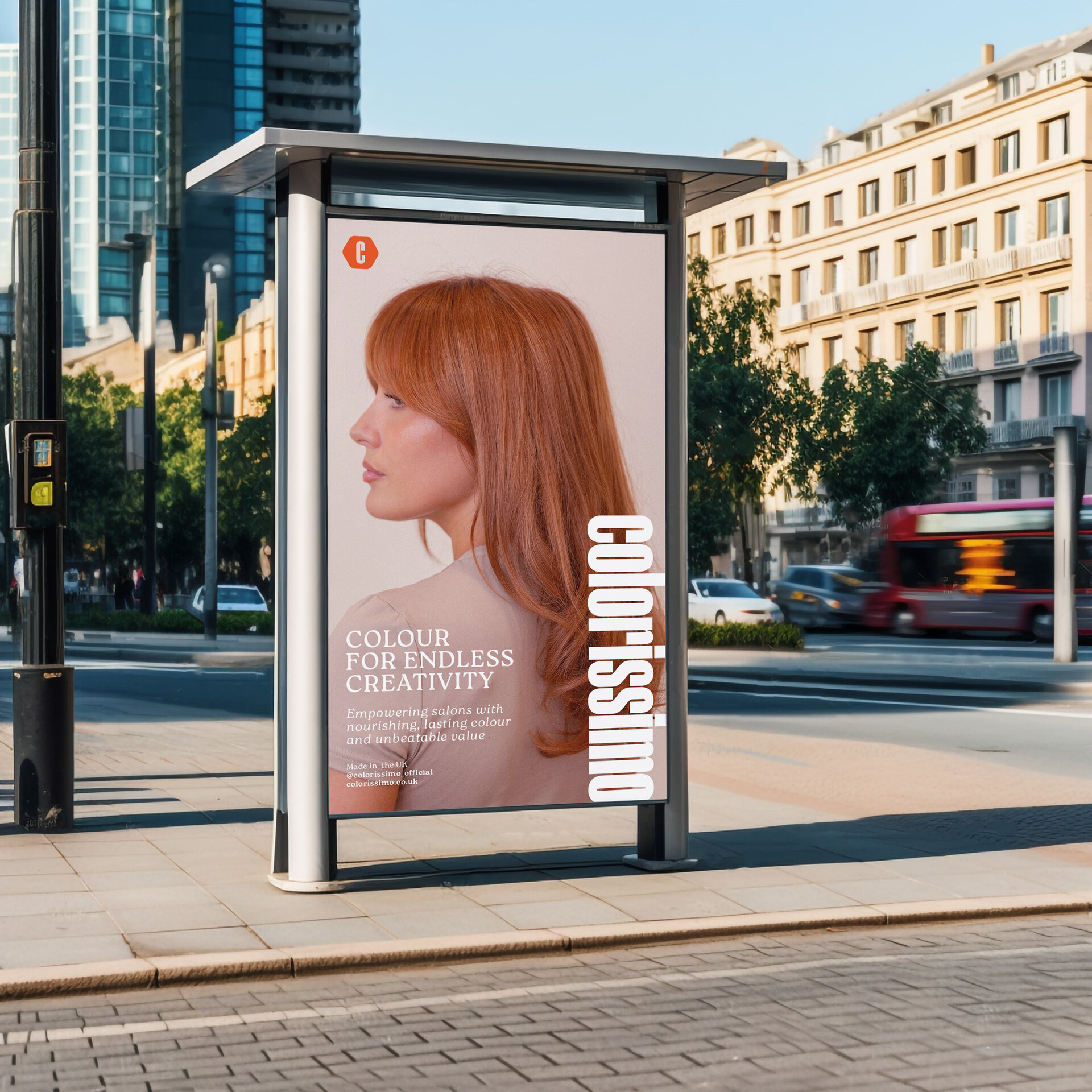
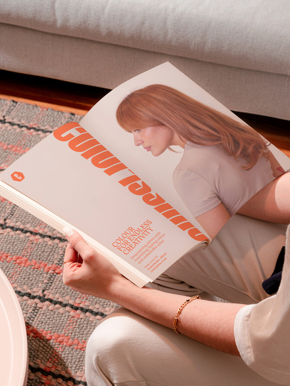
A dramatic re-positioning of hair colour brand Colorissimo. The aim was to elevate perceptions, bringing a premium feel but without a premium price tag, helping salons keep prices fair whilst still offering that luxury finish.
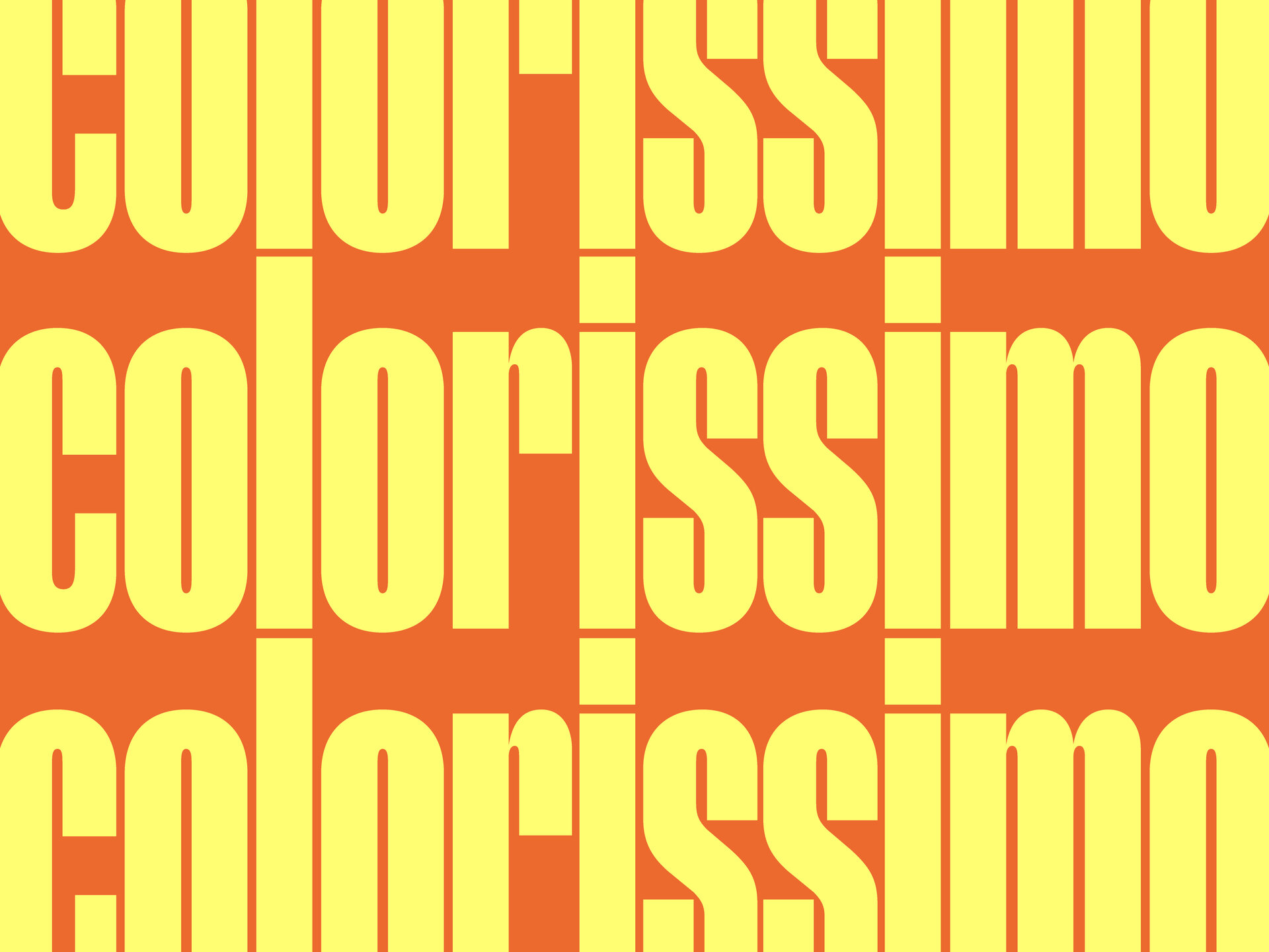
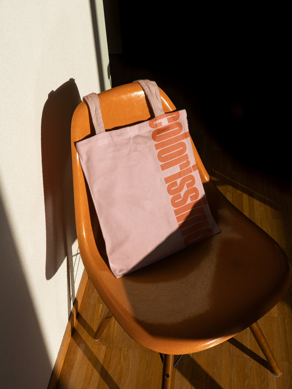
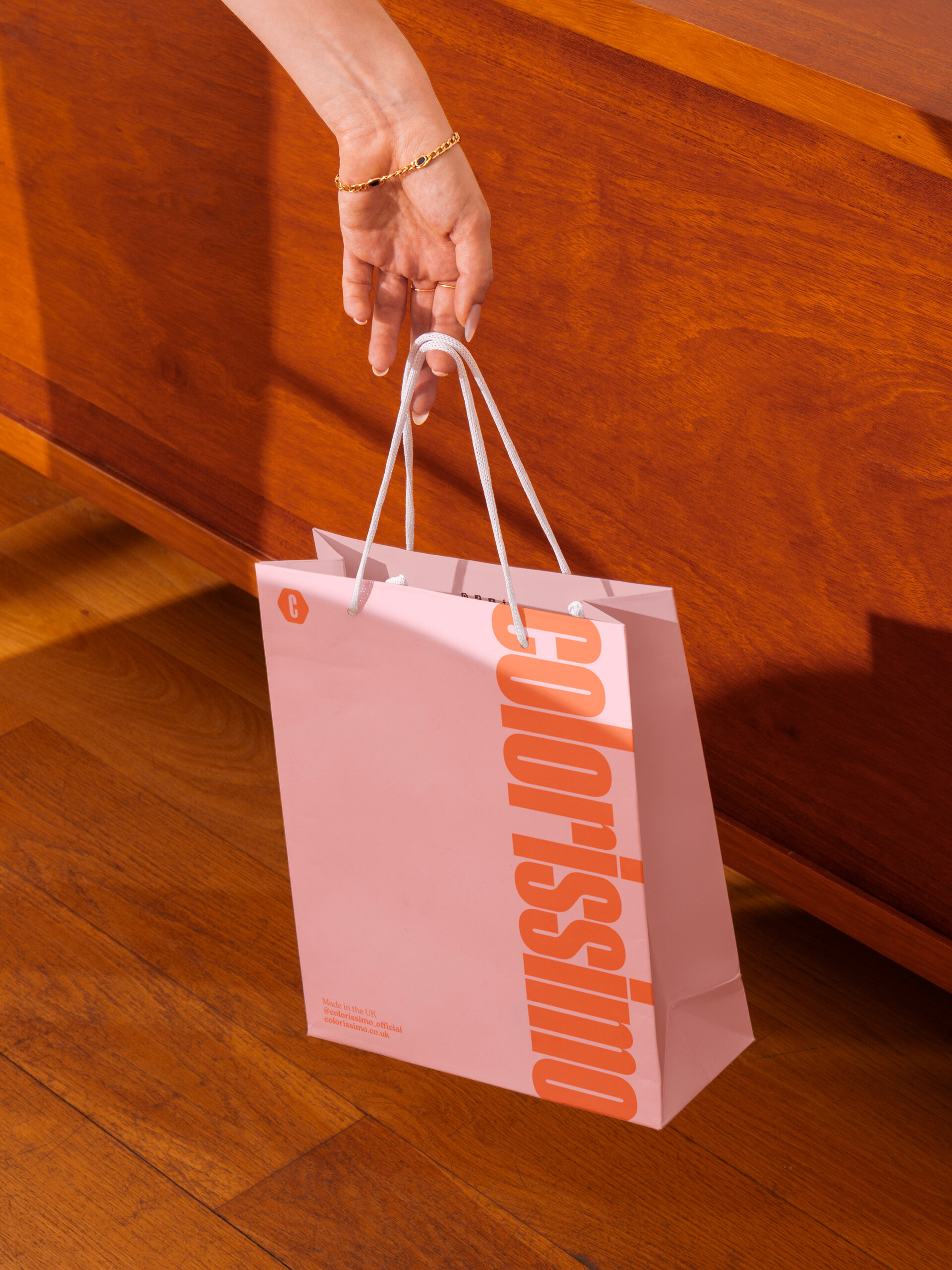
A bold and simple approach to typography and colour with a gentle nod back towards the brands 1960s roots. A strong contemporary feel that steps out of the typical hair care vernacular and into a wider fashion and beauty landscape, significantly broadening the appeal to a wider and more visually sophisticated audience and aligning the brand with other, higher end offerings.
1
A re-designed Brand Identity to maximise product presence in an elegant and sophisticated way bringing added value.
2
An elevated brand expression that appeals to new audiences and re-positions colorissimo in the minds of existing customers.
3
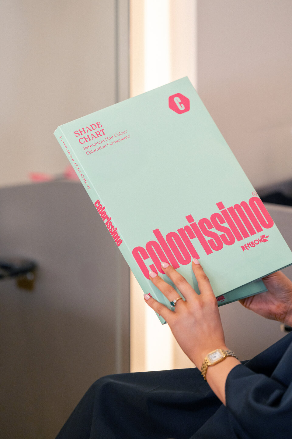
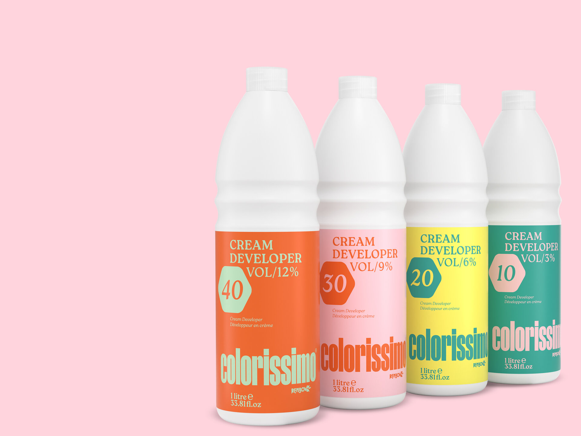
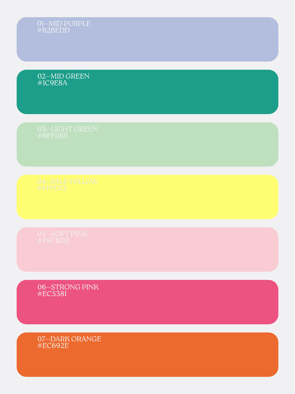
A bold and adventurous colour palette that supports the brand offer bringing recognition and order to the 94 colour product range.
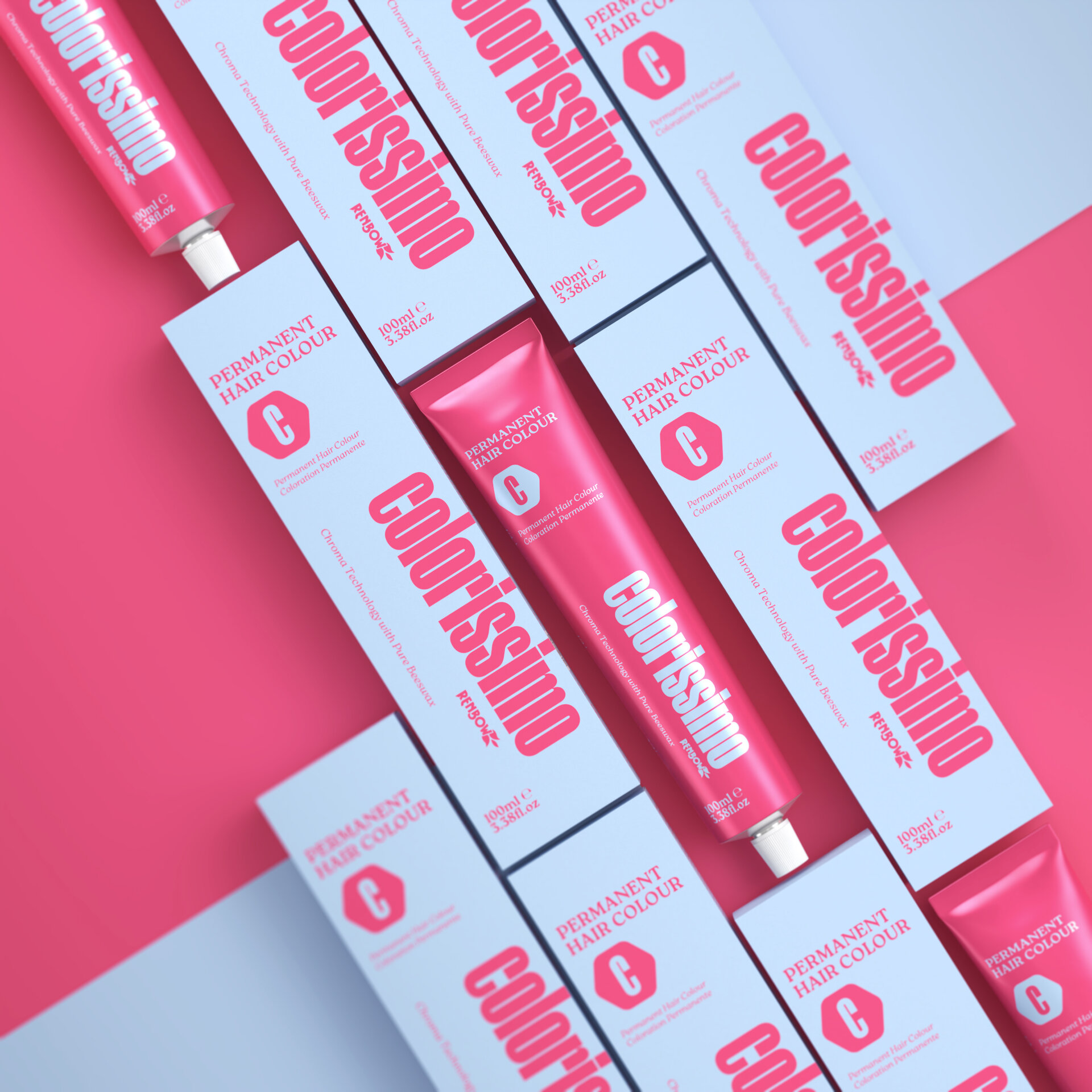
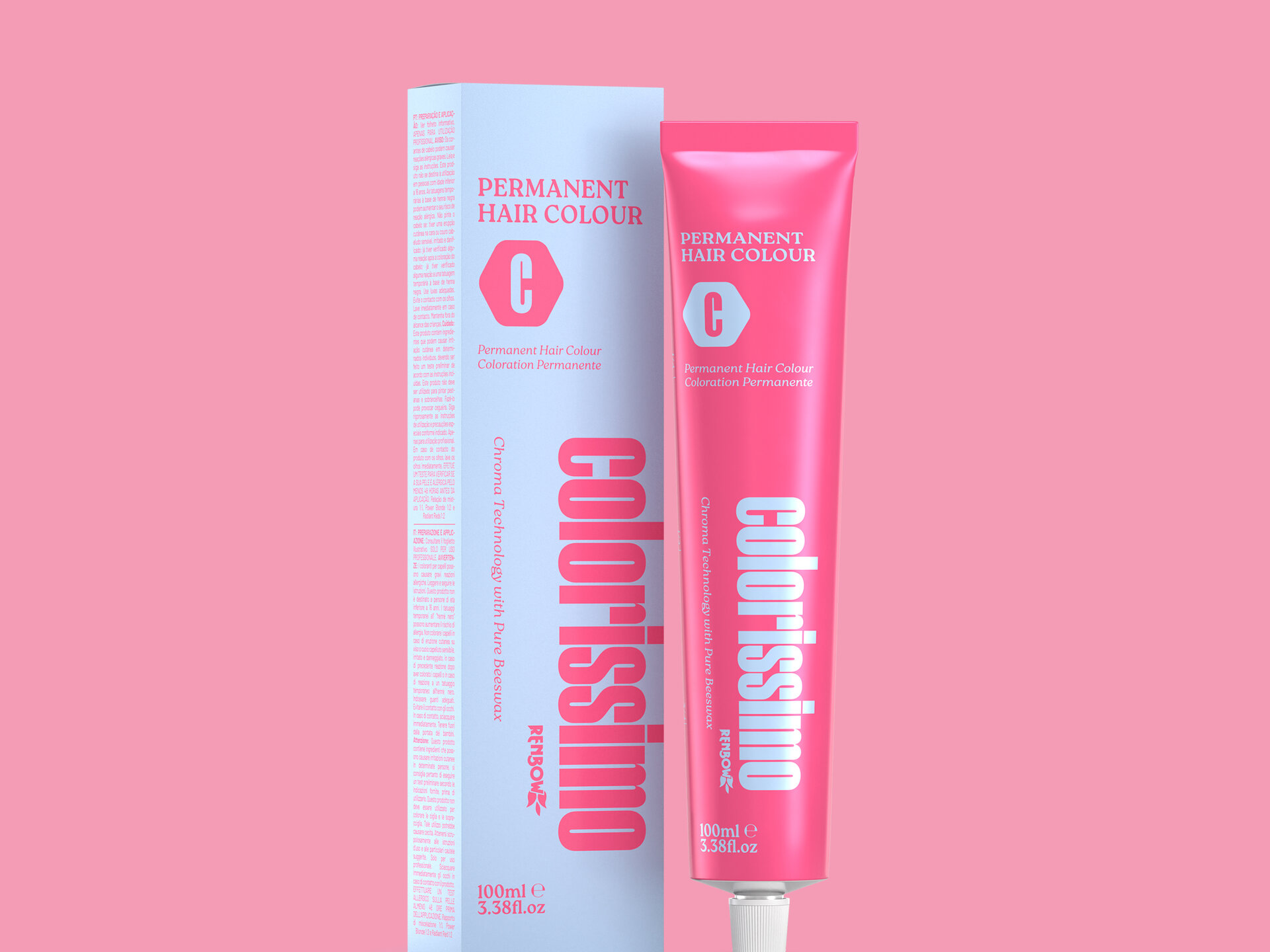
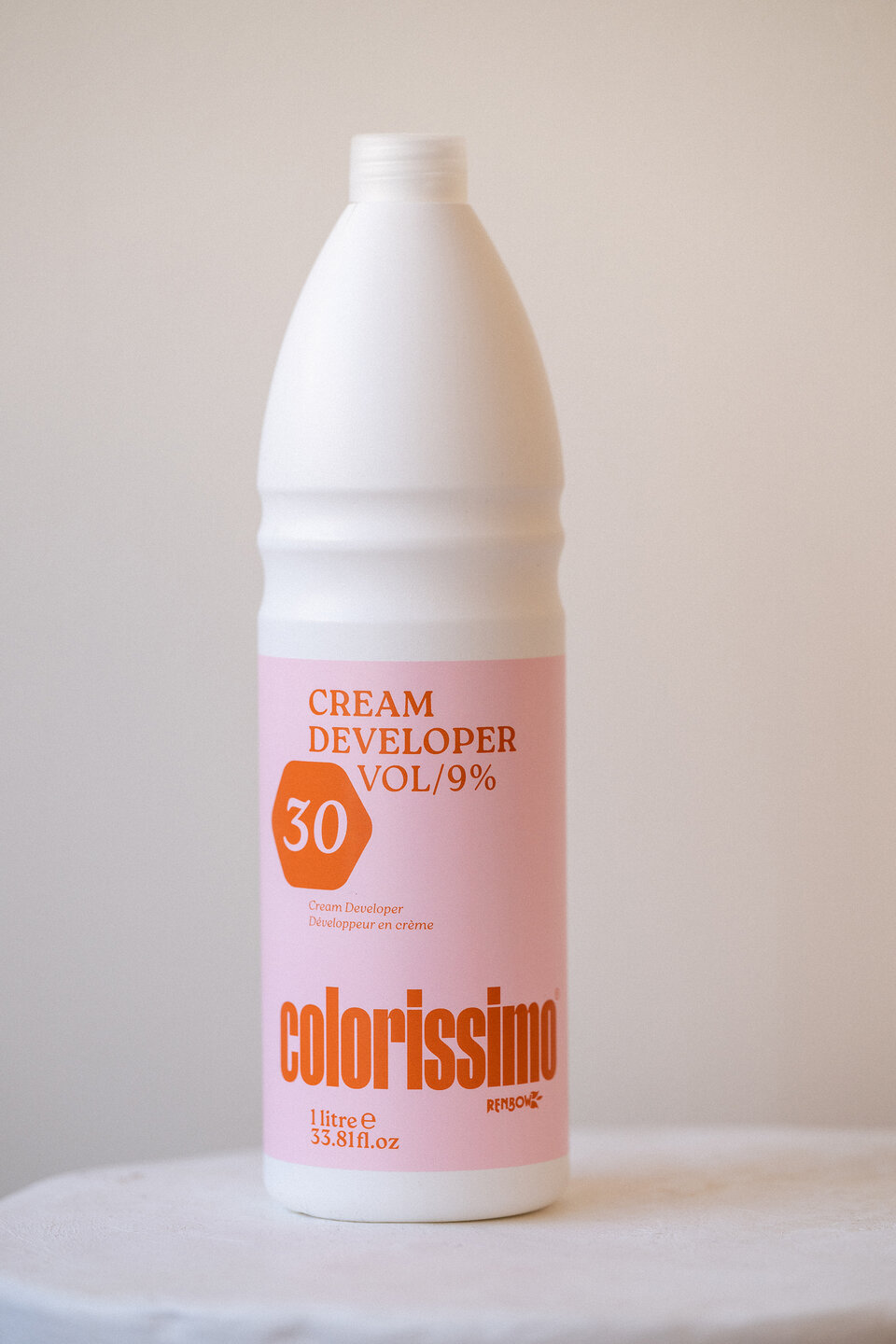
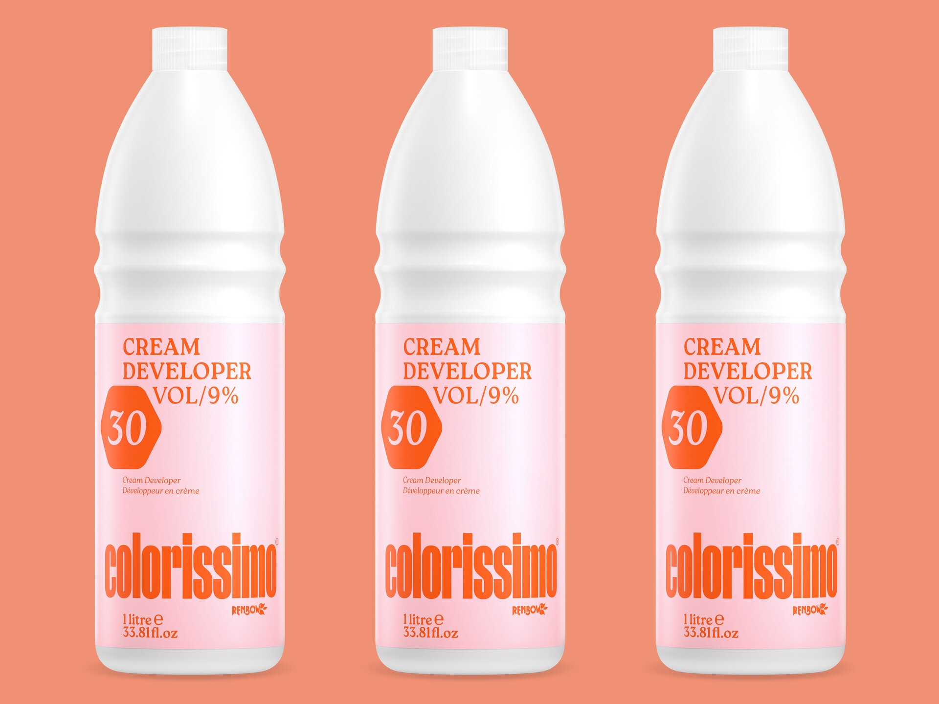
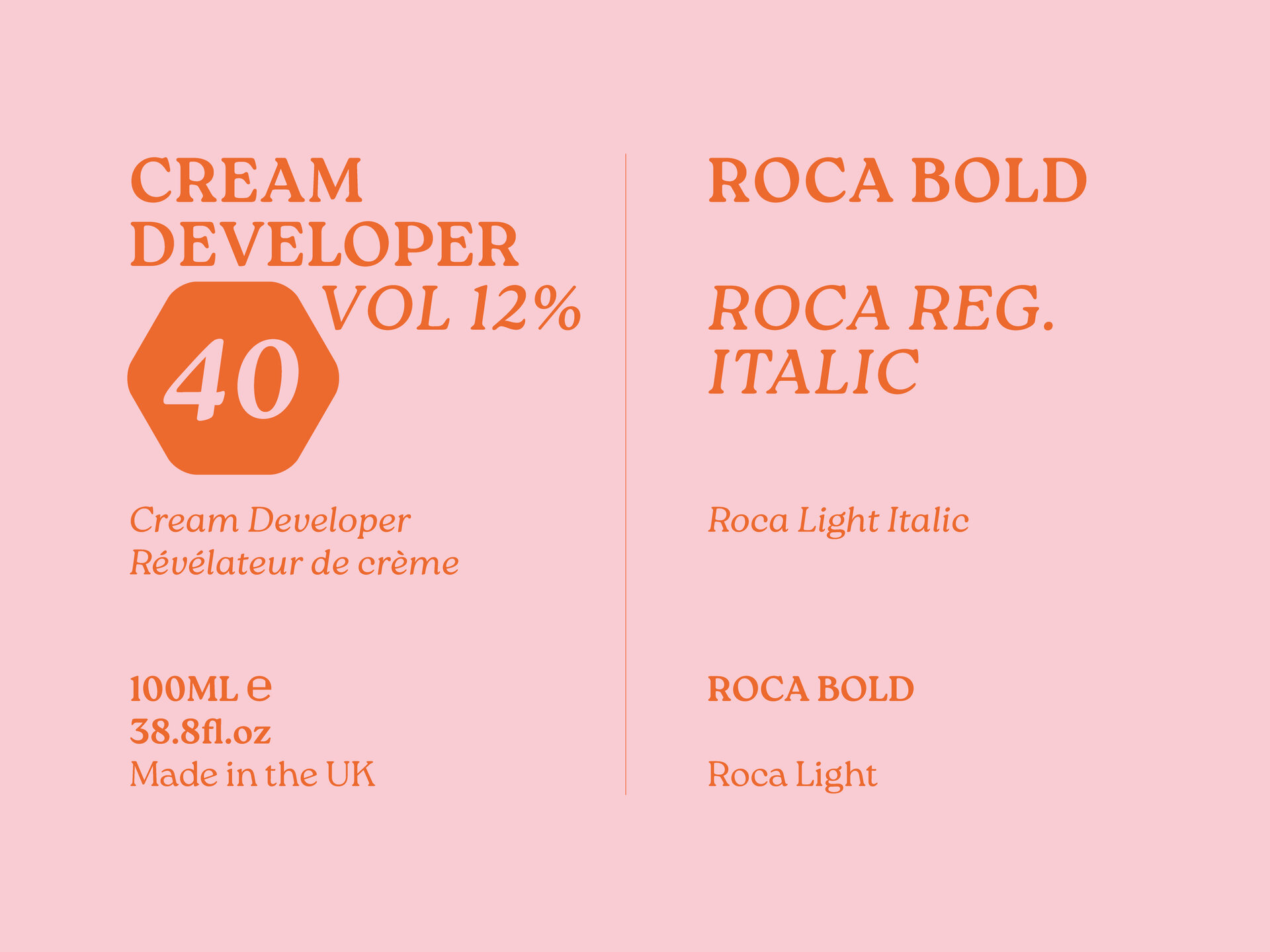
Brand Identity
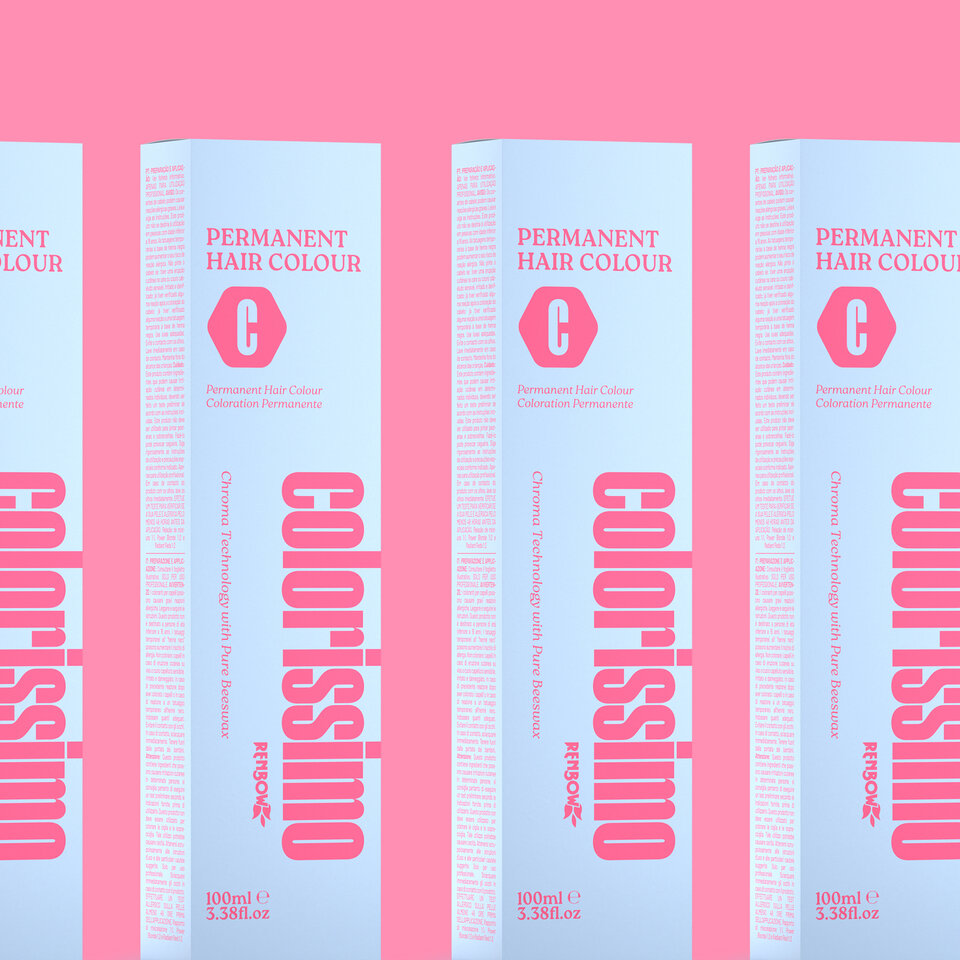
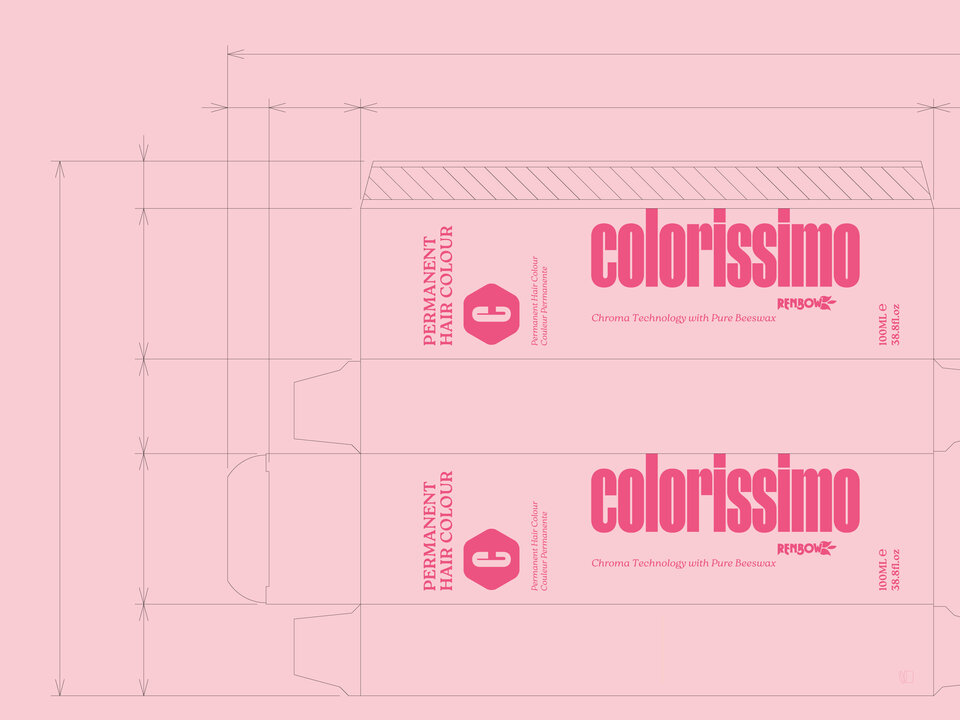
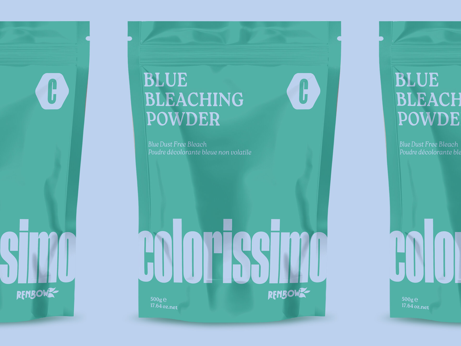
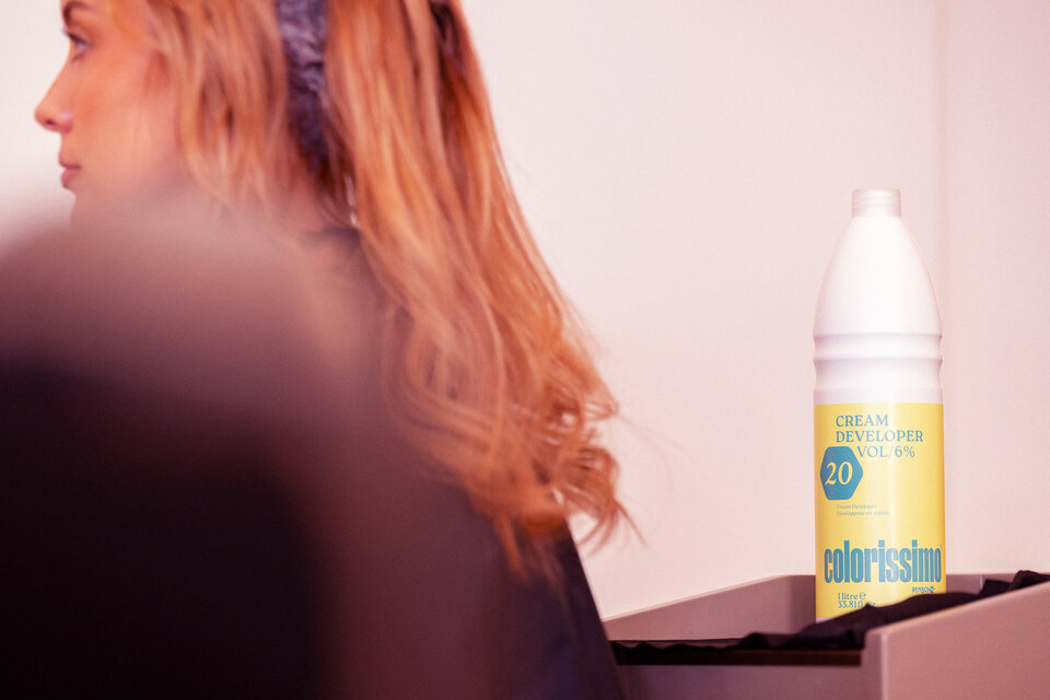
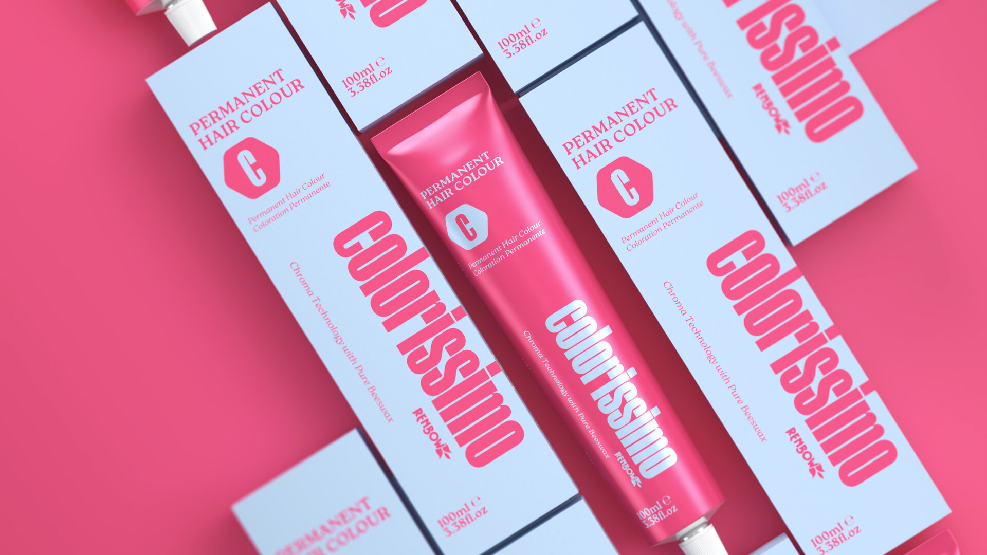
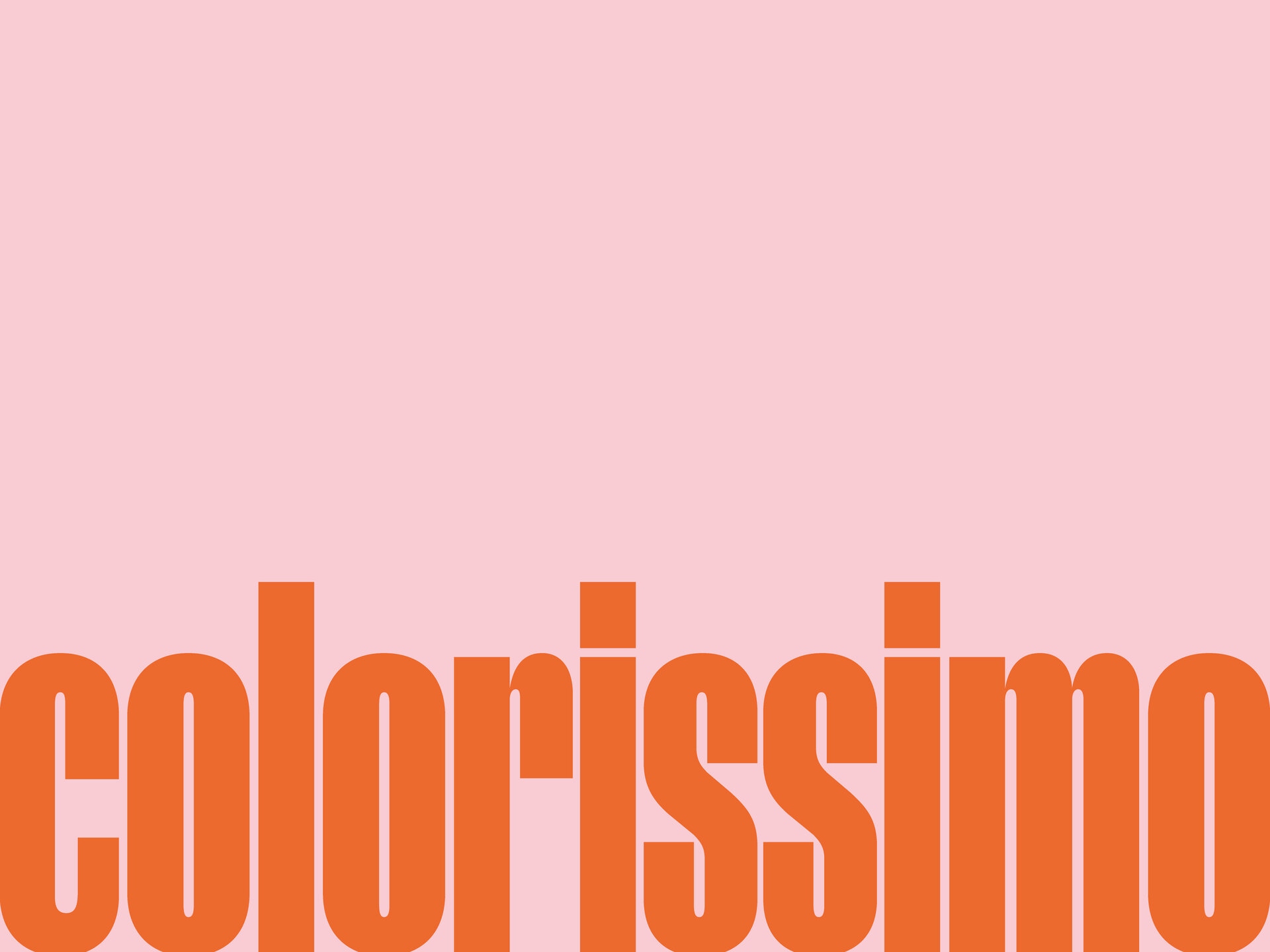
Tall, elegant letterforms make for a compact Logotype that optimises pack space for maximum shelf presence, but with style rather than blunt force. The strong palette of paired colours brings differentiation for the product range.
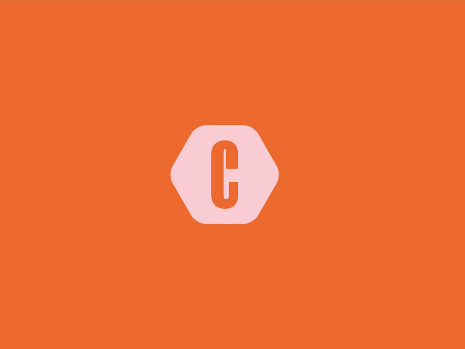
The hexagonal monogram refers to the beeswax 'Chroma' technology but also offers flexibility for product detail and information.
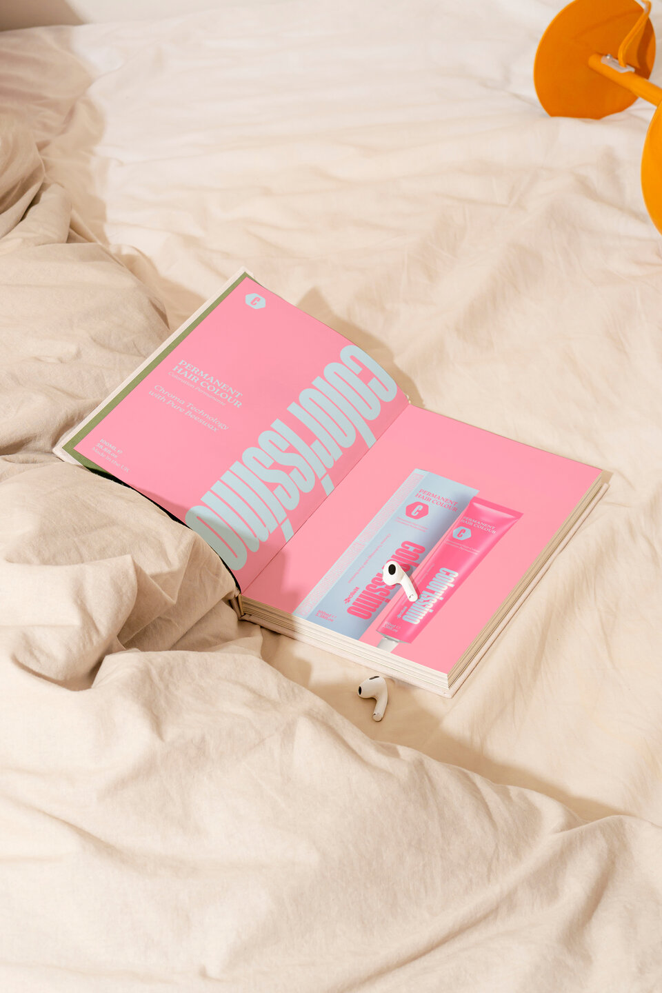
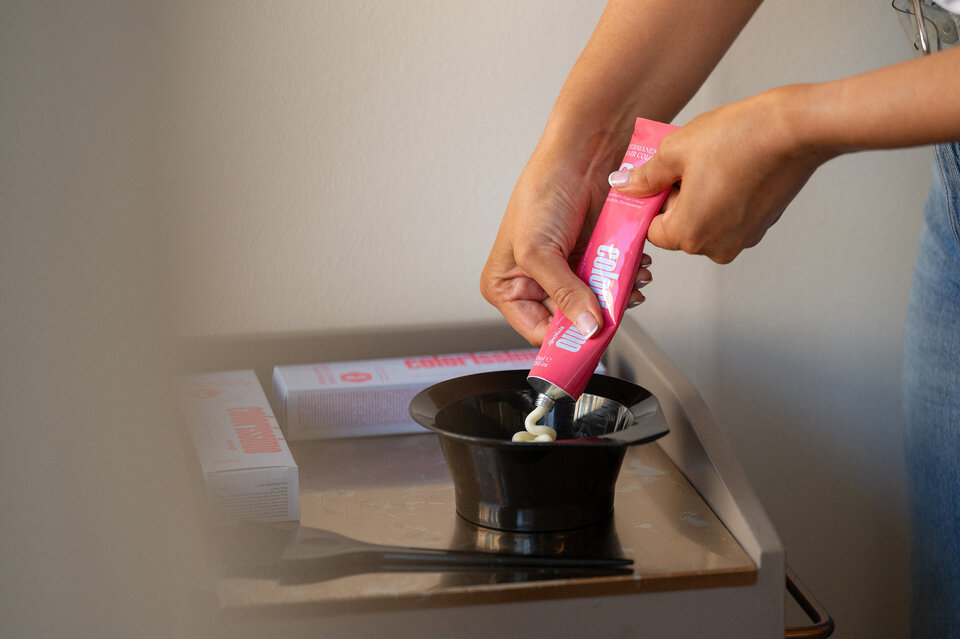
Packaging
High impact on the shelf was key here, establishing a recognisable brand presence but also communicating important product information.
In a market saturated by a 'bigger and louder' approach then the quiet sophistication of these packs offers significant differentiation more often found in the beauty market, a key influence point for the audience.