Bute Fabrics
Client
Bute Family
Date
2017–
Location
Isle of Bute, UK
Services Provided
Sector
Bute Fabrics needed to change. This meant re-establishing the company as an innovator in a market that is constantly refreshing itself.
Founded in 1947 on the Scottish island from which they take their name, Bute Fabrics supply an international marketplace with exquisite, high-performance woollen textiles.
Our revitalised brand helped drive a tenfold increase in enquiries and dramatically re-positioned the business, opening up opportunities for high profile collaborations with household names such as Tom Dixon, Jasper Morrison and Finisterre.
Brand
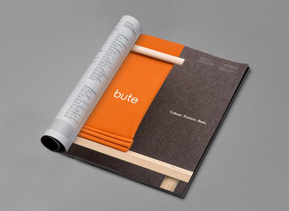
To refresh the brand identity, we re-drew the out-dated 1990s logotype. Whilst retaining the distinguishing features, we evolved the logotype achieving a timeless feel, whilst ensuring legibility in a digital context.
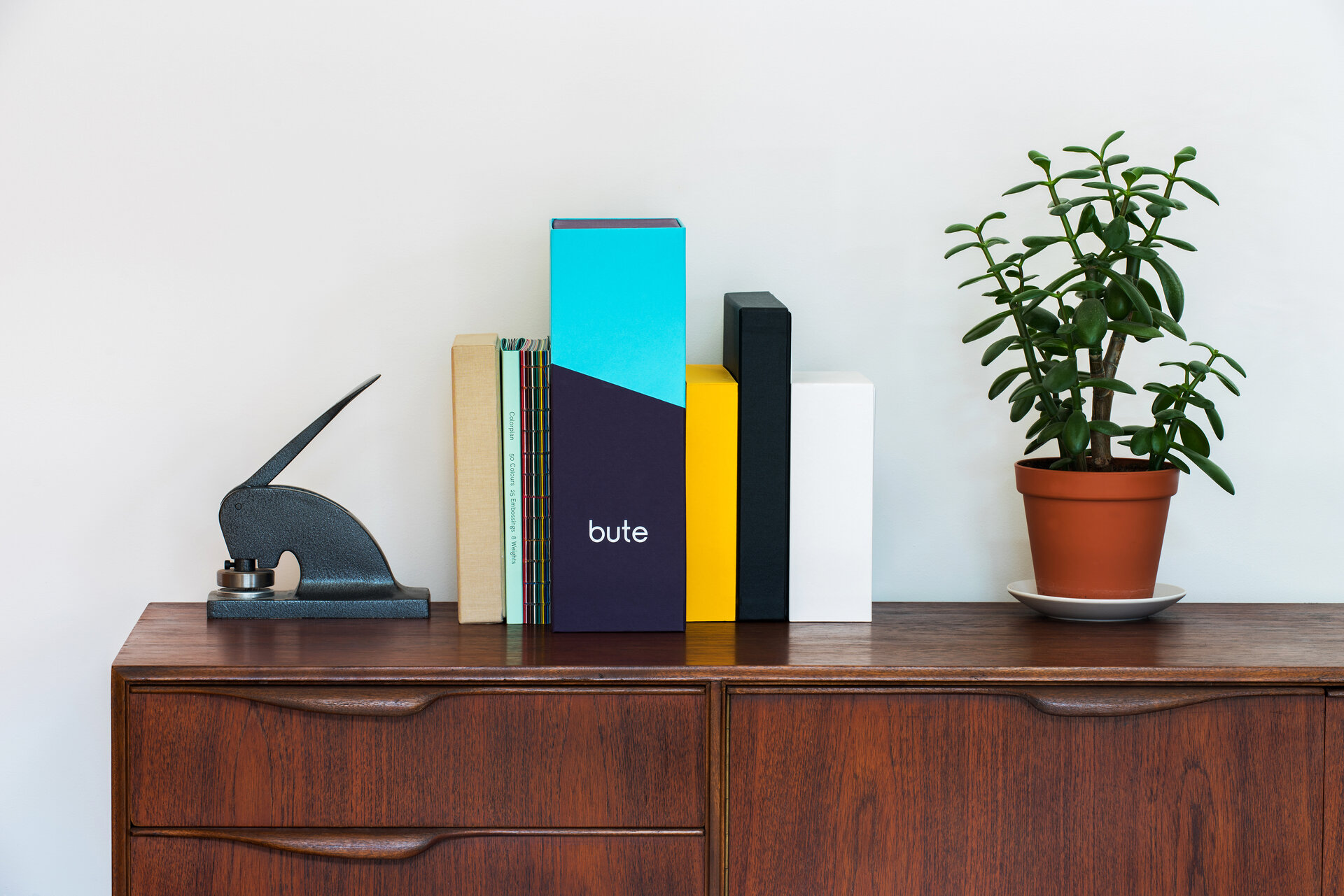
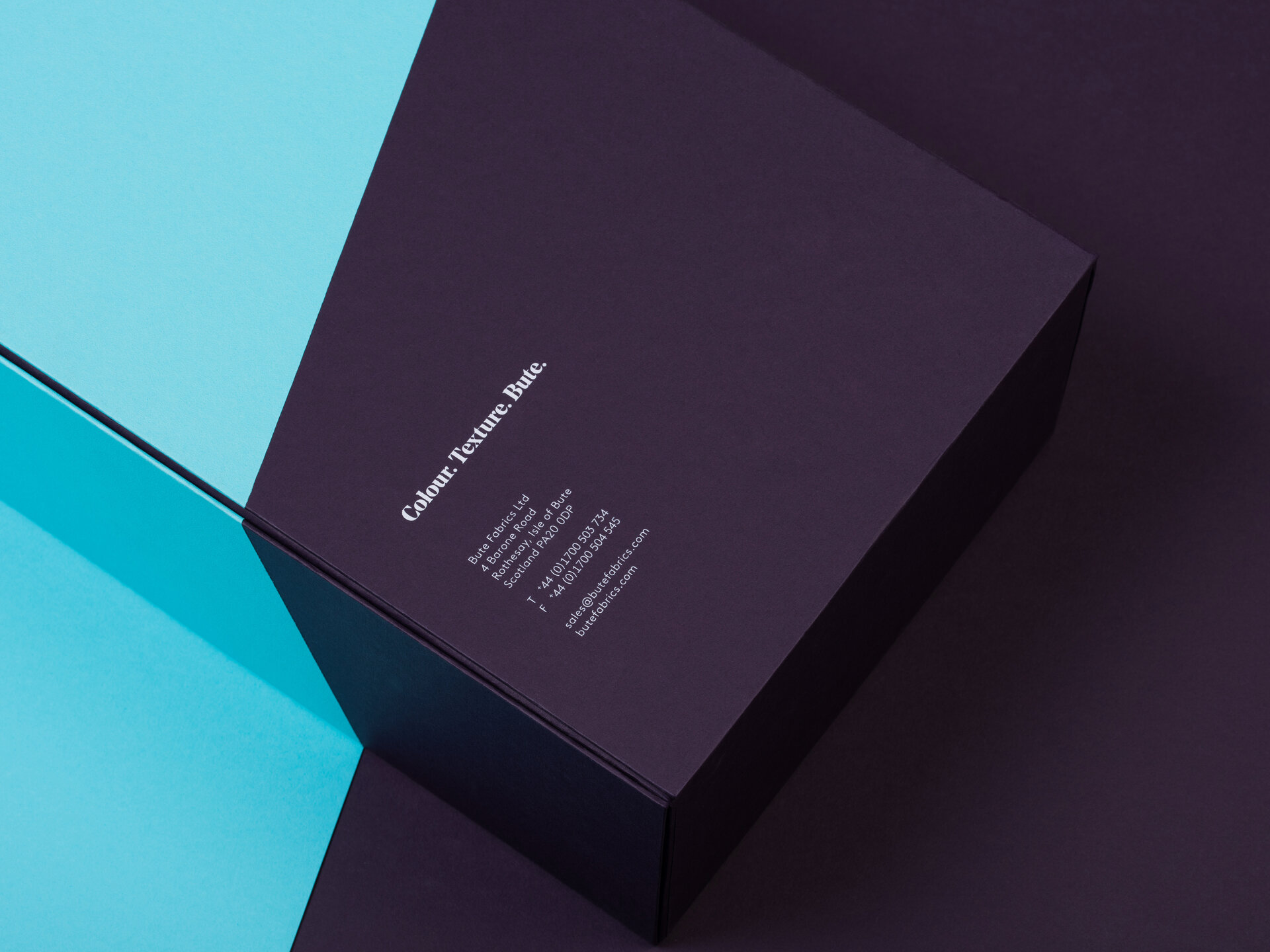
A diagonal slash motif, inspired by the way the way yarn and fabric roll on and off the looms is a key feature of the visual identity system, allowing for the playful exploration of colour combinations.
Content
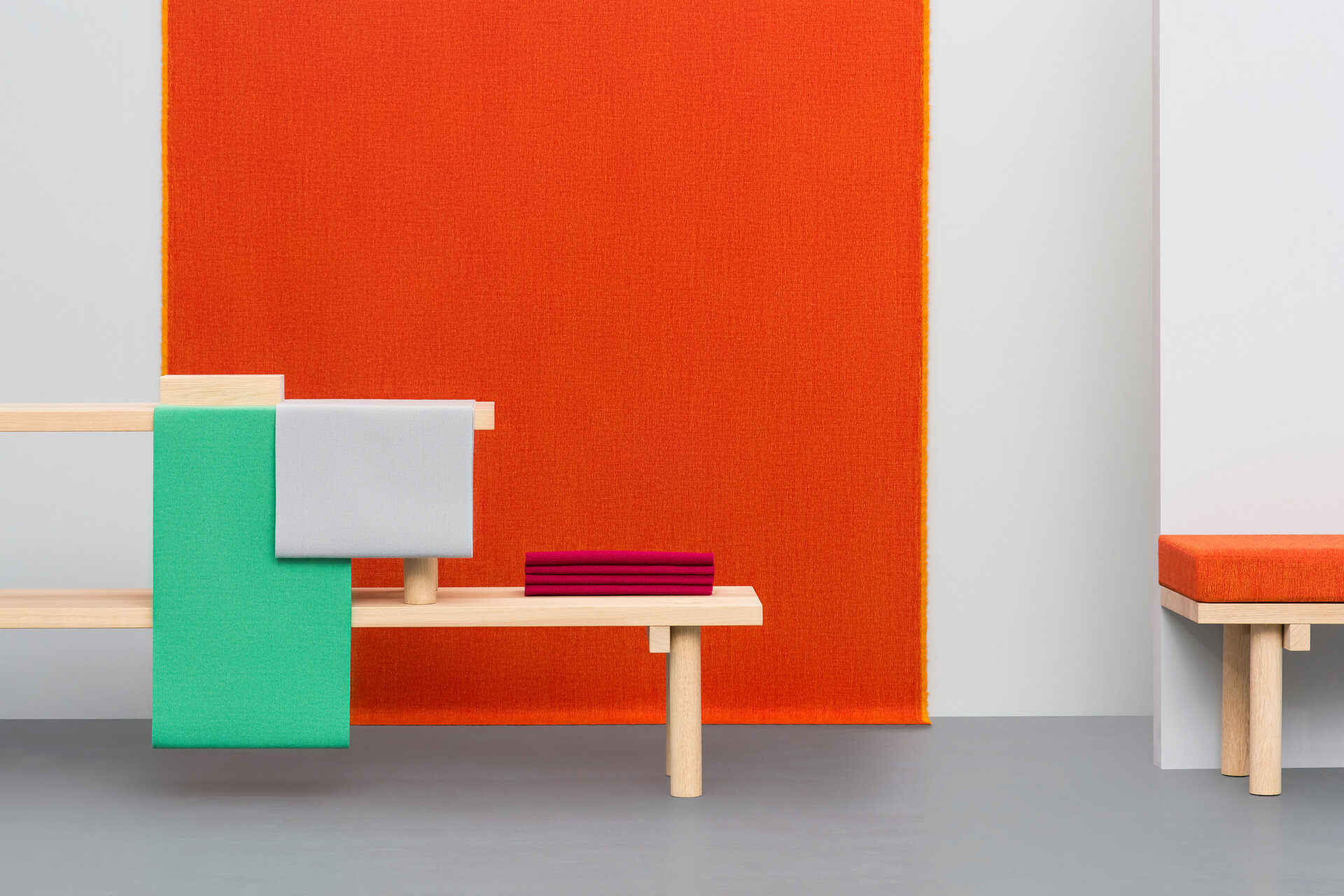
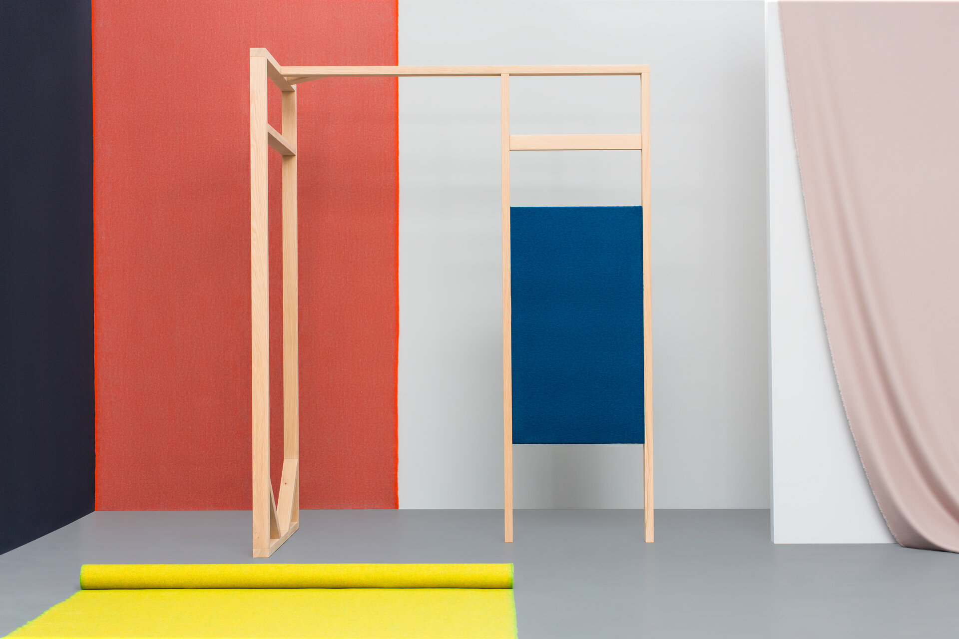
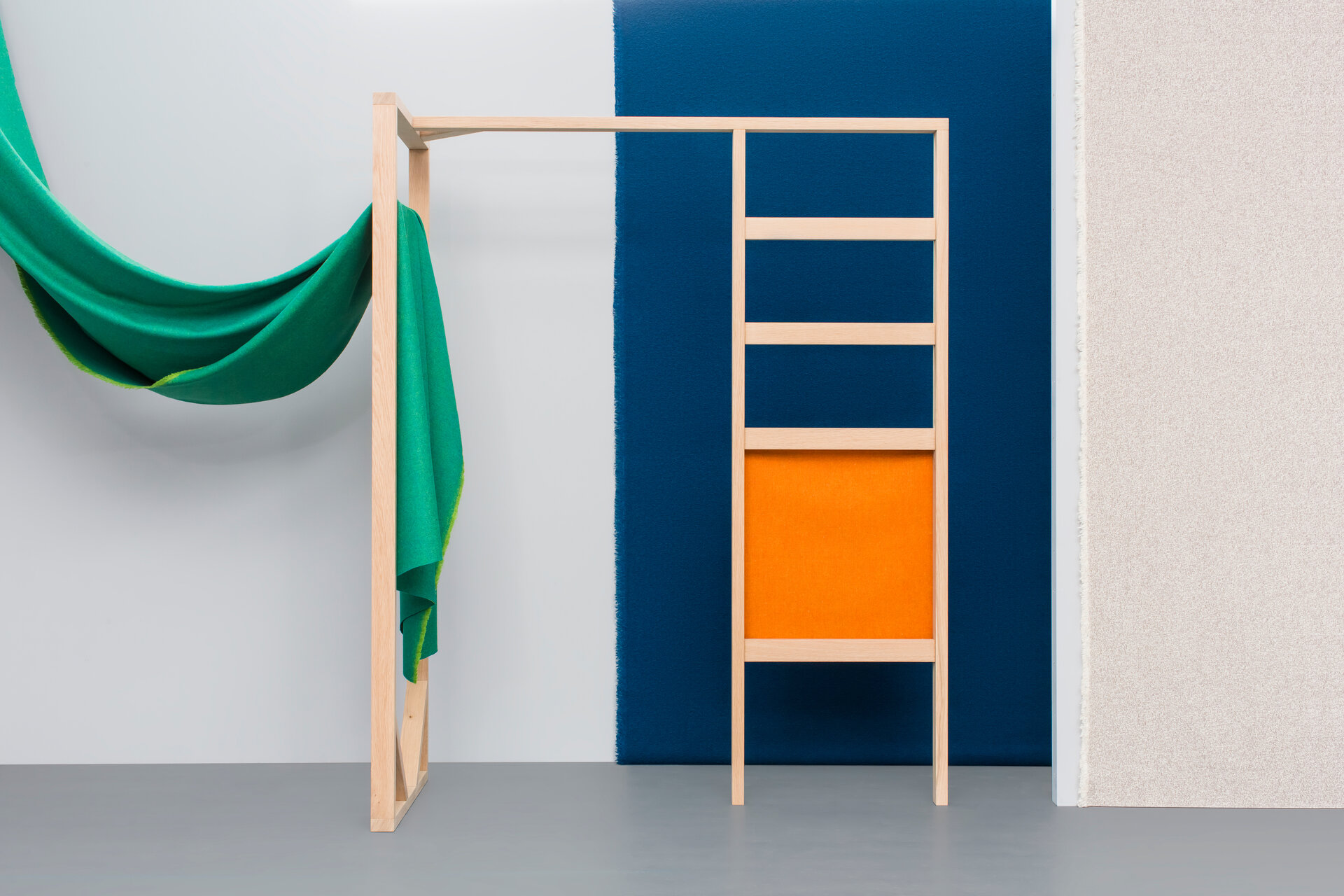
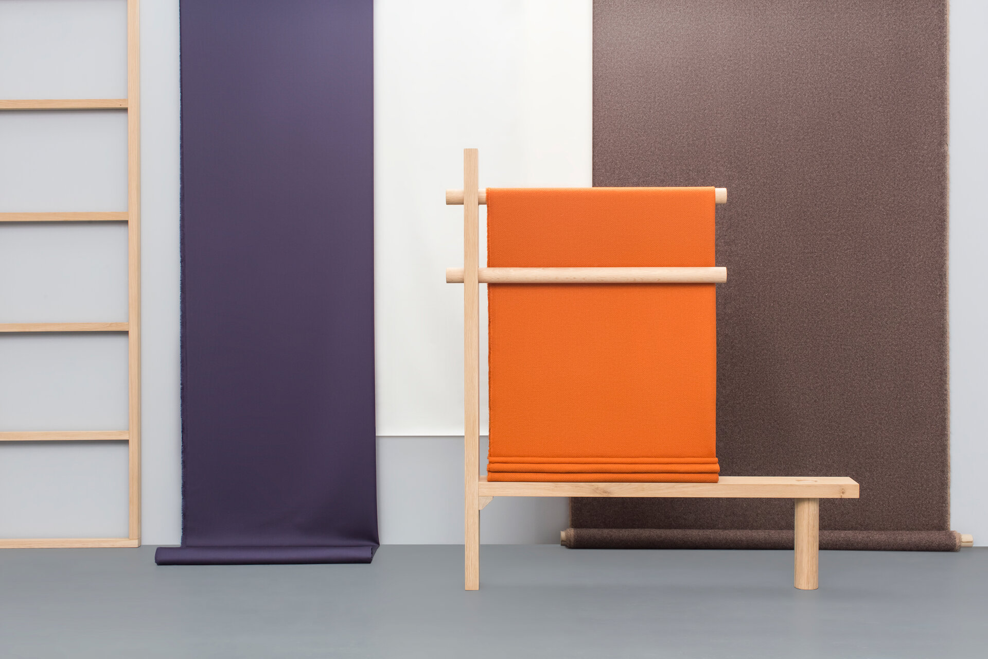
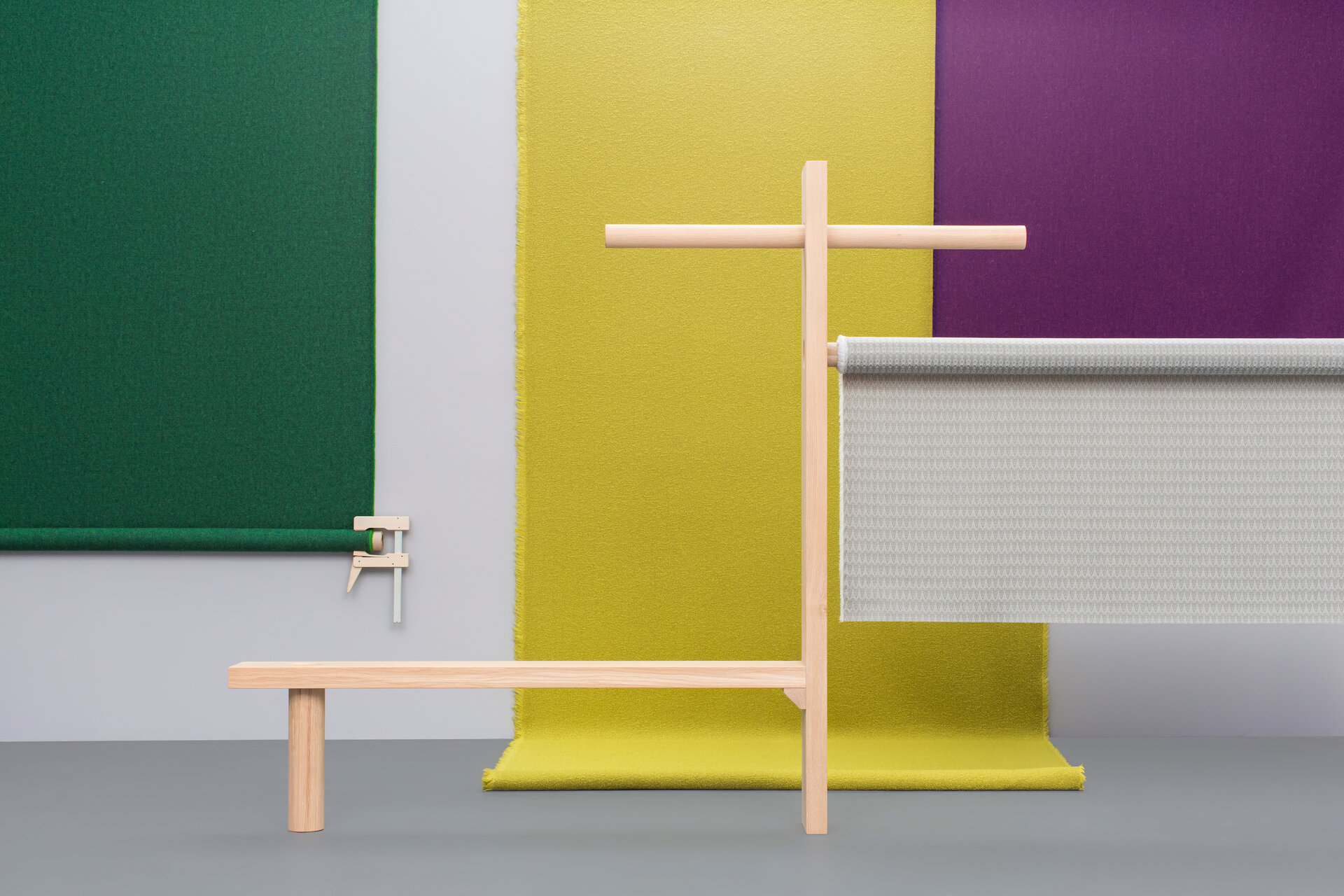
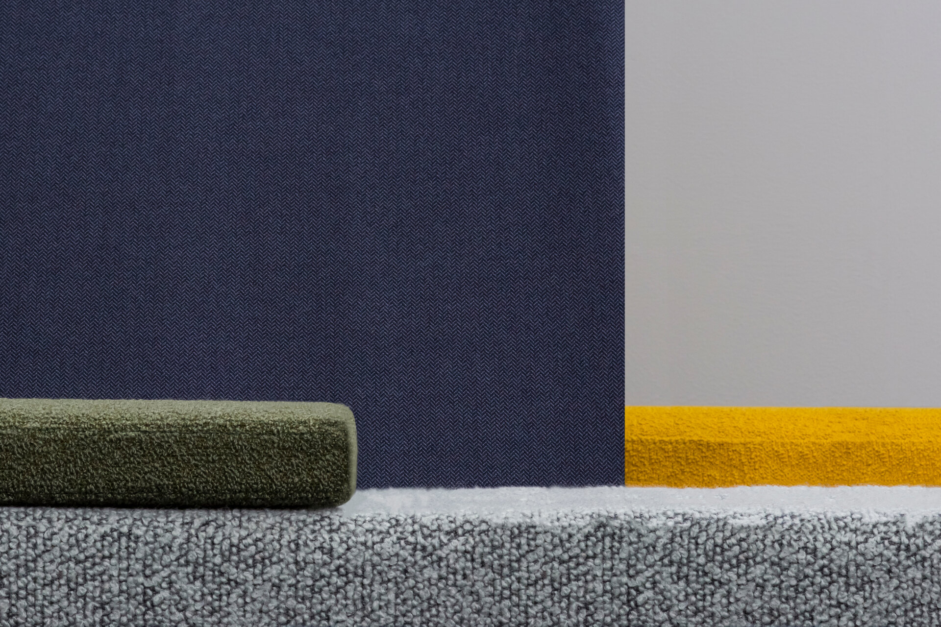
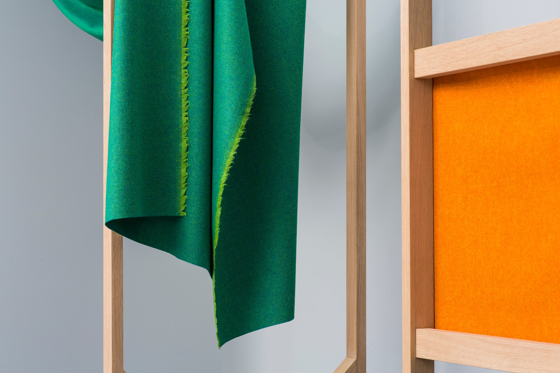
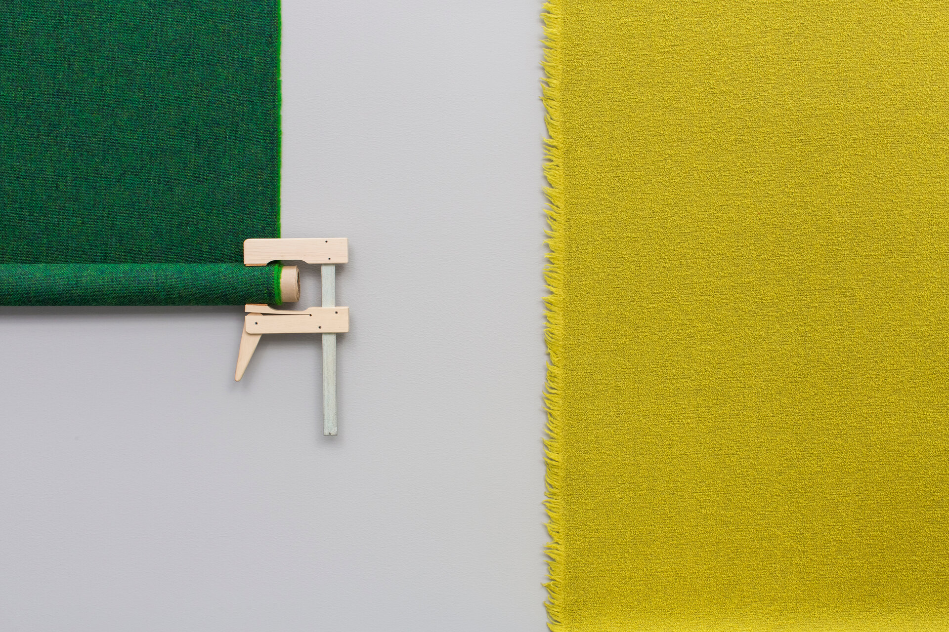
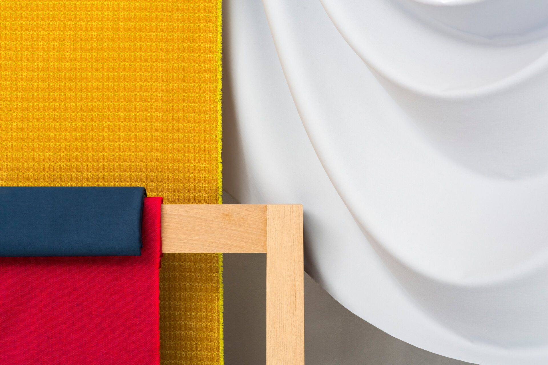
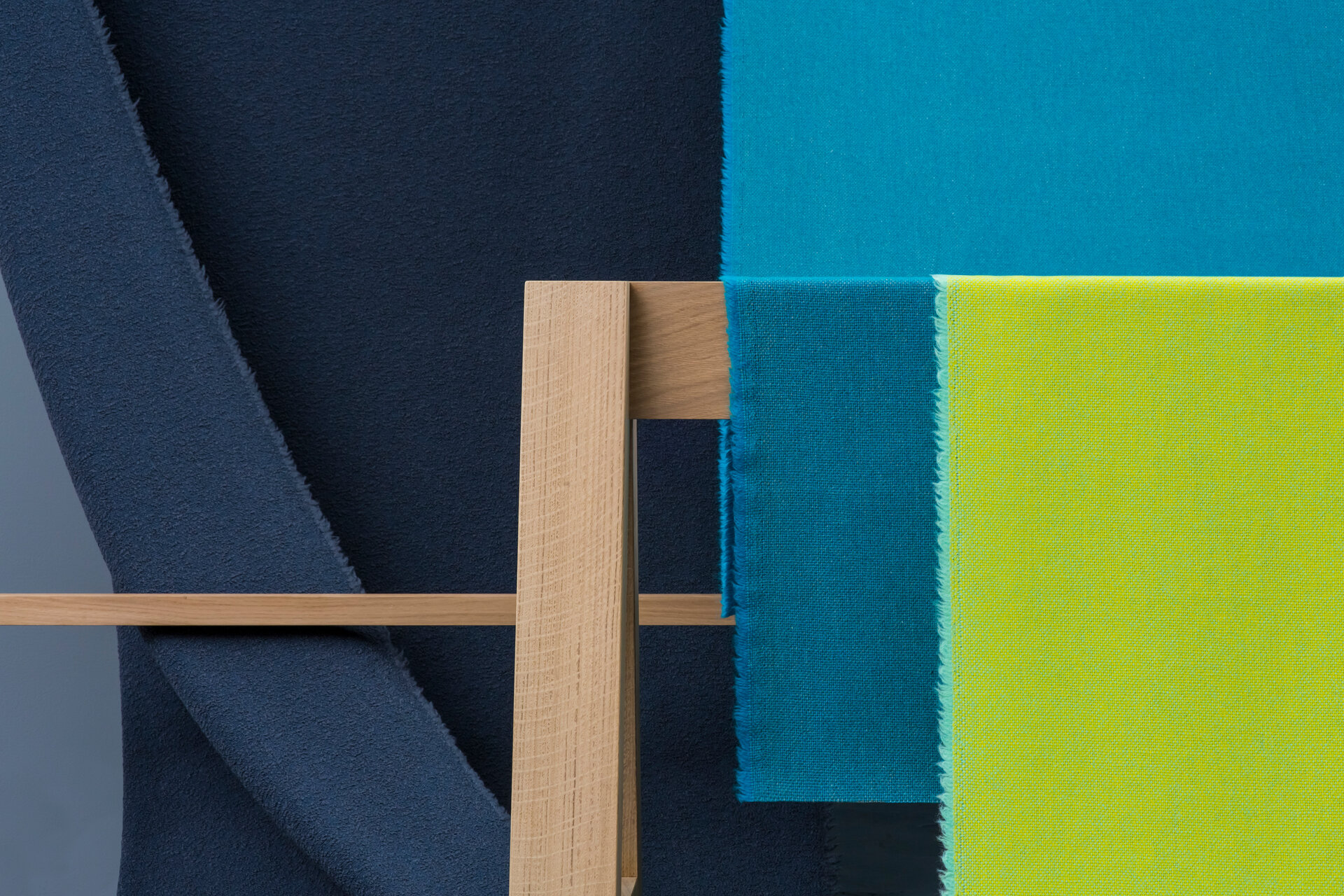
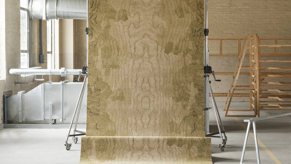
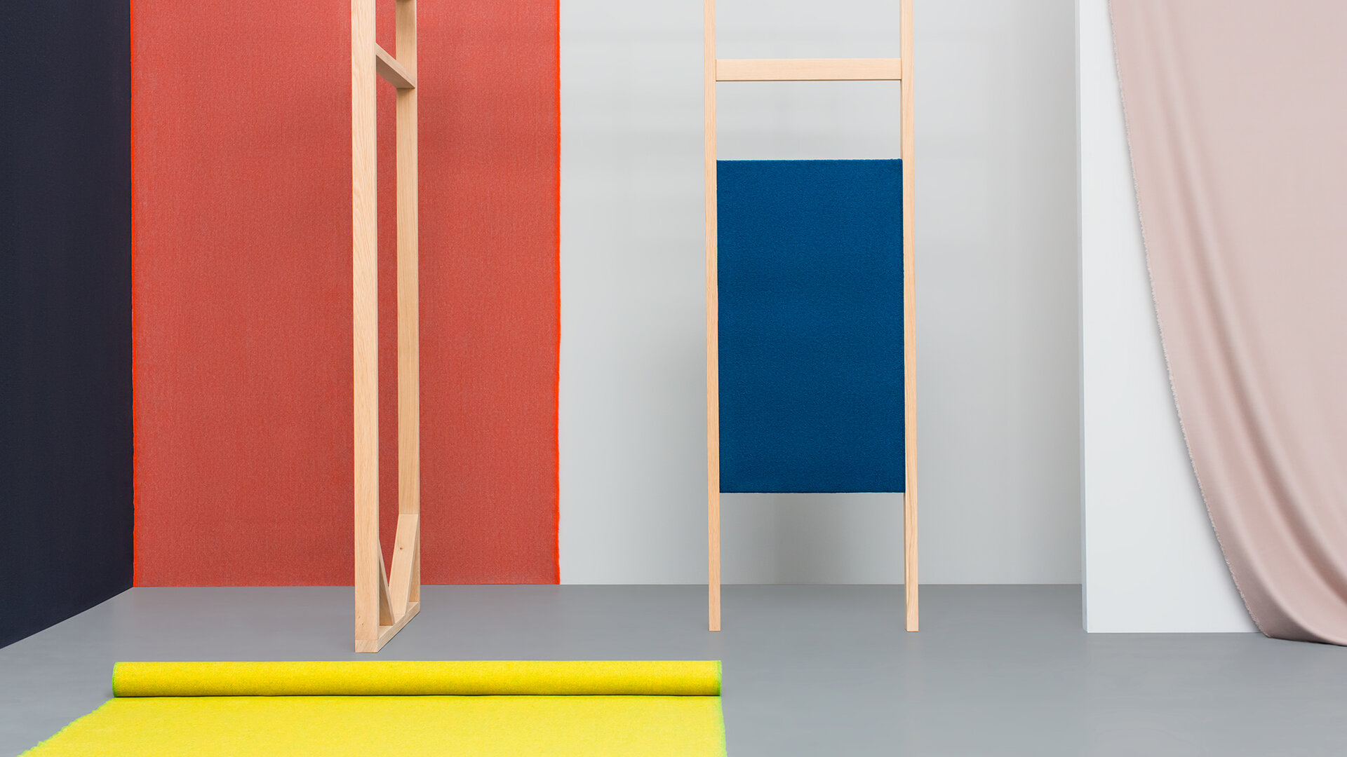
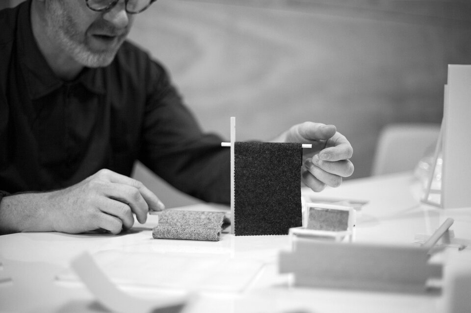
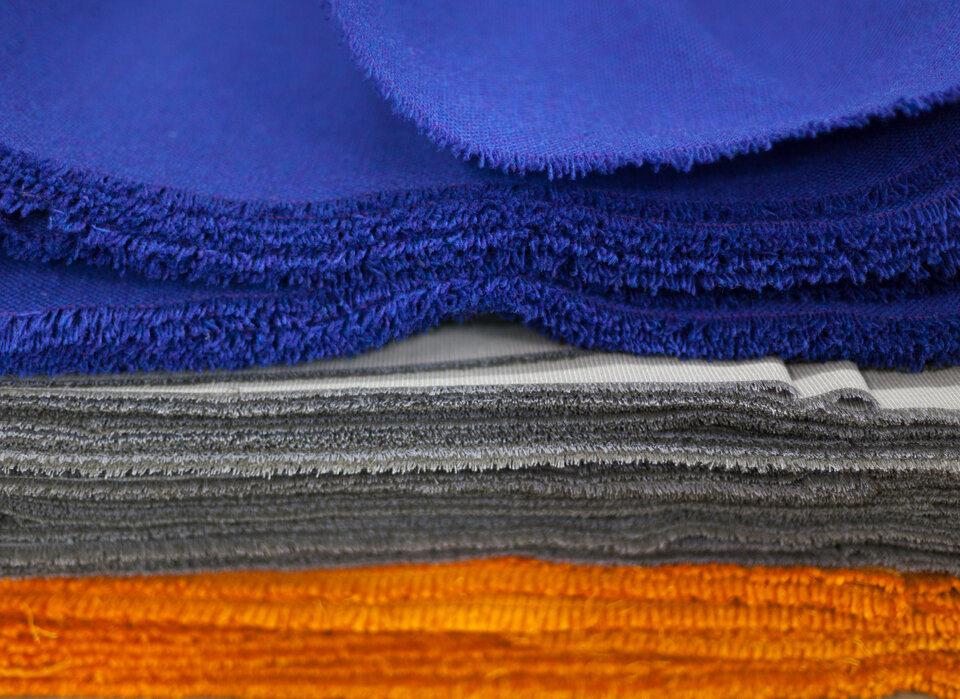
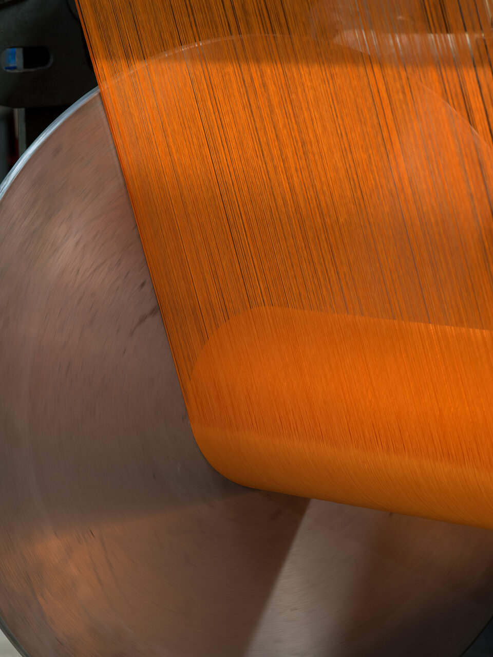
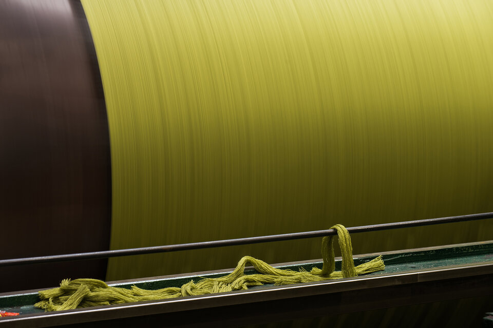
Inspiring campaign imagery showcases the fabric. Demonstrating innovation and leadership in the combination of colour and texture, opening up new possibilities for how the product can be used.
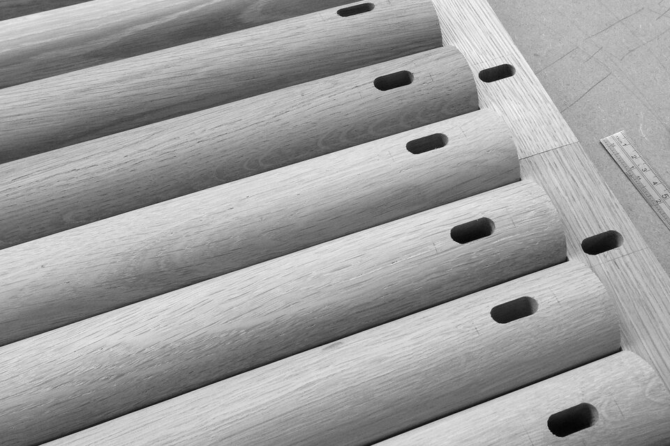
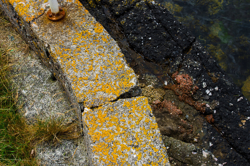
Imagery of the mill and island underpins the quality and provenance of the product and connects directly to the inspirational environment of Bute.

Packaging
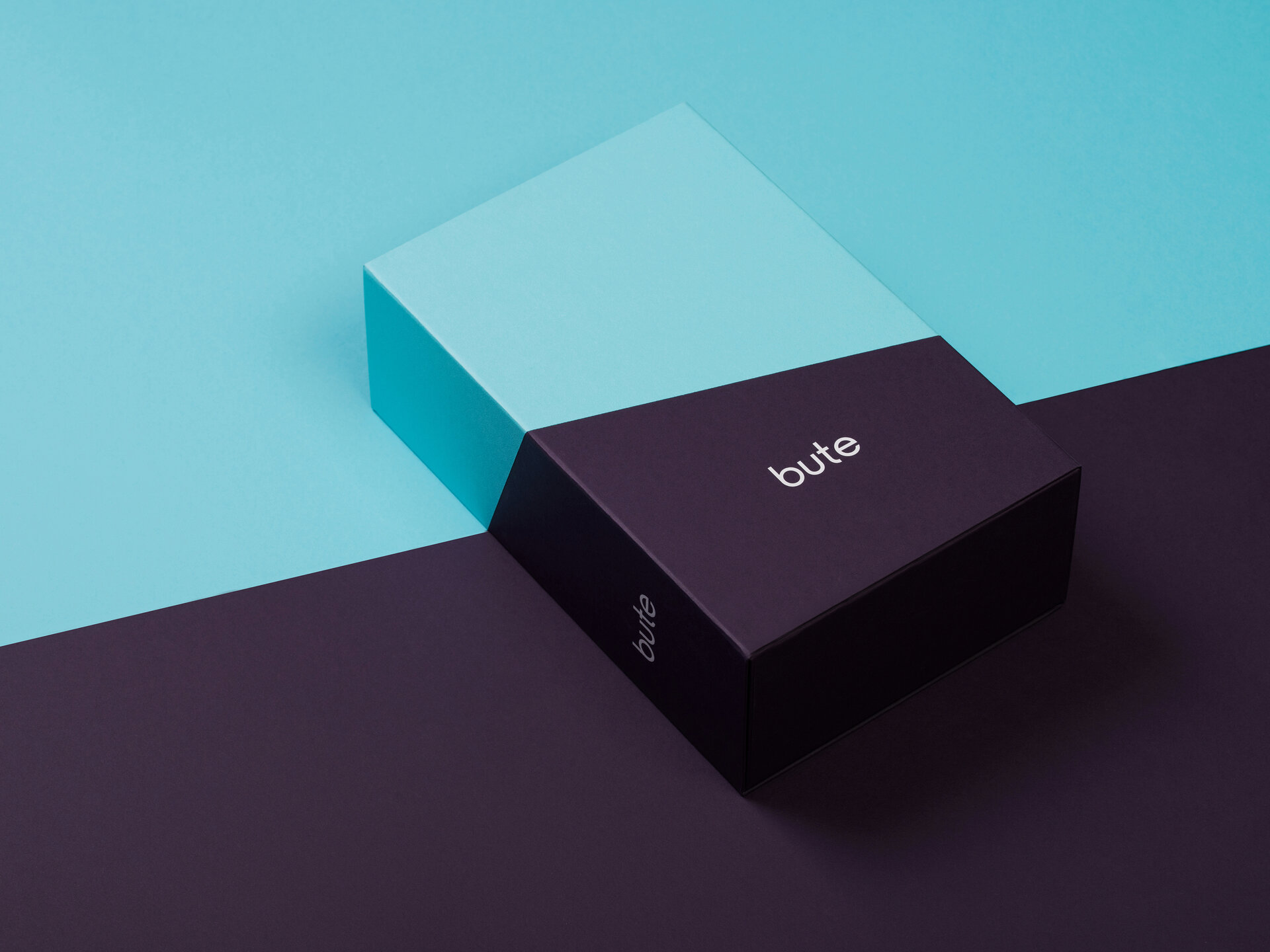
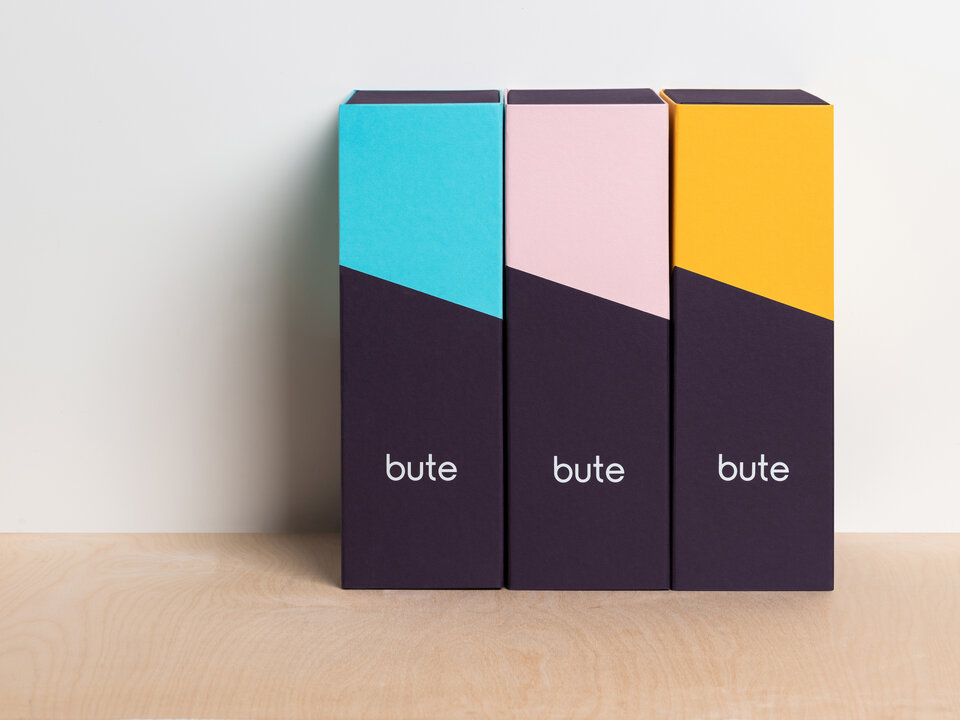
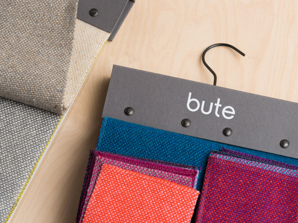
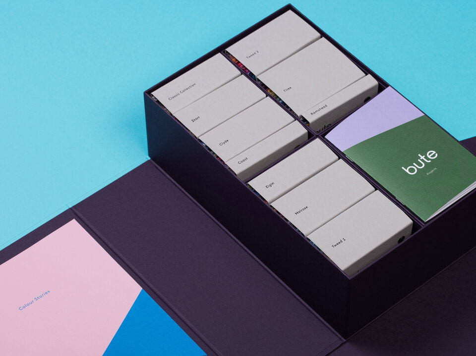
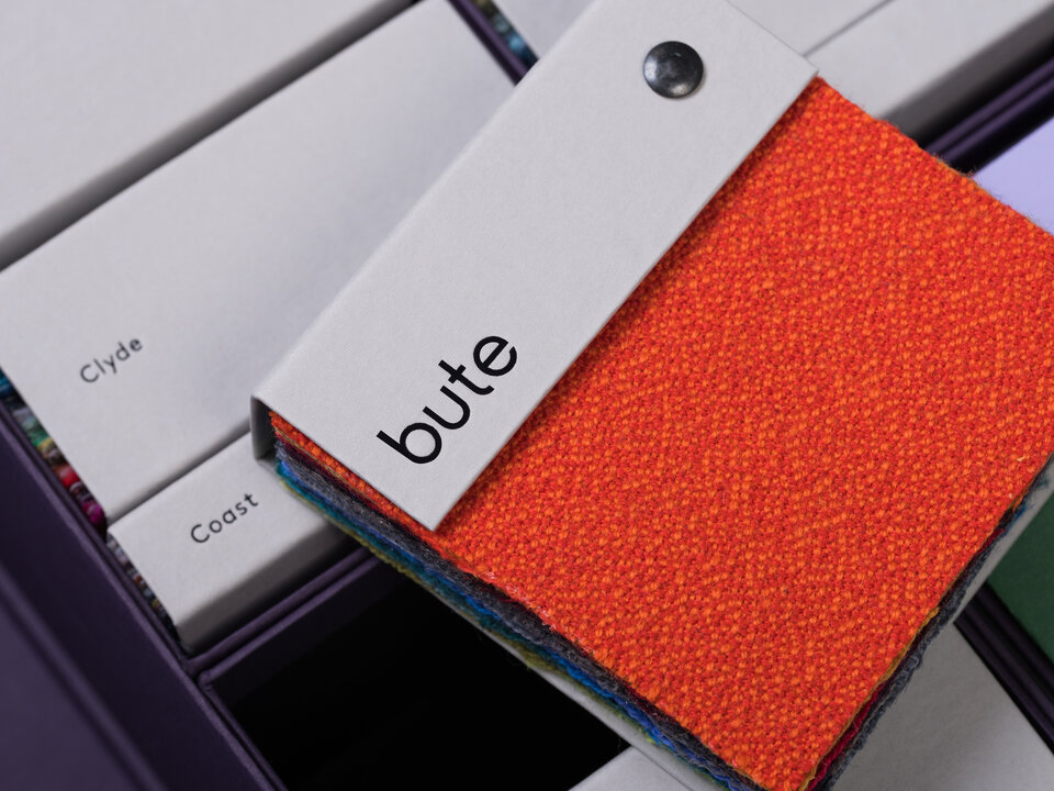
We totally redesigned the sample box. A striking two-tone exterior, available in a range of colours is true to the design ethos of the company and aligns with their clients' sensibilities.
On the inside, a total re-think of format allows designers the freedom to interact with the fabrics, colours and textures as never before, making for a more practical and satisfactory experience.
“
Graphical House have been instrumental in the rebrand of our business, enabling us to think differently about our products and how they are communicated to our markets, both existing and new. We’ve had one-hundred percent confidence in them from day one, in what’s been a game-changing rebrand for Bute Fabrics.
John Glen
Managing Director, Bute Fabrics
