Vita Sana Sol
Client
Giorgio Fresh Co.
Date
October 2025
Location
USA
Services Provided
Sector
A fresh, sun-lit identity for a new name in produce.
Vita Sana Sol specialises in sourcing and distributing premium citrus fruits across the United States, with plans to expand into a wider range of fresh fruit and vegetables. Its name (meaning life, health and sun) captures the freshness and vitality at the core of the brand.
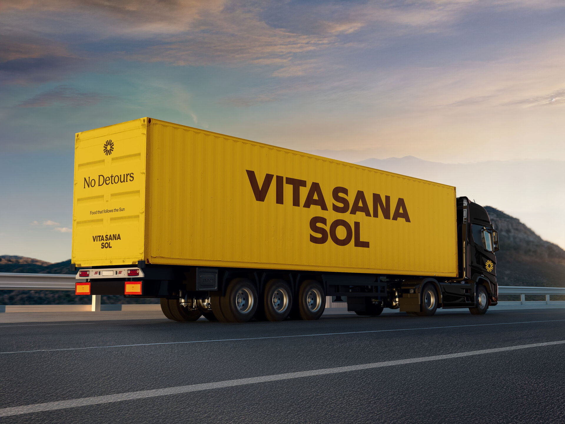
We created a flexible identity system that works across packaging, logistics and brand communications. The visual language is designed to feel warm, modern, and confident — establishing Vita Sana Sol as a trusted presence in the produce sector and giving them the foundation to grow into new categories over time.
1
A unified brand identity designed to elevate perception and establish Vita Sana Sol as a confident presence in fresh produce.
2
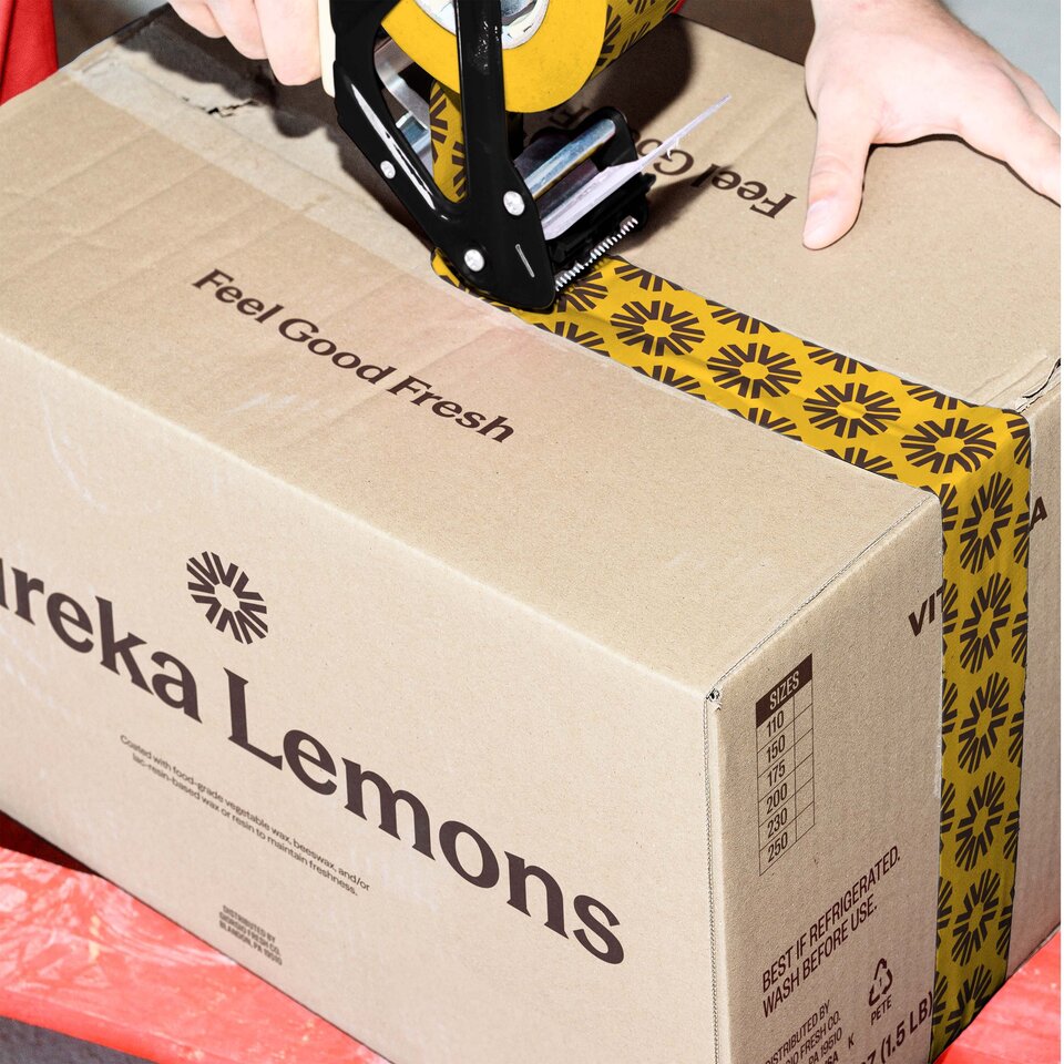
A flexible, scalable system built to work seamlessly across packaging, labelling, and future applications — ensuring consistency as the business grows.
3
Messaging and visual language shaped around freshness and vitality, giving the brand a distinctive and memorable voice in the market.
Strategy
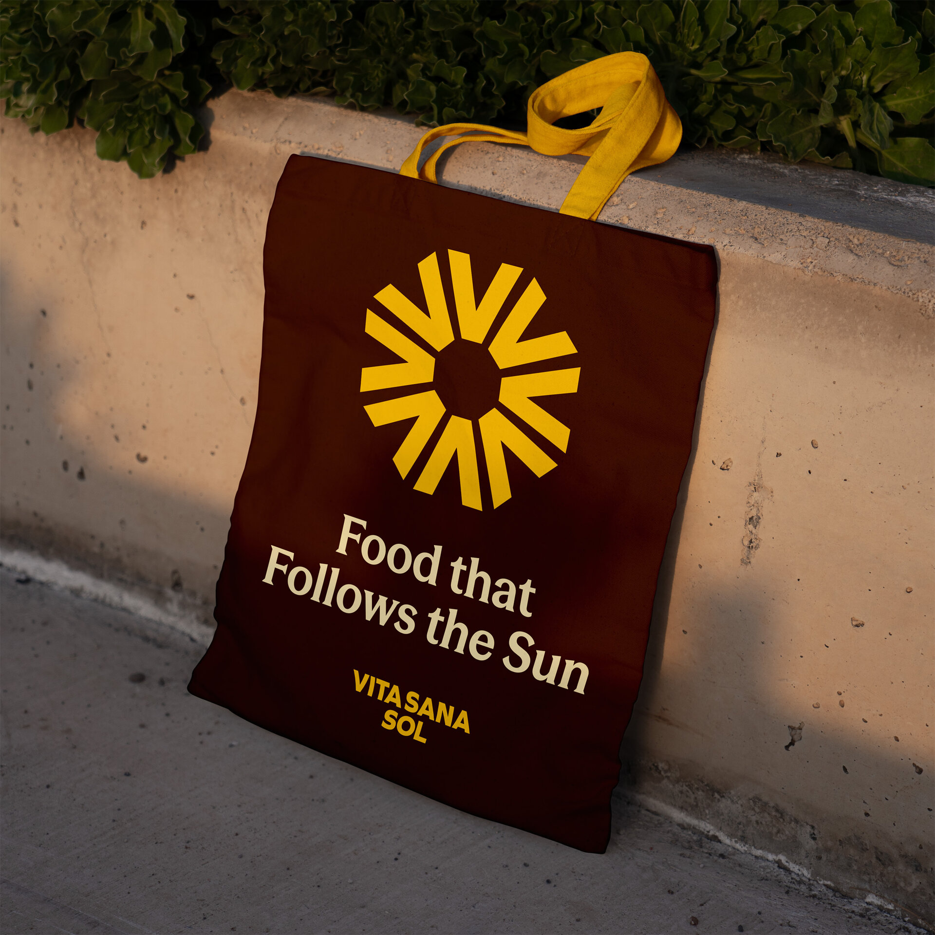
Name as narrative — We placed emphasis on the “Sol” element of the name, using it to anchor the identity around ideas of sun, energy and freshness rather than treating it as a secondary label.
Unified mark — The marque was reduced to a bold, simplified starburst, abstracted from directional arrows to signal both vitality and the rising sun.
Type as tone — A confident grotesk typeface, refined with subtle detailing, balances strength with a touch of elegance to set a distinct, premium tone.
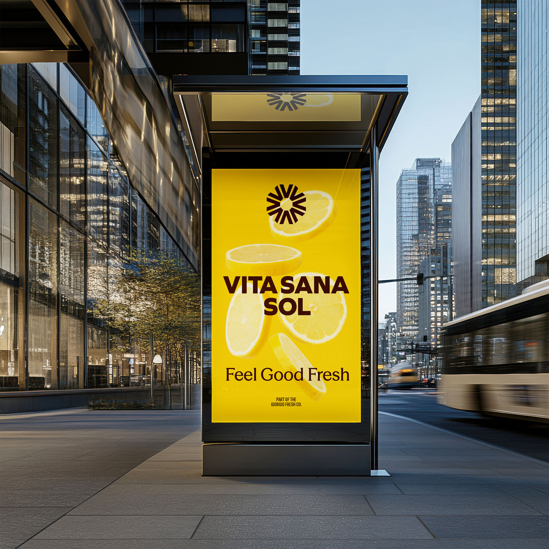
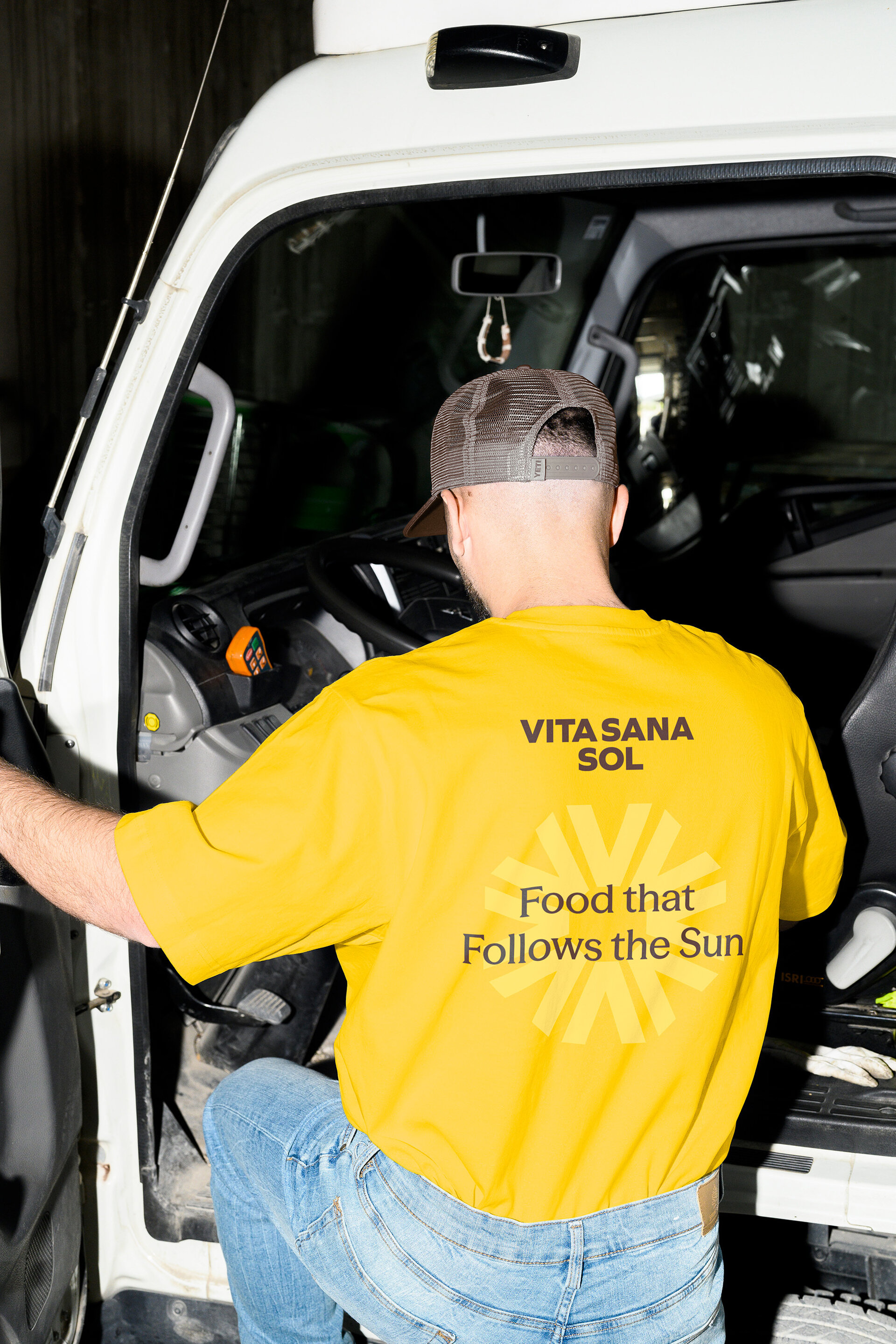
Messaging threads — Clear, concise lines such as “Food that Follows the Sun” and “Feel Good Fresh” run through communications, creating consistency while reinforcing the brand’s focus on vitality.
Brand Identity
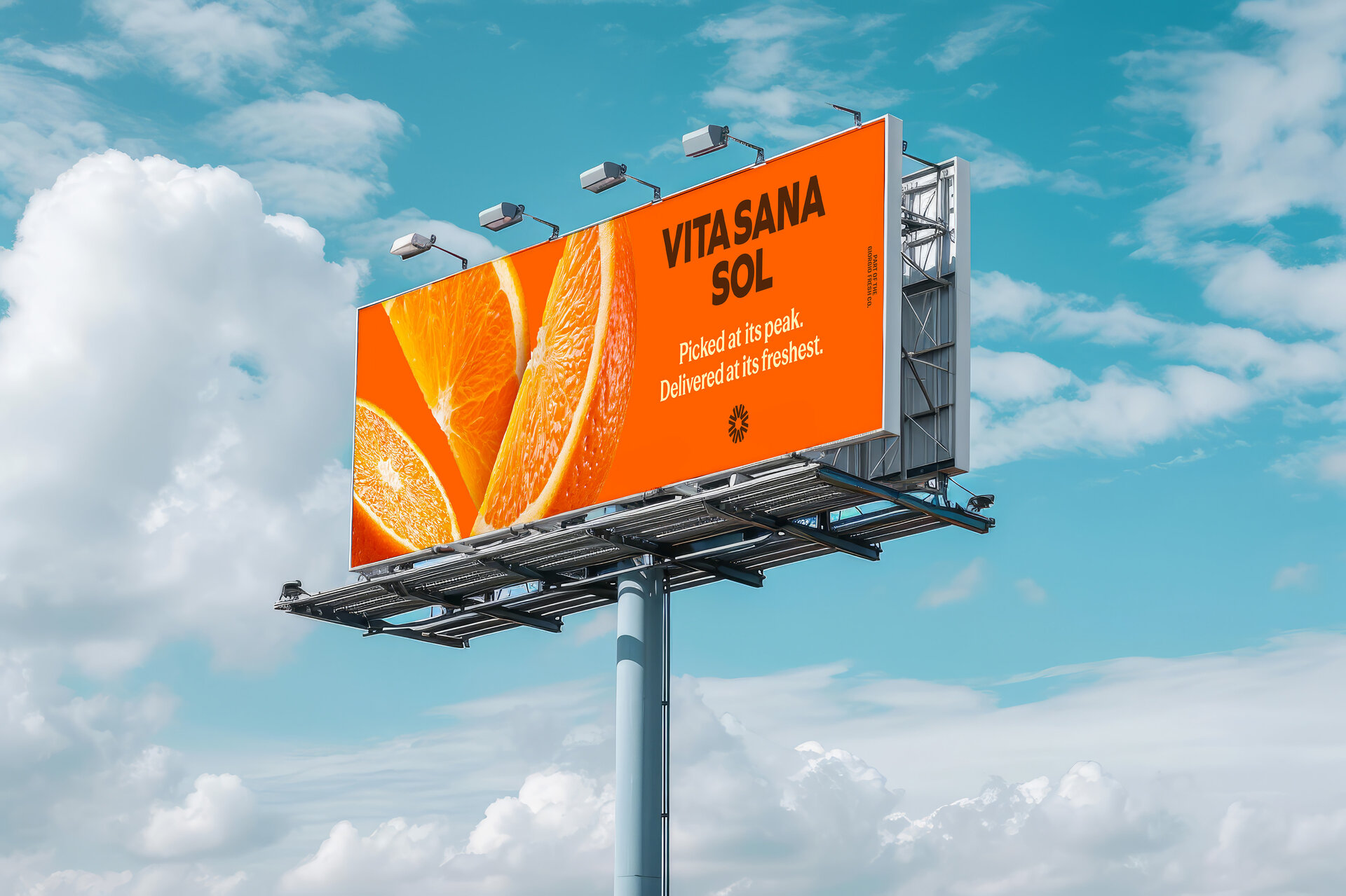
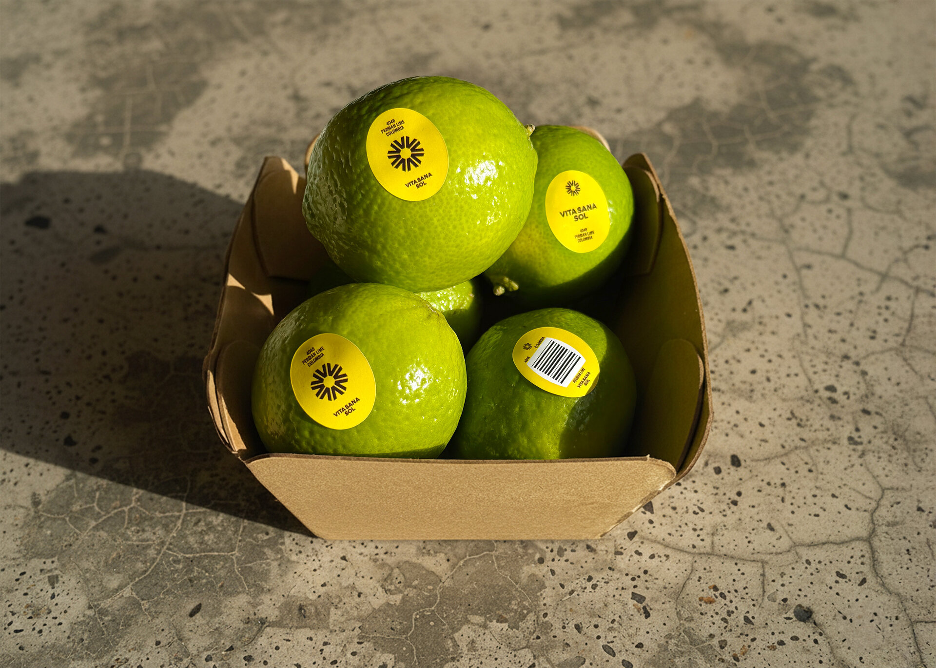
The clean, geometric logotype is balanced and resolute, paired with a new circular marque that evokes the sun, vitality, and movement — capturing both freshness and delivery in a clear, recognisable symbol.
Photography, colour and messaging are aligned to feel bright, authentic, and sensory — never overstated, always rooted in the produce itself.
“
Our goal was to move Vita Sana Sol beyond the anonymity of commodity produce, giving this division of Giorgio Fresh Company a distinctive identity that buyers can recognise and trust at speed.