20.05.25 / Daniel Ibbotson
Friends of a good drop
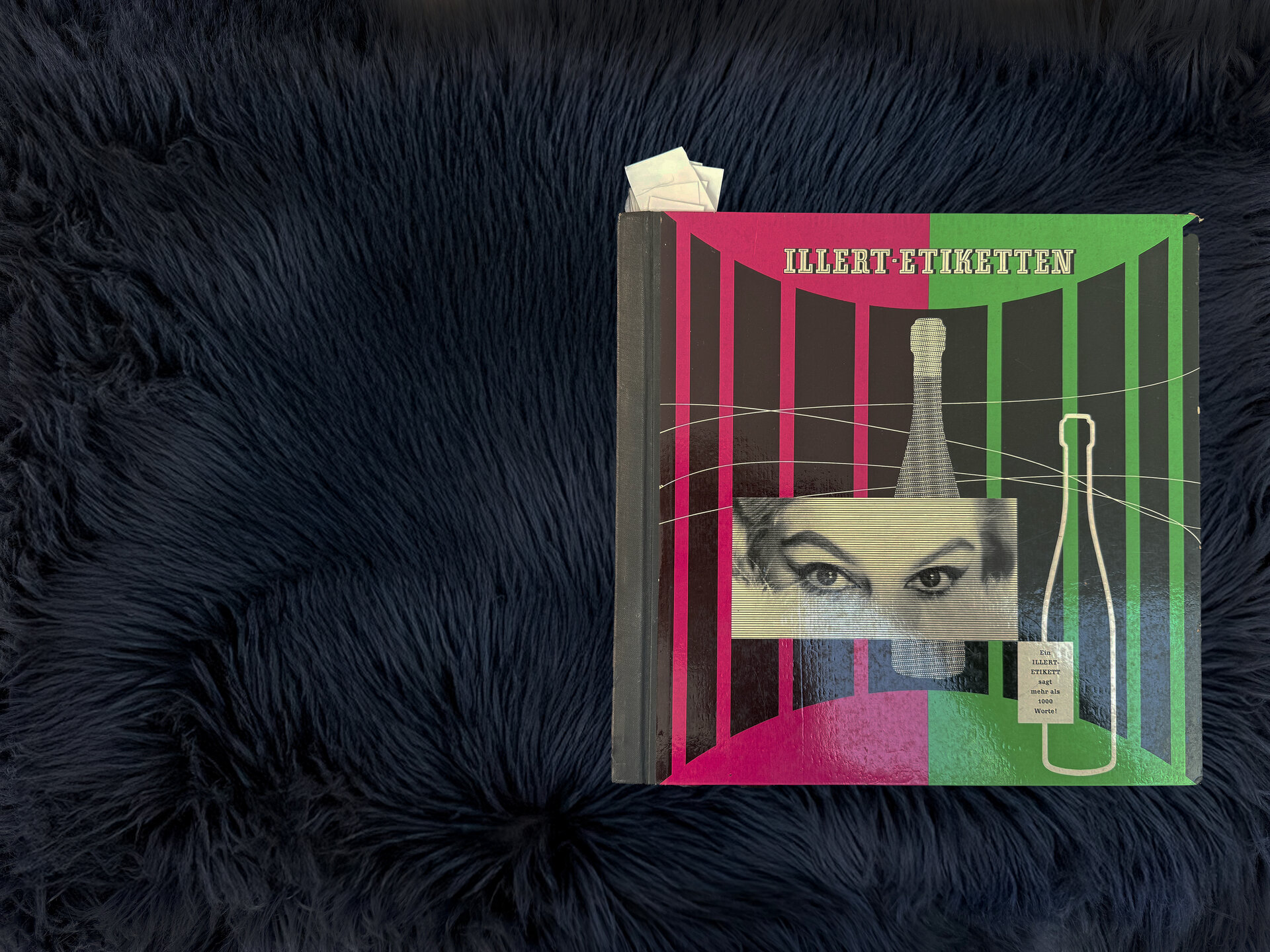
An amazing piece of vintage print that opens up a window into the world of drinks label design alongside the ever present need for self-promotion.
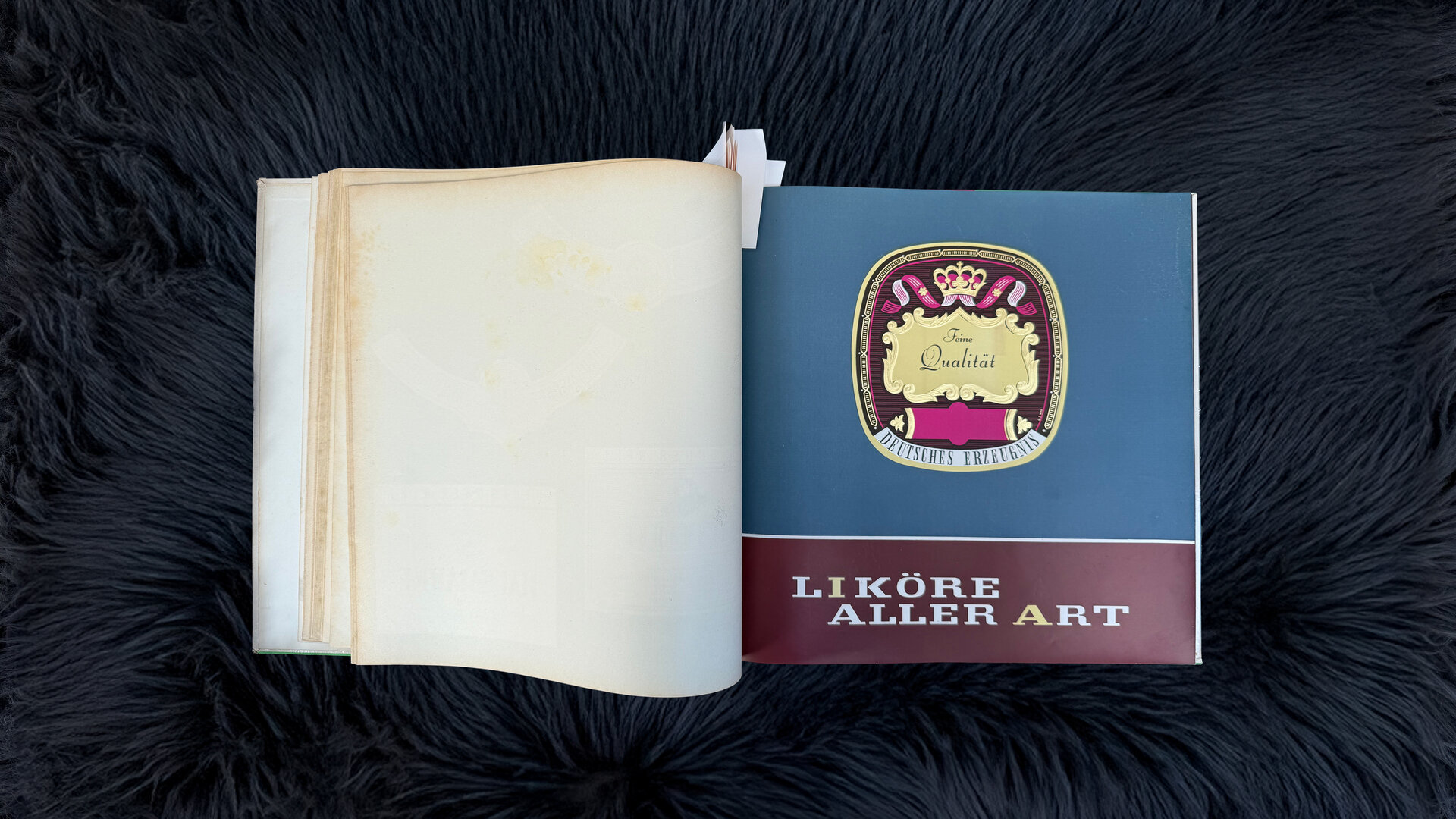
Friends of a good drop...
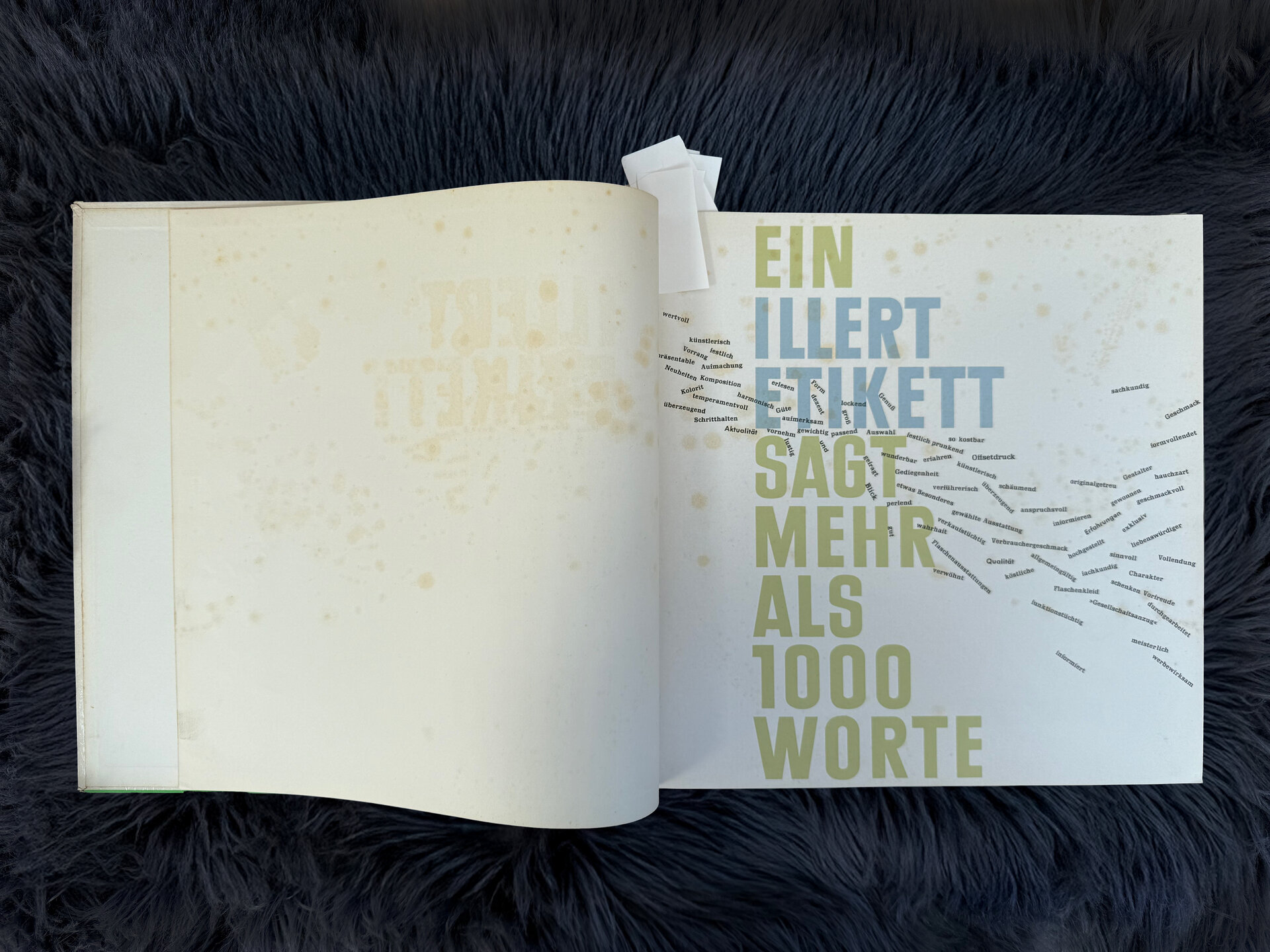
… appreciate, in exemplary bottle labelling, the possibility of providing guidance on the type, origin, character, and provenance of the beverage. These characteristics of a bottle label not only influence the choice of a particular beverage, almost always it is the individual appealing note of a characteristically designed label that casts a magical spell on the viewer, evoking the desire for possession and enjoyment. Only when a graphic and printed form convinces and fulfils all conditions, can the bottle label become an effective ‘salesperson’...
…You too can follow the path to success.
Or at least something like that, it’s written in German.
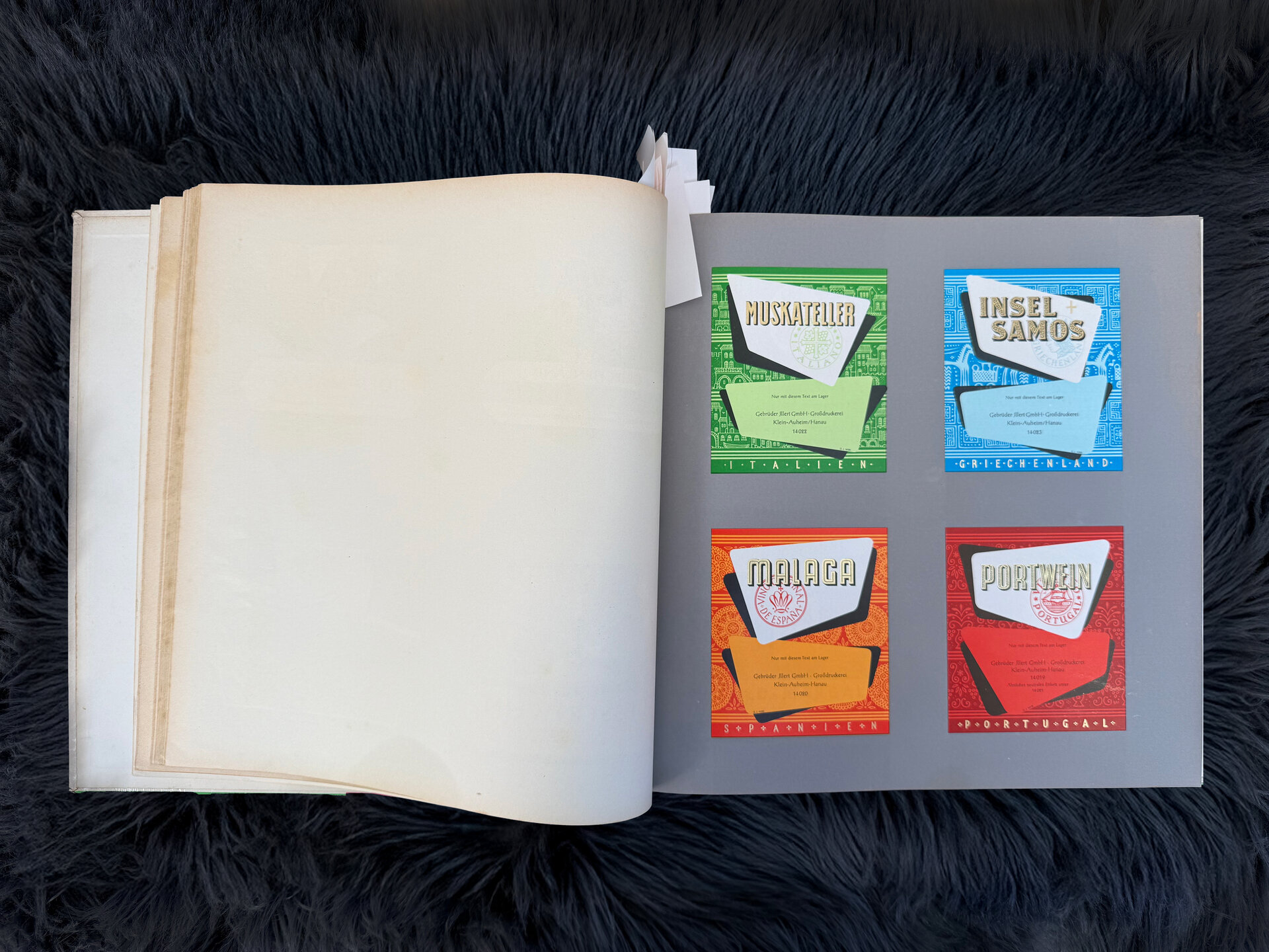
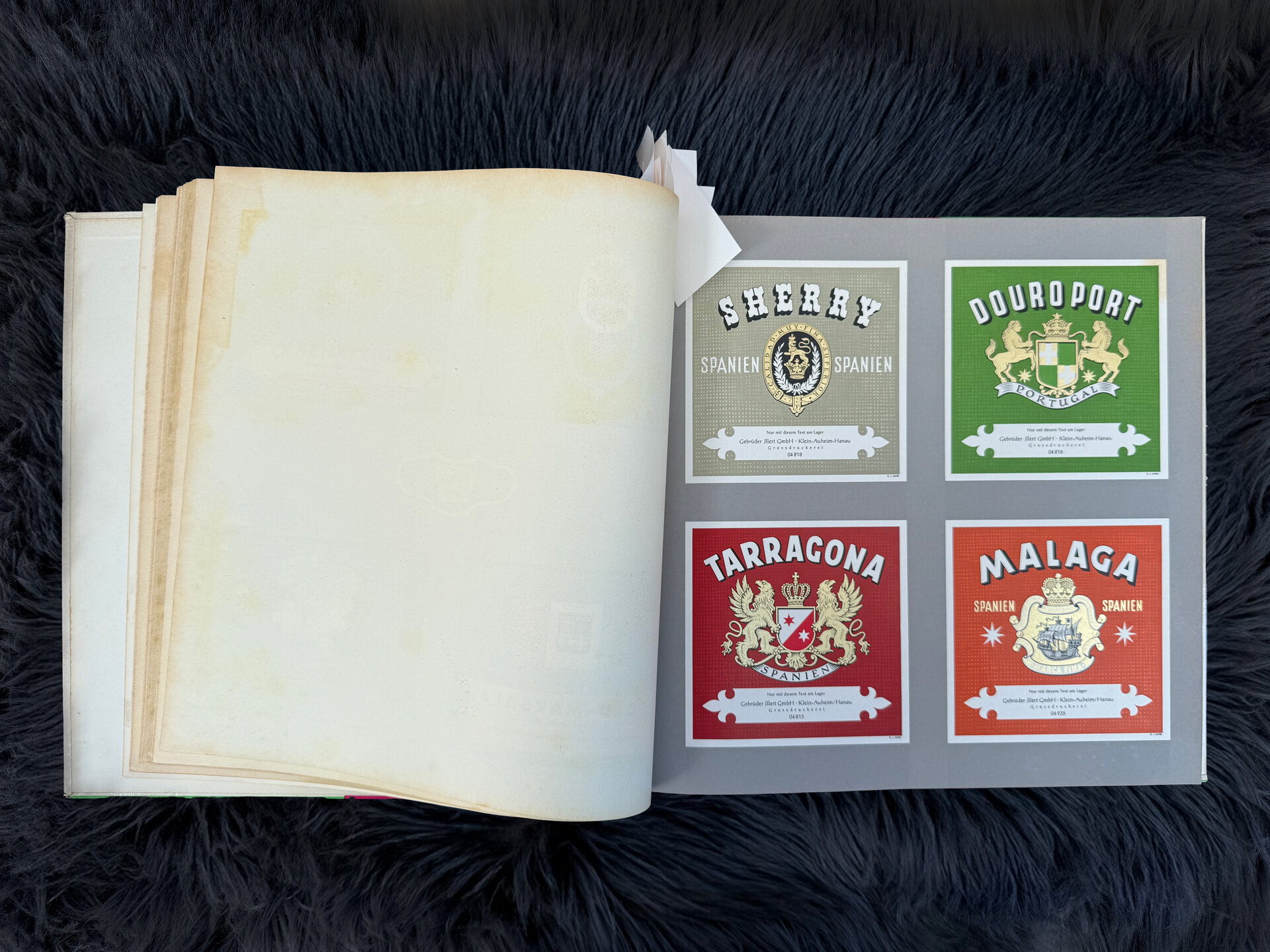
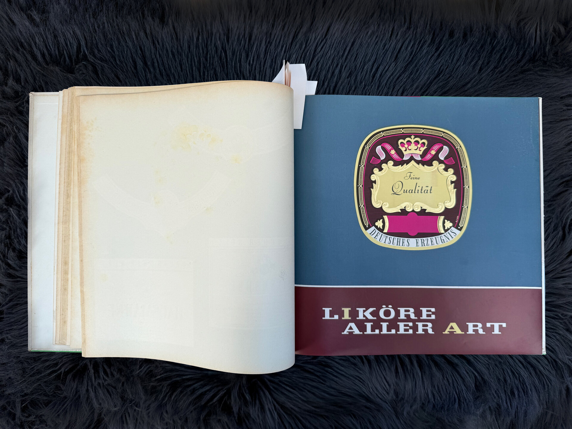
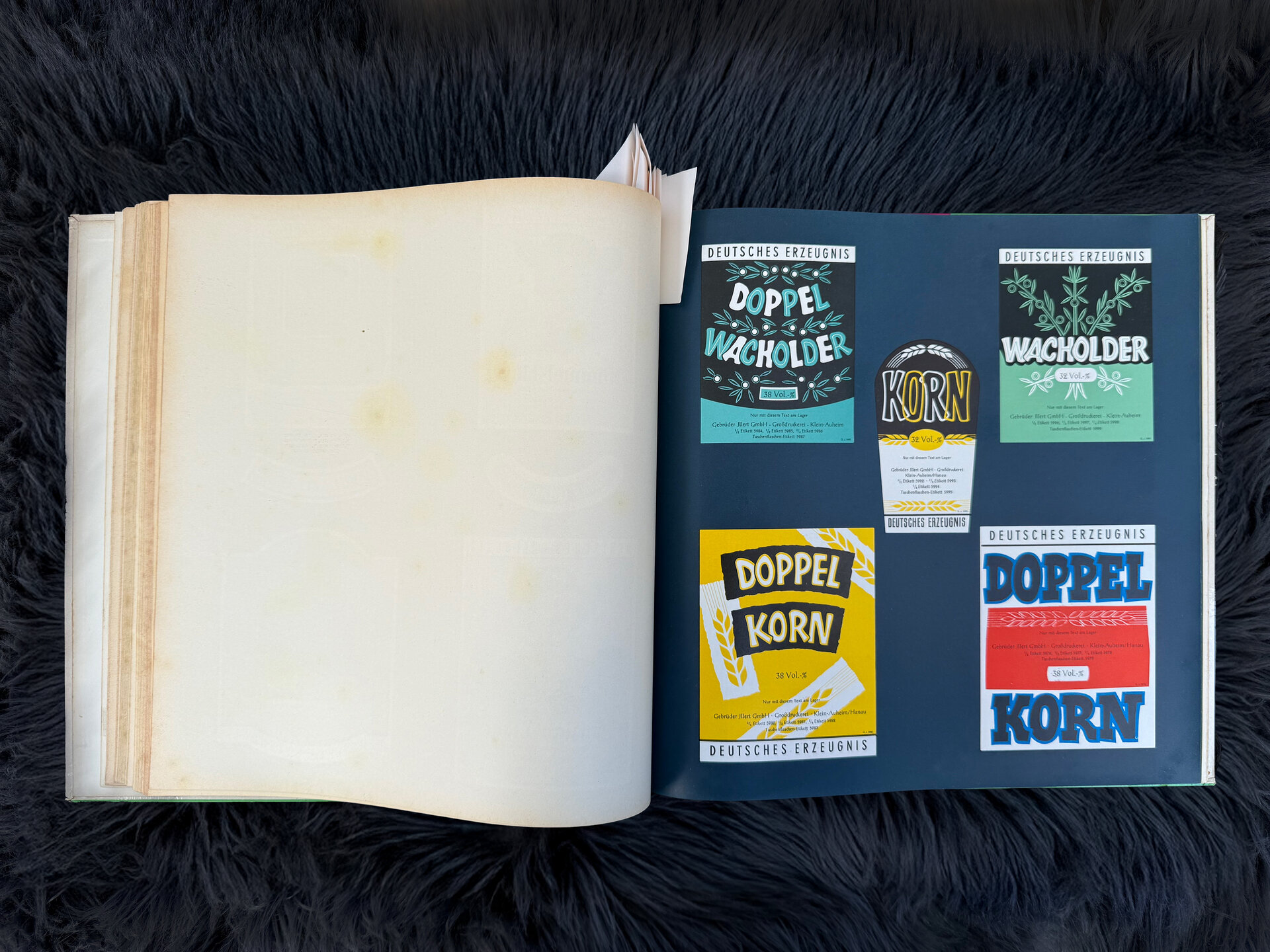
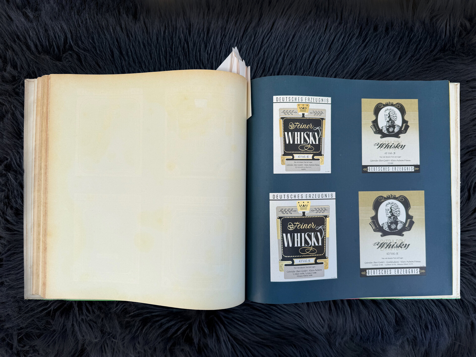
Gebrüder Illert was a lithography and printing company based in Hanau. They were known for producing labels for wine and other bottled products. This book – produced in 1960 – is a catalogue designed to showcase their wares. You could order samples of these labels to try out on your own bottles before committing. The last page of the catalogue even has perforated, tear off order cards.
As much as it sounds like the words of Jandrew from the Adam Buxton podcast, I love this idea of the label, casting its magical spell over the consumer. Labels are fascinating in this way, in that they are a kind of microcosm of what we do as designers. Within such a small physical area they have to say so much about a brand and a product. Be that a label on a wine bottle, or a whisky bottle or even a tray of mushrooms (something we’re working on at the moment). Distilling the breadth of a brand down into a piece of graphic real estate maybe 8x10cm is a challenge.
Often labels have to inform us, at a glance, of what the product is. This is especially true of bottles where you can’t really tell by looking at the contents. The design of the label – alongside the other visual components like bottle shape, maybe a neck label and capsule covering – becomes something that has to function in a fleeting moment. Is this wine? Is this sherry? If it’s wine, is it red or white? All of this information falls to that first impression, before you start to delve into the details. Because of this, design conventions emerge, making it easier to differentiate and identify particular product types. But of course these days retailers make it a lot easier by grouping things together. The red wines here, the white wines there and so on.
This feels like an opportunity to stand out rather than blend in. As I mentioned earlier we are currently working on a project to re-brand and re-position one of America's largest fresh mushroom producers. There are many motivational aspects to this project, attracting new audiences, elevating the sense of quality and value, and of course, standing out against the competition. Like a bottle label, a tray of fresh mushrooms provides a fairly limited canvas. There is so much practical work the label needs to do. What kind of mushrooms are these? Who grew them? What are the nutritional values? The bar code, the URL, the mandatory information. This is where a well thought out and tightly put together brand system comes into its own. Allowing you to present all of that information in a way that quickly and directly connects the consumer to your product, expressing the ideas and evoking the emotions that are important to you.
But how do you stand out? Well you simply do something different to what everyone else is doing. Ok, it's not quite that simple, you have to be different with an educated and intelligent intention. You have to do your research and understand the context, know what will motivate rather than alienate your audience. You have to find new ways of expressing what are often familiar messages. You have to move away from the ‘It worked for them so we’ll do the same’ attitude. Innovation occurs when someone is brave enough to step outside of the convention. Of course this is an ongoing cycle, sooner or later everyone catches up and everything looks the same again.
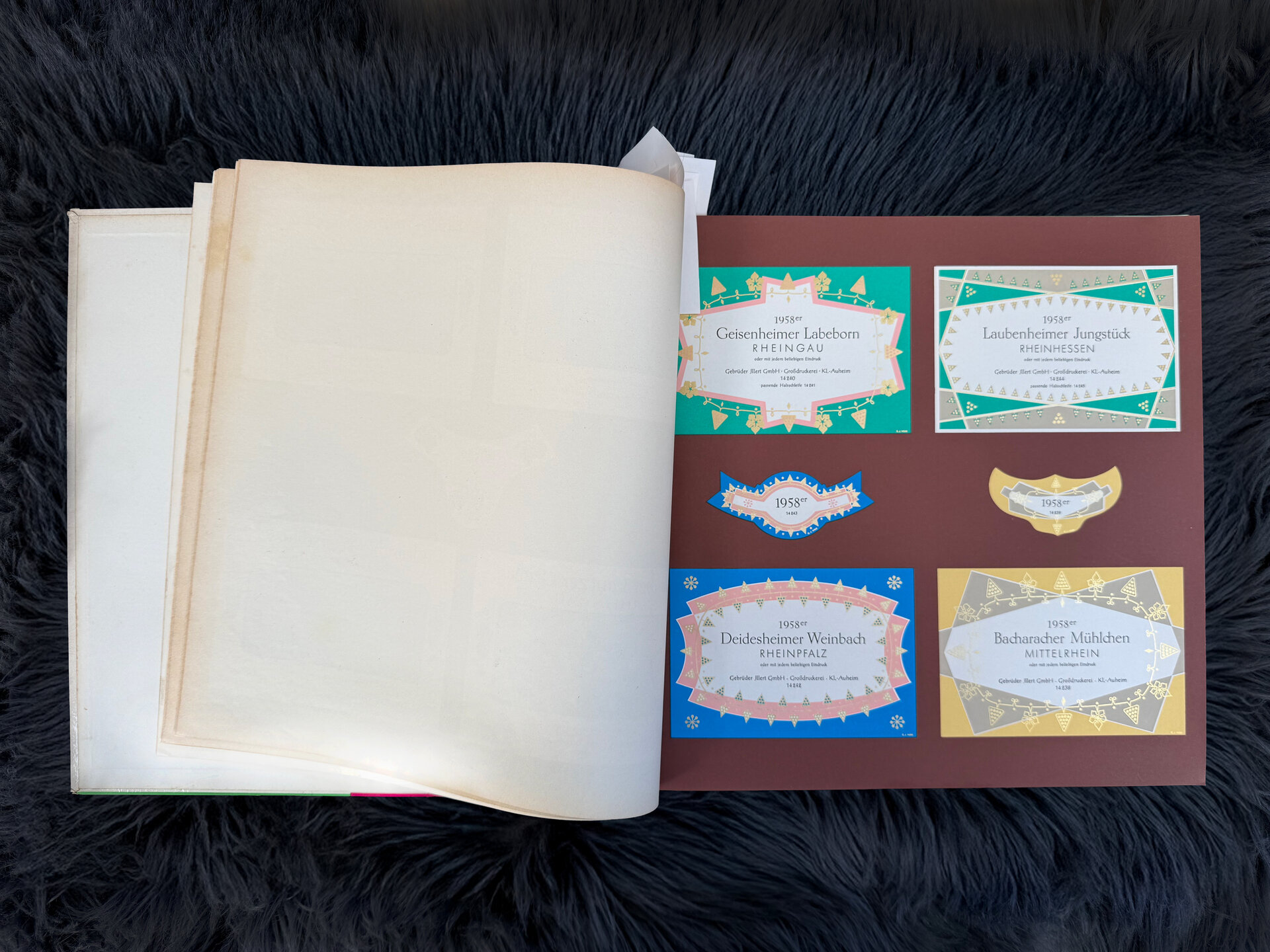
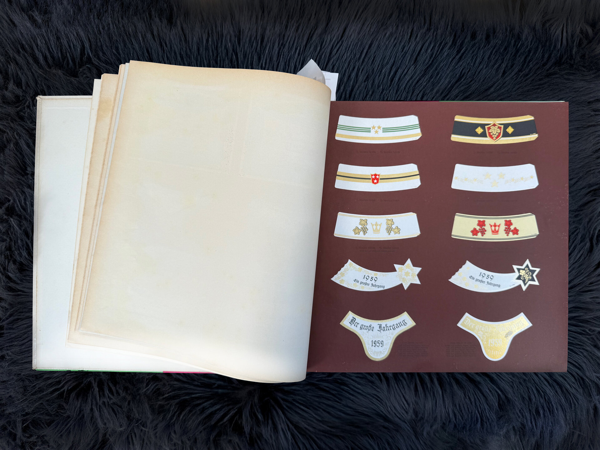
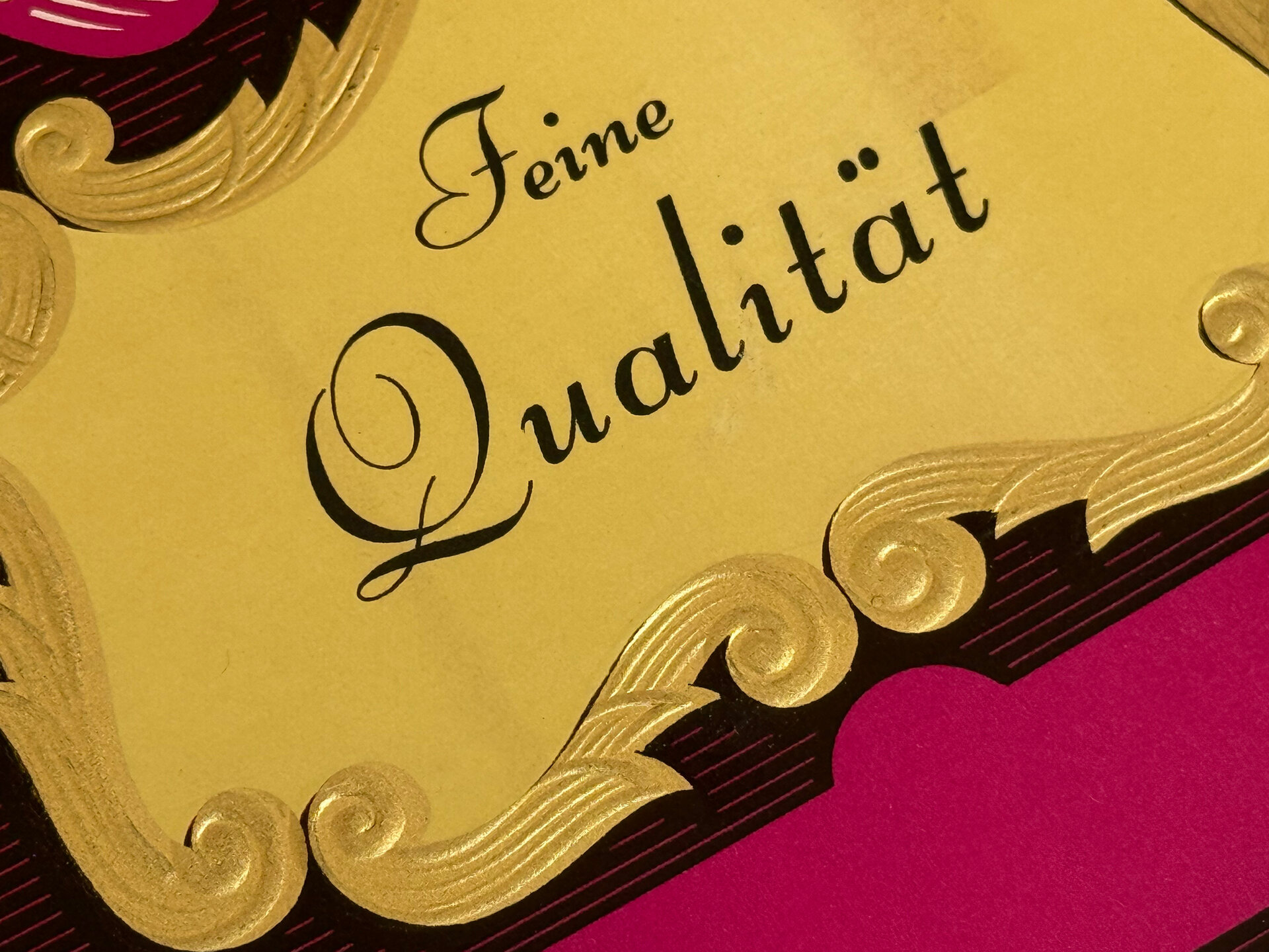
But back to this catalogue. It’s really quite something. The production values alone are off the scale compared to a lot of what we see today. The super-matt paper stock, the metallic inks, the foil blocking and debossing. All on the interior pages of a book. I’ve never seen the like. These kinds of finishes are usually reserved for the cover only.
And then there is the design of the labels themselves. The examples range from the traditional and very familiar Liebfraumilch, to the fairly adventurous (for the time) Port and Kirsch. All with exquisite use of various technical processes. Grouped together in families or collections, ranges even. Everything is executed with such finesse and attention to detail but it’s all fictional. Examples of what could be done, designed to entice potential clients. The labels casting their magical spell over these clients before doing the same for their customers.
In the studio this week we were talking about the large number of projects we now see on design blogs that are also completely fictional. Speculative, self initiated, imaginary brands. This catalogue represents the exact same thing. Illert taking their skills and using them to attract new business by creating these spectacular, detailed and rigorously resolved examples of how a drinks label could look. How an imagined brand could distill itself down into a collection of small rectangular pieces of paper and stand out against everything else through this combination of design excellence and technical quality.
And all of this in 1960 when the idea of a brand was in its infancy.
Next article
