18.01.22 / Daniel Ibbotson
The Next Future
What does a Renault 5 have to do with Star Wars, Blue Monday and our vision of our future? Probably nothing but this seemed to make sense at the time.
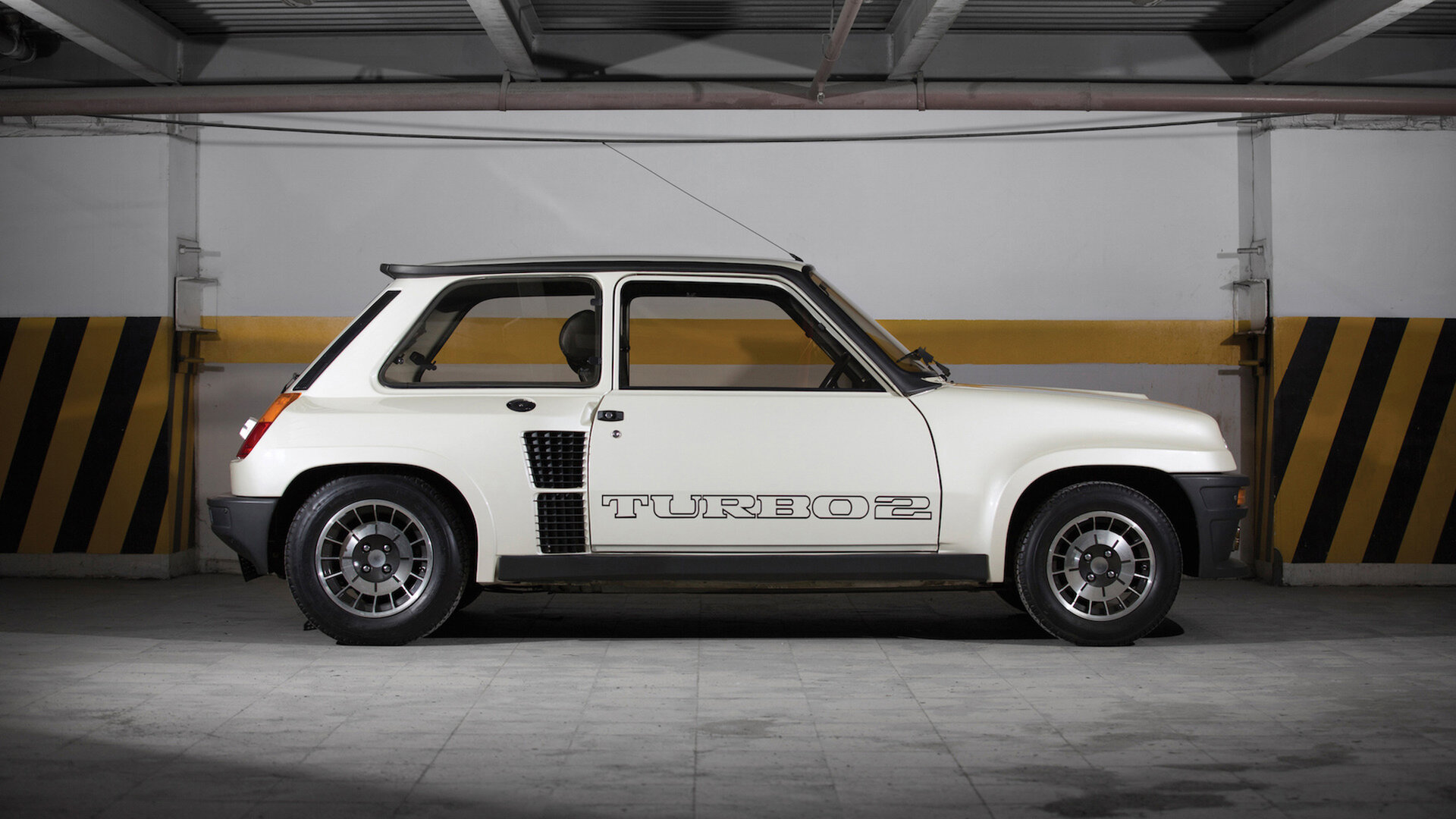
Instagram has been trying to convince me to buy a Porsche recently. I’m not going to but then I got thinking about what car I would buy, if I could have anything, and it came down to a 1982 Renault 5 Turbo 2. I love what we might call ‘neddy’ hatch-backs from the 80’s. The Astra GTE. The XR3i. The 206 GTI. And that Renault is perfection.
I’m sure absolutely no one cares but this era was when my taste was shaped, everything felt like a vision of the future to me. I'm sure it was just my age but everything genuinely looked and felt new. The other day I spent a little time looking back and tracing a path through some of the design that has stayed with me over the years. That has shaped my taste. And of course it all started with Star Wars.
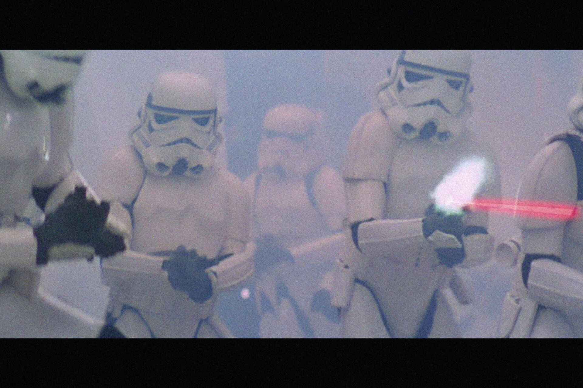
I can hear the groans now. Forty-something white bloke bleats on about Star Wars again. Well, it’s one of my earliest memories, sitting in the Odeon cinema in Derby next to my Mum and my (at the time) best pal Ian and possibly his big brother Philip who I didn’t really like very much. I was maybe five or six years old. The Stormtroopers had just entered the Rebel Alliance ship and I asked my mum if they were the good guys (The Stormtroopers). Yes she said in hushed tones. We all know how wrong she got that but I remember being pretty blown away by their outfits. Not so much Darth Vader, but the guys in white suits. This is a trend that continued throughout the original trilogy, the Snow Troopers. The Biker Scouts. The best uniforms and a very particular aesthetic. One that connects quite directly when I look at that Renault.
I wonder how many choices I have made that were basically defined by my relationship with the bad guy outfits in Star Wars? (And what would a psychologist have to say about that)?
As a slight aside, Grayson Perry in his book The Descent of Man, talks about the similarities between Transvestism and being a biker. The desire for your leathers and boots to match your bike and your helmet. Accessorising basically. I can relate to this whole heartedly. My mountain bike is white, with black bits and I ride in black gear with a few small white logos. My helmet is grey (because I couldn’t get my hands on the right size in black or white). I drive a white car with black bits. Even my dog is black and white.
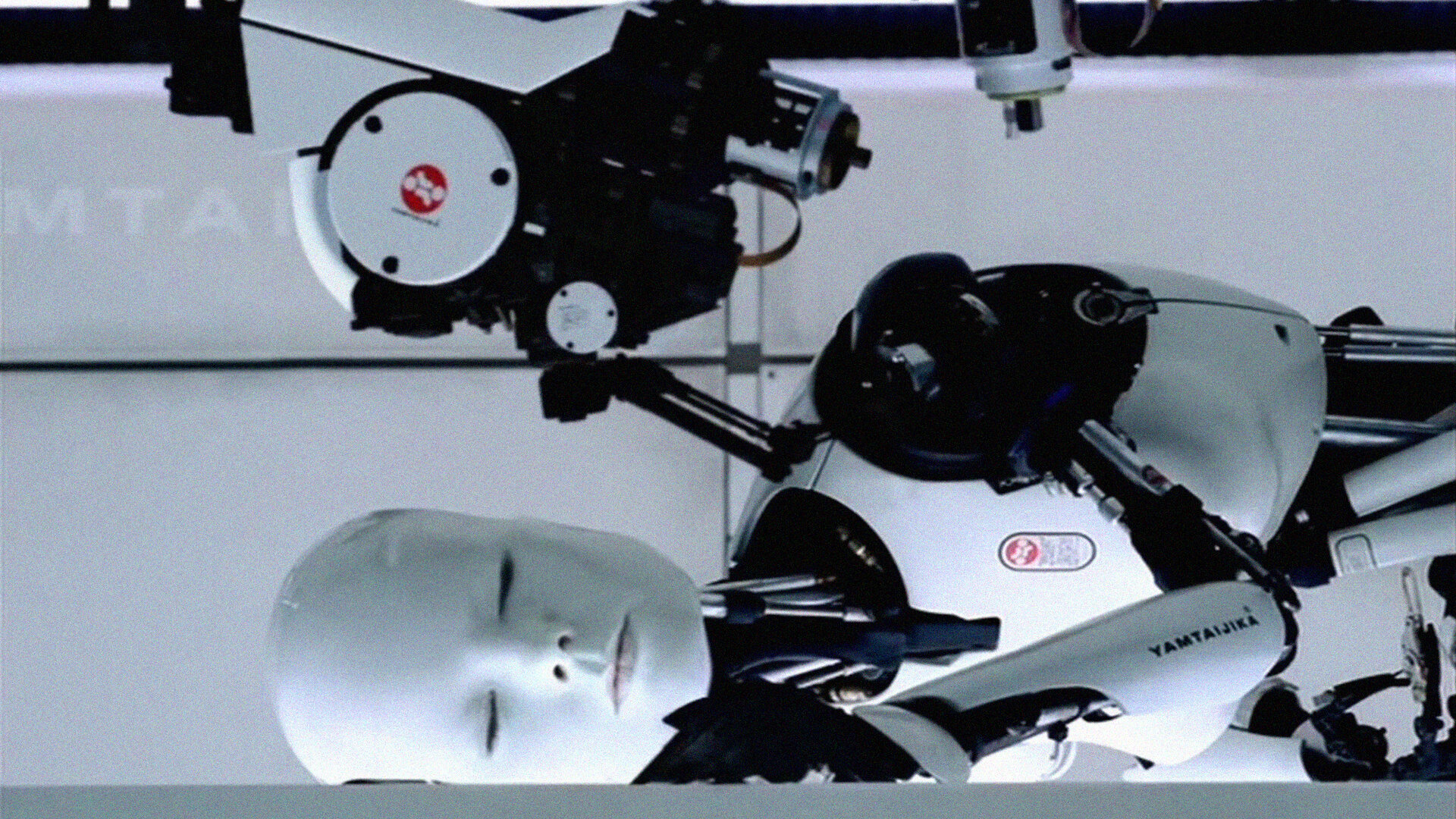
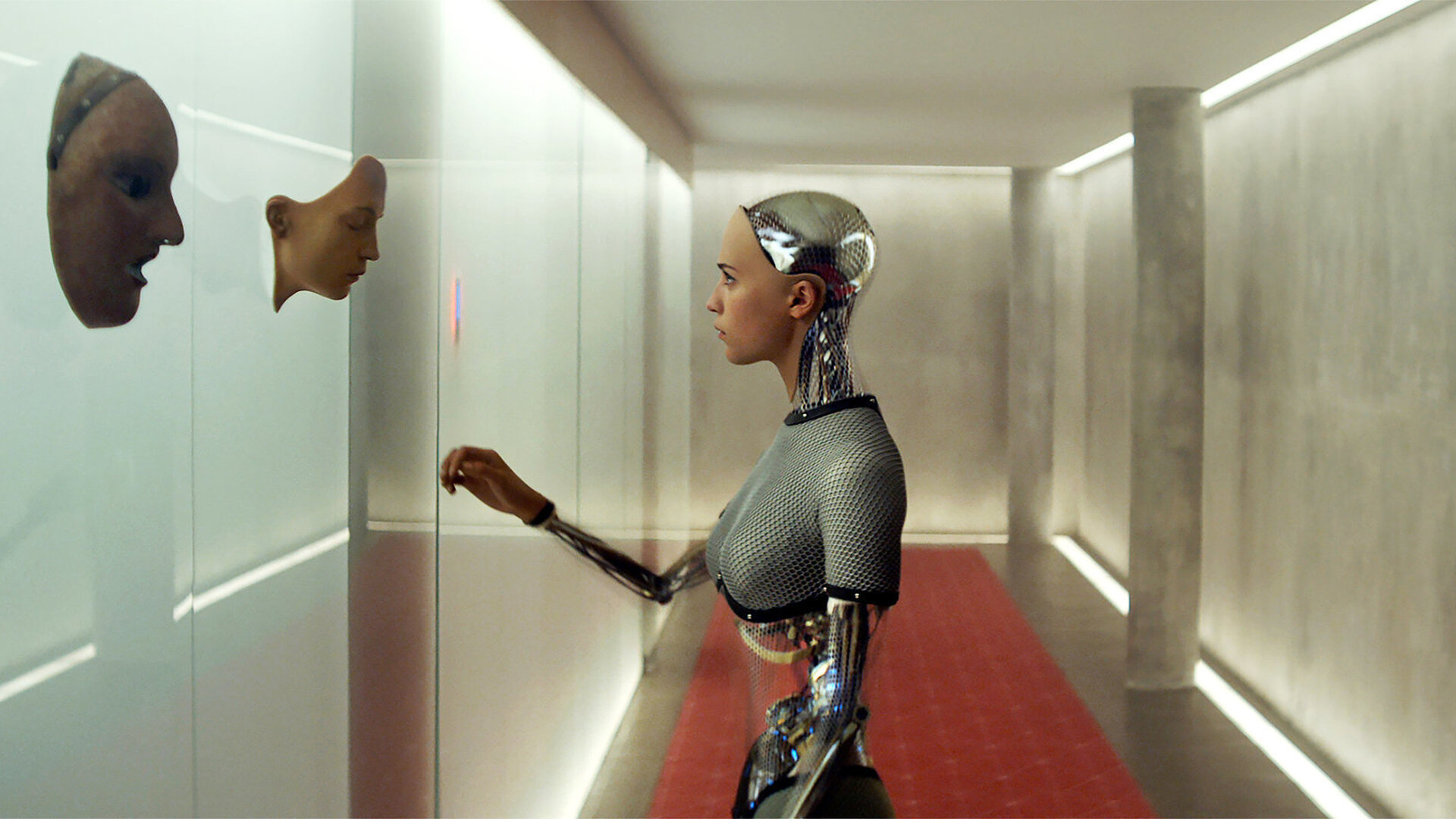
Anyway, I don’t think I’m the only one to fetishise these things. There are a lot of reference points that, for me at least, seem to tie in quite directly to this aesthetic approach. So many examples but how about the Chris Cunnigham video for Bjorks All is full of love and in turn Alex Garland's 2014 film Ex Machina.
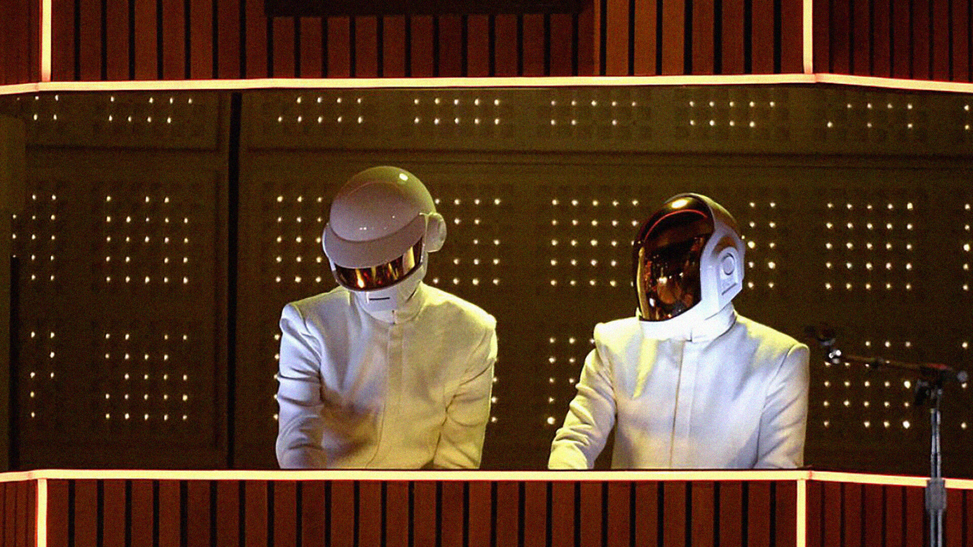
And what about Daft Punk? In many ways the genius of what they did was perhaps not really about the music at all but about that blank faced anonymity. The helmets look different but there is no other way to differentiate between them. No name, no number. The strange glamour of not having to be who they were, instead creating the opportunity to re-invent themselves, over and over, within a very fixed set of parameters, anytime they liked. Who wouldn’t want that? A futuristic mystique.
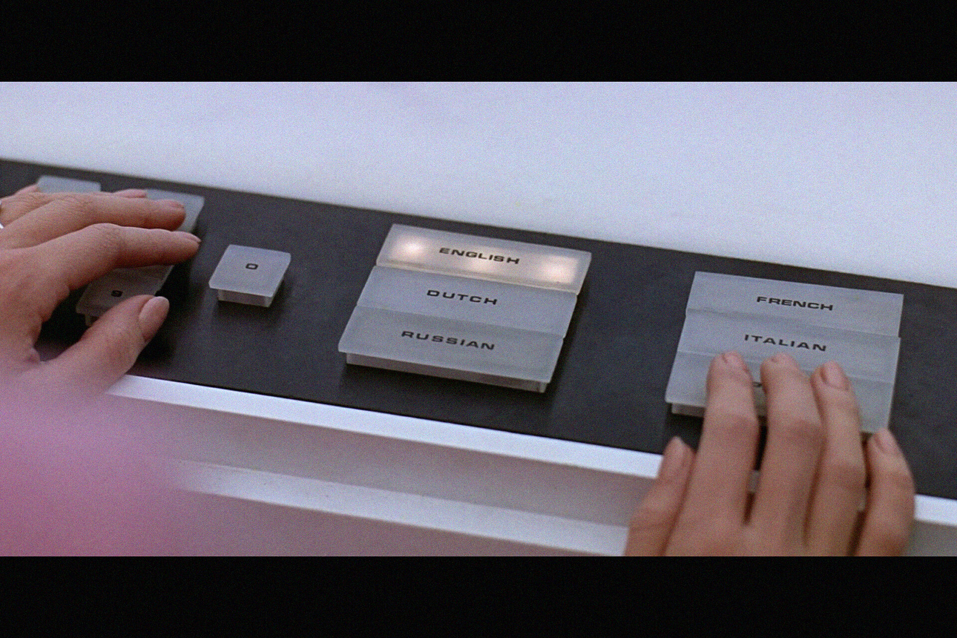
But it wasn’t just the uniforms. There are other aspects of the design language of these films (and other sci-fi from that era) that have left an impression. The on screen graphics. The set design, the signage, the knobs and buttons. There are certain people who will remember how often I would default to Eurostyle Bold Extended at the start of a project in my early days as a designer.
This aesthetic carries through to this day. 2001, THX 1138, Star Wars, Alien, Bladerunner, Moon, Interstellar, Prospect, it goes on. A vision of the future that hasn’t really changed since the late 70’s or early 80’s. It happened in the 50’s and 60’s as well, that idealistic era of early space travel, fins on everything, the Jetsons, post-war, utopian. For a while in order for things to look futuristic they had to look – what we now think of as – retro.
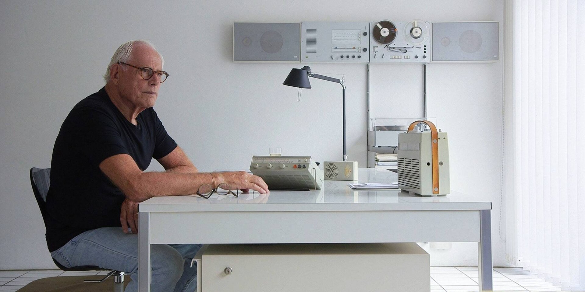
Perhaps it was Dieter Rams who moved us on from rockets and fins. Sure his career spanned four decades but early on some of his pieces, especially at the end of the 60’s, must have looked pretty out there. Even now his work stands up and looks as modern as anything else. It’s not difficult to imagine Kubrick, Lucas and their production designers being influenced as they defined the next future in the 70's. Maybe even what actual space travel looks like now, did those guys at NASA look his way? The fact is that his influence on all of this is probably far bigger but, for me at least, that would be secondary, indirect. In all honesty I hadn’t even heard of the man until I was in my late 20’s and by then the damage was done.
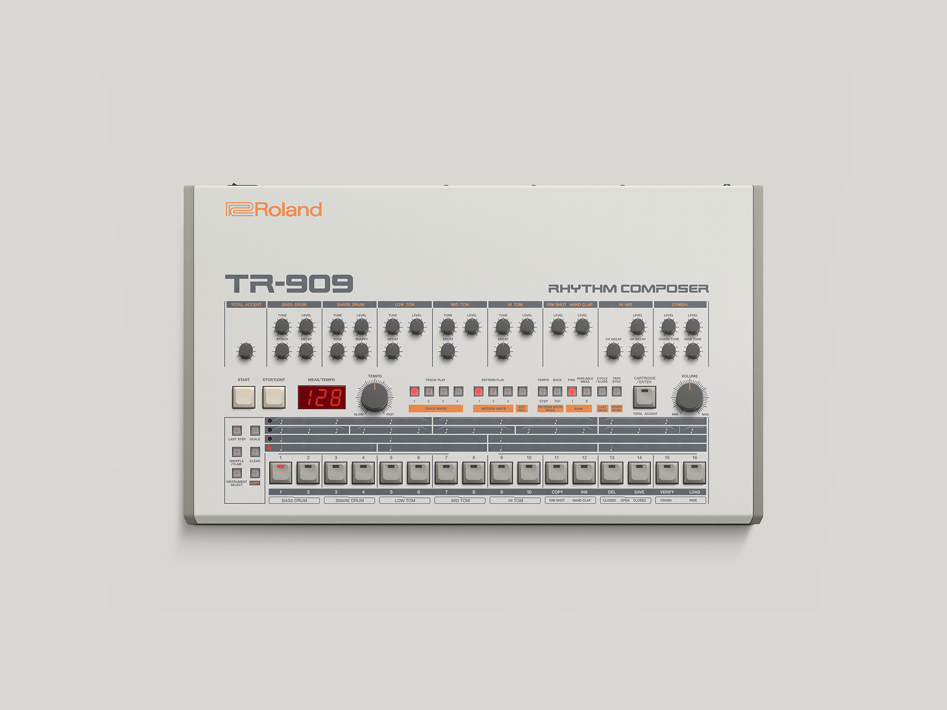
There is a well worn path here, especially around things that need to look futuristic. In the late 90’s and early 2000’s I made electronic music, in fact just before I embarked on a career as a designer it was almost the path that I chose. Then and now the world of synthesizers, sequencers and drum machines was awash with a design sensibility that payed homage to science fiction.
This steps beyond product design as well of course. The 80’s was a period when music was changing rapidly, how it was made and how it sounded. This had to be reflected in how it looked. There was a tendency for over-information. Put everything on there. Detail for the sake of it. Information as texture. This is really evident in the on-screen graphics of sci-fi, heads-up displays that had so much going on it would’ve been impossible to see anything of what was actually happening. Screens with swathes of data, flickering numbers and colours that can only be interpreted by the expert operator. I think this is something that can be tracked through the modern history of Graphic Design, in the UK in particular. I’m thinking about Octavo/8VO and The Designers Republic to name a couple. A sense that information has value, even if you can’t really decipher it.
Peter Saville's renowned sleeve for New Orders Blue Monday is a slightly different example of this kind of thing. Seemingly minimal, die-cut to look like a floppy disk with absolutely no meaningful information on it, just coloured blocks. But it turns out these blocks are actually a code containing the name of the band and the title. This colour code being a device he used a few times for New Order and also Section 25. A means of hiding information within information. Only to be interpreted by an expert operator.
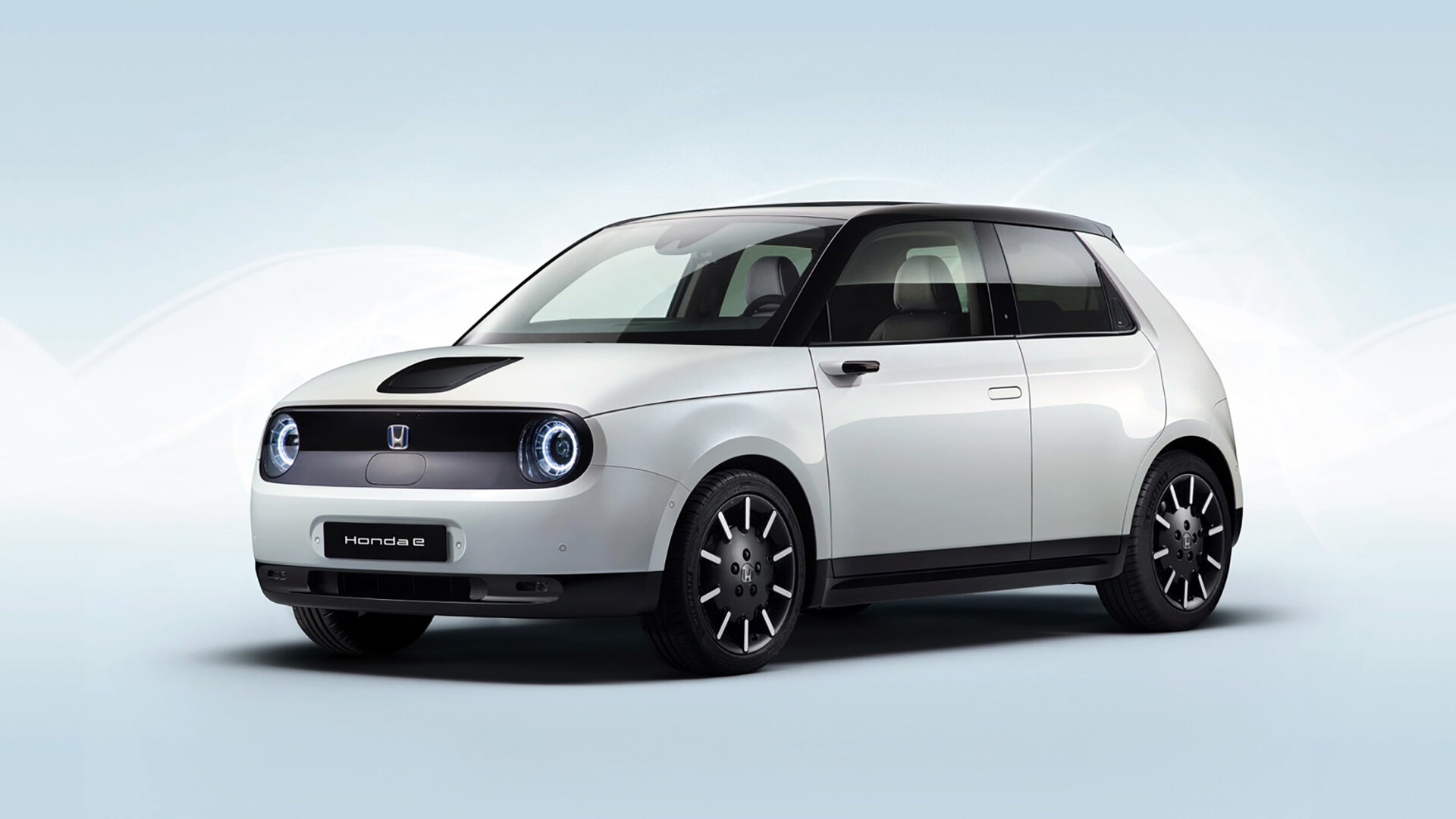
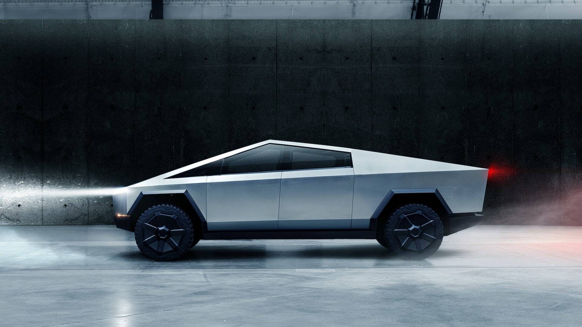
As much as I hate to admit it, the 80’s wasn’t 20 years ago, it was 40. And these visionary pieces of design are now very much in the past but, to me at least, things don’t seem to have really moved on. New things look retro again. The new Honda E certainly seems to take a lot of design cues from an 80’s hot hatch and that Tesla Cyber Truck, well, it’s like it was designed by a 9 year old in 1982 who had been asked by their teacher to draw a car from the future.
And I’m thinking about Apple products, arguably the pinnacle of modern design just now (certainly what everyone else is ripping off) but really not doing anything new visually. I have a new Apple Watch that would not look out of place on the wrist of a character in 2001 A Space Odyssey. Is it because people around my age are designing all the new stuff? Or is it something else? There is certainly innovation around functionality. Perhaps it’s just that this is the new frontier. A car that can drive itself. A watch that can tell you if you’re about to keel over and will call an ambulance when you do. Is innovation driven by information now? Or maybe, more cynically, that desire to collect data. Of course incremental innovation sells more units. Series 7 just a little better than series 6.
I’m not really complaining, I love the way all of this stuff looks (well, not that Tesla). But I am wondering where the next vision of the future will come from. It feels like we really need one. As the Dystopian fantasies of Bladerunner or Mad Max begin to become a reality for some then, understandably, we aren’t so concerned with how the future will look, more that we will have a future at all. We are constantly told what is bad for us, too much of this or that, not enough of the other. We need help to stay on top of it all but that needs a shape, to be beautiful and to truly take us forward.
Utopias are usually miss-guided and often fail but sometimes a bit of utopian optimism is a good thing. How COULD the world be rather than how WILL it be. I’ve no idea how I got here from the Renault 5 Turbo but if they re-made that with a decent electric motor and a good sized battery I’d buy one.
Next article
