09.10.23 / Daniel Ibbotson
In Rainbows
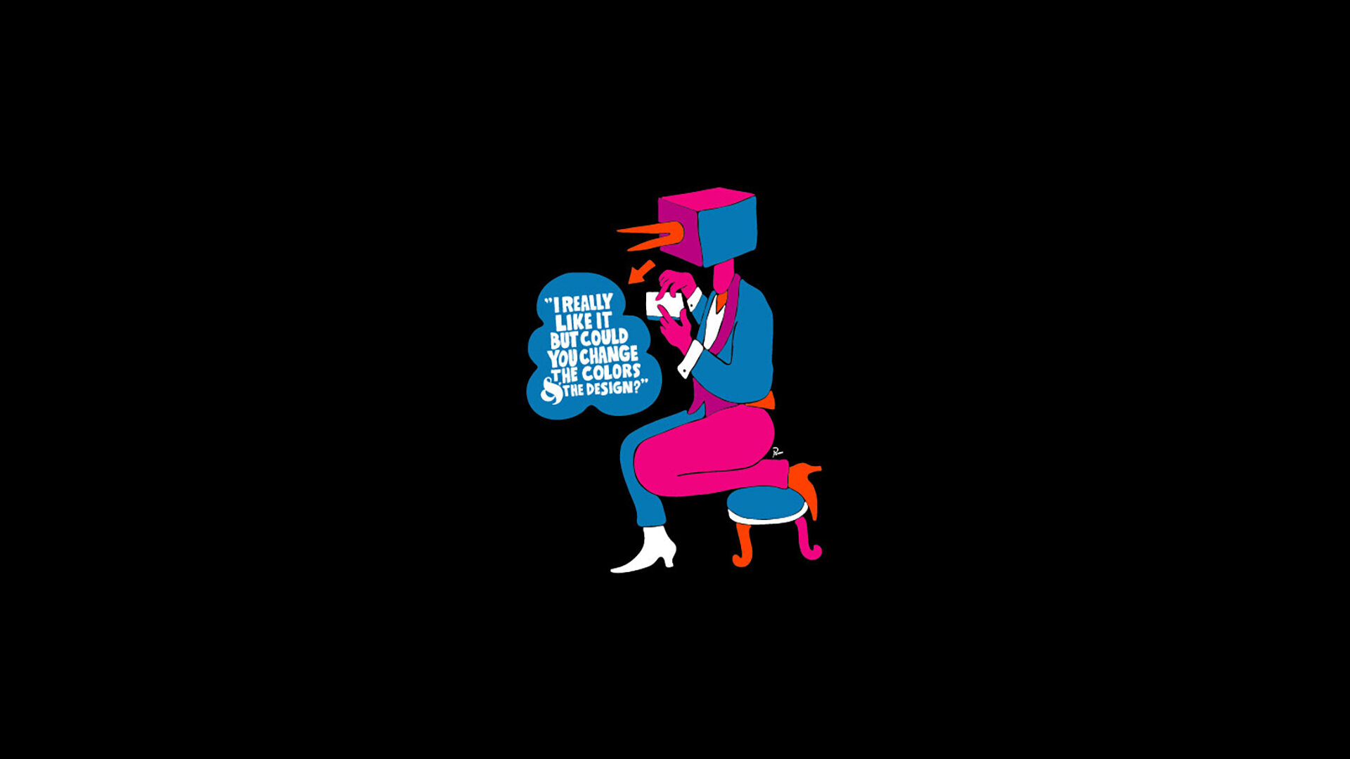
A few thoughts on how brands are using colour to open up markets and sell more stuff to more people.
Some of the longest meetings I’ve ever been involved with have been about colour. Always polarising, colour is something everyone has an opinion on and feels qualified to talk about. Historically the role colour has played for brands has been pretty straightforward. Pick a colour. Stick to it. Tell everyone it’s yours. Coca Cola, EasyJet, Tiffany & Co.
At the moment it seems like colour is a new battleground. Particularly for all of those traditionally more austere Northern European or North American brands that are trying to diversify their consumer base and tap into emerging markets around the world who want more than Black, Grey or Silver.
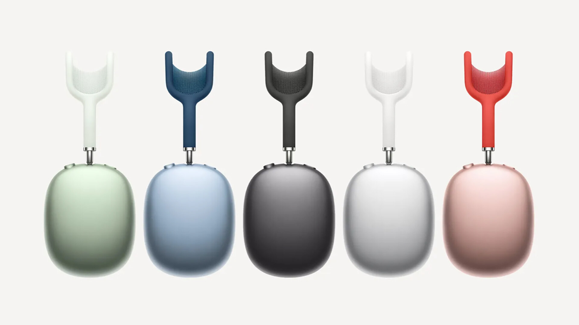
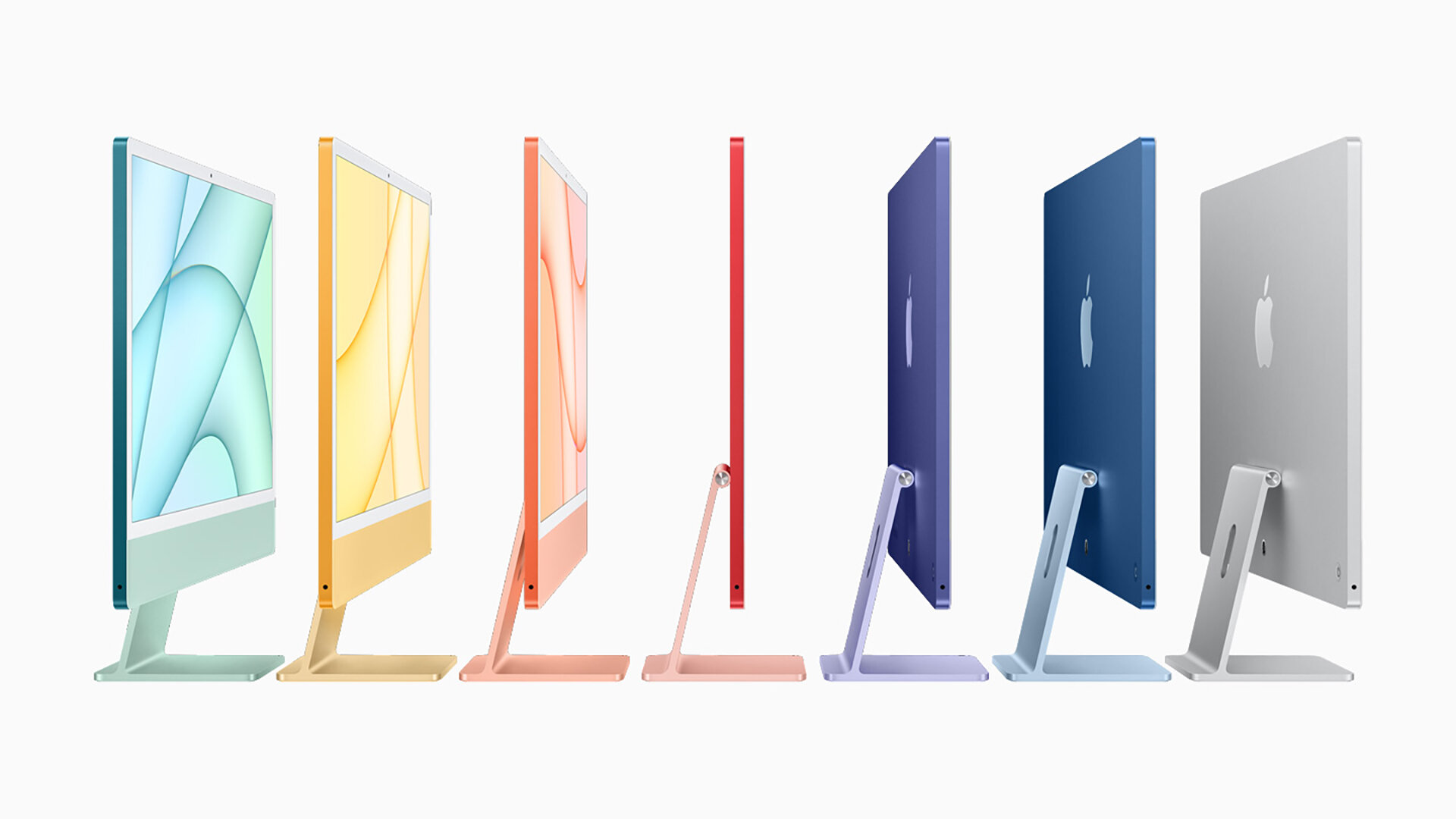
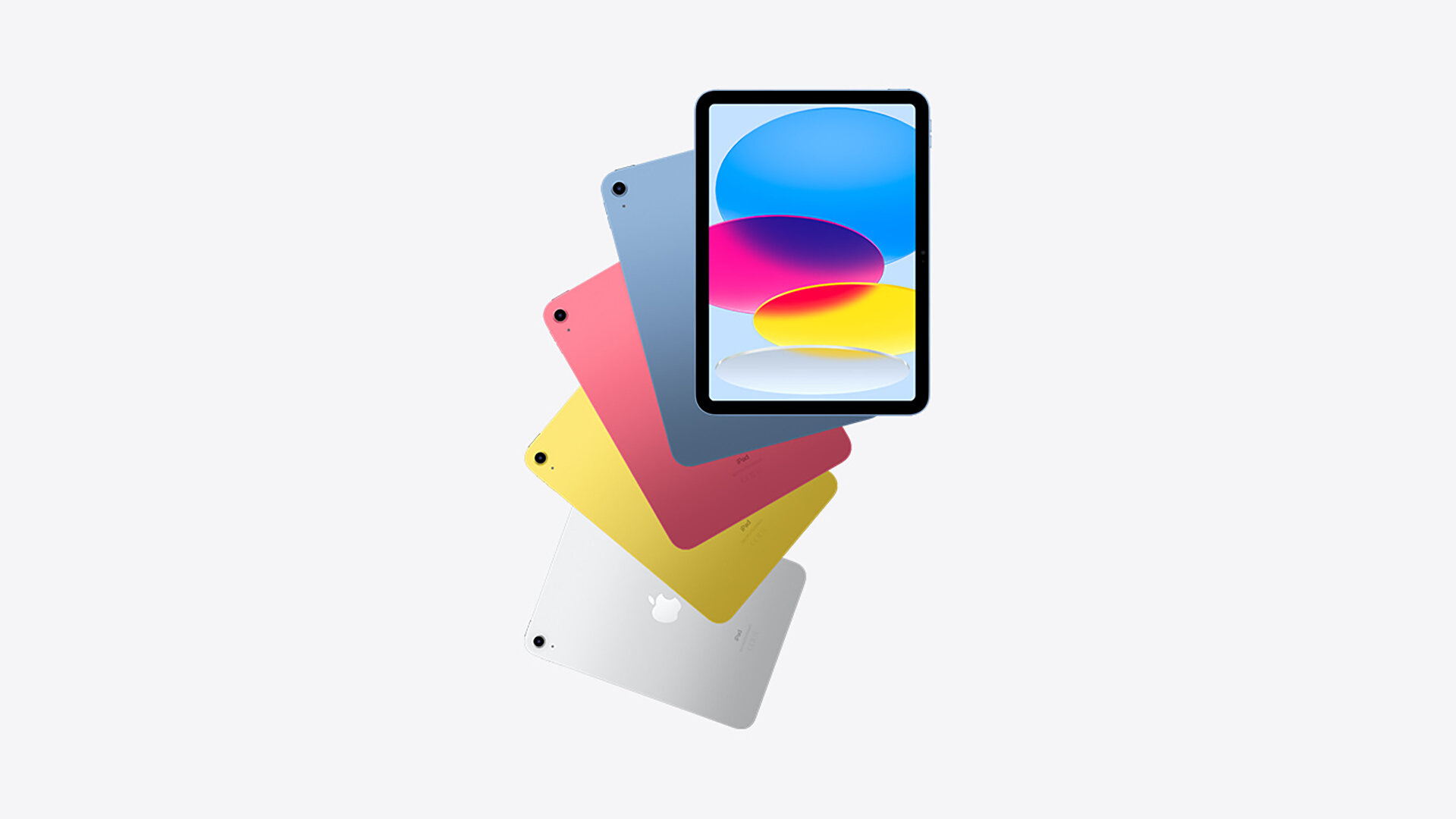
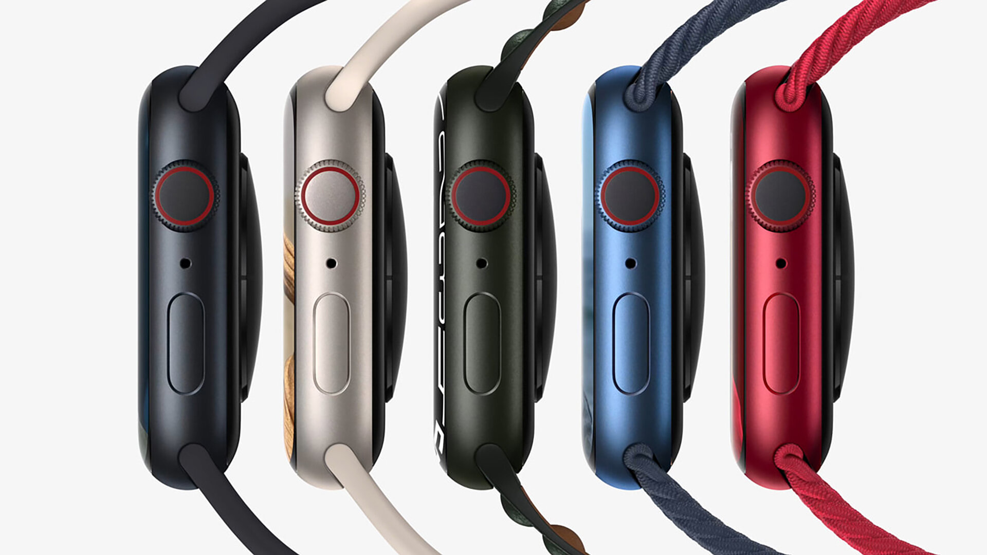
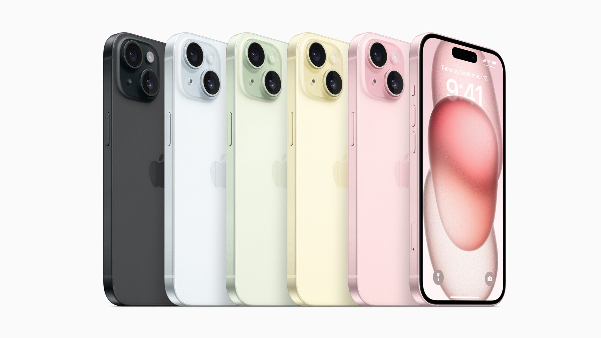
As usual Apple are a prime example. The Mac aficionados were up in arms when all of a sudden you could buy A. Gold. iPhone. But from the perspective of selling product it makes sense. In 2023 almost everything is presented as an extension of our own unique and interesting personality.
‘How can I fully express myself if my phone is the same colour as their phone? I’m not grey, I’m gold’!
Of course I’m being a bit facetious here but there are many cultures around the world where colour plays a more important role than it does for us monochrome Europeans. India, Africa, China. All massive emerging markets where colour has a cultural and personal significance, a meaning.
That’s not to say that a changing attitude to colour is necessarily becoming part of the brands core identity, in fact for many product driven brands colour is maybe slipping away at this level. The brand ID, a vessel through which things have space to change. But it is becoming a means of expression in a more flexible way than before. More like the fashion world where colour changes with the seasons.
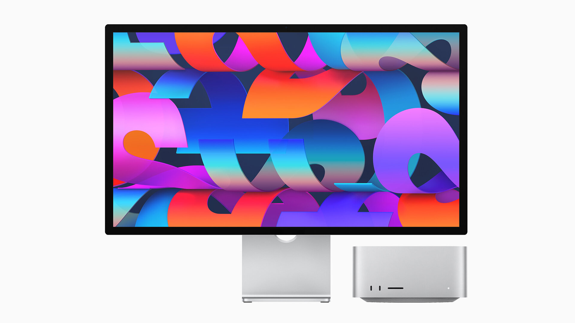
Apple uses colour to sell more units of their products to wider and more diverse markets, they also use it to drive upgrade culture. I’m tired of Starlight, I think I’m more Midnight now. This has proliferated through all but their most professionally targeted products. Beyond this, colour in the form of what we might call pattern has also become a kind of secondary brand component, even with the top of the line MacPro Display where colourful designs are used to showcase quality and reinforce the Appleness of the product.
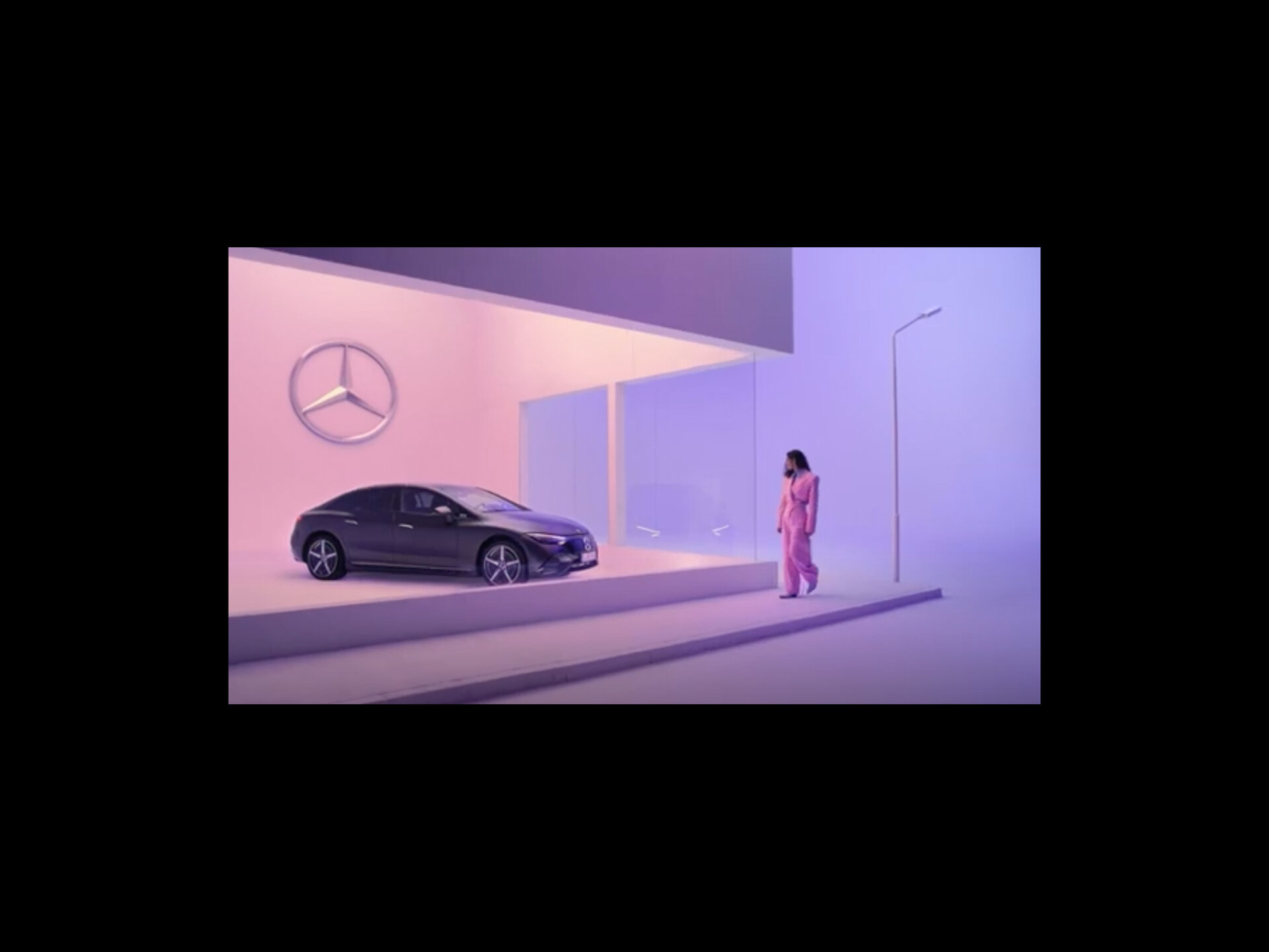
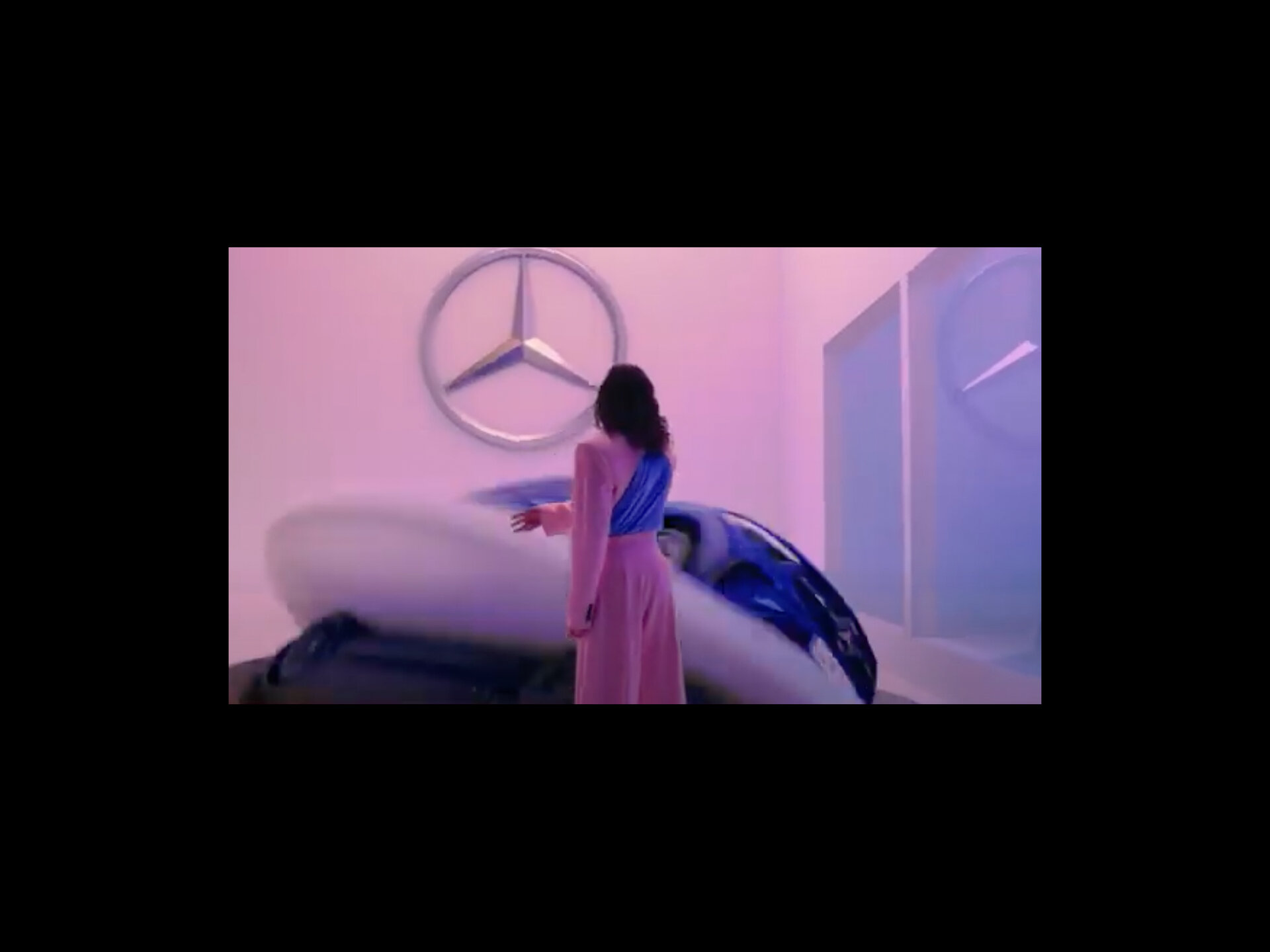
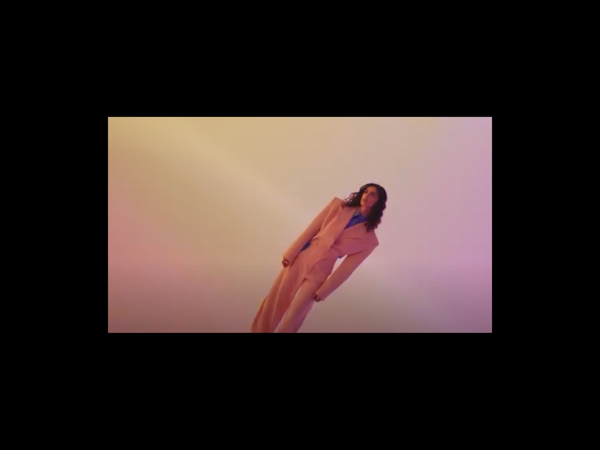

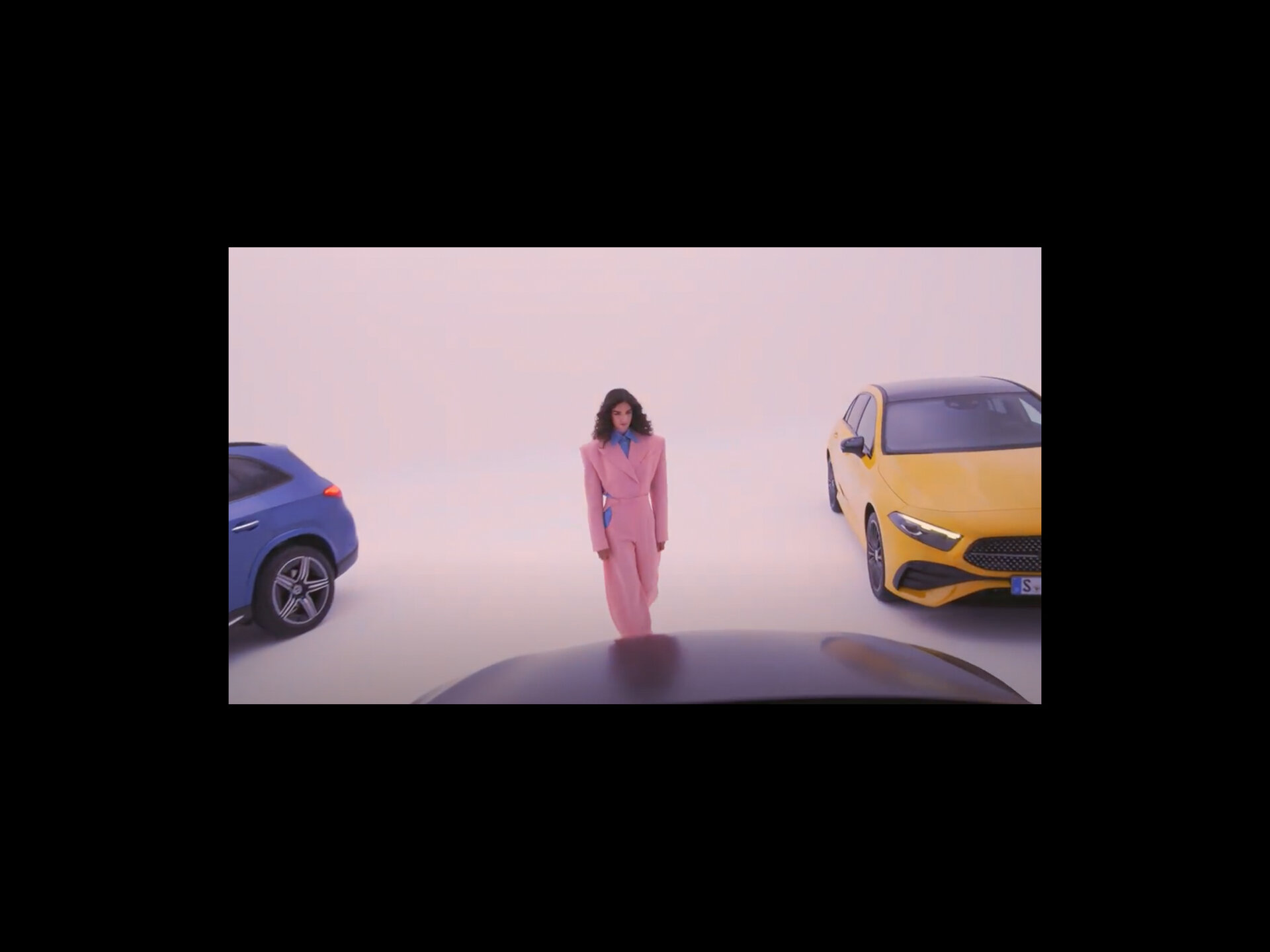
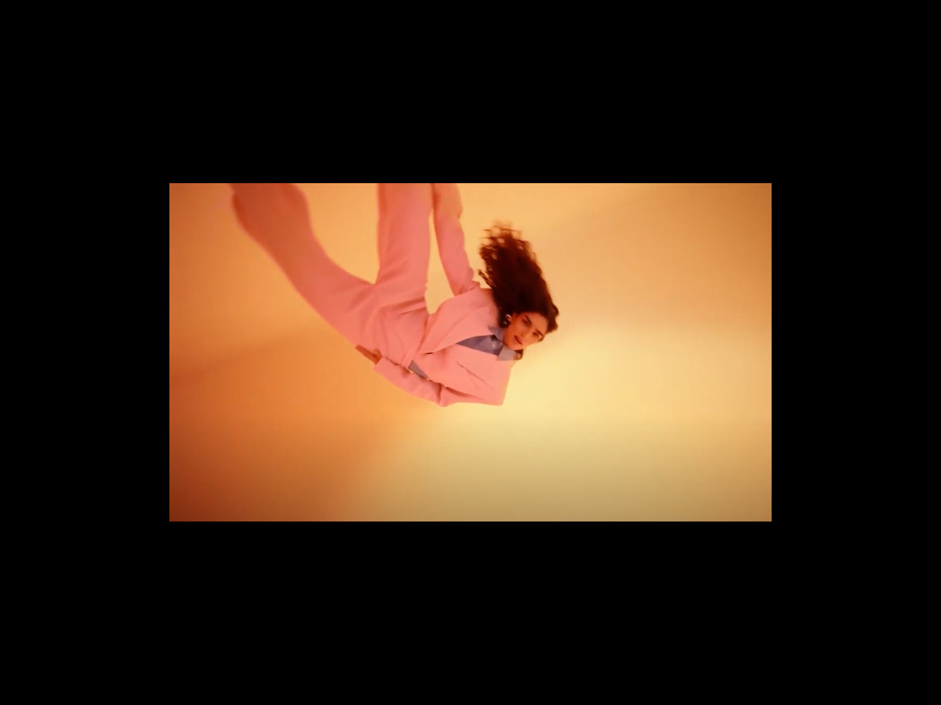
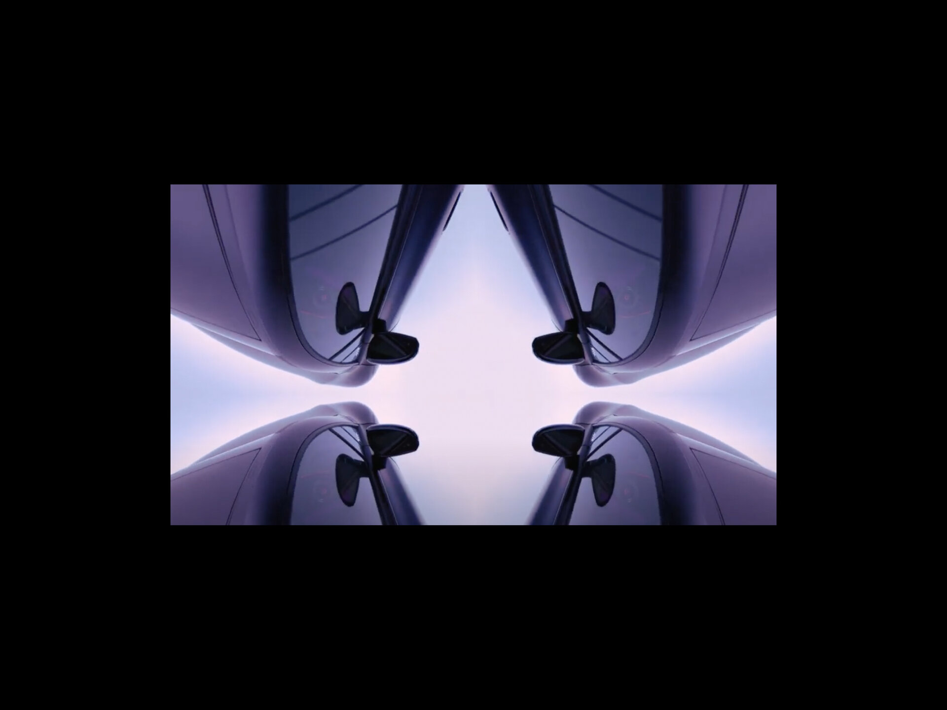
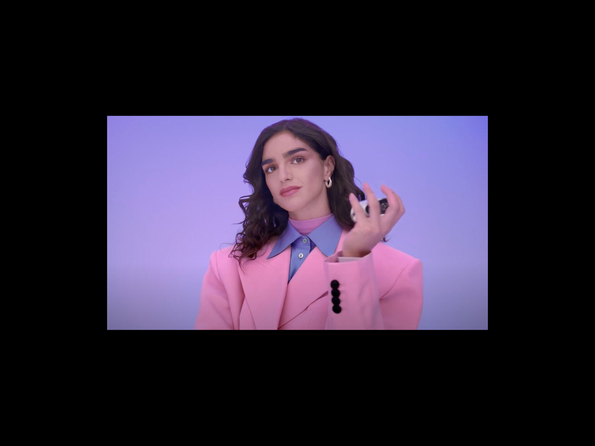
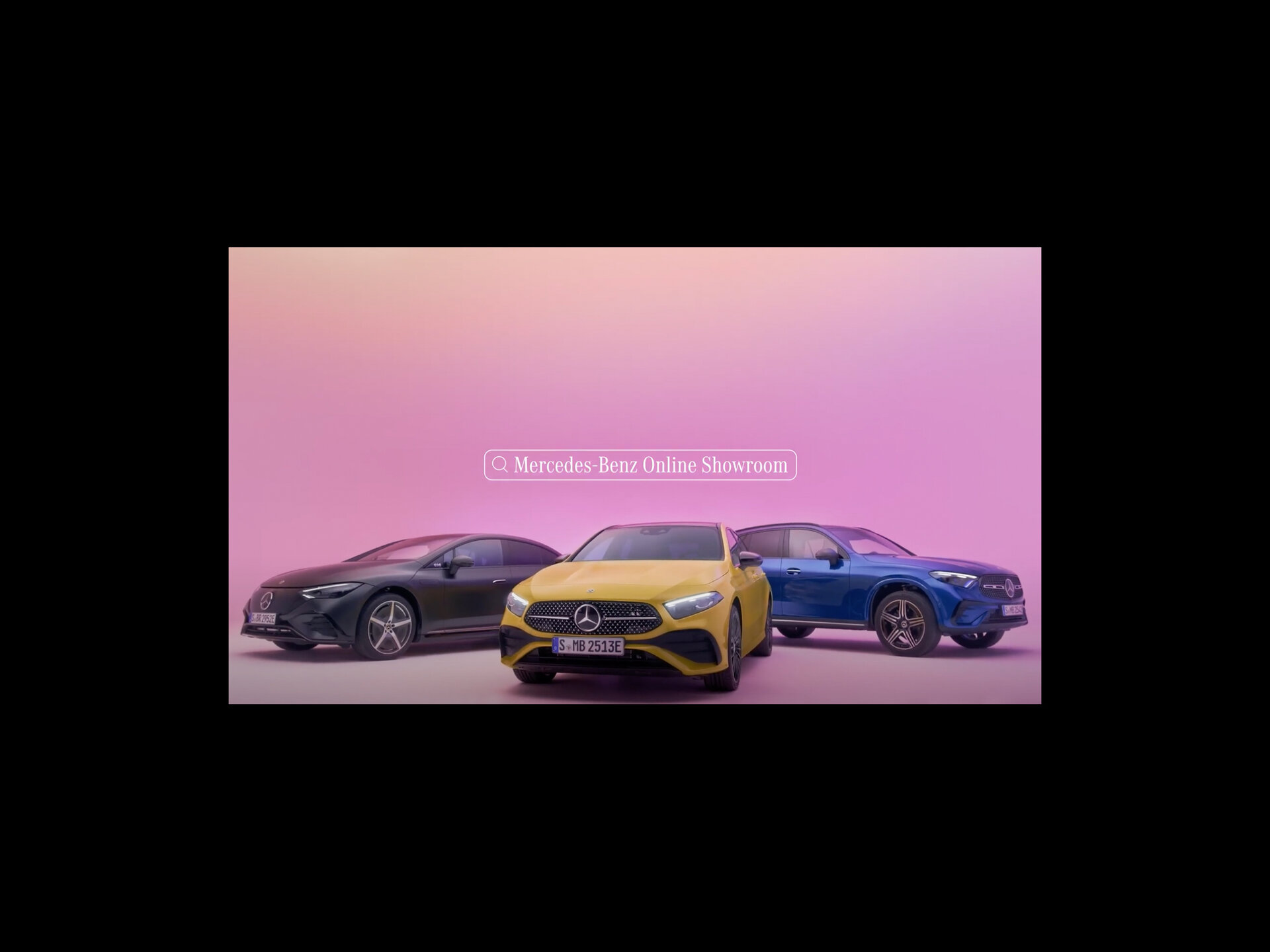
Apple aren’t the only ones playing this game. A recent Mercedes TV ad shows a young woman selecting a car in a way that is a little like flicking through garments in her wardrobe (or choosing a drink from a vending machine)! Again this idea that a product becomes an extension of our own personal expression, something we change based on how we are feeling, what we are wearing or maybe how we want others to perceive us. Traditionally not an attitude that aligns too well with a car, a serious investment. But perhaps with the development of leasing and subscription models then we’ll see people changing their car for more whimsical reasons.
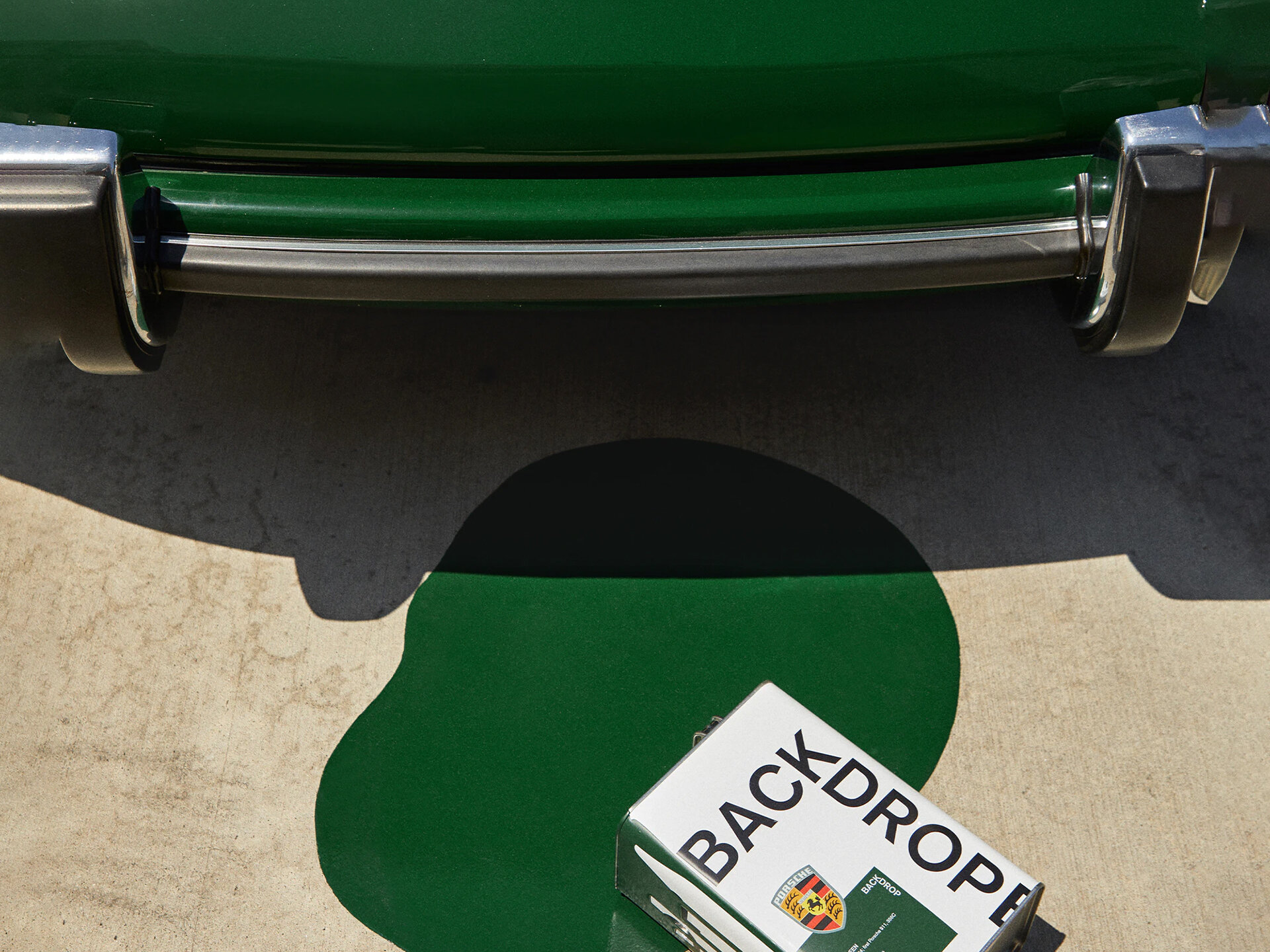
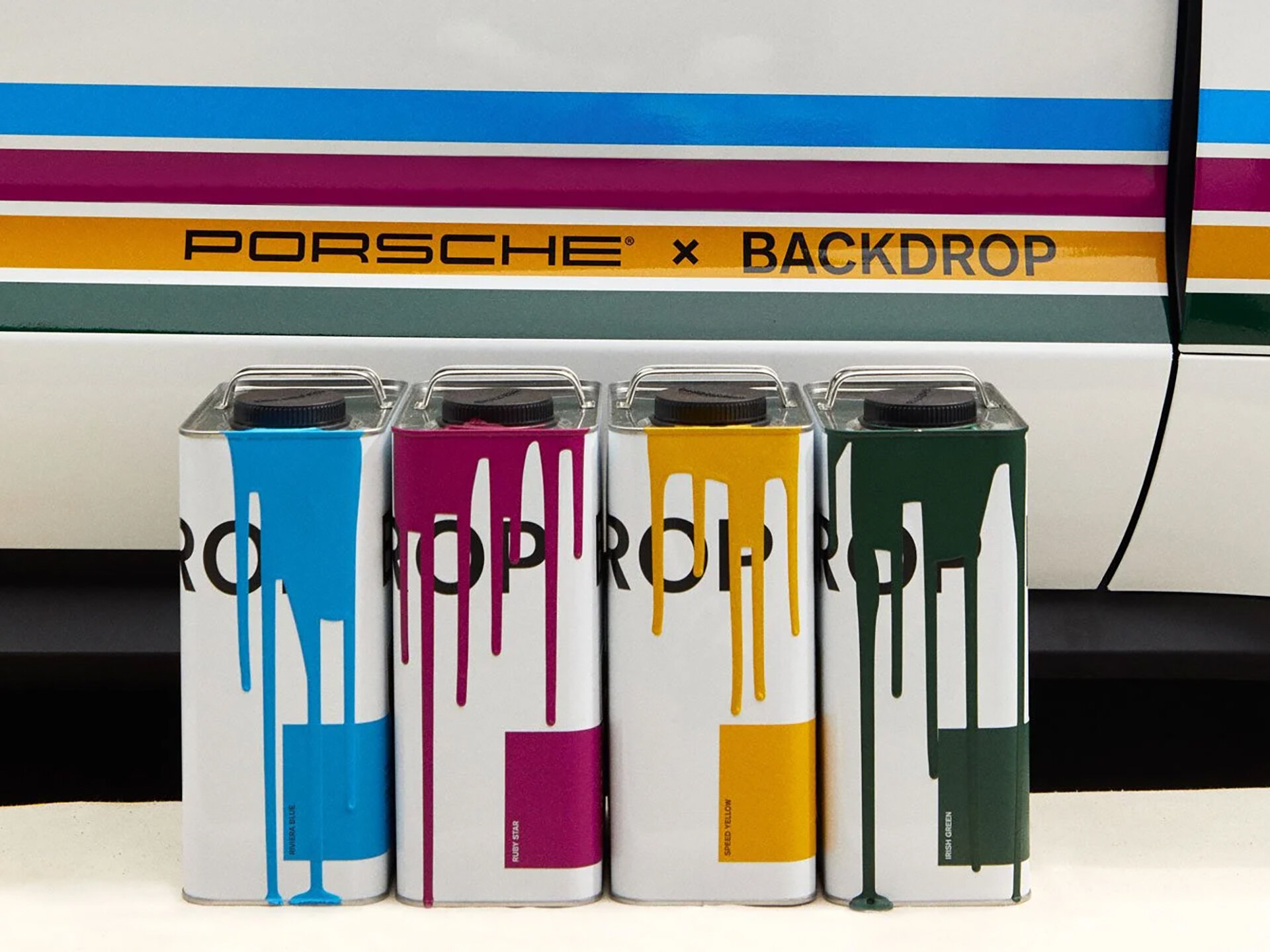
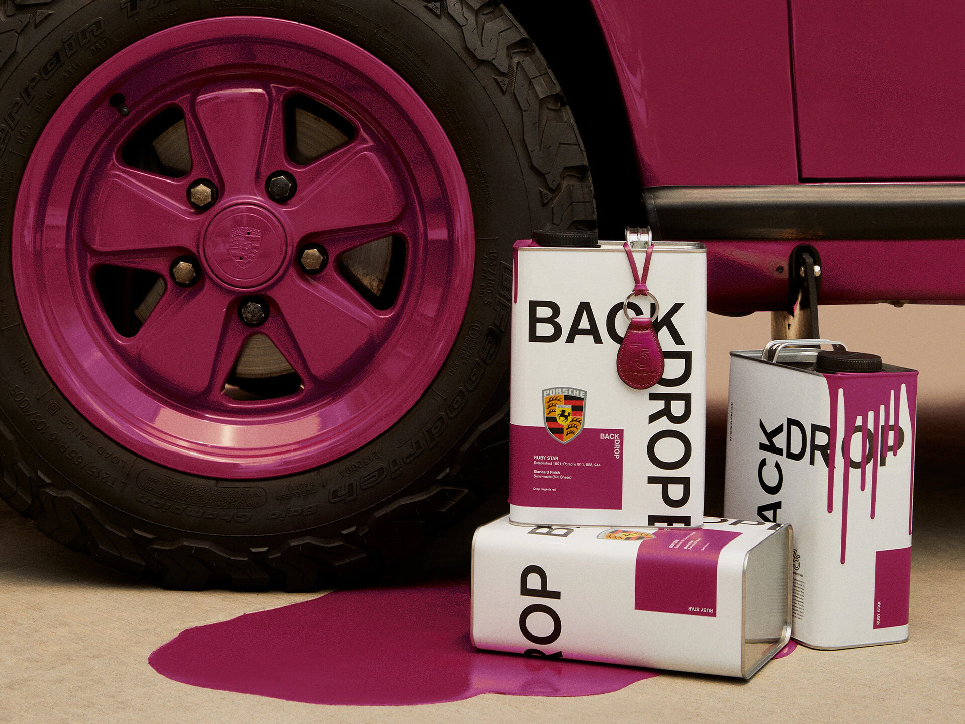
There is actually quite a lot going on with colour in the automotive space at the moment. Porsche, despite its roots, has never been a stranger to the use of strong colour. The recent collaboration with paint manufacturer Backdrop has taken this a step further. Now you can reflect the colour choices you made for your classic 911 in your home with a range of iconic paint colour references from the archives. Almost the complete opposite to this is their Paint to sample scheme where you can have your new car painted to match pretty much any sample you care to supply. The ultimate in customisation, a bold route for anyone who has the confidence to go their own way rather than follow the curated taste of the brand itself. And going your own way is perhaps what all of this is about, or at least that’s how the brands want us to feel.
But all of this is happening at the higher end of the markets. If I’m on a budget then I get less choice or maybe even no choice at all. Is colour becoming a luxury? Maybe it always has been.
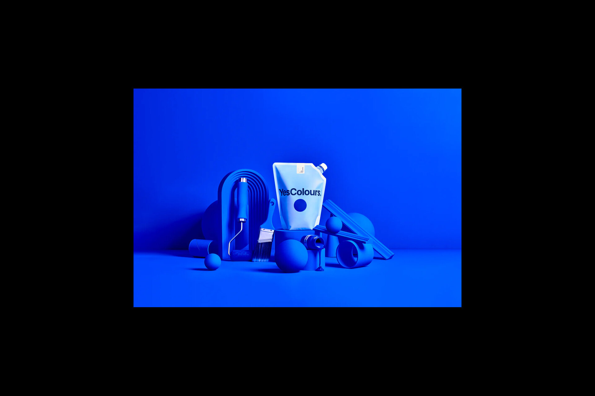
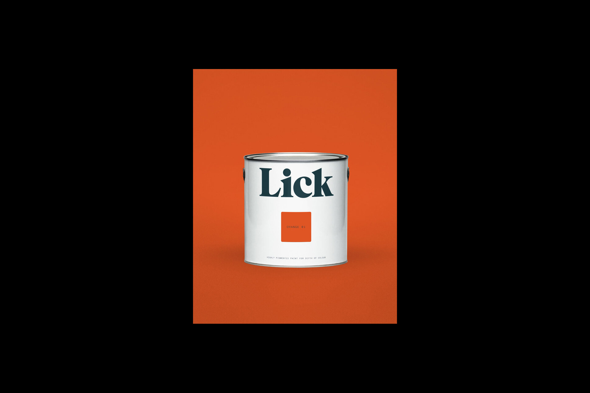
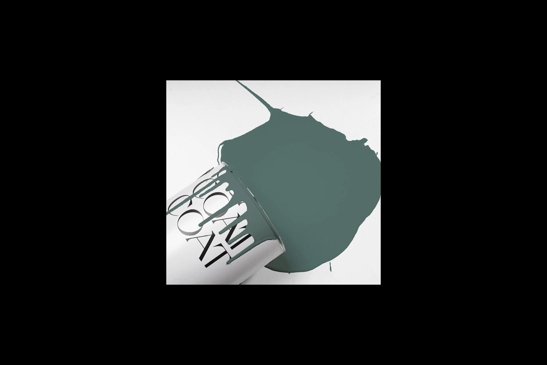
Colour is a funny thing, even though everyone has an opinion it’s not always the case that you have the confidence in that opinion to truly go your own way. For some people making a choice can be hard, and of course there are literally millions of colours, some so close it’s hard to tell them apart. Perhaps that’s why people lean so hard on brands like Farrow and Ball. They have created the sense that their taste is the way to go, their authority on the subject is to be trusted. The interior décor market is saturated (sorry) with new, niche paint brands like Lick, Coat and Yes Colour, all purveying a curated palette of colours with suitably esoteric names to help you align yourself with their offer. Ditch the tie, All inclusive, Algorithm. Your guess is as good as mine.
Some of those long meetings I mentioned earlier have started talking about a client’s dislike for the colour we had suggested for a project. Only to conclude, hours later, with the decision that yes, that is the right colour after all. It’s hard to commit to a single colour because we know our feelings about it will change. So more and more we need options. A palette. Less of a commitment?
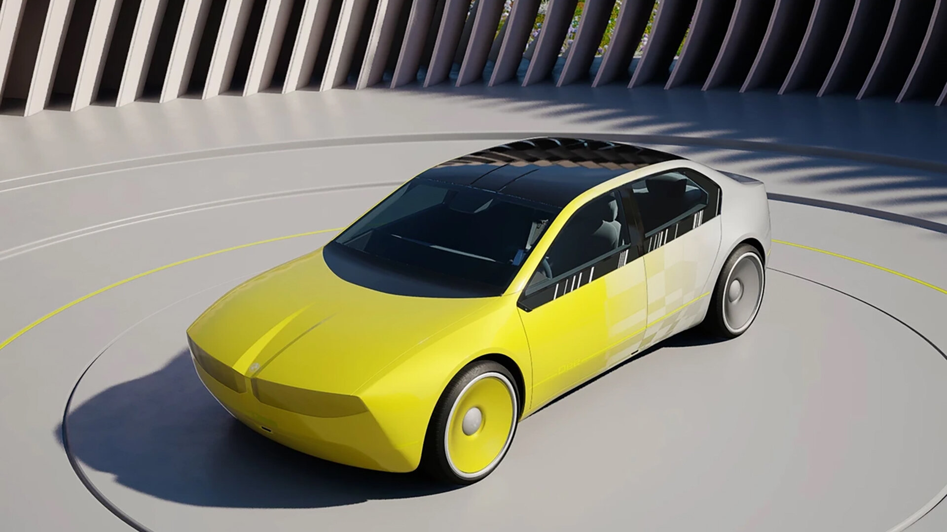
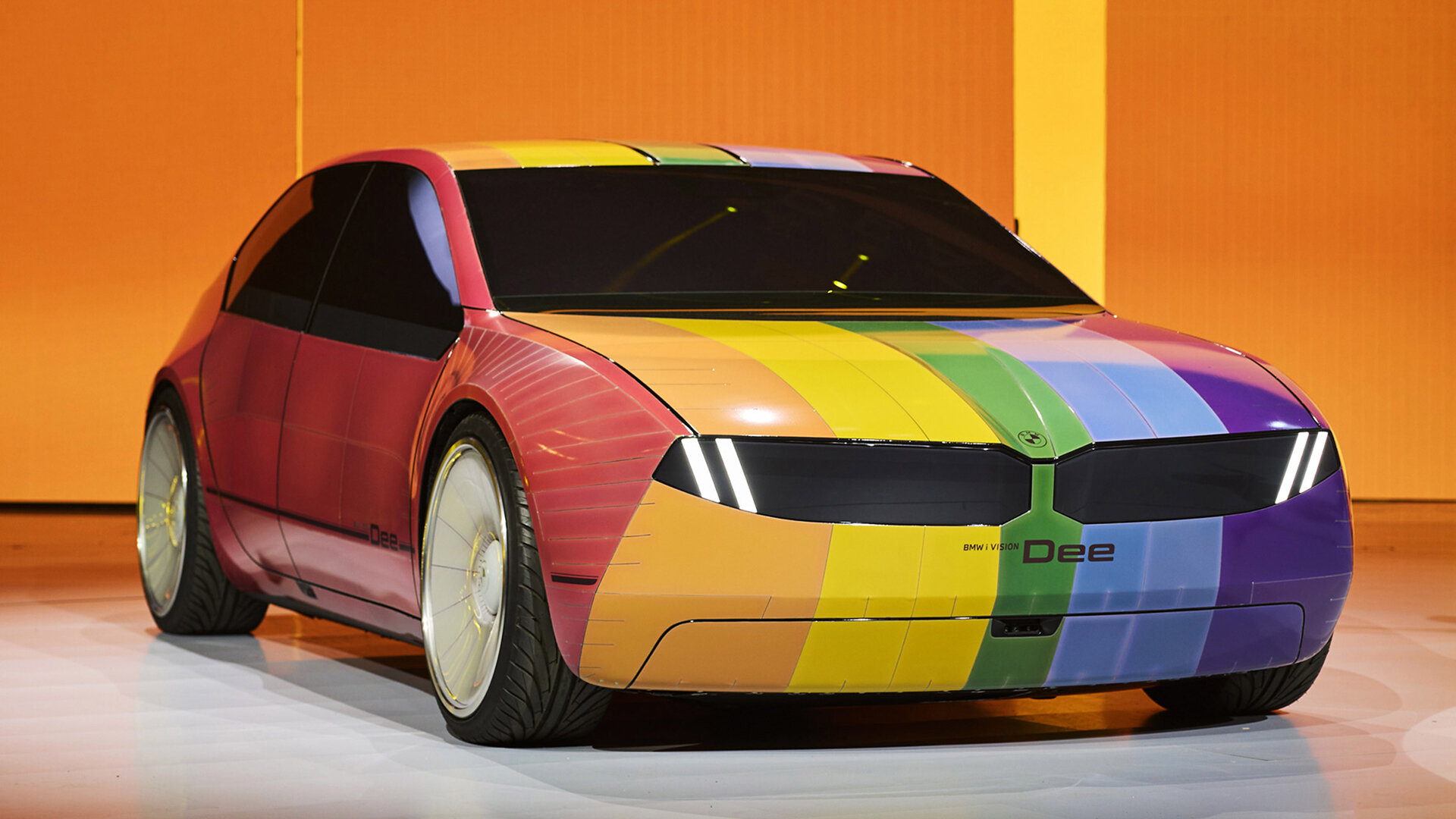
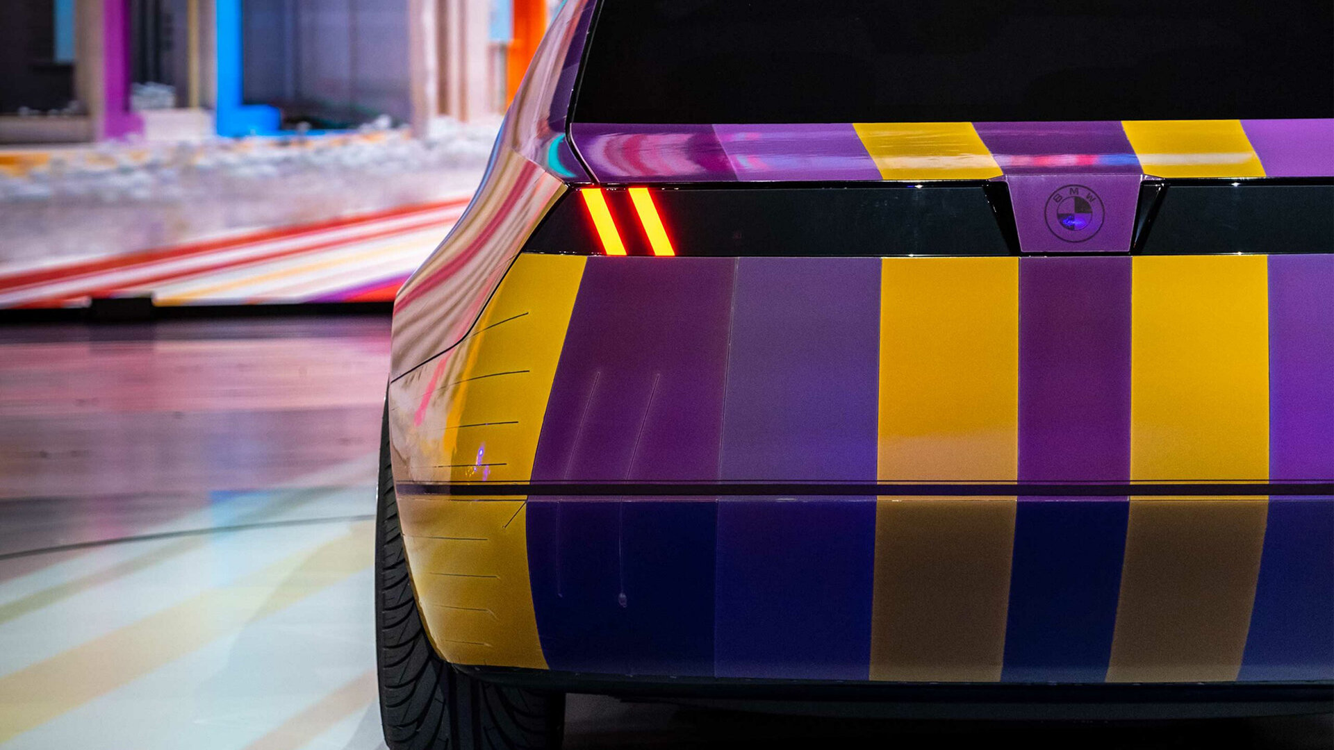
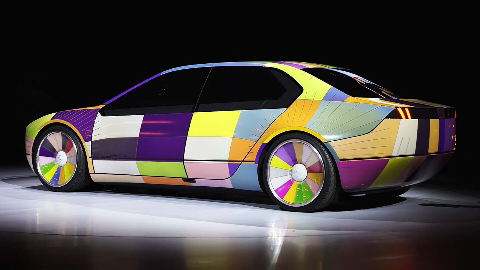
Again in the automotive space BMW has an interesting project in the pipeline with their Dee concept vehicle. Essentially a car wrapped in a screen that allows you to put any colour or design all over its surface. A gimmick? Perhaps, but we have created the demand for this. In a way it’s a logical conclusion to this quest for self expression through the things that we own. Imagine if you could control it from your phone, the fun you could have in a traffic jam. It’s a far cry from Henry Ford’s famous quote.
'The customer can have any colour they want as long as it's black'.
Maybe this is consumerism gone too far. Maybe it’s a genuine innovation that will change the way we think about accessories of all kinds and our need to change and evolve the way we present ourselves. From a certain viewpoint if you can easily change the thing you already have then you don’t need to buy a new thing. But that isn’t the way brands work is it. We align ourselves with the brand that we feel reflects our own personal values. It’s interesting seeing colour becoming a more dynamic factor in that process.
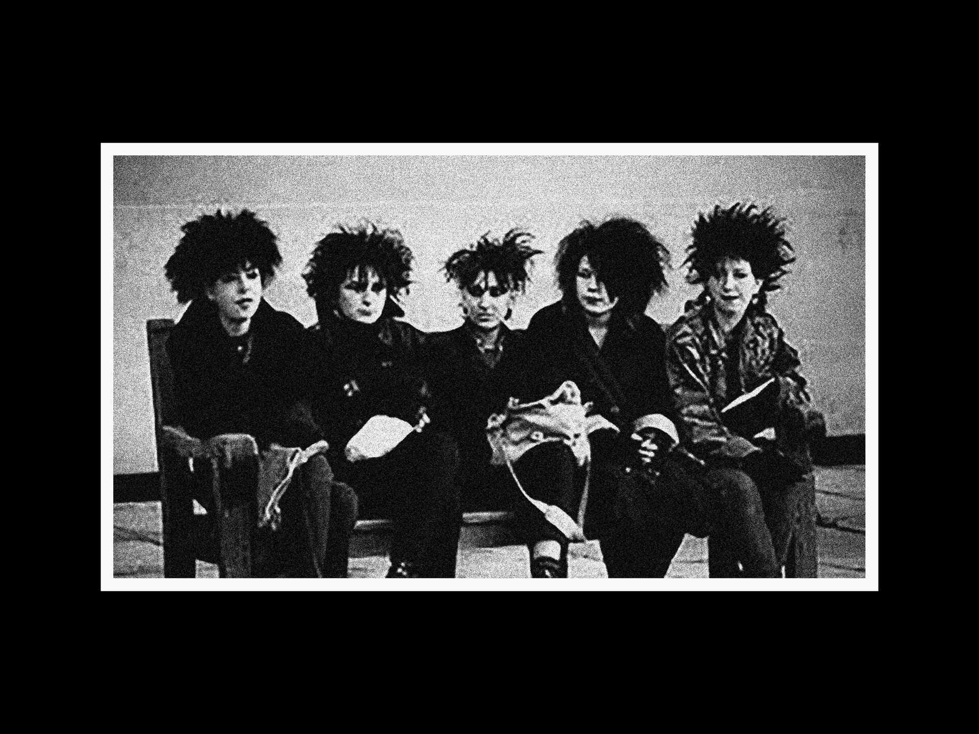
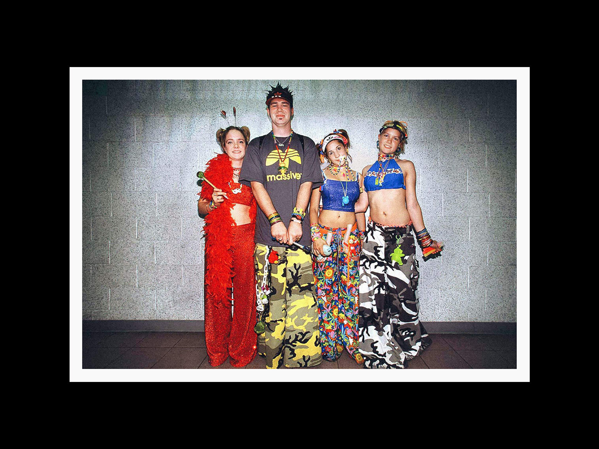
So does all of this mean anything? People have always used colour to express themselves. The Goths and the Ravers. Perhaps this is nothing more than marketing. You make a great thing and everyone wants one. Then they get sick of the fact that it only comes in black and your competitors have made a very similar thing that comes in blue as well. So you make your great thing a little better but also make it in black, blue and red now. And so it goes on.
Up here in the north perhaps we forget about colour. During the six months of winter in a northern city then we pretty much only see black and grey, some blue and white if we’re lucky. Of course we can get out of the city and witness the full richness of Autumn or Spring, but that’s not always something that people can do.
Colour is powerful. Perhaps, if this is anything at all, then it’s an opportunity to open up to some of the more vibrant cultures out there. Working with clients overseas has certainly opened our eyes to different approaches and attitudes.
A world where colour is a living, breathing thing.
Next article