30.05.24 / Daniel Ibbotson
About (type) Face
Some brief thoughts on why typefaces are such an important part of a Brand Identity.
We recently had a client ask us about switching their brand typeface from one that we had been using for around five years – since a significant re-brand that we worked on with them – for something freely available. Not an unreasonable request at all, especially if the saving in licensing was worthwhile. However in this case the cost to make that change, across all of their platforms and collateral, would have far exceeded the small licensing fee for the user seats that the company required, so in reality it didn’t make sense.
Of course though there is a whole other angle to this. To be fair they were being pushed towards this route by a digital marketing agency with their own agenda but it did provide us with an interesting opportunity to re-visit the brand identity and system and to examine if it was still fit for purpose.
A great deal of consideration had gone into the typographic approach for this particular client. The solution was a very particular and defined typographic style that underpinned the characteristics and values of the brand. The alternative face that had been suggested simply didn’t function in the same way or at the same level, it would have seriously compromised the message.
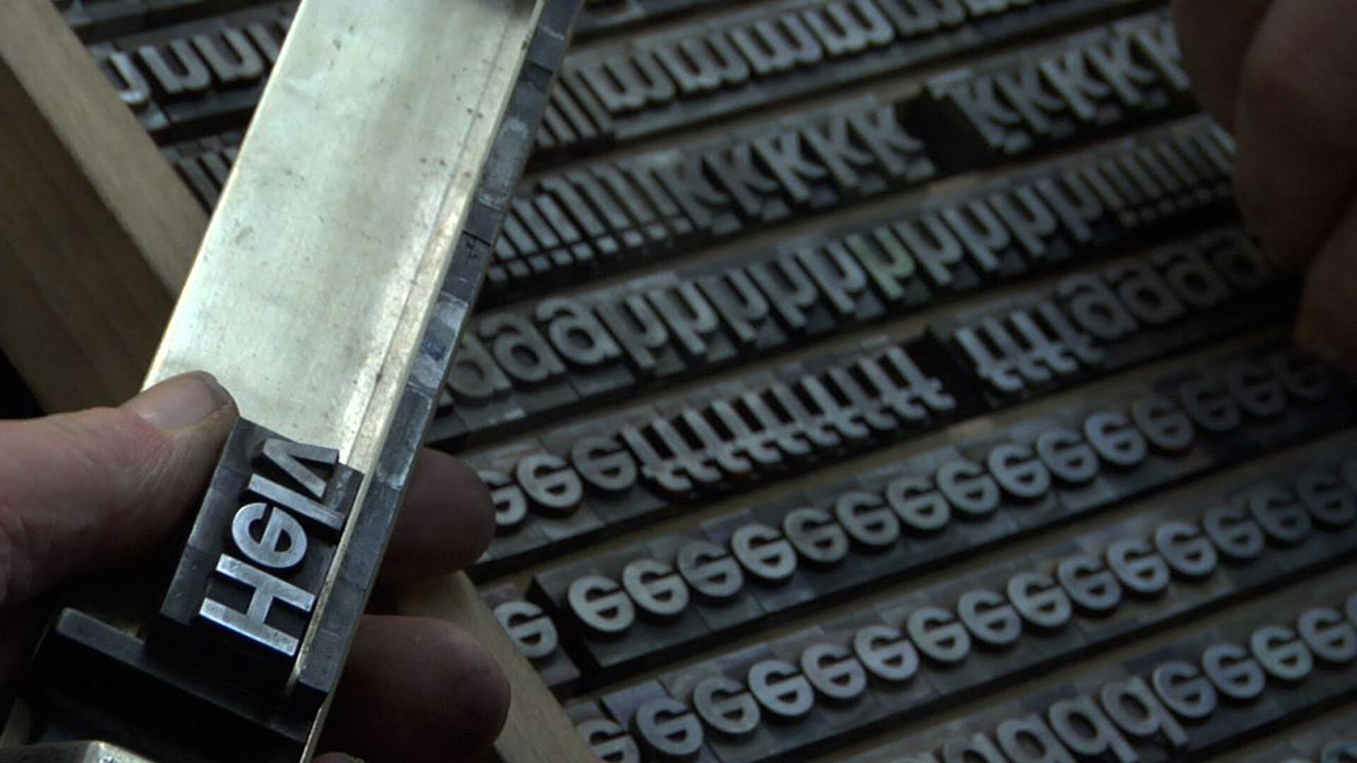
It’s become a bit of a cliché but the word typeFACE is not accidental. The idea that letters can be expressive in isolation from the words that they form has been around for a very long time :-)
There is the initial impact that a typeface makes. In the words of Michael Bierut in Gary Hustwit’s ‘Helvetica’ film when talking about a particular piece of advertising ‘Any questions? No. It’s in Helvetica’! A glib comment perhaps but the point he’s making is that Helvetica has a reputation as a no-nonsense face designed to communicate clearly and directly. It is often associated with the modernist movement for these reasons. Form that follows function. It is this initial impression that does much of the heavy lifting for a brand. Much like a logo or marque a typeface can make an impression before a word has even been read.
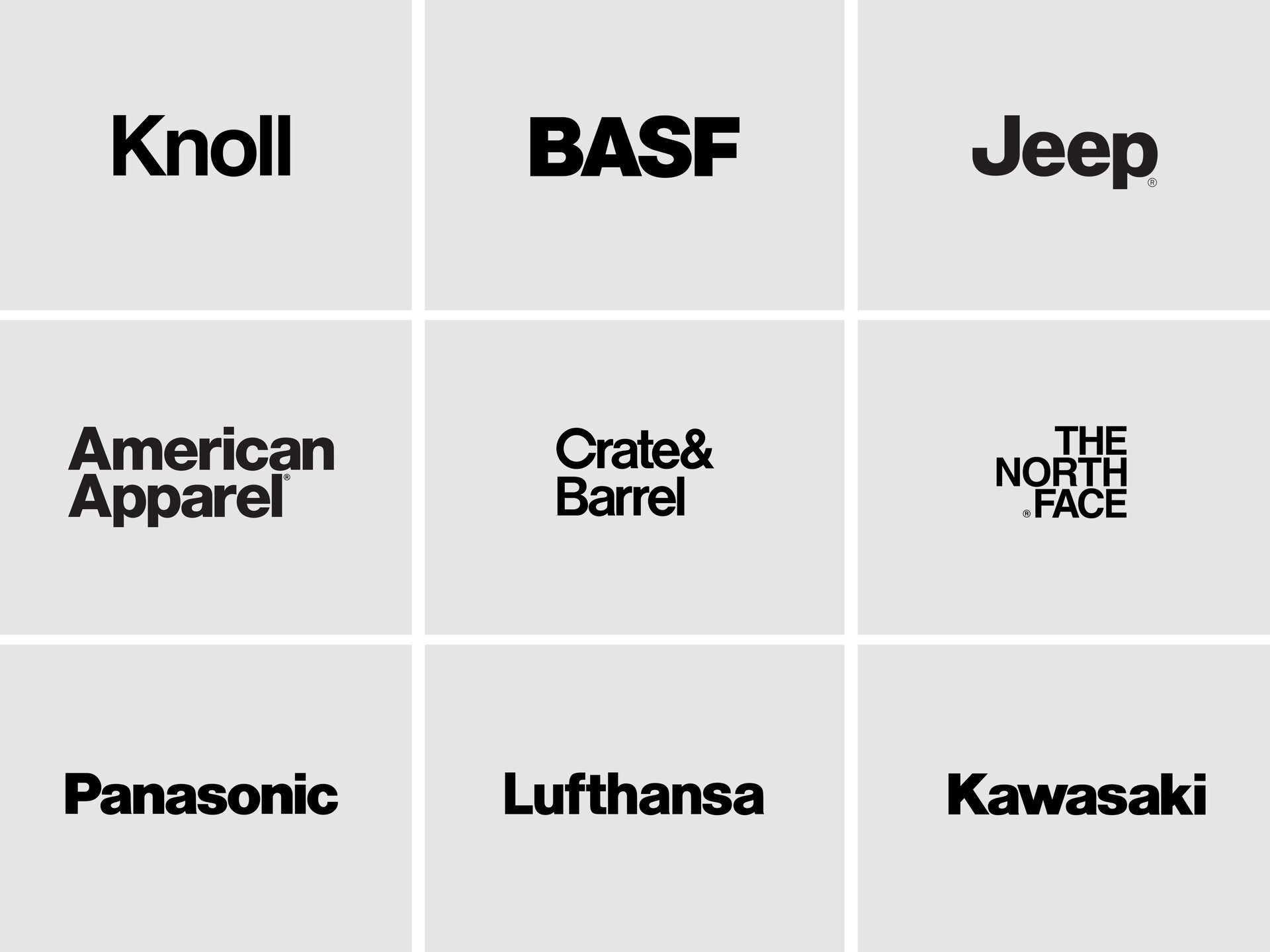
But can a typeface alone make a brand recognisable at a glance? Even something as ubiquitous as Helvetica? a typeface that has been used over and over. I may dilute my own point here but just look at this spread of well known brand identities that use Helvetica. All immediately recognisable. Although I do wonder how much of that is down to the name. A lot can be done with setting, weight, spacing and case but perhaps these examples rely on an iconic status that not all brands can achieve, especially in these days of more. However, maybe all of these companies were specifically looking to present a no-nonsense façade when they created their brand identities. Function over form. When you consider these brands this rings true.
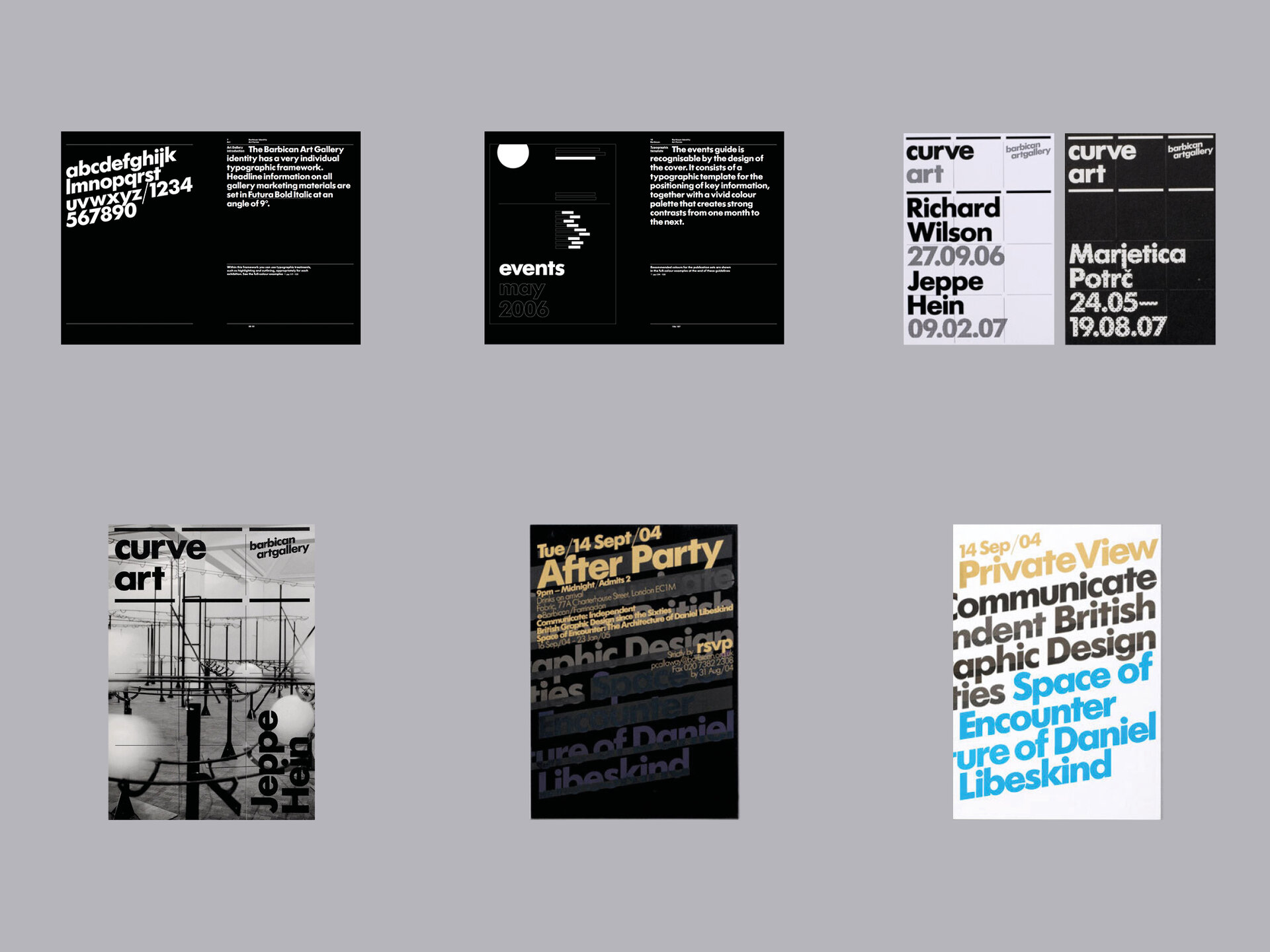
Certainly typographic systems created through the rigorous use of a particular typeface can render a brand recognisable even if the name or logo is nowhere to be seen. The Barbican is a fine example of this. The Brand Identity System, created by North, centres around a strong commitment to Futura Bold. This system has led to some of the most recognisible communications in what is often a highly competitive visual environment. Even with a strict formality to the approach there is still plenty of scope for creativity and expression whilst retaining recognition. The approach to layout here also plays a key role of course but that’s a whole other story and a whole other layer of a brands tool kit.
This commitment to the power of a typeface becomes really evident when bigger brands, seeking to solidify or elevate their position in the marketplace, set out on partnerships with Designers and Type Foundries to create their own bespoke faces that meet their needs in very specific ways.
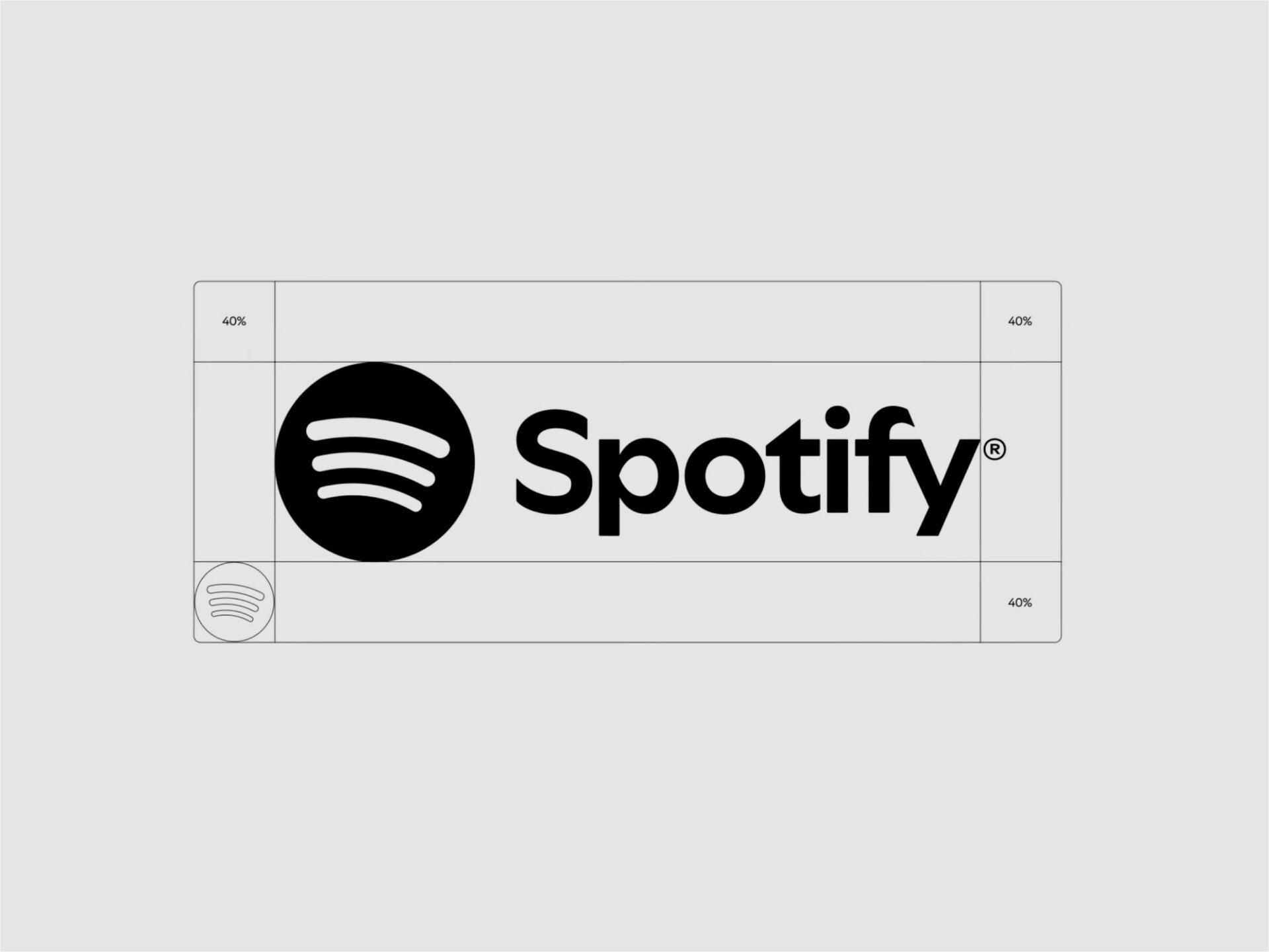
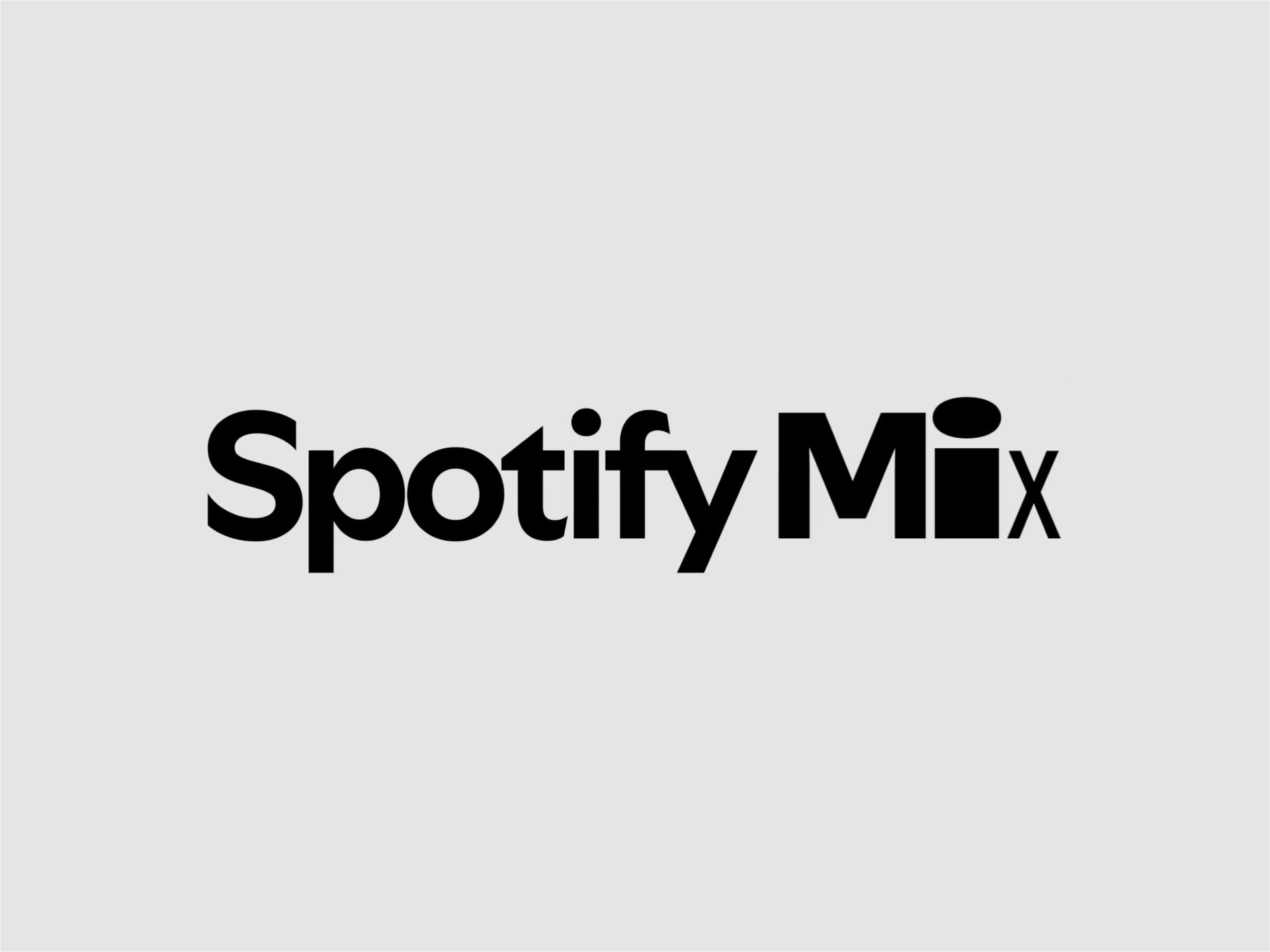
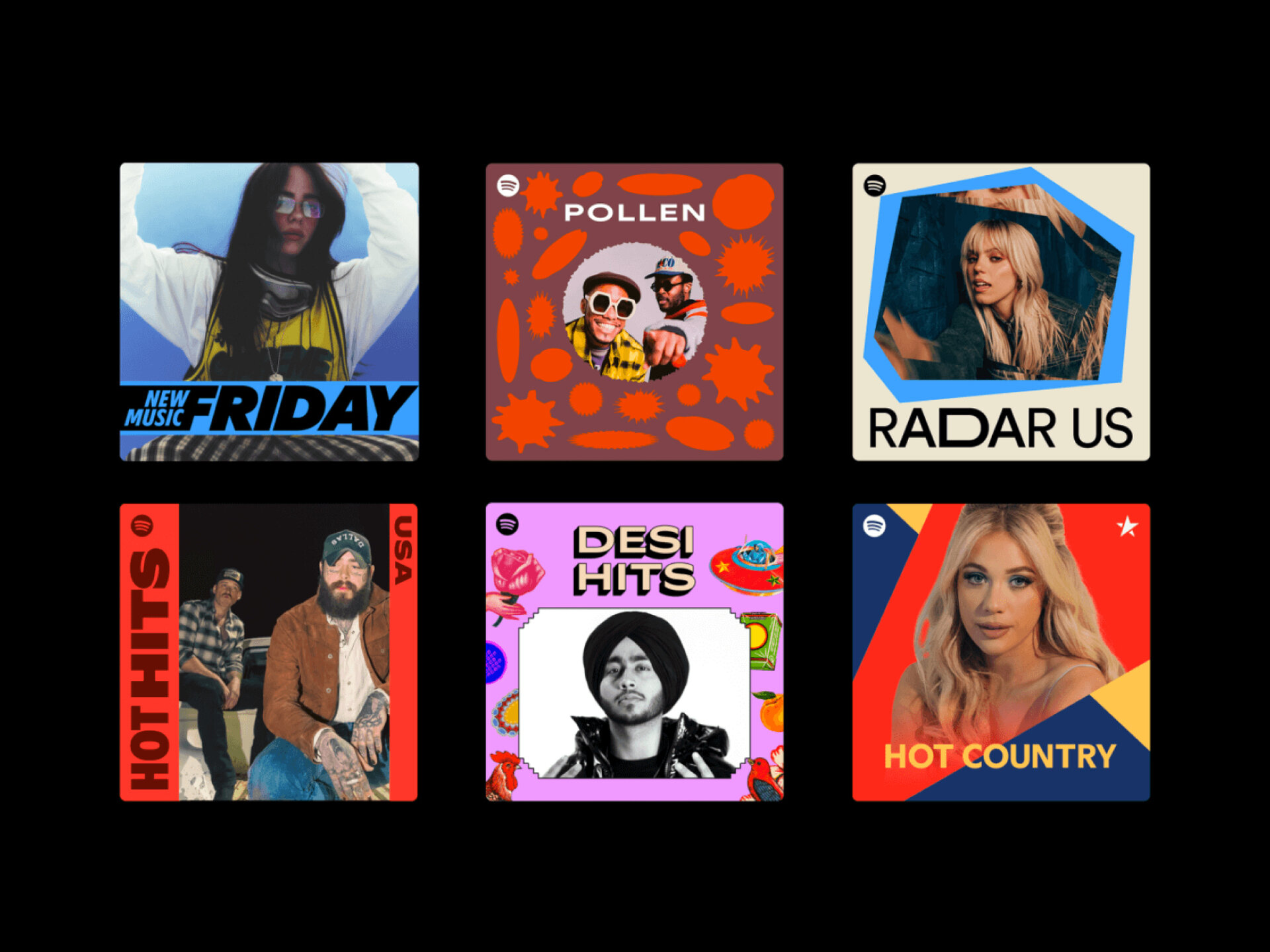
Spotify may be the latest, this month revealing a new Logotype and Typeface called ‘Spotify Mix’ created with Berlin based type foundry Dinamo. Spotify wanted to reflect the individuality of their millions of users. A tall order it has to be said, but one way they saw to do this was with a variable typeface that allows an almost infinite range of widths, weights and expressions. Combined with a vibrant, lively and hugely flexible Design System and Graphic Assets this creates an approach that is a long way from the consistency and formality of the Barbican but is perhaps more reflective of the diversity of taste at the centre of the brand. Although a potential stumbling block here is trying to be everything to everyone, to the point when any sense of unity starts to fall apart. It’s a fine line.

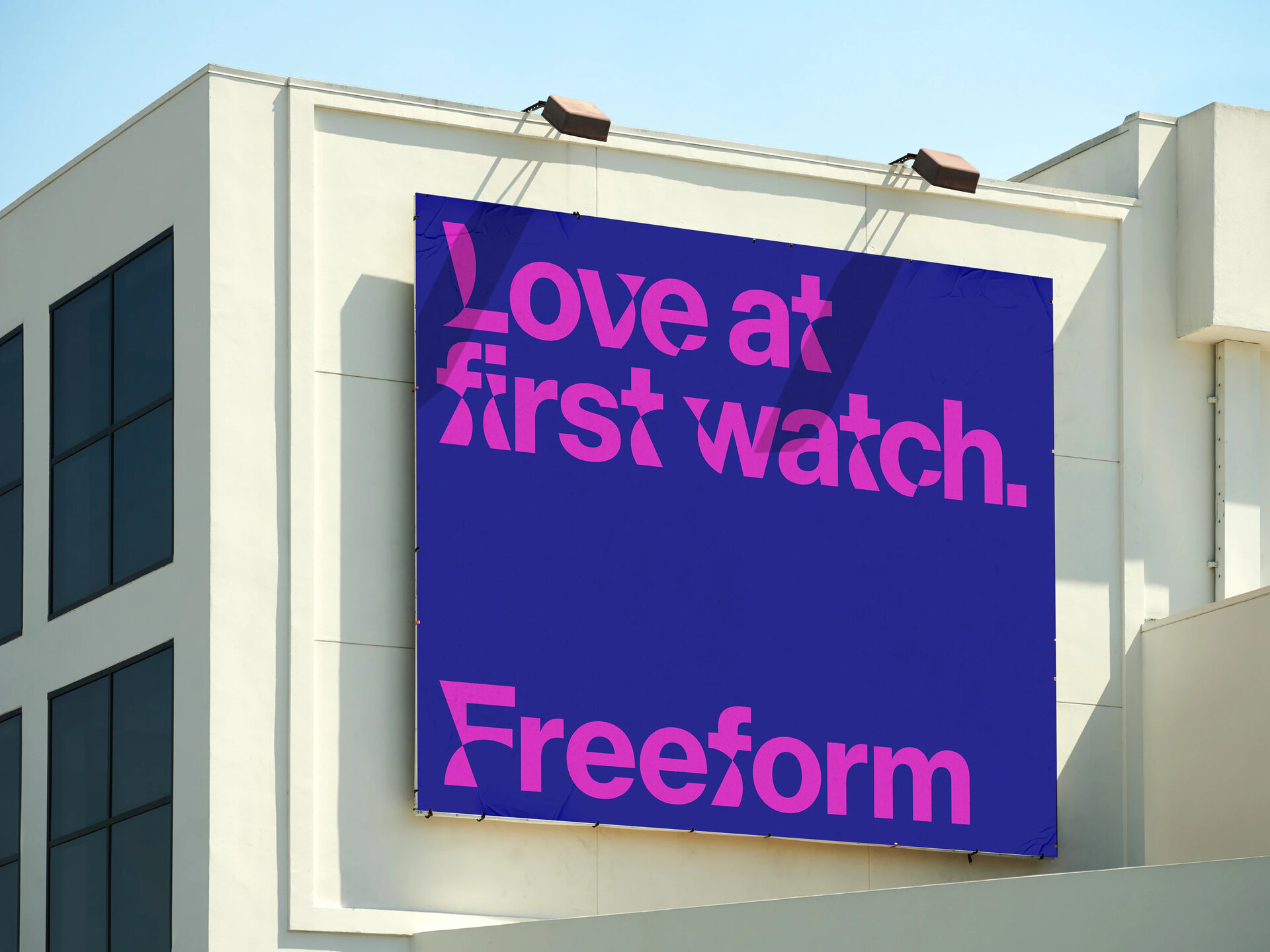
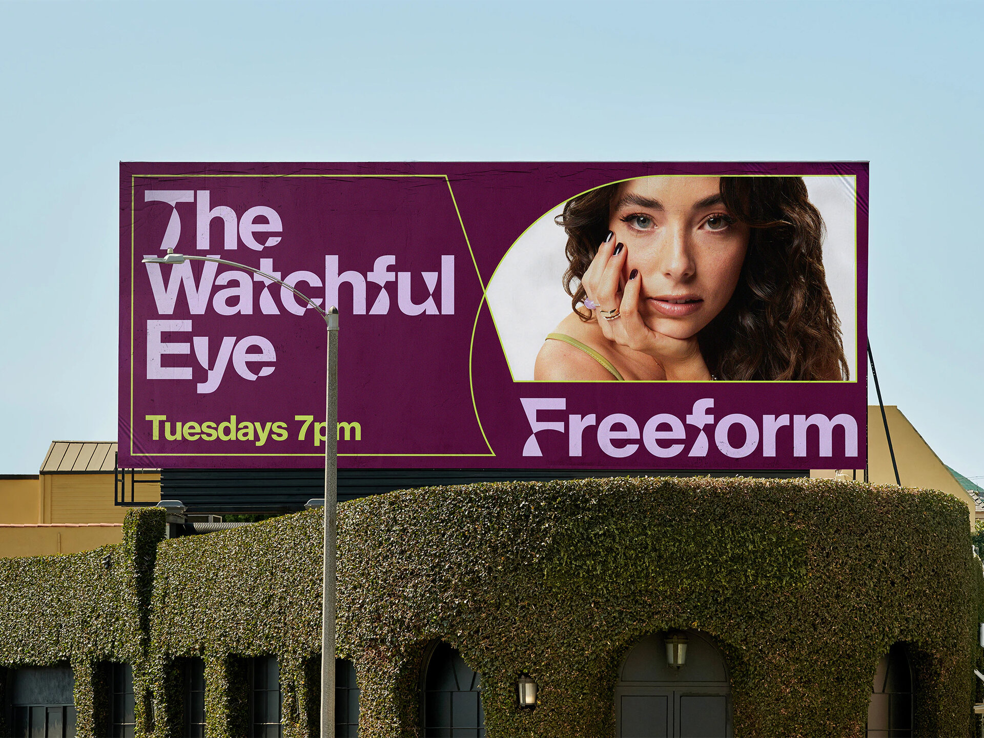
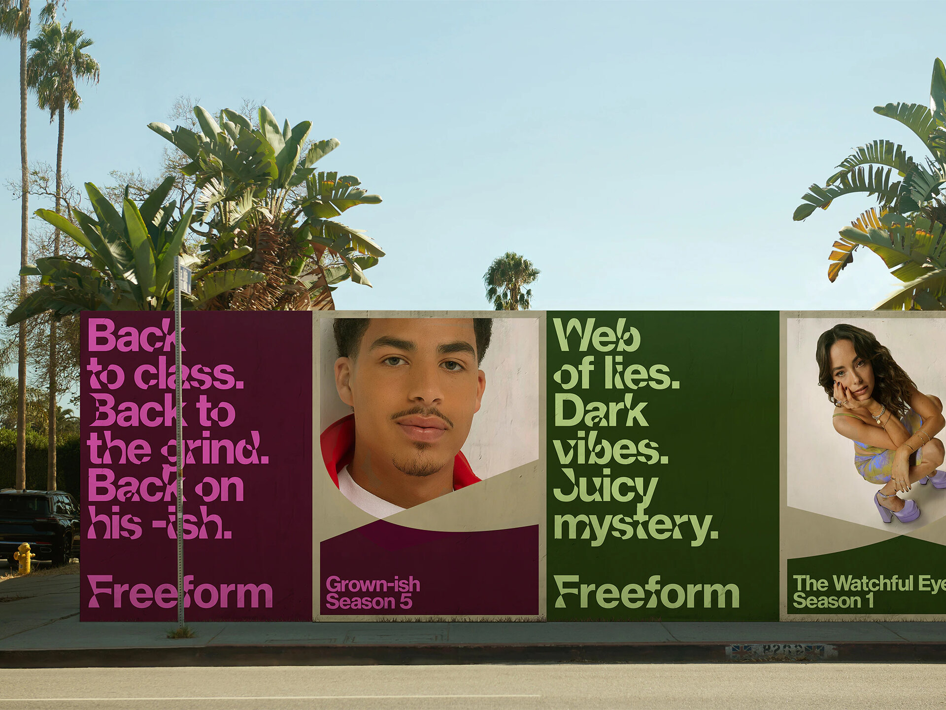
Another example of this more flexible approach can be seen in the recent brand created by Collins for Disney streaming platform Freeform. The media market is oversaturated and loud. Freeform needed to find a way to stand out and connect with their audience, backing young adult stories that curb conventions. Treating their audience ‘as age not a stage’ and reflecting their ongoing journey of re-invention and development.
Collins worked with Monotype to create a variable typeface that distorts and re-shapes fairly standard Sans Serif forms into something quite different. The nature of these distortions becomes a consistent element, recognisible and distinct as part of an identity system that has the bones of something formal but also feels liberated and dynamic in a way that appeals to the younger, and perhaps more international audience.
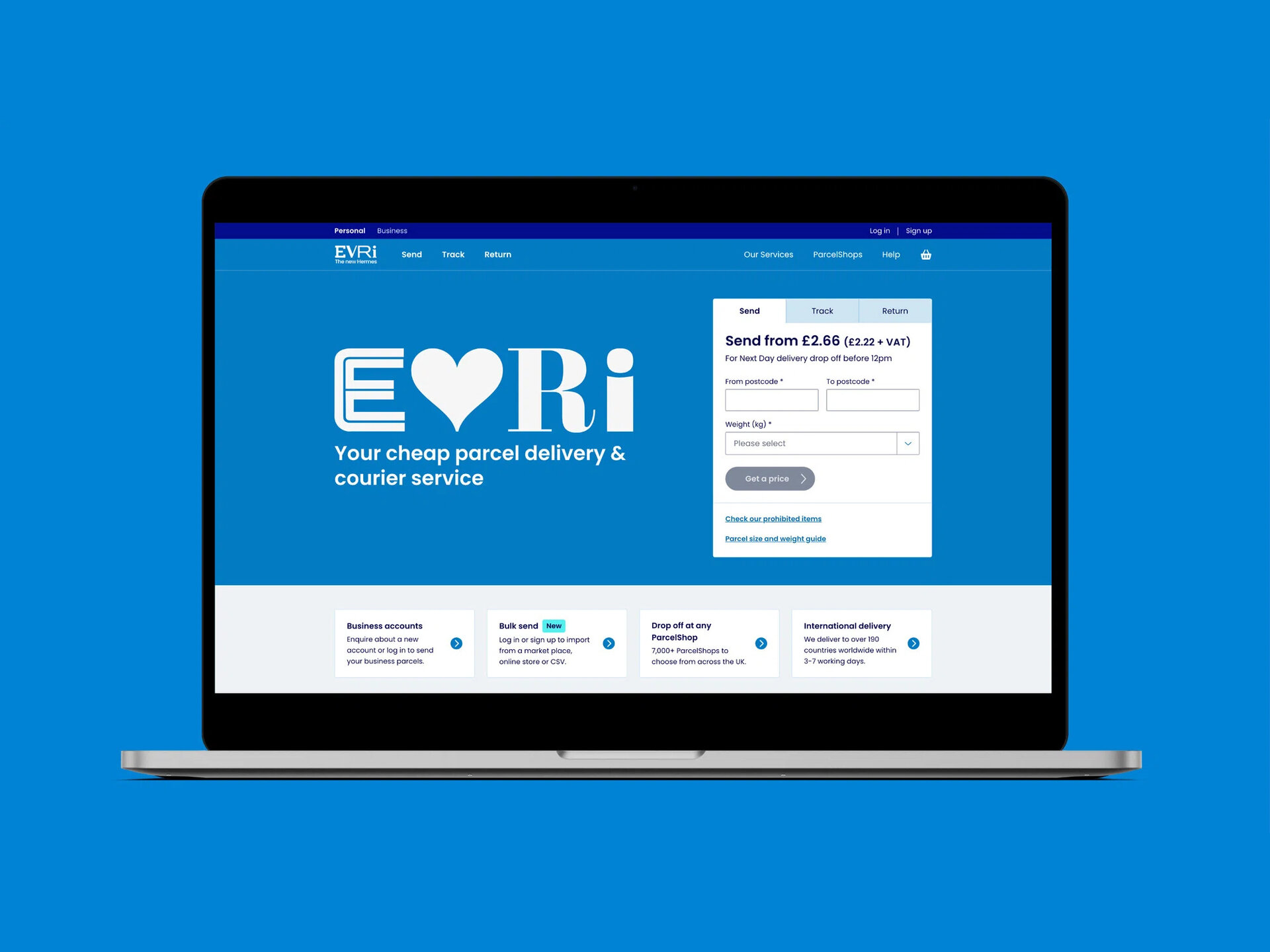
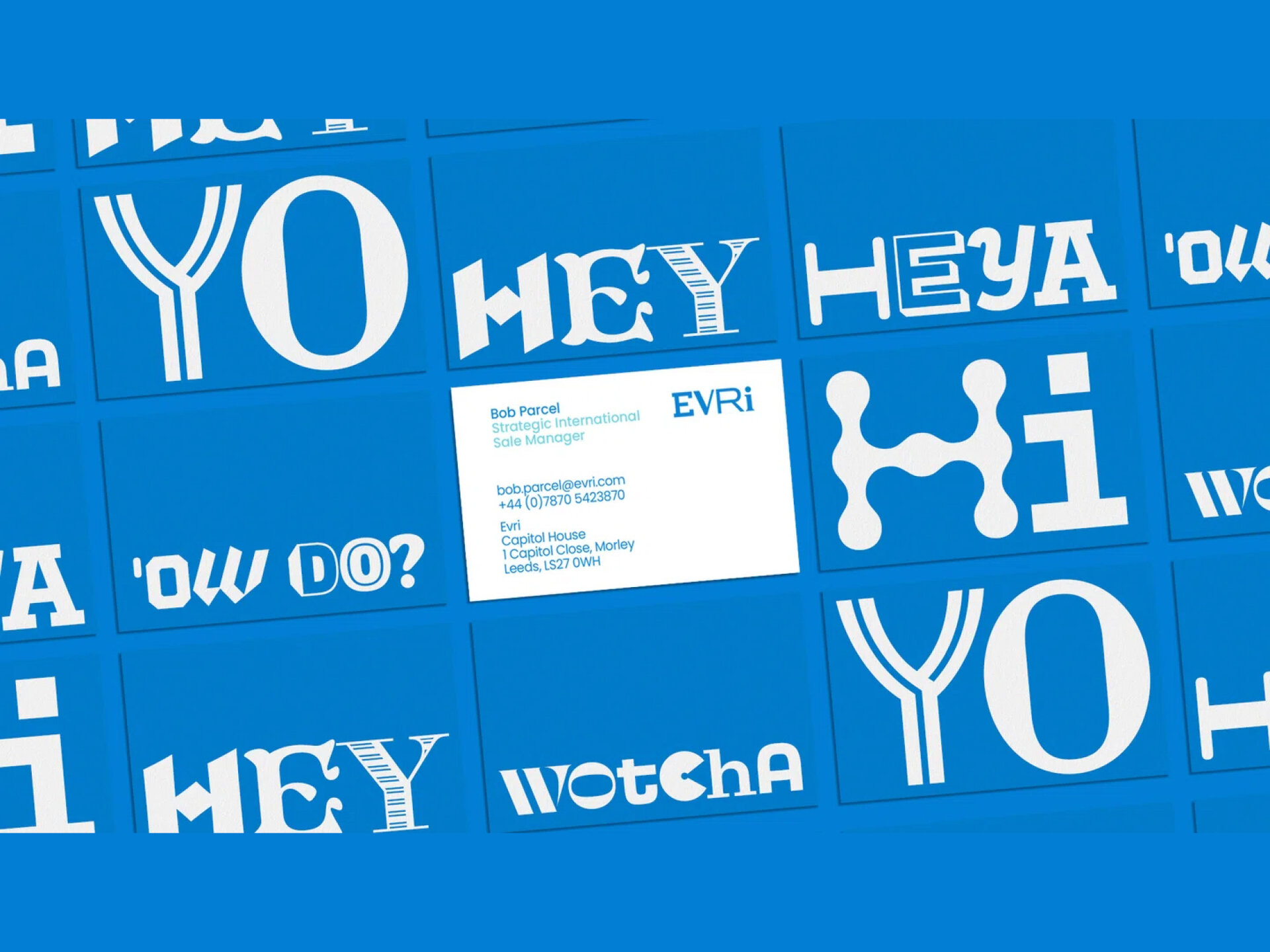
As Hermes re-branded as Evri they took flexiblity to the extreme with an experimental variable typeface, created by Superunion and Monotype, that can be configured to create up to 194,481 different logo variations (although they do seem to have settled on one main version). This is a long way from more traditional approaches to branding and feels very much in line with the phenomenon of ultimate customisation and personalisation that is starting to prevail. Not quite the cult of the individual but certainly a focus on what makes ‘me’ different. Maybe ‘I’ want to feel as though a brand is speaking to ‘me’ in a special voice that only ‘I’ experience. Evri-thing to Evri-one.
Let’s just take a moment. 194,481 different logo variations. Mind boggling.

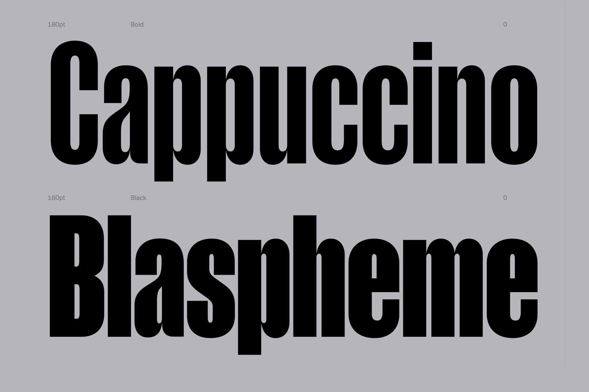
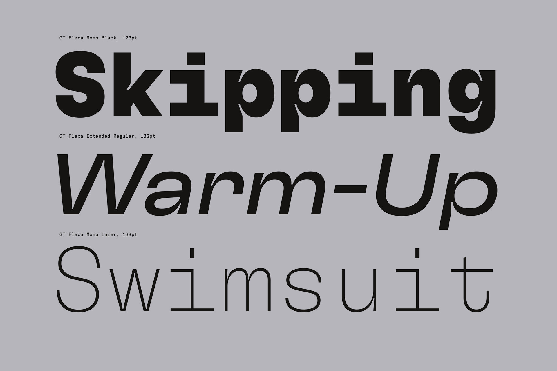
Typographic ‘personality’ can also be quite subtle, only evident on close inspection or perhaps at large scale. Elements that bring a character and quality to a letterform. A sense of elegance or maybe technical attention to detail. For example, Manuka, a tall, condensed face based on old woodblock type, designed by Klim. The subtle curved forms, for example on the lowercase ‘a’ bring a natural, leaf-like feel, softening individual shapes as well as the overall impression. In contrast, Flexa by GrilliType has cut-away forms, almost like exaggerated ink-traps, that bring a sense of engineered detail and structure. Far more evident in the heavier weights but very subtle in the lighter variants. These kinds of details can provide subliminal reinforcement of the values and personality of a brand, taking the pressure off a Logo or Logotype to say absolutely everything and bringing a depth and complexity to communications and expression.
Almost every typeface we have looked at here (except for Evri) sits broadly within the ‘Grotesque’ or ‘Neo Grotesque’ family. Sans Serif essentially. There is of course a massive variety of other type styles to consider, all sitting within their own families and making their own statements. Serif, Slab, Script, Handwritten, Display. The list goes on. It should also be said that whether a typeface is free or not isn’t necessarily an indication of its quality. Many of the world’s leading Type Foundries are now creating typefaces especially for Google Fonts and similar platforms.
Having a bespoke face created especially for your brand may be out of reach for most but a well considered off the shelf alternative can work just as hard. There are many high profile brands that use freely available or at least easily accessible typefaces. Netflix, Google and Nike to name a few.
The point is – that wherever your typeface is sourced from – be it bespoke or off-the-shelf, the choices you make for your brand will go very a long way to helping you communicate clearly with your audience.
Type is the face that gives character to your voice.
Next article